

A 5% long bond isn’t the crisis, it’s the receipt, and the fifteen years when money was free did far more damage to growth than normal interest rates ever will.
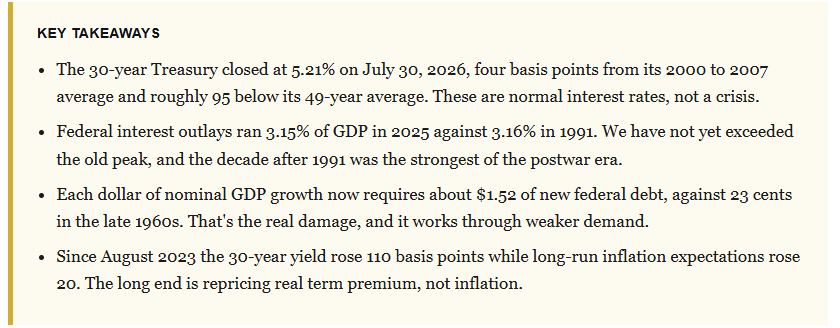
This past week, two charts crossed my desk, arguing the same thing from opposite ends. The Kobeissi Letter flagged that U.S. borrowing rates just hit their highest level since 2007. Then, my friend and colleague, Adam Taggart, framed the economy as a submarine, with bond yields as the surrounding water pressure, asking how close we are to the hull giving way. Both are hunting for the same “implosion point.” Both are anchored to an assumption I think is wrong, namely that a 5% long bond is a “crisis” rather than a price. Normal interest rates are not a crisis, and the level of the long bond is the least useful number in this entire debate.
The Submarine Metaphor Has A Flaw
Let’s start with Adam’s analogy, which is vivid and understandable, and why it had traction. Depth equals pressure; pressure equals stress; and somewhere down there, the hull of the ship fails. The symbolism is good; a submarine has a fixed “crush depth” set by the laws of physics. However, an economy doesn’t. What matters isn’t how deep yields go, but whether the borrower’s income is compounding faster than the interest clock is ticking. Moreover, we must know how much of the existing debt has actually repriced.
Here’s the problem with that argument in its popular form. It treats a 5% long bond as the oddity. Yet a 5% long bond is NOT the anomaly. What was odd was the fifteen years of zero-rate policy and four rounds of quantitative easing that taught a whole generation of investors that money was “free.” We’ve written about this before, and the data on rising interest rates has consistently refused to cooperate with the crash thesis.
So the first job is to define what “normal” actually means. If normal interest rates are the 5% kind, then the last decade and a half was the anomaly, and the current tape is a return to form. If free money is the baseline, everything looks like a crisis. One of those framings has 60 years of data behind it.
Rates aren’t the disease. They’re the thermometer.
Normal Interest Rates Are Not A Crisis
Let’s put the current level in context using the Federal Reserve’s own constant-maturity series, which runs daily back to 1962. I pulled all 16,129 observations rather than trusting anyone’s screenshot.
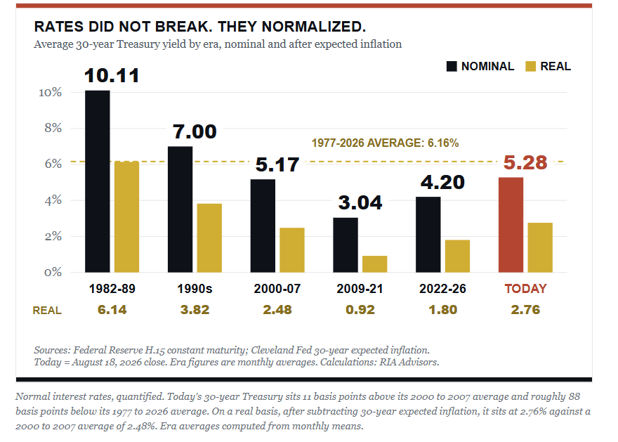
Notice what the gold bars do. After adjusting for expected inflation, today’s real long yield of roughly 2.8% sits within 30 basis points of the pre-crisis norm. That’s less than half the 1980s level and nowhere near a record. The 2009 to 2021 column, where the real long yield averaged 0.92%, is the outlier that needs explaining, not this one.
In other words, what were historically normal interest rates now look strange to us only because we spent fifteen years learning the wrong baseline. Of course, a 5% long bond feels violent after a decade of 2%, but that says much more about our reference point than about the bond market.
Secondly, I mentioned the Kobeissi framing, which is accurate on its face, and I’d only tighten one detail on their analysis. When looking at the Fed’s constant-maturity data series, the last comparable print to the August 17th high of 5.31% was June 12, 2007. Therefore, describing a return to the 2007 level as a bond market gone “crazy” quietly concedes that the ZIRP period was the “baseline,” when it wasn’t. That was the anomaly.
The Interest Burden Isn’t Unprecedented
Now, let’s explore where the debate usually pivots after ending the level debate. “Yes, but servicing costs are the highest level ever,” is usually the next progression in the debate.
However, this is where the “doom” case is the weakest. Ken Buck, writing in The Epoch Times, calls the national debt “a bona fide job-killer” and cites daily interest payments of nearly $2.8 billion. While the interest rate figure is correct, the conclusion drawn from it is not.
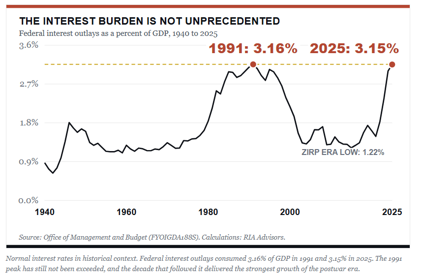
Read that chart again. Washington’s interest bill, measured against the size of the economy it is borrowing from, sits exactly where it stood in 1991, back when Alan Greenspan chaired the Fed and not one commentator was writing about “fiscal collapse.” That isn’t a record, and it isn’t off the chart. What came next was the 1990s. Such is the fact that never survives the trip into a “debt spiral” thread.
So is the debt “harmless”? Not even remotely, and I have never said that it was. The risk is real, and I have written numerous articles about the “negative multiplier” of debt on the economy. It’s just nothing like the risk on offer in the headlines, and you can only see it by dividing the interest bill by the debt stock. Normal interest rates aren’t the danger here; rather, the gap between what we pay and what the market charges is.
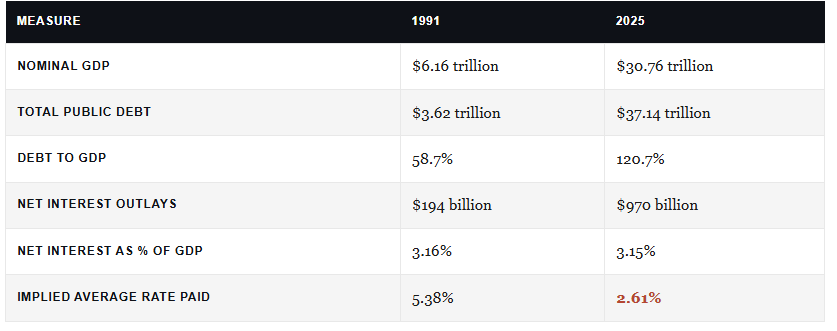
Let me say one thing about measuring the data, as it matters. The figures above use OMB’s net interest outlays, the budget line item, which is the only series that runs consistently back to 1940. Treasury’s gross interest expense on the public debt is larger, roughly $1.2 trillion or about 4% of GDP in fiscal 2025, because it includes interest credited to federal trust funds. This is an important distinction because it is an intragovernmental transfer rather than a cash cost to the public. Either measure works, but you can’t mix them in the same comparison, and the “Persistent Purveyors Of Doom” mix them constantly.
With all that said, we can sum it up in one sentence. We currently carry ten times the debt at half the interest rate. More importantly, the debt burden looks manageable today only because the average coupon on $40 trillion is still roughly 2.61%, a legacy of borrowing enormous sums during the zero-rate years. Every month, some of that cheap paper matures and gets refinanced at market, and the interest-rate bill rises even if the Fed cuts, and the 30-year yield never moves again.
Think about it this way. If we repriced the entire Treasury stock to July’s 5.21%, the interest rate burden would jump to roughly $2.03 trillion, or 6.4% of GDP. That would certainly be new territory. However, it also would not happen overnight, because the average maturity of the debt is measured in years.
A homeowner is a great example of this. Let’s assume a homeowner locked a 2.6% mortgage in 2021 and is now watching the reset schedule arrive one year at a time. When the rate reset day arrives, nothing breaks, but the payment slowly increases until it starts crowding out everything else in the budget. That’s all that is happening with the federal balance sheet, and it’s a slow grind through the maturity schedule rather than a sudden, irreversible, and devastating hull breach.
Where Debt Actually Bites
Don’t mistake me for being “Pollyannish.” There is a real mechanism that does damage, it is just not interest rates. It’s what each borrowed dollar buys. Using OMB debt data alongside BEA nominal GDP, I calculated how much federal debt was added per dollar of nominal growth across six periods.
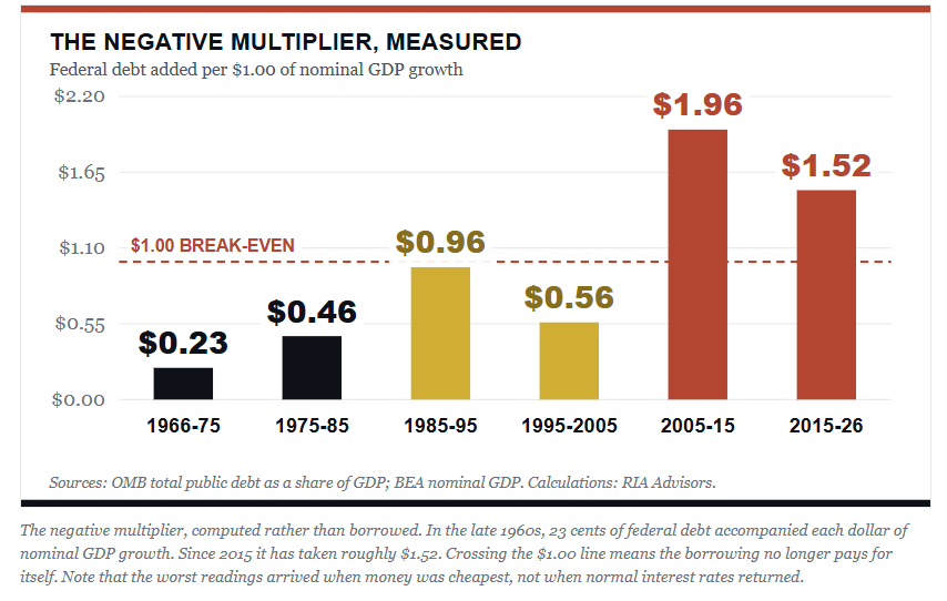
In the late 1960s, 23 cents of new federal debt came with each dollar of nominal growth. Since 2015, it has taken about $1.52. Therefore, when you spend more than a dollar of borrowed money to buy a dollar of output, you aren’t “stimulating” anything. You’re substituting. Lacy Hunt at Hoisington has made this case for years, and the arithmetic keeps proving him right.
This is the damage, and notice that normal interest rates play no part in it. The multiplier broke down hardest during the zero-rate era, when money was as cheap as it has ever been in American history and Washington borrowed with both hands because carrying the debt cost almost nothing. Cheap money didn’t fix the problem. It fed it.
Where the popular version goes wrong is the causal chain. Buck describes “crowding out” as debt service that is “pushing investment into Treasury bonds.” That isn’t the mechanism. Crowding out happens because deficit financing competes for a finite pool of national savings. And the CBO, whose 33-cent estimate Buck cites, explicitly notes that private investment falls by less than national saving does, because higher rates attract foreign capital. That’s why the figure is 33 cents, and not a dollar, within a published range of 15 to 50 cents.
Why Normal Interest Rates Are Disinflationary
Here’s the part almost everyone gets backward. Rising long yields are read as an inflation signal, and rates do, in fact, respond to inflationary inputs such as oil prices. However, a study of the data suggests something more interesting, and the decomposition is straightforward.
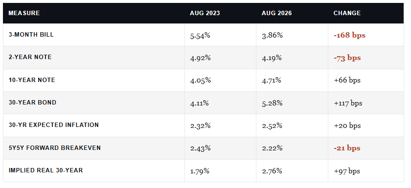
The front end fell 168 basis points while the long end rose 117. Meanwhile, long-run inflation expectations moved just 20 basis points, and the forward measure the Fed actually watches went the wrong way for the inflation thesis. So roughly 97 of those 117 basis points is real yield and term premium. Not price fears, but rather compensation for duration.
That is a bear steepener driven by supply and term premium while the central bank eases, and it’s a disinflationary configuration, not an inflationary one. Investors are demanding more compensation to hold duration against relentless issuance. They are not demanding compensation for future inflation.
The transmission runs like this. Debt-funded spending pulls demand forward from tomorrow into today, and then servicing that debt diverts income from consumption to interest payments, which is a transfer from one pocket to another rather than new output. Call that “austerity” by arithmetic instead of by legislation.
Read that again carefully, because this is the crux of the “negative multiplier” of debt. For each newly borrowed dollar, its purchasing power buys less economic growth than the dollar before it. When that occurs, as it is currently, demand weakens, money velocity falls, and pricing power erodes. That’s the Japanification path we’ve written about before, and Japan ran that experiment for three decades without producing inflation.
The Pushback: Doesn’t The Long End Still Matter?
So, here is the question that keeps landing on my desk almost daily.
“Higher treasury yields must eventually reach households, so isn’t this just a matter of time?”
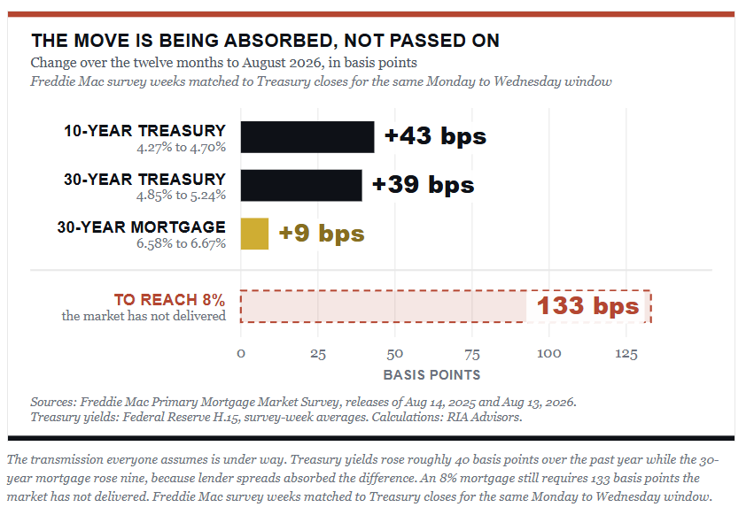
The objection is certainly valid. If normal interest rates were doing real damage, the “transmission” should be visible somewhere in the household data by now.
Over the past year, the 10-year Treasury rose about 43 basis points, and the 30-year rose by 39 basis points. Freddie Mac’s 30-year fixed mortgage rose only 9 basis points from 6.58% to 6.67%. Roughly one-fifth of the move in Treasuries actually reached the borrower, because the primary mortgage spread compressed from 231 basis points over the 10-year to 197, absorbing most of the increase before it ever hit a closing table. Kobeissi’s suggestion that mortgages could approach 8% requires another 133 basis points that the market is currently refusing to deliver. Could it happen? Sure. But it just isn’t happening today.
Furthermore, credit data tells a similar story with an important wrinkle. Credit card balances 90 days or more past due just hit 13.1% in the first quarter, which is a 15-year high. However, aggregate household delinquency rates have remained at 4.8% and have barely moved, while credit card transitions into early delinquency have actually ticked down. While the New York Fed describes the pattern as “K-shaped”, it is the prime borrowers who are fine, while subprime and the 18-to-29 cohort are genuinely struggling.
In other words, the stress at the bottom of the income ladder is “crowding out” working with brutal efficiency, and it holds down spending without threatening the banking system. It is the disinflation showing up in real households, and it tells you that normal interest rates are doing their job: pricing risk and rationing credit.
What Normal Interest Rates Mean For Portfolios
The commentary from Adam and the others is great for getting clicks and views, but as Adam always states, this is about making “thoughtful decisions for your money.” Therefore, if we follow the argument to its end, it lands in an awkward place for both camps.
If debt truly suppresses growth, and if the long end is repricing real term premium rather than inflation, then a 5.2% 30-year yield is not a warning that the economy is about to break.
Instead, it’s the price a lender can now demand in a market that has lost its biggest price-blind buyer.
When it comes to carrying bonds in a portfolio allocation, we favor that analysis. Think about it this way. If real yields are near 2.8%, with long-run inflation expectations anchored around 2.5% and a growth impulse that weakens each time debt substitutes for output, such seems to be a reasonable entry point for extending duration in portfolios.
We are not saying do so aggressively, and certainly not all at once. Investors can buy into weakness, layer purchases in tranches, and allocate them to the part of a portfolio that still holds equities.
Will that trade be right immediately? No. The term premium can widen further, and the Treasury’s issuance mix at the long end is a policy decision nobody can forecast. If fiscal deficits keep widening, and foreign demand weakens, the long bond can grind higher for longer than any valuation argument suggests. However, that is the cost of this position, and you should size it knowing that.
However, the trade-off cuts the other way too. Extending duration reduces portfolio volatility and gives you a hedge that actually works if growth disappoints. It also protects your principal investment when held to maturity. However, it caps your portfolio upside if nominal growth surprises to the upside. As Howard Marks keeps reminding us,
“You don’t get paid for being early, you get paid for being right about what you’re being compensated to own.”
What does this mean for investors? Stop treating normal interest rates as a crisis gauge. Watch the average coupon on the federal debt, the rate of change in term premium, and whether nominal growth is outrunning the interest clock. Those three tell you something, but the “scary” headlines about yields tell you almost nothing.
The debt problem is real. It just isn’t a bomb. As we’ve written before, the debt and deficit problem isn’t what you think. It’s a tax on future growth, collected slowly, and normal interest rates are s
Sources and Notes
Ken Buck, “The Real Threat to Young Americans’ Jobs Isn’t AI. It’s the National Debt,” The Epoch Times, July 2026, syndicated via Creators Syndicate. Mr. Buck represented Colorado’s 4th congressional district from 2015 to 2024.
Federal Reserve H.15 Selected Interest Rates, daily constant-maturity Treasury yields, 1962 to July 30, 2026. 16,129 observations retrieved in session.
Office of Management and Budget, Federal Outlays: Interest as Percent of GDP (FYOIGDA188S), 1940 to 2025, via FRED. This is net interest outlays. Treasury’s gross interest expense on the public debt was roughly $1.2 trillion in fiscal 2025, near 4% of GDP, a figure we have cited previously. The two series differ by interest credited to federal trust funds. All historical comparisons in this article use the net series throughout for consistency.
OMB, Federal Debt: Total Public Debt as Percent of GDP (GFDEGDQ188S), Q1 1966 to Q1 2026. Bureau of Economic Analysis, nominal GDP. Debt levels and the debt-per-dollar-of-growth series are RIA calculations from these two sources.
Federal Reserve Bank of Cleveland, 30-year and 10-year expected inflation; market breakeven and 5-year 5-year forward measures.
Freddie Mac Primary Mortgage Market Survey, 30-year fixed rate 6.66% as of July 30, 2026, against 6.72% a year prior.
Federal Reserve Bank of New York, Quarterly Report on Household Debt and Credit, Q1 2026.
Congressional Budget Office, The Long-Run Effects of Federal Budget Deficits on Interest Rates. Central crowd-out estimate of 33 cents per dollar of deficit, range 15 to 50 cents.
Social Security Administration, 2026 Trustees Report Summary. The OASI trust fund is projected to deplete in Q4 2032, at which point continuing income covers 78% of scheduled benefits. Combined OASDI depletion is projected for 2034 at 83% of benefits.
Era averages for real yields are computed from monthly means of daily yields less the corresponding monthly expected-inflation reading. The “today” figure uses the July 30, 2026 daily close of 5.21% less the June 2026 expectation of 2.52%.


Comments
Log in or sign up to join the conversation.