


Let’s take our regular weekly look at jobless claims. Plus, this week I want to make a statement about jobless claims vs. long term unemployment.
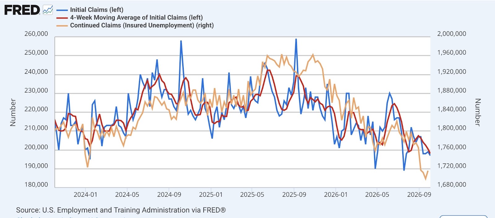
First, initial jobless claims declined -2,000 to 197,000. Aside from 2 weeks in 2018, the only time prior to the pandemic that initial claims were this low was all the way back in the 1960s. The four week moving average declined -2,500 to 198,000, also the lowest since the 1960s. And with the typical one week delay, continuing claims rose 17,000 to 1.716 million, in the lowest range since early 2023:
In the YoY% comparisons more important for forecasting purposes, initial claims were lower by 15.5%, the four week moving average lower by 13.0%, and continuing claims lower by 11.0%:
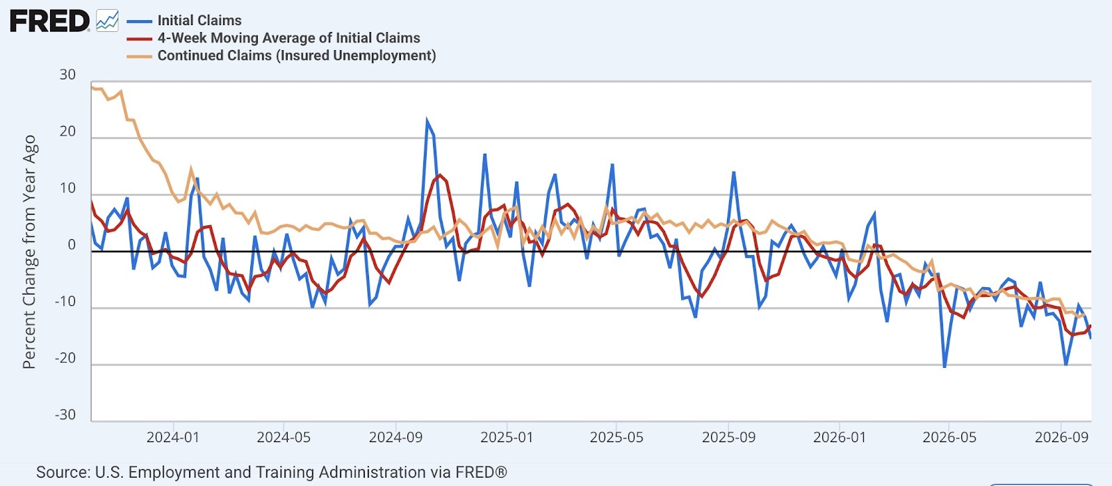
These YoY comparisons keep getting better, even in the face of very good numbers one year ago. This is very positive for the economy over the next few months.
Not only are jobless claims very positive, but the stock market (blue in the graph below), concentrated on AI-related gains, is higher by about 15% YoY. Thus the “quick and dirty” forecast model, which also included the four week average of jobless claims (inverted, +10%), remains very positive for the economy as well:

It’s early enough in the month that I can eschew a comparison with the unemployment rate, but last Friday I read a prominent reporter touting how long term unemployment was recessionary. This is simply not the case. So let’s compare YoY jobless claims with long term unemployment by 27 weeks or more (blue in the graph below):

There are two important things to notice about the above graph. The first is that, if new jobless claims lead the unemployment rate, they lead long term unemployment even more. Secondly, note that long term unemployment continues to rise even after a recession is over; i.e., early during the ensuing economic expansion. In other words, a rising long term unemployment number is consistent with both a recession and also a renewed upturn in the economy.
Another way to look at this is the ratio of long term unemployment to initial claims. Here’s the historical look:
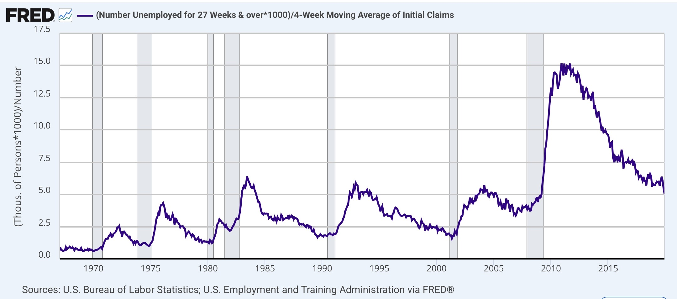
Again, note two things about the above graph. First, just like the number of long term unemployed, the above ratio also continues to rise into the ensuing expansion for months after the recession is over. Secondly, note that there has been a long term secular trend of a higher ratio of long term unemployed vs. newly unemployed both at the troughs and the peaks of the comparison. This has been particularly true since the 1980s. In part this is likely due to the relative strength of employers vs. workers and the decline of unions since the Reagan era. It may also be due to workers adapting to the availability of long term unemployment benefits, especially as more and more spouses also work; i.e., the unemployed worker can afford to be choosier about what next offered position of employment to accept.
Now here is the post-pandemic view:
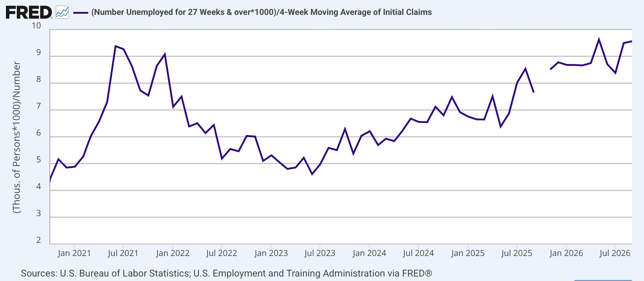
Just as with prior periods, the ratio peaked in the summer of 2021, more than a year into the post-pandemic Boom. There are ambiguous signs that it may be peaking again now, going on a year after the late 2025 “mini-recession.”
In short, whatever long term unemployment may suggest about the economy, new jobless claims get there first.



Comments
Log in or sign up to join the conversation.