
The historical trend in US household incomes is one of my favorite research topics. However, until recently I've never systematically analyzed the data for individual states. That changed last week when a reader emailed me a question about the median income for his state.
I've now compiled a few tables for the 50 states and DC based on the Current Population Survey, a joint undertaking of the Census Bureau and Bureau of Labor Statistics, which includes annual data from 1984 to 2012. The details are fascinating and rather sobering.
First, some context. The median US income in 2012 was $51,017, up from $22,415 in 1984 -- a 127.6% rise over the 28-year timeframe. However, if we adjust for inflation chained in 2012 dollars, the 1984 median is $47,181, and the increase drops to 18.7%, that's an annualized growth rate less than 0.5%.
The Latest Data and Peak Income Years
The peak annual median income for the US, adjusted for inflation, was in 1999. The latest data point, thirteen years later -- after two recessions and two market crashes -- is down 9%. Here is a alphabetically sorted table showing the data for the 50 states and DC along with the US median data.
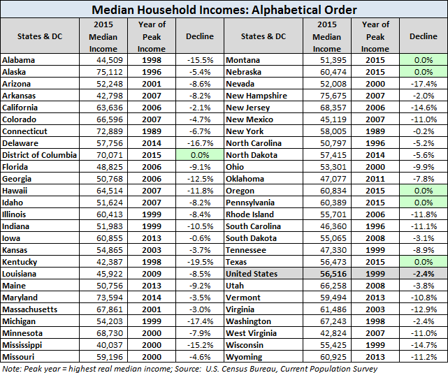
The alphabetical listing above makes it easy to find individual states, but for some additional insight, let's sort the data based on the decline from the peak year.

It probably comes as no surprise that the nation's capital would be at a record high. But why is Wyoming the only state with this distinction? It's quite an unusual state: It is the least populated (0.58 million) with a 93.1% White population (compared to 77.9% for the US). Wyoming receives more federal tax dollars per capita in aid than any other state except Alaska. The economy is primarily based on the mineral extraction industry along with travel and tourism. The latest unemployment rate is 4.0%.
Back to the big picture: The median household incomes in 17 states plus DC have fared better than the US median as measured by the real percent declines from peak years. A total of 33 states have suffered greater declines, with four states dropping more than 20%. Delaware is the biggest loser, down a whopping 27.1% since its real median income peak in 2000.
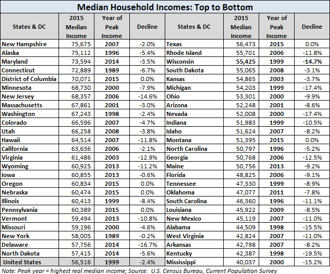
Highest to Lowest Median Incomes
The next table sorts the data by the 2012 median income column. A quick look at this table shows the huge spread between the $71.8K median in Maryland and the $36.6K in Mississippi. Of course, the cost of living is a critical factor in comparisons of the raw data. I have more on that topic below.
For an idea of the geographical distribution of median incomes, here is a map that color codes the states based on a quintile breakdown. Six Northeast states, not surprisingly, dominate the top quintile and are in fact the top six in the table above, along with DC. I've lumped Virginia and Maryland in the "Northeast" region, but it's the political capital of DC (pun intended) that no doubt ensures their membership in the top tier.

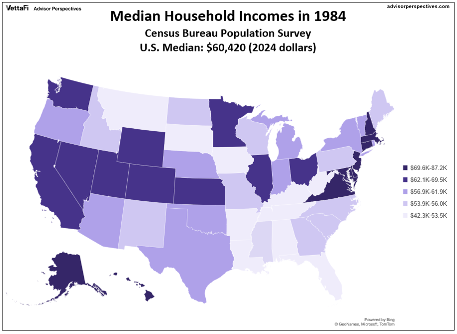
For the sake of comparison, here is the comparable map for the year 1984, the earliest year for which the Current Population Study provides the state breakdown.
The 21st Century Winners and Losers
I'll conclude this commentary with a comparison of the rankings of the 50 states and DC in 2000 and in 2012. The key column is the one labeled Change. DC and 19 states have risen in the rankings, six are unchanged, and 25 have declined, with Delaware again at the bottom.
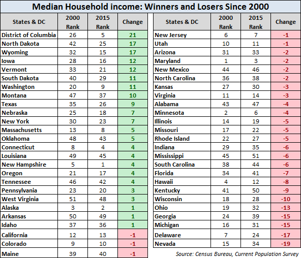
The many economic and political factors underlying the changes in rank are beyond my scope. I will point out, however, that the "Unchanged" category was the obvious goal for residents of Maryland, the top state for median income in 2000, but probably not for 50th place Arkansas.
In a follow-up commentary, I'll take another look at median incomes by state after adjusting for the cost of living. As you can readily anticipate, the rankings shift dramatically.
Notes:  Click on the adjacent image to visit a page with links across the top that will facilitate comparison of the tables and maps in this commentary.
The tables and maps above are based on state median income data from the American Community Survey and annual supplements available (here).
The inflation-adjustment used for the CPS data is based on a little-known version of the Consumer Price Index, the CPI-U-RS (RS stands for "research series"). For more about this deflator, see my annual update comparing hypothetical deflators as applied to US median household incomes.
Comments
Log in or sign up to join the conversation.