
This morning's employment report for March showed a 701K decrease in total nonfarm payrolls, which was well below the Investing.com forecast of -100K.
Here is an excerpt from the Employment Situation Summary released this morning by the Bureau of Labor Statistics:
Total nonfarm payroll employment fell by 701,000 in March, and the unemployment rate rose to 4.4 percent, the U.S. Bureau of Labor Statistics reported today. The changes in these measures reflect the effects of the coronavirus (COVID-19) and efforts to contain it. Employment in leisure and hospitality fell by 459,000, mainly in food services and drinking places. Notable declines also occurred in health care and social assistance, professional and business services, retail trade, and construction.
Coronavirus (COVID-19) Impact on March 2020
Establishment and Household Survey DataMarch data from the establishment and household surveys broadly reflect March data from the establishment and household surveys broadly reflect some of the early effects of the coronavirus (COVID-19) pandemic on the labor market. We cannot precisely quantify the effects of the pandemic onthe job market in March. However, it is clear that the decrease in employment and hours and the increase in unemployment can be ascribed to effects of the illness and efforts to contain the virus. It is important to keep in mindthat the March survey reference periods for both surveys predated manycoronavirus-related business and school closures in the second half of the month.
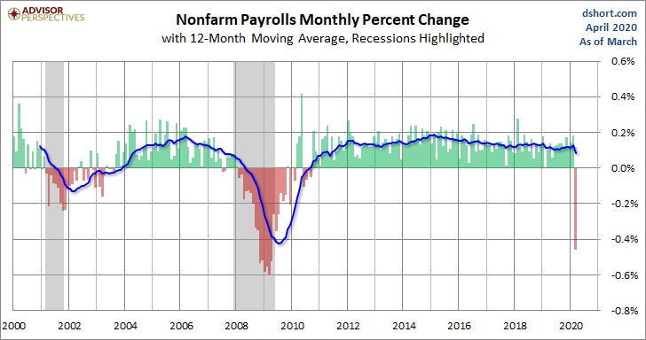
Here is a snapshot of the monthly percent change in Nonfarm Employment since 2000. We've added a 12-month moving average to highlight the long-term trend.
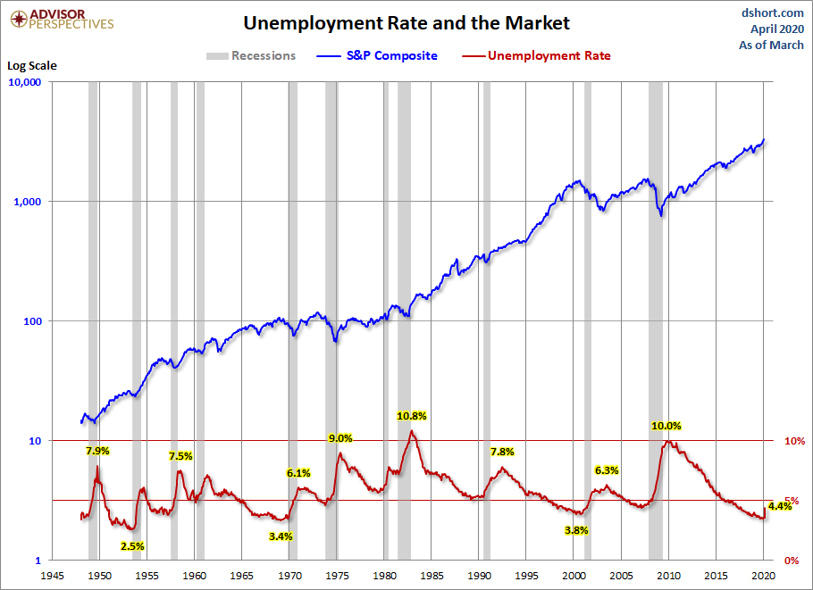
The unemployment peak for the current cycle was 10.0% in October 2009. The chart here shows the pattern of unemployment, recessions and the S&P Composite since 1948. Unemployment is usually a lagging indicator that moves inversely with equity prices (top series in the chart). Note the increasing peaks in unemployment in 1971, 1975 and 1982. The mirror relationship appears to be repeating itself with the most recent and previous bear markets.
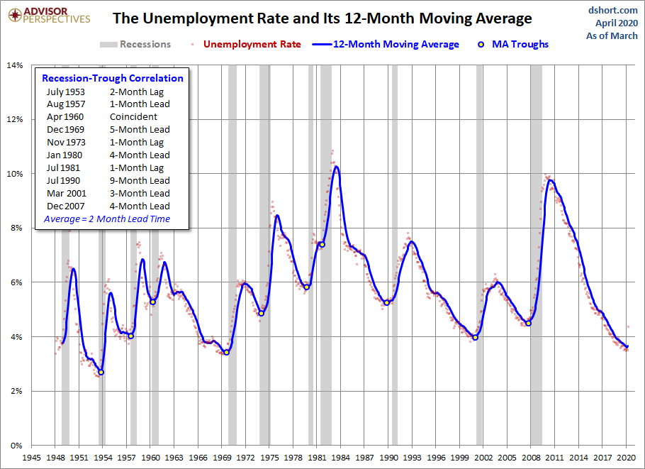
Now let's take a look at the unemployment rate as a recession indicator or more specifically the cyclical troughs in the UR as a recession indicator. The next chart features a 12-month moving average of the UR with the troughs highlighted. As the inset table shows, the correlation between the MA troughs and recession starts is remarkably close.
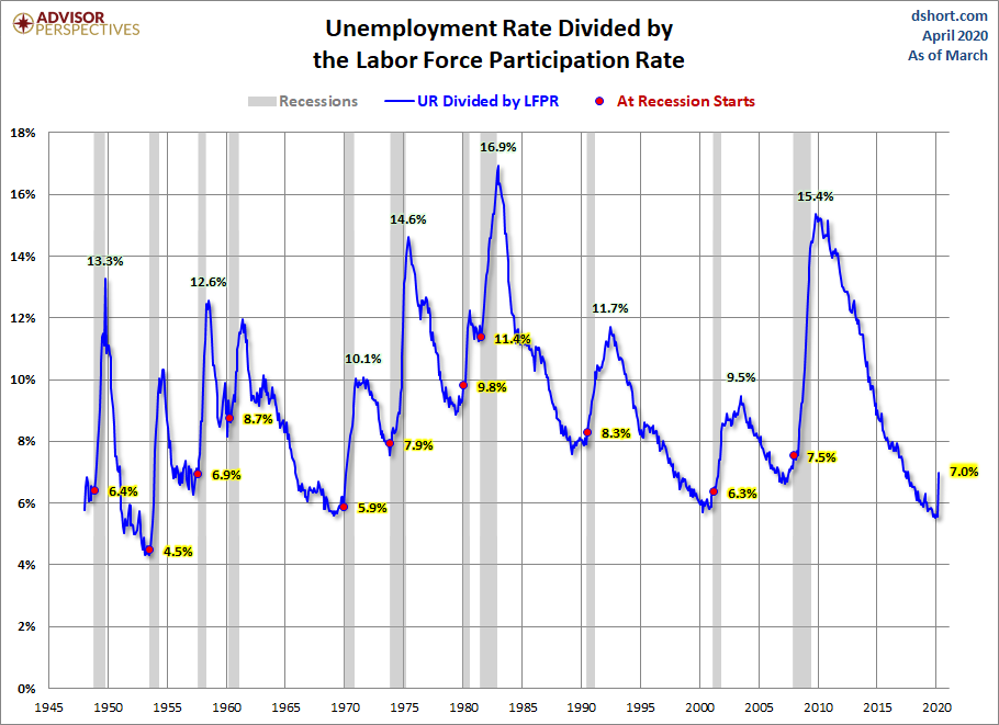
Here's another chart to illustrate the reality of the unemployment rate - the unemployment rate divided by the labor force participation rate.
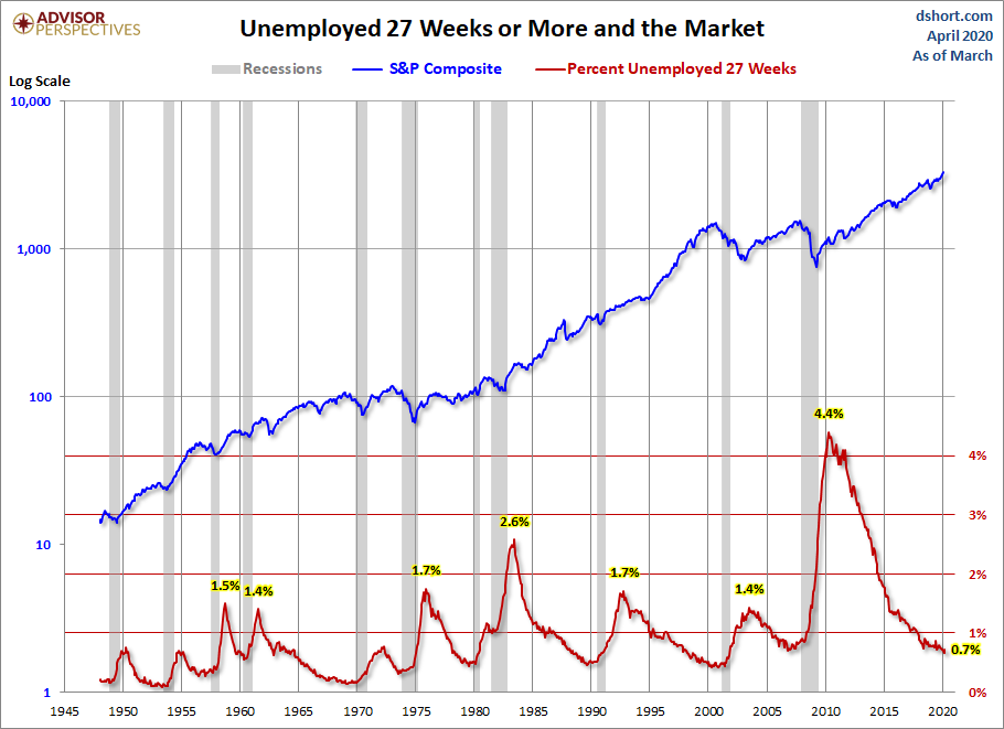
The next chart shows the unemployment rate for the civilian population unemployed 27 weeks and over. This rate has fallen significantly since its 4.4% all-time peak in April 2010. It is now at 0.7%, unchanged from the previous month.
The next chart is an overlay of the unemployment rate and the employment-population ratio. This is the ratio of the number of employed people to the total civilian population age 16 and over.
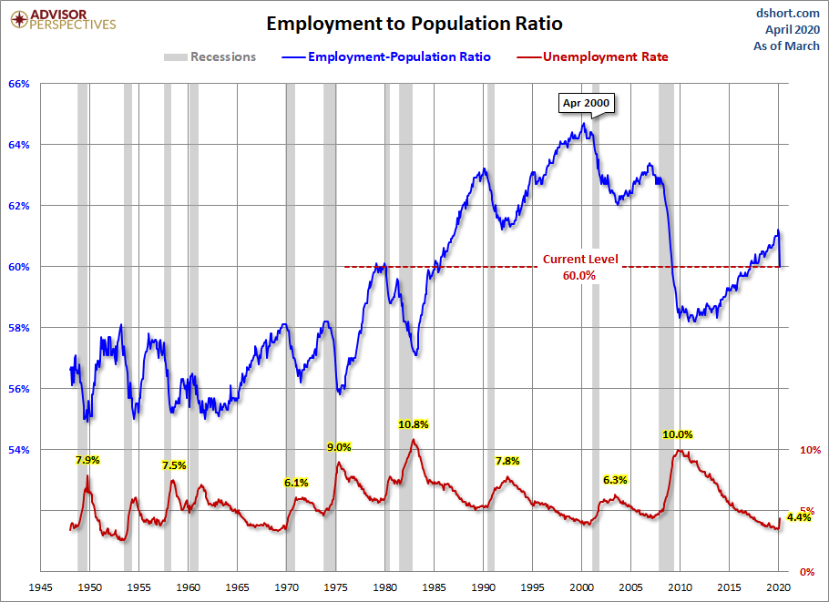
The inverse correlation between the two series is obvious. We can also see the accelerating growth of women in the workforce and two-income households in the early 1980's. Following the end of the last recession, the employment-population has been range-bound between 58.2% and 60.6% — the lower end of which that harkens back to the 58.1% ratio of March 1953, when Eisenhower was president of a country of one-income households, the Korean War was still underway, and rumors were circulating that soft drinks would soon be sold in cans.
The latest ratio of 60.0% is below its pre-recession high.
For a confirming view of the secular change the US is experiencing on the employment front, the next chart illustrates the labor force participation rate. We're at 62.7%, down slightly from last month's 63.4%.
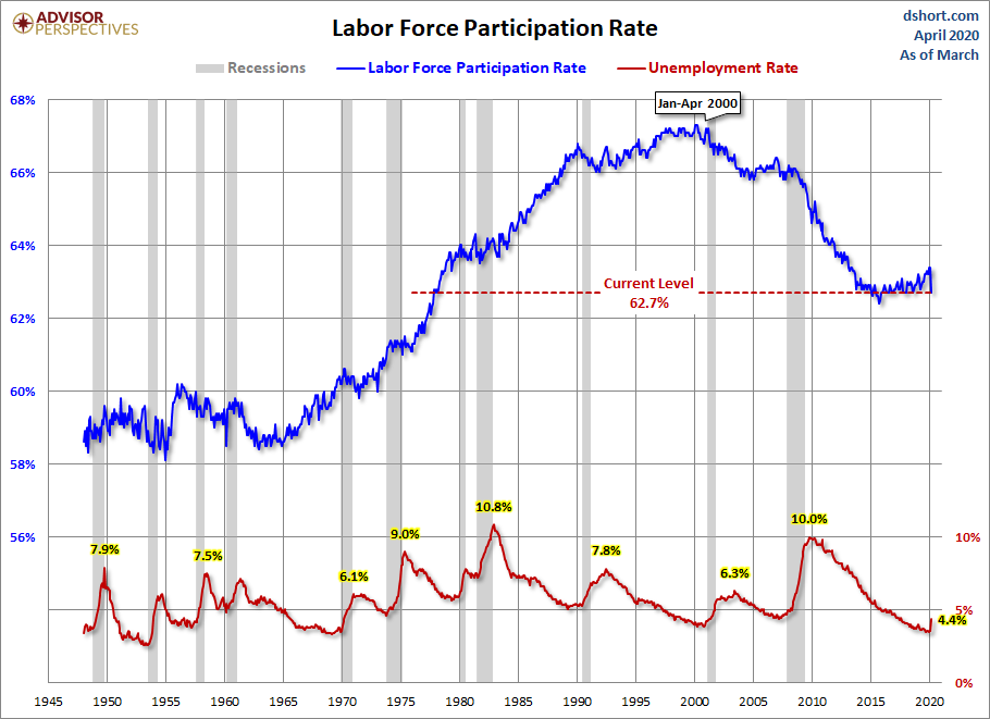
The employment-population ratio and participation rate will be interesting to watch going forward. The first wave of Boomers will continue to be a downward force on this ratio. The oldest of them were eligible for early retirement when the Great Recession began, and the transition of the Boomer cohort to full retirement age won't end until 2030.
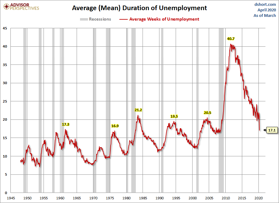
What is the average length of unemployment? As the next chart illustrates, we are perhaps seeing a paradigm shift — the result of global outsourcing and efficiencies of technology. The post-recession duration of unemployment is at 17.1 weeks, well off the 40.7-week all-time high in late 2011.
The Bureau of Labor Statistics' broadest measure of unemployment is the U6 series, which includes the total unemployed, plus all marginally attached workers plus total employed part-time for economic reasons. This series dates from 1994.
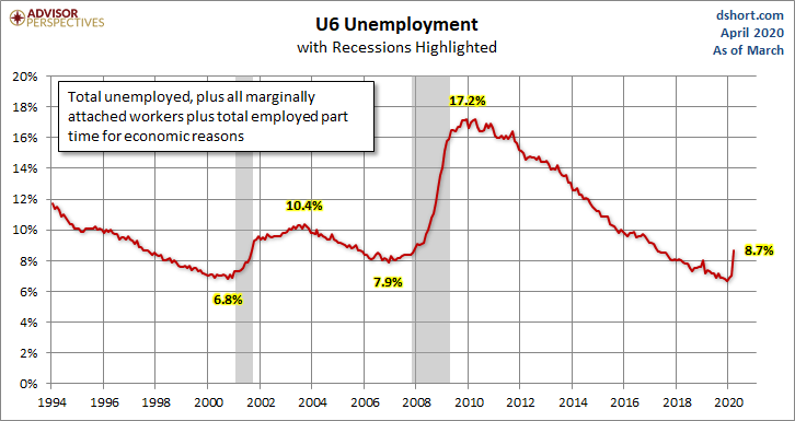
The U6 series is currently at 8.7%.
Notes: The start date of 1948 in the charts above was determined by the earliest monthly employment data collected by the Bureau of Labor Statistics. The best source for the historical data is the Federal Reserve Bank of St. Louis.
The S&P Composite is a splice of the S&P500, which started in 1957, with the S&P 90, which preceded it.

Comments
Log in or sign up to join the conversation.