
I wrote about the Fed announcement and press conference yesterday, and my focus was on inflation fallacies. One of the other things that Powell mentioned was a strong employment climate, and today’s Bureau of Labor Statistics Job Report would seem to confirm this.
After all, the economy created 263,000 new jobs in April and unemployment is now at nearly 50 year low of 3.6%. In fact, I am happy to see that many jobs created because it outpaces the population increase by about 31.5% (180,000 per month).
So the headline numbers look like the NASCAR winner’s circle, but you know I have to take a look under the hood to see for myself.
There is something in every one of these reports called the labor force participation rate. Very simply, this is able bodied civilians (everyone but the military), 16 or older, who are capable to work, expressed as a percentage of the total population. In the denominator of this ratio, we actually include children, disabled, retirees, college students, and others, in addition to all the people who are actually in the work force. Which makes the number a little lopsided. After all, 62.8% of the population working or wanting to work sounds low.
A little history here would be helpful…according to the BLS itself, the rate was below 60% for nearly two decades following WWII. As women entered the workforce that number slowly inched up to 61% by the early 70’s, and peaked at 67.3% in January 2000. It has steadily fallen since that time, as seen in this graph from the St. Louis Fed:
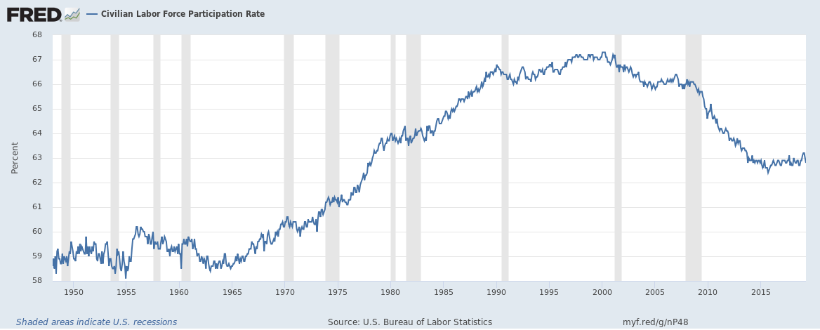
In any case, as you can see in the graph current number seems to be trending back up a bit having bottomed at the end of 2015. Yet the last time the number was this low was when women were still just starting to enter the workforce in great numbers in the 1970’s. The population is much larger now, and assuming that the average percentage of able bodied workers has remained steady, this number shouldn’t be as low as it is. It implies that the workforce has shrunk while at the same time the population has grown. We should rather see the participation rate during economic expansion growing with the economy and population, not moving in the opposite direction.
The second number that has me very worried is something called U6 unemployment. The headline number of 3.6% doesn’t include all unemployed workers. That number, about 6.186 million people, includes only those who have looked for employment in the last 4 weeks. But what about all the other people who’d rather be working instead of binge-watching episodes of Kobra Kai on YouTube? U6 employment includes everyone who wants to work, regardless if they applied for a job or not, and includes people who may be working part time but would rather be working full time. It includes all the unemployed as well as all the under employed. And that number is 11.818 million, or 7.5%.
7.5% sounds like it still might be great, because after all, during the Obama Administration it stayed over 10% until the last month of his tenure. When viewed from another perspective though, it becomes a little worrisome. One of the signs of recession is when all the data peak, either at a high for numbers we want to see rising, or at a low for numbers we want to see falling. This is one of the numbers we want to see falling, and before the last two recessions, it bottomed out at 7.9% in December 2008 and 6.8% in October 2000 (St. Louis Fed, seasonally adjusted). So it’s right in the sweet spot now for peak economic frenzied growth just before recession.
That’s it for now, and thanks for reading Volume 72 of The Macro Market Wrap Up With The Mad Genius. Make sure to leave any questions or comments below. Until next time remember that there is always a bull market somewhere in the world, and on the opposite side of every crisis there always lies opportunity.


Comments
Log in or sign up to join the conversation.