
The latest JOLTS report (Job Openings and Labor Turnover Summary), with data through October, is now available. The first chart below shows four of the headline components of the overall series, which the BLS began tracking in December 2000. The time frame is quite limited compared to the main BLS data series in the monthly employment report, many of which go back to 1948, and the enormously popular Nonfarm Employment (PAYEMS) series goes back to 1939. Nevertheless, there are some clear JOLTS correlations with the most recent business cycle trends.
The chart below shows the monthly data points four of the JOLTS series. They are quite volatile, hence the inclusion of six-month moving averages to help identify the trends. For the last two and a half years, the moving average for openings has been above the hires levels as seen in the chart below.
(Click on image to enlarge)
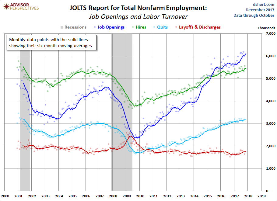
The most closely watched series is the one for Total Nonfarm Job Openings, the blue line in the chart above. The moving average peaked in mid-2007 and began rolling over to its trough a few months after Great Recession ended and is currently at an all-time high. The Hires series has risen at a slower pace. Its moving average is now at its post-recession high. Quits have been steadily trending upward and are now above its pre-recession high; they are generally thought to show an economy that supports the flexibility to leave or change jobs. The Layoffs and Discharges series, the red line, has been essentially flat since early 2013, but in September hit an all-time low.
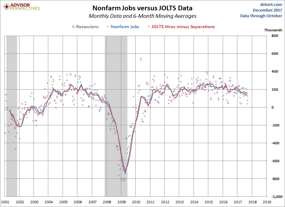
For comparison, here is the monthly BLS Employment Situation Summary charted with JOLTS data:
(Click on image to enlarge)
A Population-Adjusted Perspective on JOLTS
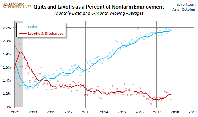
The chart above is based on the actual numbers in the JOLTS report. A better way to view the numbers is as a percent of Nonfarm Employment, which essentially gives us a population-adjusted version of the data. Here is that adjustment for four of the JOLTS series. Note that the vertical axis for each is optimized for the high-low range to facilitate an understanding of the individual trends.
(Click on image to enlarge)
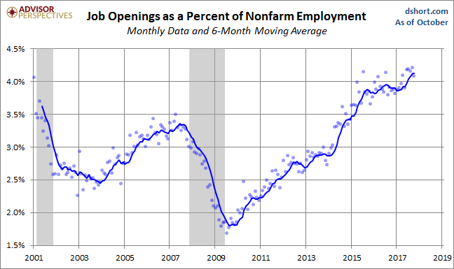
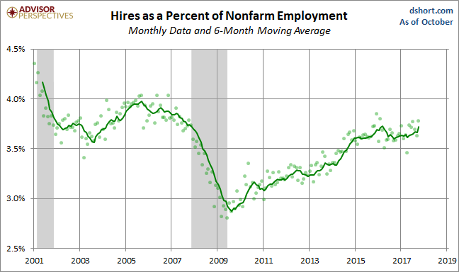
Where Are We Now in the Business Cycle?
Based on the six-month moving averages, we can see that:
- The Openings are near its record high since the start of the series in December of 2000 and the moving average has been above the hires levels for the last two and a half years.
- Hires are now above their pre-recession peak.
- Quits are above the trough between the last two recessions and just below its interim high.
- The Layoffs and Discharges series is slightly above its all-time low.
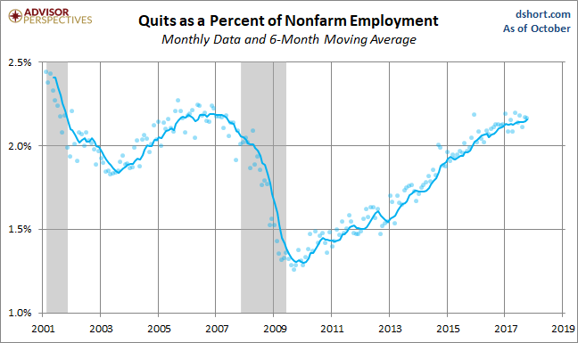
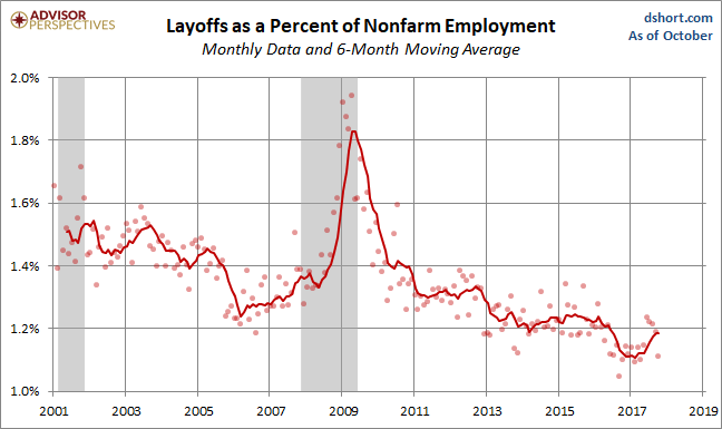
The Trend in Quits
To reiterate a previous point: Increases in Quits suggest employment flexibility. Quits tend to be inversely correlated with Layoffs & Discharges, which are associated with business cycle weakness. Following the last recession, Quits began increasing in 2010, and the rate accelerated in 2013. The trend leveled out in 2015 but then resumed the upward trend later in the year and continues through 2017. Layoffs & Discharges saw a downtick in the later months of 2016, leveled out in the early months of 2017, jumping up recently.
(Click on image to enlarge)
It would, of course, be excellent if we had historical JOLTS data stretching back through several business cycles. But alas we do not.
The JOLTS reports will be interesting to watch in the months ahead. But the volatility of the data, which is also subject to revisions, encourages caution in taking the data for any given month very seriously.

Comments
Log in or sign up to join the conversation.