
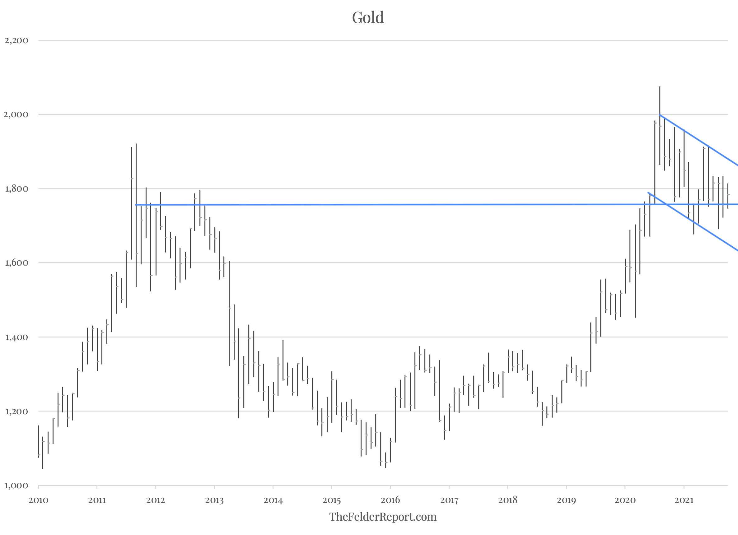
The monthly chart of the gold price right now is a great example of how this methodology can help in terms of adding clarity to the technical picture. Below is the monthly chart of the gold price. The prior bull market topped out in 2011 and rolled over into a bear market that lasted until late-2015. Prices rallied from there to make a new high last year. Since then, however, the gold price has been in consolidation mode, possibly forming a pennant pattern around horizontal support.
(Click on image to enlarge)
When we isolate the pattern of price relative to its 36-month moving average, though, the picture becomes a fair bit clearer. After bottoming in 2014, momentum put in a bullish divergence with price in 2015 (failed to make a lower low), setting the stage for the reversal higher. Rallies in 2016 and 2017 formed a horizontal resistance level around the 10% mark. Momentum broke out above this level in 2019, foreshadowing the surge in price in 2020.
(Click on image to enlarge)
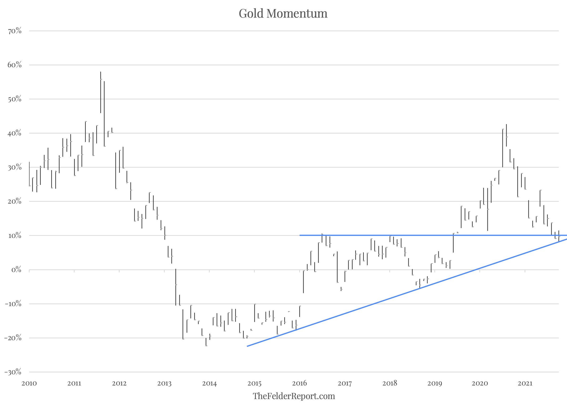
Since the peak in both price and momentum last year, the latter has come down to test the breakout level which now coincides with its uptrend line that dates back to the beginning of the new bull market. Traditional technical analysis would tell you this is a classic test of a breakout which should be followed by another major leg higher. And if momentum doesn’t resume its uptrend, you at least have a very clear risk level which, if broken to the downside, would represent a warning regarding the current environment for gold prices.
In short, the long-term momentum picture shows a classic bullish setup for the gold price that also allows gold bugs to define their risk. And that’s not nearly as evident on the price chart alone.


Comments
Log in or sign up to join the conversation.