


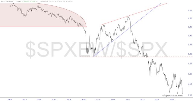
Here’s a single chart that neatly illustrates how the poor breadth of the market isn’t just something of the past week or two but has been developing as an issue for about a dozen years. It is a simple ratio chart of the equal-weighted S&P divided by the “regular” S&P. It has been in a state of degradation for many years, since fewer and fewer mega-caps are doing all the heavy lifting.
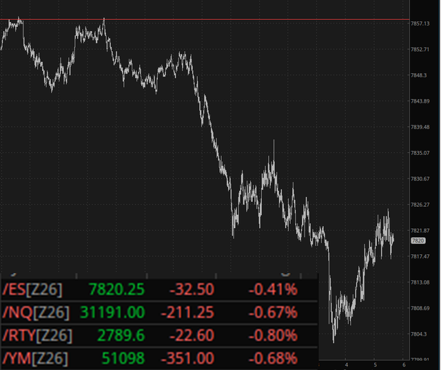
Meanwhile, in overnight action………



Comments
Log in or sign up to join the conversation.