

A week ago, I posted a projection by Jim Bianco of the growth in US coronavirus cases through March 21. We are 7 days into that 10 day period. Let’s update the status.
First, here’s another copy of Bianco’s graph:
(Click on image to enlarge)
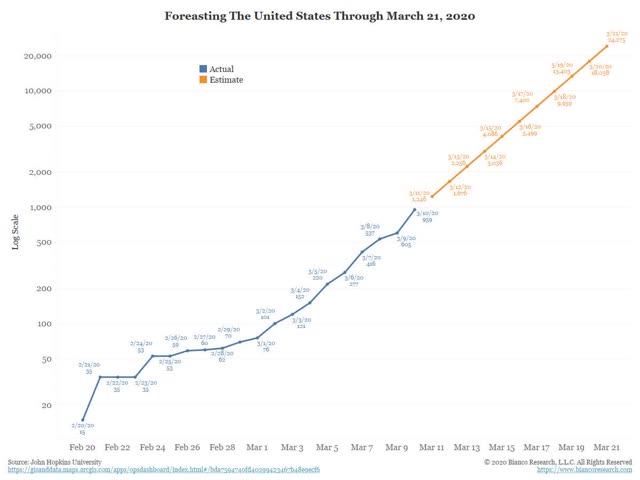
Below, I give the day by day projection, the day by day actual number (pulled from the Johns Hopkins site each morning), the growth rate in the actual numbers, and the deviation from Bianco’s estimate:
Date Projection Actual Growth rate Deviation
Mar 11, 1246. 1326. 38%. +6%
Mar 12, 1676. 1701. 28%. +1%
Mar 13, 2256. 2174. 28%. -4%
Mar 14, 3036. 2952. 36%. -3%
Mar 15, 4086. 3774. 28%. -8%
Mar 16, 5499. 4661. 24%. -15%
Mar 17, 7400. 6496. 39%. -12%
The “good” news is that Bianco’s projections were too pessimistic, and the percent of deviation to the downside has generally been growing.
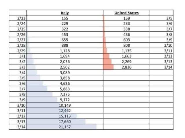
Here is another projection I found at a health policy profession’s site (sorry, I forgot where and don’t have a link), comparing US numbers with Italy’s 11 days previously. The actual cases above are actually *higher* than the 3-day forward projection through March 17:
(Click on image to enlarge)
In any event, as indicated in my chart, in the past week the number of reported infections has grown by, on average, a little over 30% each day (the low is 24%, the high 39%). Some of this is the ability to test, etc., but I decided to see what would happen if the rate of increase doesn’t change.
Basically, the number of actual reported infections has increased by 10x in a little under 9 days. Starting from this morning forward, here’s what each 9-day increment would look like if the current rate of increase continues. Keep in mind that the *actual* number of infections is probably, at minimum, 10x the reported number, partly due to the inability to test, and partly due to people with mildly- or even non-symptomatic cases not getting tested:
March 18 6,500
March 27 65,000
April 5 650,000
April 14 6.5 million
April 23 65 million
April 29 (6 days) 313 million
Obviously this will be factually incorrect, because of measures that have already been taken, plus measures that will be taken as the impact increases even further. Also as the virus “burns through” the population, the rate of infection spread will diminish.
But probably the next 9 days are still baked in the cake. And the number of people who have been exposed to the virus, vs. the number tested and reported, is probably at least 10x higher. So by March 27, probably at minimum there will be 650,000 infections. I’ve seen estimates that it could be 40x higher; if so, that would be 2.6 million infections by March 27.
Now here is the truly scary graph. This comes from the UK’s Imperial College of Medicine. It is the graph that apparently finally frightened both Donald Trump and Boris Johnson into some semblance of action:
(Click on image to enlarge)
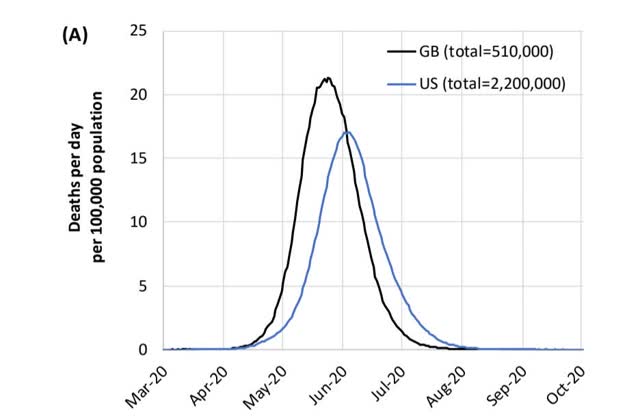
Take a look at the April 20 date in the above graph. It is indistinguishable from zero. In other words, as bad as we think things are now, and as bad as they could be a month from now, they are figuratively only a slight foretaste of how bad things could be by the Fourth of July unless effective action is taken.



Comments
Log in or sign up to join the conversation.