
And oh what a week it was... if you went into the week under the impression that new S&P 500 (SPX) record highs were within reach, you had the right expectation! At Finom Group (for who I am employed), our guided approach to macro-fundamental analysis aids in improving your portfolio performance and with that, let's take a look at what we offered in last week's Research Report, to see if we offered an appropriate expectation for the S&P 500:
"Many of our breadth indicators have improved over the last 3 weeks and are presenting the case for upside breakout near-term. The near-term indication is highly subjective and as such we’ll put our definition and outlook to it as follows:"
- Finom Group is of the opinion that the S&P 500 (SPX) will achieve a new all-time high within the next 3 weeks, if not sooner.
- The caveat to our near-term outlook would be a breakdown in U.S./China trade talks and/or a demonstrative break from the current Brexit-delay pathway.
Based on the near-term forecast for the S&P 500, produced by evaluating the macro-fundamentals and market internals/breadth, it seems as though the hammer hit the nail on the head and with rapidity. The S&P 500 closed the week at a new record closing high this past week, surging higher by nearly 1.5% to 3,066.91.
As I look forward to the coming week's market activity, it's always important to reflect on market performance and prepare for the week ahead. I believe that the greatest advantage a trader/investor can have lay within preparedness and flexibility. Going into a new trading week without reasonable expectations and full of rigidity can prove the undoing of a rather strong year-to-date portfolio performance. That's not what I want to see happen and as such I emphasize the importance of dedicating at least a half-hour a week to the reading and digesting of my firm's weekly Research Report. So without any further ado...
All Things S&P 500
Out with October and in with November. As we herald a new month and bid farewell to the past, we can't help but to recognize seasonal factors have played out quite well for much of the year.
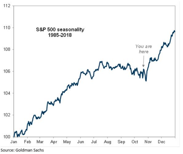
As shown in the chart above from Goldman Sachs, if you had bought the seasonal dip in early October, coming out of Q3's end of quarter rebalancing, you would have done yourself a favor. The market has trended higher in each of the last 3 weeks. But what is also highly recognizable is the dip that also has taken place, on average, during the first week of November. With that dip/drawdown/pull back front of mind and recognizing the strong seasonal trend at work in 2019, investors should not be caught by surprise if after a breakout to new highs the S&P 500 finds itself with a near-term pullback. Instead and as I always suggest: The pullback is not to be feared but to be gauged through the lens of opportunity. Why is this?
- The equity markets have been successfully climbing the "wall of worry" for most of 2019. Now it feels like some key of the concerns are receding.
- We are entering into a period with more manageable macro risks:
- Brexit tensions have eased as the issue is pushed into Dec’19 at least.
- The trade narrative has also arguably improved with U.S./China apparently seeking some compromise through a "phase 1" trade deal of sorts.
- Improved macro risks are also coinciding with a more moderate pace of growth deceleration.
- Positioning remains very supportive: Investment capital has already moved from equities in anticipation of the concerns, leaving lots of room for capital inflows.
- Buybacks continue to act as an underlying bid to the market.
- Earnings beats continue to come it at the median (4.2%) rate and better than feared.
- Low bar economic data and EPS growth set the stage for a rebound in 2020, while EPS continue to be ratcheted lower.
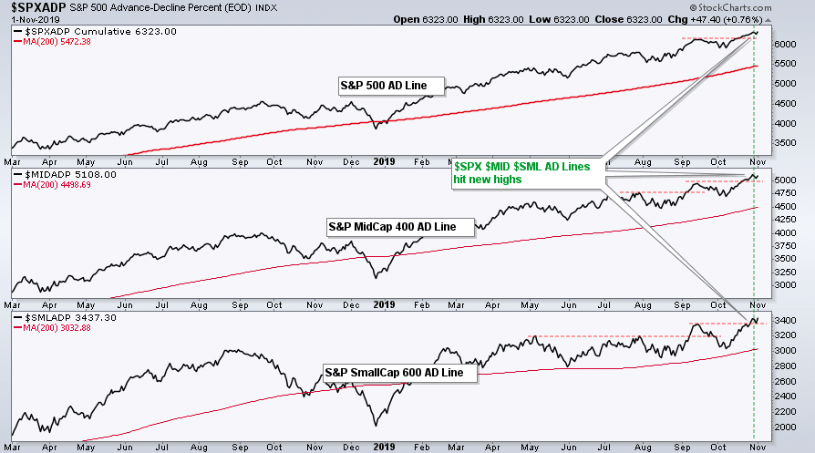
I could literally add another 10 bullet points to the notes above, but you get the picture! And with all that being said let's now take a look at those market technicals and internals/breadth. The charts below complete the S&P 1500 composite Advance/Decline line (S&P big-cap 500 - S&P mid-cap 400 - S&P small-cap 600), which made a new high last week and undisputedly defines that breadth has improved with room to run. Through this market internal/indicator, we can decipher that more stocks will move above their 20 and/or 50-DMAs while currently below overbought territory.
In each of the past 3 weeks, the percentage of stocks trading above their 50-DMA had improved. In the prior reporting period, that percentage increased to 65.35 percent. In the past trading week, as the S&P 500 moved to new highs, the percentage of stocks trading above their 50-DMA also increased.
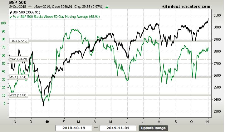
At the close of the past trading week, over 69% of stocks within the S&P 500 were trading above their 50-DMA. The same improving breadth can also be seen in the percentage of stocks trading above their respective 20-DMA, as shown in the chart below:
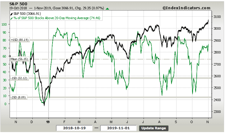
Unfortunately, when we look at both the charts depicted above, one thing becomes very clear, divergence. Although the S&P 500 has made successive new highs from July-present, both market internals have made successive lower highs. Is this a bearish takeaway or something we should take into greater consideration? The answer should be a resounding NO! It happened! These market internals have been weaker during a bullish market uptrend and yet didn't prove the undoing of said uptrend. Sometimes divergences are just that, divergences and found without the ability to negate the totality of a market move or trend. Now... that sounds like a reasonable and/or logical answer, right? Surely, but we still need to know why. It's why's that matter the most.
To answer the why we have to better understand what comprises the S&P 500. The S&P 500 index consists of most, but not all, of the largest companies in the United States. The S&P 500 market cap is 70 to 80% of the total U.S. stock market capitalization. It is a commonly used benchmark for stock portfolio performance in America and abroad. Beating the performance of the S&P 500 with less risk is the goal of nearly every portfolio manager, hedge fund and private investor. That should be everyone reading this report, by the way;-)! Now that we know what the S&P 500 is, so to speak we should now what stocks make up the greatest weighting. That's the "why" we are looking for, which serves to explain the divergence found in the market internals.
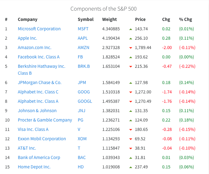
You may have heard the saying, "As Apple goes, so goes the S&P 500". As shown in the table above, AAPL shares are the second most heavily weighted stock in the S&P 500. AAPL shares are also up more than 60% year-to-date, 14% over the last month and were up nearly 4% this past week alone. So while many of the stocks within the S&P 500 are still not trading above their 50 or 20-DMA, the S&P 500 can still trend higher as shares of AAPL have performed remarkably. What this exercise or study in "why" we are seeing breadth divergence from the S&P 500 also suggests is very important. It suggests that should AAPL shares falter more so than what can be made up by a greater constitution of the S&P 500 stocks, the benchmark index would likely come under pressure.
While the CBOE Total Put/Call ratio isn't necessarily a breadth indicator, it is a market sentiment indicator and should be looked to as a means of understanding the complacency or fear expressed by market participants.
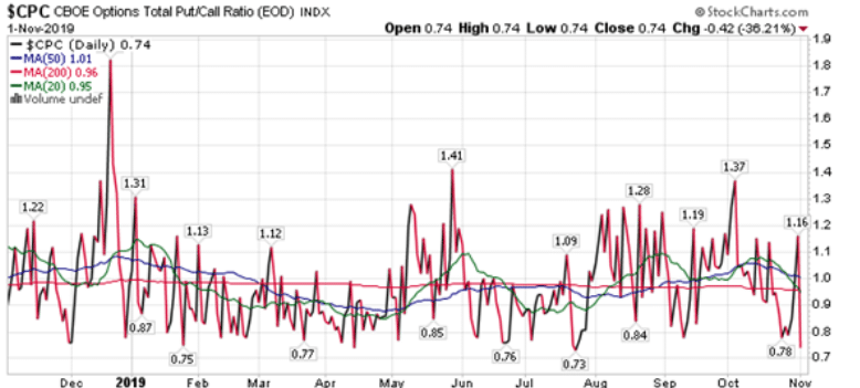
Based on what we can see as we commence November trading, complacency is having a field day of sorts. The Put/Call ratio is down to the second-lowest level of the year. The sentiment is getting overtly bullish out there in the "land of equities" folks. And why not, remember we have entered the best time to own stocks, from November to April. In fact, November has recorded the greatest percentage of new all-time highs since WWII.
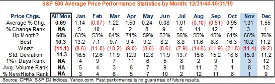
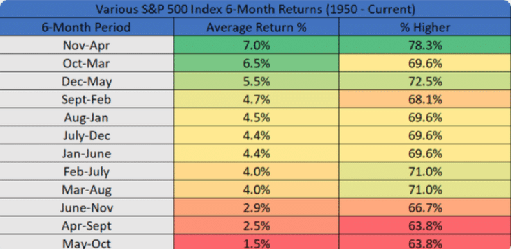
We've already seen a new record-high on the first day of November 2019 and expect a pull back to some degree during the month of November, but I also anticipate another new record high to come during the month. Pinpointing when that record-high will come isn't as important as knowing the probabilities. While history doesn't always repeat itself, I do suggest the macro-fundamentals support a continuation of the bullish market trend through year-end. So to the point of historical data and seasonality, we offer the following table from LPL Financial:
- Over the past 10 years, these next 6 months have been higher 9 times and up 8.8% on average.
- Only time it was lower was '15/'16 when the S&P 500 fell 0.7%.
Reverting to market internals, as I can't help but to salivate over the seasonal data in the table above, we come to the S&P 500 new highs minus new lows (NH-NL) market internal/breadth reading. Fortunately, unlike the divergences we've seen in other market internals/breadth, this one is performing in-kind with the S&P 500. But even so, there is seemingly always a pro and con to each breadth indicator.
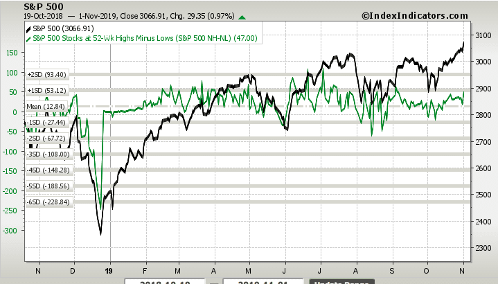
While there is a seemingly little divergence between the NH-NL reading and the S&P 500, the indicator is hitting peaks seen in past months. This, combined with the complacency expressed in the Put/Call ratio, may suggest a near-term pull back is afoot. We might also glean this complacency, bullishness and near-term peak through the latest Bank of America Merrill Lynch Bull/Bear indicator.
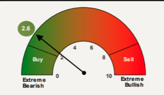
The Bull/Bear indicator tends to be a contrarian indicator. This basically suggests that reading in the Buy zone tends to be an equity sell signal and a reading in the sell zone tends to be an equity buy signal. Having said that, we suggest investors are best positioned awaiting market confirmation of either signal and not getting out in front of it. Markets can remain overbought or oversold for longer than most anticipate.
In reviewing market breadth and seasonality I assert that the bull market should continue into 2020, absent any near-term exogenous shock to the economy that is unforeseeable. The wall of worry that the market has climbed throughout the year is rather remarkable and possibly the greatest found since 2015. The recent breakout has been equally positive. The S&P 500 index broke out to new all-time highs on Monday and confirmed the breakout by continuing to close above the previous all-time highs (3028) for the next 2 trading sessions. The upside breakout created a small gap on the chart at 3,025, which was easily filled on Wednesday.
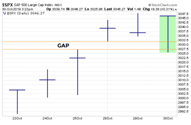
After filling the gap on Wednesday and with some drawdowns on Thursday, the S&P 500 rallied back nearly 1% on Friday to achieve another record high. With all these bullish setups taking place, which suggests more highs are ahead, if not a near-term "blow-off top" moment, there does remain an open gap for the S&P 500 to "complete" potentially.
There is now support at the previous all-time highs, in the 3025-3030 area. If the S&P 500 were to close below that level it would represent an opportunity to add equity exposure, assuming the macro-fundamentals are unchanged. The next support area, however, is at 2950, which is where the bullish gap exists for the S&P 500 (red circle on this chart). A close below there would be somewhat bearish, however, and demand additional study. But we'll worry about that if or when that bridge is crossed.
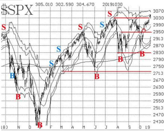
Most importantly, as it pertains to market breadth and broader technical analysis, moving averages tell the story of market strength at present and usually for the interim. When we look at the following chart, we can see that the S&P 500 has clearly broken out higher and with ample white space above all moving averages.
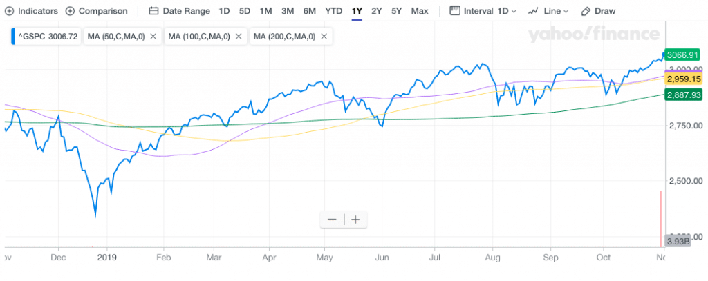
The 1-year chart identifies a stark contrast to the same period a year ago whereby the moving averages had a downward slope and the S&P 500 was trading below the 3 major moving averages. Moreover, today's ascending moving averages find the fast moving average, 50-DMA, at the top while the slowest moving average, 200-DMA, resides at the bottom of the moving averages.
Alright, here comes our final stats and charts as it pertains to this segment of our weekly Research Report...
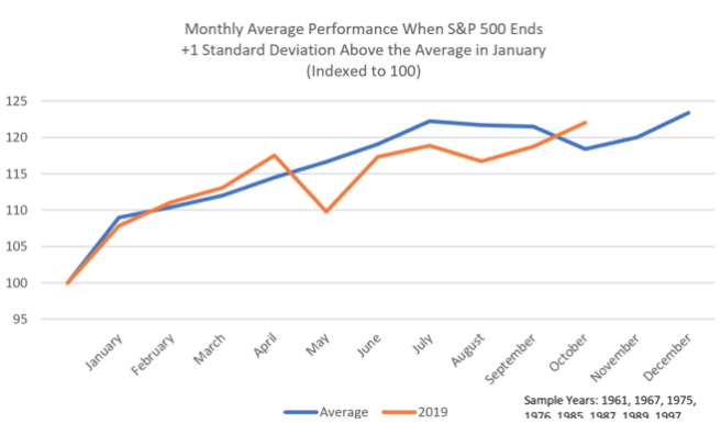
The S&P 500 rallied more than 7% in the month of January. It proved to be one of the strongest January months in history. “Strong January Playbook”, or historical analysis of what happens after the S&P 500 has outsized gains in January, has worked nearly every month in 2019. Abnormally strong January returns have been a historically clear signal about market direction over the balance of the year.
- The S&P 500 rose by 7.9% during January 2019, one standard deviation above this month’s average return of 1.2% since 1958 (first full year of data).
- There’s only been 8 other Januaries that have also returned +1 standard deviation above the average, or 15% of the time: 1961 (+6.3%), 1967 (+7.8%), 1975 (+12.3%), 1976 (+11.8%), 1985 (+7.4%), 1987 (+13.2%), 1989 (+7.1%), and 1997 (6.1%).
The reason why I am now talking about the strong January playbook and historical data is because, as we mentioned before, history doesn't always repeat itself. The S&P 500 was higher most of the time every month on average from February through July after an especially robust January return. But that didn't happen this past May (down 6.7%). Here are two more examples of the Strong January Playbook not "playing out".
- September did better than expected. The average historical return in “Strong January years” during this month is negative 0.1%, with the S&P lower +60% of the time. This September, the S&P 500 defied this trend with a +1.7% return.
- Also in October, the S&P was up roughly 2.1% for the month. The average historical return in “Strong January” years for October is negative -2.5% and the S&P 500 was down +60% of the time. However, excluding the stock market crash in October 1987, it was up an average of 22 basis points. So while this month’s return bests the average, it is directionally in line save the outlier year of 1987.
And what is on everyone's mind now, of course, is what happens in November and December during the Strong January Playbook. Datatrek identified the periods as follows:
- November (good): The average historical return is +1.3% and the S&P was higher 75% of the time. The worst return was -8.5% in 1987 and the best was +6.5% in 1985.
- December (really good): The average historical return is +2.8% and the S&P was higher 88% of the time. The weakest return was -1.2% in 1975 and the strongest was +7.3% in 1987.
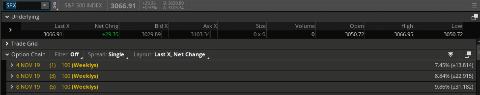
This past trading week found the S&P 500 weekly expected move breached beyond the indicated $29/points indicated in the SPX options market. For the coming week, the weekly expected move has moderated slightly higher to $31/points.
Weekly Economic Data
What I continue to see in the economic data is that the soft data and hard data move in different directions. That was no more abundantly clear than in the economic data releases this past week. Once again, we've seen the hard data come in better than anticipated while the soft data (ISM/PMI surveys) comes in either worse than anticipated or with modest upticks.
The first soft data survey came from the consumer sector. The Consumer confidence index edged down to 125.9 from a revised 126.3 in September, the Conference Board said Tuesday.
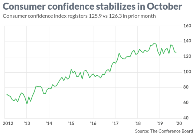
While this sentiment indicator wasn't met with much of a market reaction, it does still reside near cyclical highs and isn't sounding any alarms at the moment. On the same day, Pending home sales were released.
The Pending Home Sales Index (PHSI), a forward-looking indicator based on contract signings, rose 1.5% to 108.7 in September. Year-over-year contract signings jumped 3.9 percent. An index of 100 is equal to the level of contract activity in 2001. Based on the proliferating housing sector data since the spring, anybody suggesting the Fed's rate pause and subsequent cuts have not provided any benefit to the economy is simply not being forthright or candid.
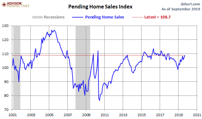
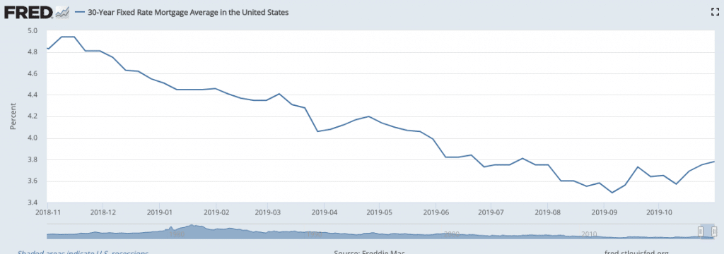
The chart above of Pending home sales identifies a sharp, V-shaped rebound in home sales since the Fed's rate pause and through the mid-cycle rate cuts were implemented. The plunge in rates on a YoY basis is also expressed in the 30-year fixed rate mortgage, which is more than 1 point lower than it was this time a year ago.
Akin to the hard data expressed in the Pending home sales data, both ADP private-sector employment and Q3 2019 GDP came in better than forecast by economists. Gross domestic product, the official scorecard for the economy, grew at a 1.9% annual pace in the third quarter, the government said Wednesday. Although consumer spending didn’t match or beat the second quarter’s robust 4.6% increase, spending still rose a very healthy 2.9 percent. Consumer spending accounts for about 70% of all U.S. economic activity.
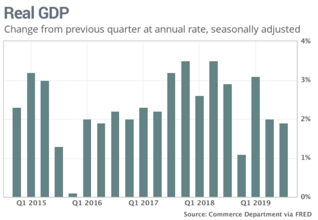
The noted housing strength also found its way into the outperforming GDP print. The housing industry contributed to the economy’s growth for the first time in nearly 2 years. Residential investment climbed 5.1 percent. Tumbling mortgage rates have drummed up more demand and subsequently forced builders to boost construction. This strength in housing was also expressed in the latest monthly construction spending data. Outlays for U.S. construction projects rose 0.5% in September at a seasonally adjusted annual rate of $1.29 trillion, the Commerce Department reported Friday. Economists polled by MarketWatch had expected growth of 0.3 percent.
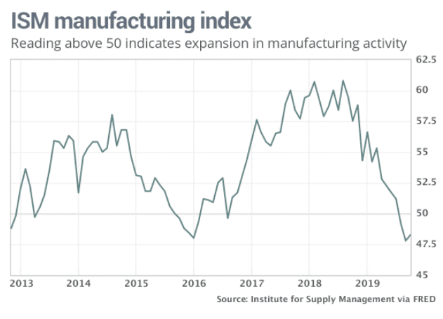
With the hard data in-hand through Wednesday and the Fed announcing it's last 25bps rate cut, unless the data forces more cuts in the future, the ISM Manufacturing data would prove the more pressing of the soft data that investors desired to see most.
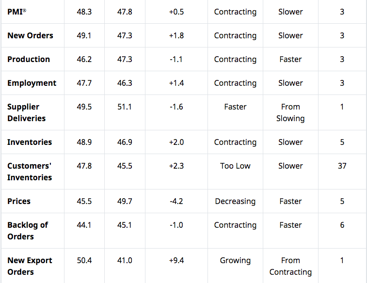
The ISM data certainly improved, but most of the attention surrounded the little improvement that was made and while the latest reading still found the index in contraction territory. The Institute for Supply Management said its manufacturing index edged up to 48.3% in October from a 10-year low of 47.8%, but it remained in contractionary territory for the third month in a row. The last time that happened was in 2015 during a downturn in the oil patch.
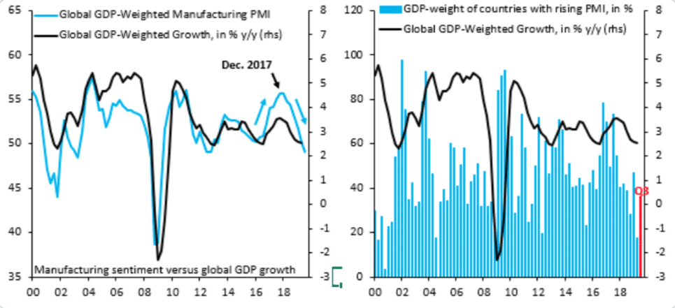
Manufacturing is less and less a part of the U.S. and global economy with each passing year. It's with this premise that investors should start to think that maybe people need to be more careful when using manufacturing data as indicators for the whole economy. It's also why we should probably use global-GDP weighted PMIs when judging the strength or weakness of the economy, as recently offered by Robin Brooks and supported with the following charts:
While the headline reading for October ISM Manufacturing came in slightly higher than in September, some individual metrics identified a strong rebound and further example the issues related to these surveys/soft data sets. ISM new export orders in October rose from 41.0 to 50.4 (up 9.4), the strongest reading since June, underscoring that this is a "sentiment" indicator that can swing wildly with back and forth in trade tensions, but doesn't necessarily capture "true" activity or adverse fallout from tariffs.
The "Grandaddy of them all" economic data releases for the week came from the latest Bureau and Labor Statistics (BLS) Nonfarm Payroll report for the month of October. Even with ADP private-sector payrolls showing an additional 125,000 jobs were created during the month of October, nervousness over just how many jobs were removed from the labor force by way of the UAW strike during the month lingered amongst economists. Economists were anticipating that only 80,000 jobs were added during the month of October. Bank of America Merrill Lynch suggested the month could have shown a net decline in jobs.
All fears were removed on Friday, however, as the number of jobs added during the month exceed all economists' expectations. The U.S. created 128,000 new jobs in October and hiring was stronger at the end of summer than previously reported, suggesting the economy is still holding up better than expected despite trade turbulence and a slowdown in global growth.
Employment might have grown by close to 200,000 last month absent the GM strike and the end of 20,000 temporary Census jobs. The previously reported September payroll number was revised higher to 180,000 Nonfarm payrolls from 136,000. October's manufacturing employment declined 36,000; however, motor vehicles and parts fell 42,000, mostly reflecting the GM automobile labor strike. The unemployment rate, meanwhile, edged up to 3.6% from 3.5%, still hanging around the lowest level since 1969. Wages rose 0.2% in October to $28.18 an hour, but worker pay isn’t increasing as fast as it was earlier in the year. Wages have climbed 3% in the past 12 months.
Even though job growth and the economy have slowed in 2019, companies are still filling jobs and few have resorted to widespread job cuts. Layoffs and the unemployment rate remain near a 60-year low, giving Americans the confidence to keep spending enough to propel the economy forward. Speaking of spending...
Americans increased spending in September for the seventh month in a row, but did so at a more moderate pace, keeping the economy expanding at a steady rate. Consumer spending rose 0.2% last month, the government said Thursday. At the same time, though, many households are trying to save for the holidays.
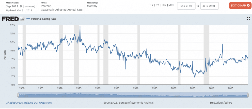
The savings rate moved up to 8.3% from 8.1%, keeping it near a post-recession high. Fewer Americans are spending beyond their means, compared with a decade ago. Simply put, this is the most disciplined consumer we've seen since the 1960s, the only other period in which the economy expanded with an expanding Personal Savings Rate as tracked by the St. Louis Federal Reserve Bank. (Chart above)
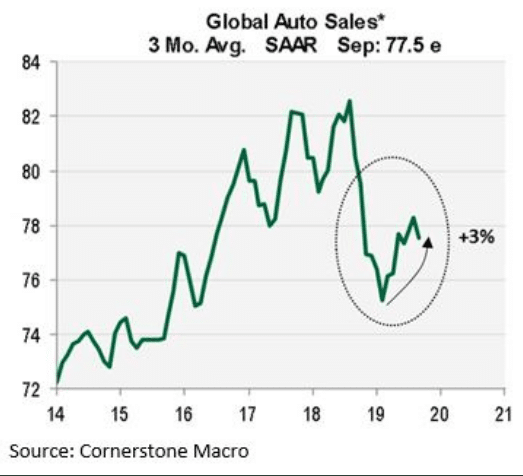
When we think more globally, we are forced to recognize that the global employment situation remains strong and supportive of economic growth. One of the ways we can define this strength is through global auto sales, which tend to rebound when central banks are providing easy monetary policy and cutting rates, as they have been through 2019. So if you're looking for additional "green shoots", look no further.
“The domestic part of the economy is still solid. The global part is getting hit by the trade war and European slowdown.” – Nathan Sheets of Prudential Growth Fixed Income Management.
Taken as a whole, the economic data continues to support economic growth going forward. The economy has moved from above trend-growth in 2018 to a period of trend-growth in 2019. It remains to be seen if the slowing growth continues or finds re-acceleration. The confluence of economic data combined with improving trade relations should prove an economic upturn of sorts that is likely to play out into the first half of 2020. Recent inventory overhang is likely at levels where they provide support for manufacturing resurgence by year's end and into the first half of 2020.
In addition, we would expect a near-term "phase 1" trade deal to prove stimulative for business investment/CAPEX. Over the last few months, although CAPEX is down YoY, it has improved.
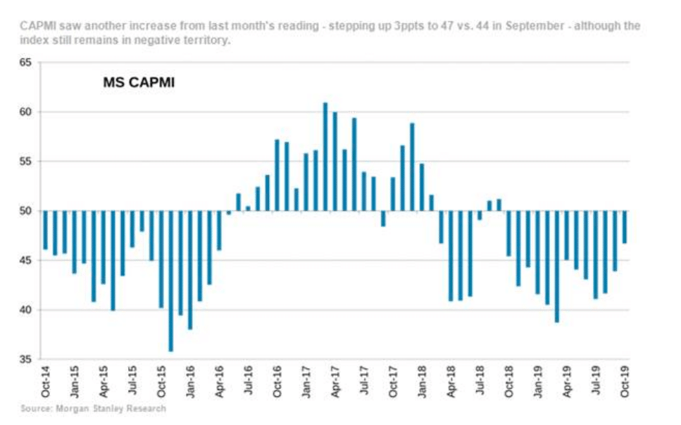
- MS CAPMI index registered a 3ppt increase in October (coming in at 47 vs. 44 last month), but also represents the third consecutive month with a positive change on a sequential basis.
- The result this month, however, also marks one full year of sub-50 readings.
For the week to come, the economic data calendar proves a touch lighter than the previous week.
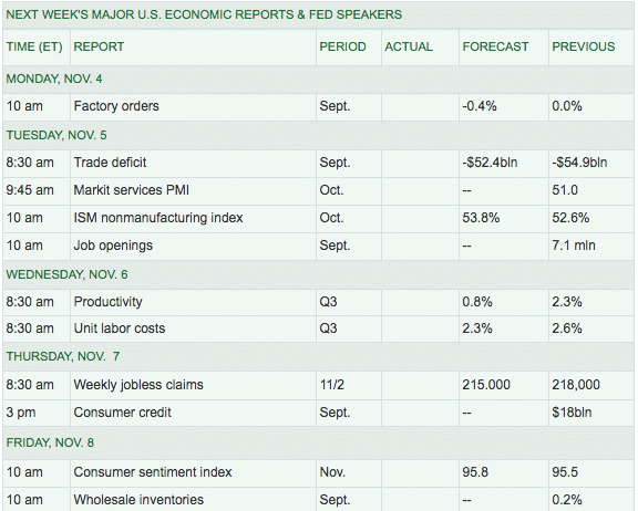
ISM and Markit services data will likely be the most anticipated reports of the trading week. Later in the week we'll get the latest reading on Initial Jobless Claims and rounding out the week will be a look at consumer sentiment once again.
Fund Flows Betta', Kinda'
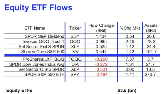
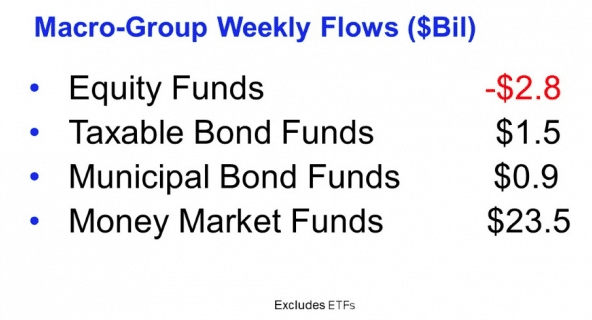
According to Lipper Weekly FundFlow Insights, equity ETFs recorded their third straight weekly increase (+$3.5 billion), driven by SPDR S&P Dividend ETF (SDY, +$1.4 billion) and Invesco QQQ Trust 1 (QQQ, +$985 million). Muni bond ETFs also contributed to the total net inflows as they took in $240 million in net new money for the week.
As usual, though, money market funds (+$23.5 billion) paced the net inflows among the fund asset groups. The lion’s share of the group’s net positive flows emanated from the Institutional U.S. Government Money Market Funds (+$23.7 billion) peer group while, conversely, the Institutional Money Market Funds (-$1.0 billion) and U.S. Government Money Market Funds (-$943 million) groups both saw money leave.
As for why money market fund balances are rising, take your pick. I'm of the opinion that it is not as ominous as the media makes it out to be. I believe the best explanation is that retail capital is slowly moving from banks to this market now that short-term rates are comfortably above zero. The alternative narrative is that investors are skittish about market conditions and prefer cash to longer-term investments. The reality is that both can be true.
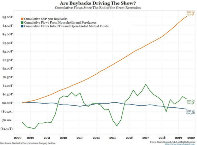
While retail investors and general institutional funds continue to de-risk from equities over the last several years and net outflows have become commonplace, corporations have proven more than willing and able to fill the gap in buying up stocks. The biggest buyer of equities in this decade-long bull market has been corporations buying back their own shares. Last year, corporations bought $900bn of their own stock and are on pace to potentially eclipse that rate in 2019.
In a calendar year whereby EPS is expected to be flat to lower YoY, buybacks have also proven a benefit to EPS. Even as net income and or sales fell for Apple Inc. in its most recently reported quarterly results, the company's EPS grew YoY. The decline in both net income and sales on a YoY basis led this fund manager to tweet out the following:
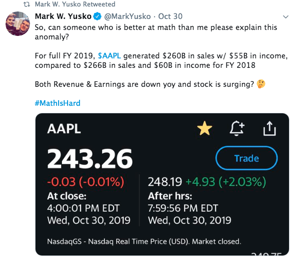
Nobody ever accused Mark Yusko of being a math scholar. Nonetheless, let's look at what happened through Apple's reporting.
- Apple disclosed Thursday that it spent $17.9 billion to buy back 92.6 million shares during the fiscal fourth quarter ended Sept. 28, or about 2% of the shares outstanding.
- That compares with the $17.0 billion Apple spent in the previous quarter and the $49.2 billion spent over the previous three quarters.
- The company has $78.9 billion remaining in its stock buyback program. Apple's stock rose 13.2% during the quarter, to boost its market-capitalization by roughly $115.7 billion as of the latest share count.
- The 10-K filing with the Securities and Exchange Commission showed that Apple had 4.443 billion shares outstanding as of Oct. 18, down from 4.519 billion shares as of July 19.
- As a result of the reduced share count, Apple was able to report late Wednesday a rise in fourth-quarter earnings per share to $3.03 from $2.91, even though net income fell to $13.69 billion from $14.13 billion.
And that's how it's done folks. This is what "sticks in the craw" of Perma bears! Almost as much as they hate the Fed, which serves to provide both economic stimulus and supportive financial conditions that produce economic growth, they hate buybacks.
Earnings Outlook
With each passing week that makes up the Q3 2019 earnings season, I anticipate positively revised EPS forecasts from both Refinitiv and FactSet. Recall from last week's Research Report I offered the following statement:
"We anticipate a continued positive revision streak from FactSet as the Q3 reporting season rolls forward."
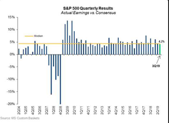
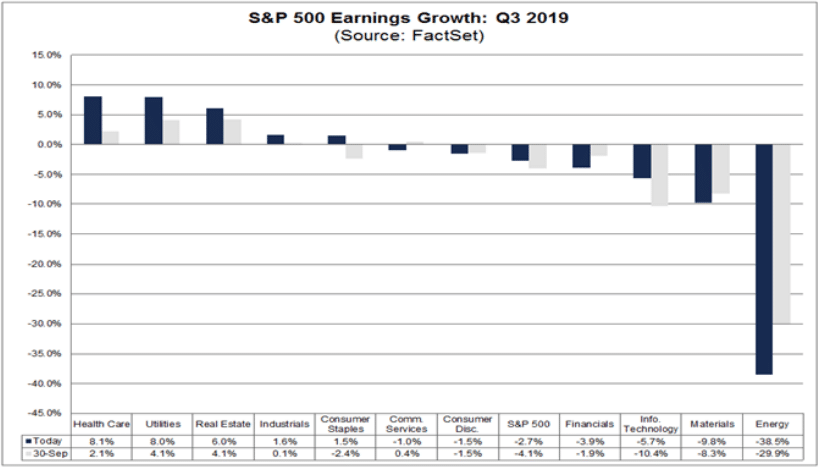
With that as a reference point for expectations going forward, we reiterate this statement. Additionally, I recognize the current beat rate for S&P 500 companies, which have issued reports to-date, is right at the historical median beat rate average of 4.2 percent.
Recall that at the onset of earnings season, FactSet was forecasting a decline of S&P 500 EPS on a YoY basis of -4.7 percent. If the beat rate holds constant through earnings season, the actual EPS decline will only be -.5% YoY. A decline is still a decline but it is far from the earnings recession witnessed from Q4 2015 through Q2 2016 (double-digit EPS decline). So let's take a look at the latest EPS outlook for the Q3 earnings cycle from FactSet.
- To date, 71% of the companies in the S&P 500 have reported actual results for Q3 2019.
- In terms of earnings, the percentage of companies reporting actual EPS above estimates (76%) is above the 5-year average.
- In aggregate, companies are reporting earnings that are 3.8% above the estimates, which is below the 5-year average.
- In terms of sales, the percentage of companies (61%) reporting actual sales above estimates is above the 5-year average.
- In aggregate, companies are reporting sales that are 0.9% above estimates, which is also above the 5-year average.
- The blended revenue growth rate for the third quarter is 3.1%, which is above the revenue growth rate of 2.8% last week.
- The blended (combines actual results for companies that have reported and estimated results for companies that have yet to report) earnings decline for the third quarter is -2.7%, which is smaller than the earnings decline of -3.8% last week.
As we can see from the last bullet point, FactSet has materially and positively revised their Q3 EPS estimate. I expect a continuation of this when we review the outlook again, come next week. Here are some forwarding looking thoughts and estimates from FactSet:
- Looking ahead, analysts see a decline in earnings in the fourth quarter followed by 5% to 7% earnings growth for Q1 2020 and Q2 2020.
- The forward 12-month P/E ratio is 17.2, which is above the 5-year average and above the 10-year average.
- During the upcoming week, 90 S&P 500 companies (including 1 Dow 30 component) are scheduled to report results for the third quarter
With FactSet's EPS outlook out of the way and improving, here is a depiction of the more widely anticipated earnings reports for the coming week:

Like FactSet, Refinitiv has also positively revised their Q3 2019 EPS outlook to reflect the better than expected earnings results.
Aggregate Estimates and Revisions
- Third-quarter earnings are expected to decrease -0.8% from 18Q3. Excluding the energy sector, the earnings growth estimate is 1.6%.
- Of the 356 companies in the S&P 500 that have reported earnings to date for 19Q3, 75.8% have reported earnings above analyst expectations. This compares to a long-term average of 65% and prior four-quarter average of 74%.
- 19Q3 revenue is expected to increase 3.7% from 18Q3. Excluding the energy sector, the growth estimate is 5.0%.
- 59.2% of companies have reported 19Q3 revenue above analyst expectations. This compares to a long-term average of 60% and an average over the past four quarters of 59%.
Just last week, Refinitiv had forecasted EPS to decline -2% on a YoY basis. It's quite probable that next week's update finds Refinitiv reflecting higher once again and possibly with a positive EPS outlook for the Q3 2019 period.
There's no denying that when earnings are flat--negative YoY, market gains are produced from what is known as multiple (Price/Earnings) expansion. This is the case in the current year where the valuation/PE has expanded from roughly 15X forward 12-month S&P 500 EPS in 2018 to over 17X presently. As mentioned in our recent State of the Market video; using valuation/PE as a guidepost for capital allocation is a faulty strategy. Notice how FactSet assesses the market's valuation/PE, with previous years' average. We only know what valuation/PE averages were, not what they are going to be in the future. With that in mind, what we do know is that over the decades valuations/PEs have expanded for the major indices.
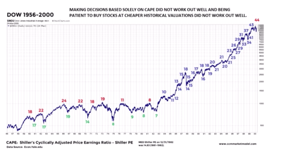
The concepts above are also reflected in the latest Ciovacco Capital YouTube video and charts/tables. The following graphic identifies the Dow's valuation/PE from 1956-1983. The median Shiller PE from 1982 back to 1881 was 14.83.
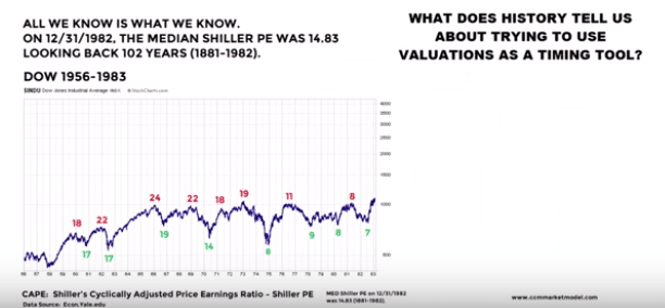
But from 1983-1987, and as shown in the following graphic, the Dow's valuation/PE expanded beyond that recent PE range.
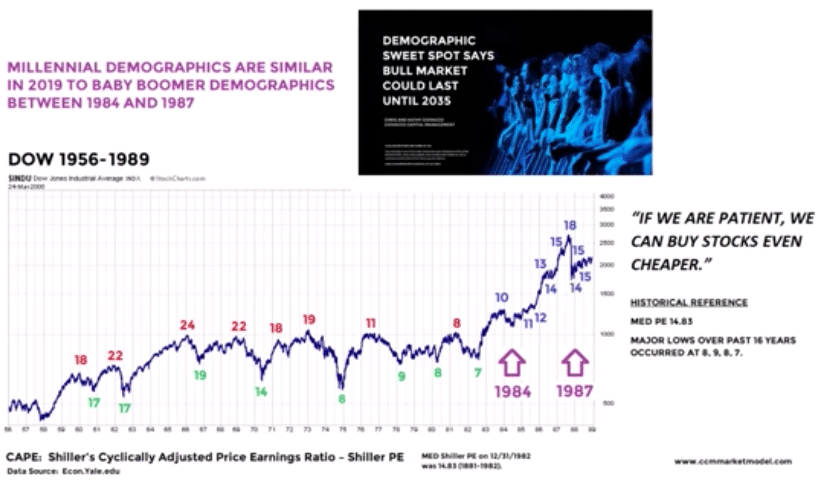
Based on the previous two graphics, we still have no idea of what valuations/PEs will produce in the future. To reiterate, using valuations/PE as a guidepost for capital allocation in benchmark indices is not an optimal strategy. Now, let's look at what valuations/PEs looked like from that 1987 point to 2000.
With this study in valuations in focus, I ask investors to consider that the current breakout in the major indices is predicated not just an economic rebound into 2020, with improved growth. Such an improvement from economic growth is anticipated to coincide with a rebound in earnings growth. This is key to understanding and rationalizing a flat EPS year with an S&P 500 gain of more than 22% year-to-date. The S&P 500 is a forward pricing mechanism, not a present-day pricing mechanism.
Investor Takeaways
For the week to come it's important to reflect one more time on seasonality as displayed in the chart below:

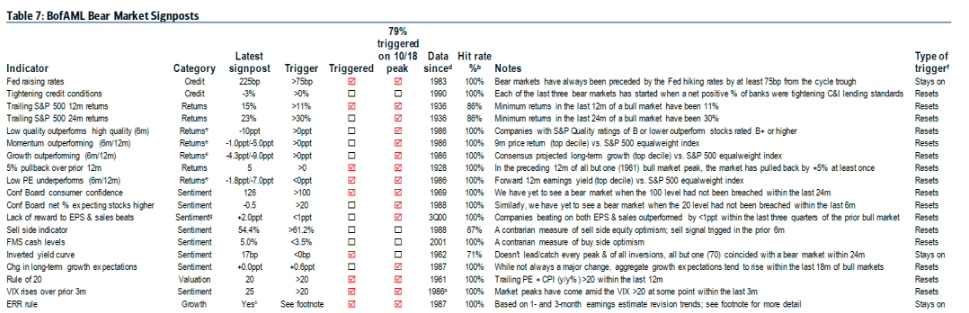
No matter the strength or weakness of the bull market, bear markets are far less probable without economic weakness developing more profoundly. Of the necessary conditions that ended prior bull markets, just 47% of Merrill Lynch's Bear Market Signposts have been triggered, where 80%+ have been triggered ahead of the last seven market peaks.
With investor sentiment and positioning remaining relatively defensive, potential upside surprises to cyclical areas of the economy are not fully priced into equity markets, in my humble opinion. So if the conditions for better growth in the U.S. and globally continue to fall into place, I believe equity markets could have more potential upside through the end of the year. Trade safely and have a great trading week ahead folks!
Comments
Log in or sign up to join the conversation.