

Summary
We believe that asset price moves are influenced in a significant way by the flows of liquidity (money) in, and out, of the financial system.
Note that the response of asset prices to those flows is variable; some assets respond more quickly to the flows; for other assets, the impact of flows come later.
There's a class of systemic liquidity which influences high-frequency changes in many risk assets - the periodic, episodic, infusion and claw-back of systemic liquidity conducted by the Fed and Treasury.
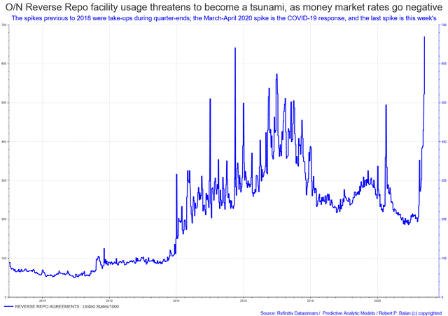
The Federal Reserve has plethora of ways available to them to control systemic liquidity. The central bank may deploy its balance sheet, the bank reserves, the required reserves (although this is more used to sop up liquidity in the narrower sense), reverse repos (take out liquidity from the system, as well).
This highlights the fact that the impact of disparate sources of liquidity is cumulative. The procedure, however, is not a straight-forward summation of the liquidity vectors (as in Fourier wave analysis).
This article was derived from this Seeking Alpha article:
An Equity/Risk Asset Sell-Off Now, Then A Major Trough Is Due In Late April-H1 Of May: Actionable Ideas To Profit From Those Moves
----------------------------------------------------------------
Background Materials On Systemic Liquidity
How systemic liquidity impacts asset prices
We believe that asset price moves are influenced in a significant way by the flows of liquidity (money) in, and out, of the financial system. Our experience and work, indeed, support the thesis that the most reliable correlations (relatively speaking) can be found in the causality, which stems from monetary flows (changes in systemic liquidity) to the changes in asset prices (see graphs above).
Very often, it is the change rate in the nominal values (flows), not the absolute changes in nominal value (the stock), which makes the most impact. Note, however, that the response of asset prices to the impact of those flows is variable; some assets respond more quickly to the flows; for other assets, the impact of those flows come later. There are also several sources of systemic liquidity, and those sources do not necessarily synchronize their activity. While there are elements of seasonality in the liquidity mix, sometimes, there are episodic variations which could skew well-established patterns which have held up for years.
Using liquidity as analytical tool
Those are the most difficult aspects we've met in using the flow of real money balances and predicting their impact in the behaviour of asset prices. Therefore, the key to a successful use of systemic liquidity as bedrock in the analysis of risk asset price dynamics lies in being able to corral that variability into a singular vector which could relate to the behaviour of risk asset price. We discuss this in the latter part of the article.
Fiscal and monetary policy initiatives lead by 5 to 6 quarters
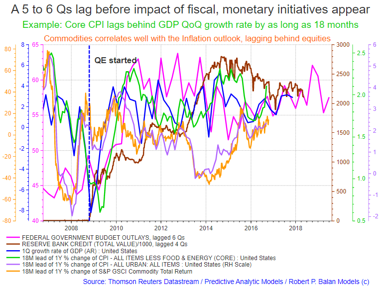
We have discussed this phenomenon before and showed examples at various settings (see that here) - fiscal and monetary initiatives take from 5 to 6 quarters before the peak effect is seen in the changes in growth and activity. In the example below, changes in GDP lag behind changes in fiscal budget outlays by almost 4 quarters. Changes in Core CPI, in turn, lag behind changes in growth by 18 months; likewise, changes in Headline CPI and Commodities lag changes in GDP growth by 18 months. It takes some time for the peak effect of changes in fiscal outlays to appear in the changes in some macro data and in the price changes of many risk assets.
Systemic liquidity from the Treasury and Fed
There is another class of systemic liquidity which influences the high-frequency changes in many risk assets - the periodic, and episodic, infusion and claw-back of systemic liquidity conducted by the Federal Reserve and the US Treasury. To cite one such example: the US Treasury Cash Balances expand and contract in significant degrees at least 6 times a year (perhaps even eight times, if minor episodes are included), see graph below.
There was only one instance in the past 12 years when the cadence of the inflow and outflow of the Treasury's cash balances deviated from historic norms. That was in late Q3 2008, when the Great Financial Crisis was full-blown. The Treasury Cash Balance at that time mushroomed circa 350 times in about two months. That period, indeed, was crunch time, so the Treasury let loose a massive wave of systemic liquidity (see graph below, orange line). This is just one example of liquidity infusion and claw-back from the Treasury. There are others.
The seasonality of the US Treasury Cash Balances (from 2006 to 2017)
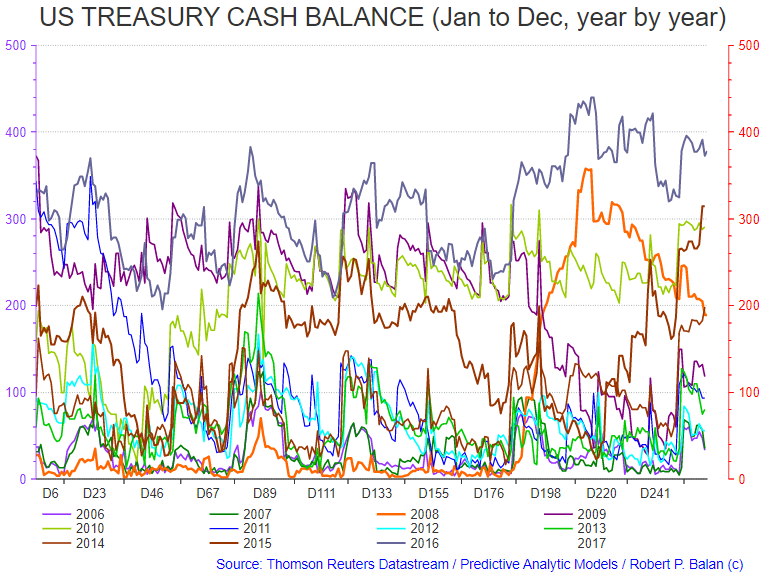
Note how "regular" the peaks and troughs of the Treasury Cash Balance data. There was only one anomaly - in 2008, at the onset of the Great Financial Crisis.
The seasonality of the US Treasury Cash Balances (from 2013 to present)
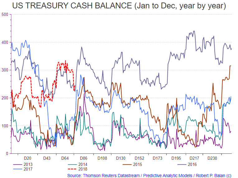
Note the "nesting" of seasonal troughs and peaks of the US Treasury Cash Balances. Balance data for 2018 is just about to make a bottom.
The Federal Reserve has plethora of ways available to them to control systemic liquidity. The central bank may deploy its balance sheet, the bank reserves, the required reserves (although this is more used to sop up liquidity in the narrower sense), reverse repos (take out liquidity from the system, as well).
All these tool, and the various Open Market Operations which the New York Fed conducts on a regular basis (e.g., Temporary OMO Repos), or buying or selling securities, provide the means for the central banks to control the Monetary Base. Of course, the Fed has total control over the size of the Monetary Base (MB). It has become synonymous with the Fed's balance sheet after the central bank's Large-Scale Asset Purchases (LSAP), more popularly known as Quantitative Easing (QE), conducted during the early part of the Great Financial Crisis (GFC).

Interaction of liquidity flows
The liquidity from the Fed's Open Market Operations and the US Treasury interacts with the systemic liquidity stemming from fiscal and monetary policy on cumulative basis. If the disparate waves of liquidity from various sources coincide, the aggregate, subsequent positive impact on risk assets' prices will be huge. The inverse is, of course, also true - the negative impact on safe haven assets will be huge as well. If the aggregated withdrawal of liquidity from various sources coincide, risk asset prices will subsequently tend to crumble (and safe haven asset prices will subsequently outperform). See the example in the graph below.

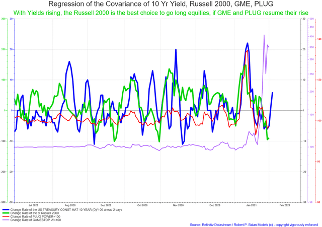
Liquidity sources are combining to push up bond yields higher in the near term. That is not a good sign for safe haven assets, which adds to our conviction that risk assets will recover soon and will be buoyant over the medium term, as liquidity inflows stoke upwards pressure for equities.
Cumulative process
This highlights the fact that the impact of disparate sources of liquidity is cumulative. The procedure, however, is not a straight-forward summation of the liquidity vectors (as in Fourier wave analysis) - that route does not work too well here. Also, asset prices do not necessarily respond in a coincidental way to the waxing and waning of aggregate liquidity. And very often, it is the change rate in the nominal values (flows), not the absolute changes in nominal value (the stock), which makes the most impact. As mentioned, the response of asset prices to the impact of those flows is variable; some assets respond more quickly to the flows; for other assets, the impact of those flows come later (see graph above and below).
How to handle the chaos
From the point of view of one particular asset, the disparate liquidity flows will be peaking and bottoming at various times (and at different amplitudes). One way to handle the chaos and to make the math work more tractable is to index the data, then find a calibrated match of the resulting vector versus the regressed price of the asset in the time continuum. We are not looking for point solutions in price terms here - just the inflection points in time. Even then, it is laborious - but it is worth the trouble (see graph below).
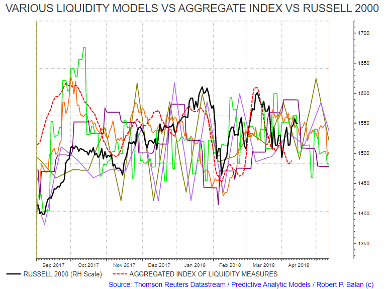
That roughly describes the fundamental framework and the set-up of the analytical tools that we use at Predictive Analytical Models (PAM).

Comments
Log in or sign up to join the conversation.