

It is now abundantly obvious that the FOMC and its clumsy rate-pegging and credit printing tools are not remotely fit for purpose.
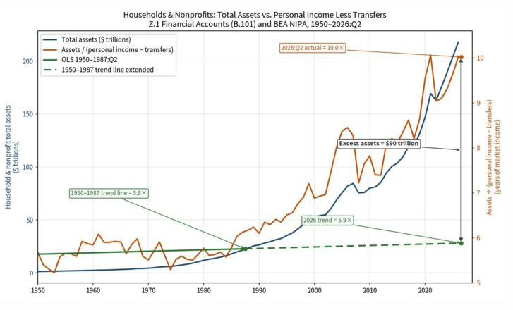
The real impact is dramatically displayed in the graph below. It shows that after 1987 the growth rate of household assets relative to earned income (i.e. excluding transfer payments) took off like a bat out of hell.
Indeed, as shown in the graph during the heyday of the 1950s through 1987, the nominal value of household assets tracked the growth of earned income almost in lockstep, with the ratio relatively flat through the 37-year period, posting at 5.8X in Q2 1987, up slightly from an average 5.4X ratio during 1950 to 1954, when the US economy moved into its strong post-WWII growth era.
The virtually nonexistent slope of the trend line (solid green below) during that era of unprecedented middle-class prosperity means that had it continued for another 39 years through Q2 2026, the end point ratio today would be just 5.9X, not the actual ratio of 10.0X.
So, yes, the Fed’s red-hot printing press did make a whopping difference. To wit, the household and nonprofit sectors today hold the staggering total of $90 trillion more in assets of all types—from owner-occupied residences to cash accounts, bonds and stock portfolios—than would have been the case based on pre-1987 asset-to-income trends.
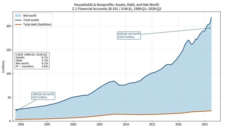
What this means is that the American household sector did not earn and save its way to the huge gains in assets and net worth reported by the Fed’s Flow of Funds data. That is to say, net worth is up from almost $11 trillion to $196 trillion since 1989, but that is not mainly due to savings from the growth of earned income.
As shown, below borrowings helped modestly, rising 5.3% per annum or modestly ahead of the 4.6% per annum growth of personal income ex-transfer payments. But the real catalyst, obviously, was the far faster growth of asset values, which rose at a compound annual rate of 6.1% during the period.
At the end of the day, however, the comparison which says it all is the gap between asset growth at 6.1% per annum and income growth of just 4.6%. In a word, assets grew 35% faster than income over that three and one-half decade period because, well, the Fed inflated them with its red-hot printing presses.
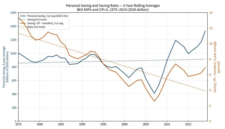
For want of doubt, we show the opposite trend in the household savings data, meaning that the American public has not saved its way to riches since Alan Greenspan discovered the printing presses in the basement of the Eccles Building soon after he took office in the midst of Black Monday’s 23% collapse of the Stock Market on October 19, 1987.
The juxtaposition of the savings graph below and asset graph above, in fact, tells you all you need to know. Since 1975, the true household savings rate—measured as personal savings divided by household income less transfer payments (used as the denominator here because the government’s 160 million Welfare State beneficiaries save virtually nothing on a net basis) has been plodding steadily lower (dotted red line), from an average of 13.3% of income in 1975 to 6.7% of income at present.
At the same time, the constant dollar level of savings pencils out anemically, indeed. The growth rate (blue lines) in real terms has been just 0.6% per annum since 1975.
So, no, America did not save its way to $196 trillion of net worth after the era of Keynesian monetary central planning commenced in October 1987. The Fed inflated asset prices to a fare-the-well.
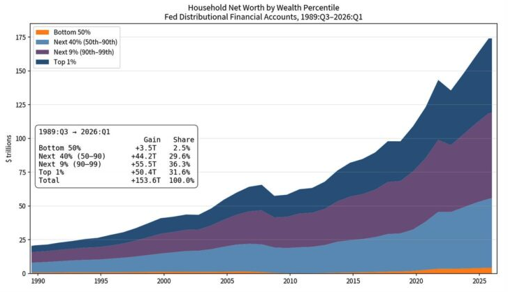
Of course, all this inflated net worth is just the half of it. The more onerous dimension lies in who got it or in the distribution. In that regard, the graph below speaks for itself. Since Q1 1989, household net worth has risen by an aggregate of $154 trillion.
As it happened, however, the bottom 50% got 3% of the gain, while the top 1% harvested 32% of the loot. Some earnest commentators are now mystified as to why the hoary doctrine of socialism seems to be making a comeback in certain quarters of American politics.
The geniuses at the Fed, however, should not be confused at all. It’s all their handiwork.
In the land of the central bank printing presses, the rich do get richer, indeed, and not because they earned it on an honest free market operating based on sound money.
In fact, the chart above reflects the true failure of Greenspanian central banking. And when the massive inflationary bubbles embodied in this graph above finally do blow sky-high, don’t blame it on the free market.
In short, what amounts to free money has been the real culprit all along.


Comments
Log in or sign up to join the conversation.