
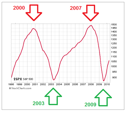
Hard Evidence Was Helpful Near Major Turns
The chart below shows the S&P 500’s 200-day moving average between 1998 and 2010. Given the S&P 500 dropped by over 50% on two separate occasions in that period, it was helpful to have tools to monitor the market’s risk-reward profile.
What Are The Charts Telling Us Today?
This week’s stock market video goes beyond the S&P 500 to help us gain a better understanding of the market’s bigger picture tolerance for risk. Numerous markets are covered, including gold, silver, and energy. The broader analysis can provide insight beyond the widely followed S&P 500.
Video Length - 00:30:55


Comments
Log in or sign up to join the conversation.