


When you look at this stock market over the last 12 months, outside of a few weeks where we sold off, and about 1.5 months where we rallied, plus a massive 2-day move to start the month of August out, the market has largely done nothing more than chop around. That means nearly 10 of the last 12 months have been nothing more than a brutal chop fest.
And now we have warnings coming from Anthropic and OpenAI claiming we need to slow down frontier development in AI. Couple that with rising interest rates from continuous inflation, and an Iran war that looks like another one of those ‘forever’ Middle East wars, there’s a lot holding this market back.
But on the same note, the market isn’t breaking down either. Every time we have been on the cusp of such a breakdown, we have seen this magical stick save come in at the last second and bolster the markets higher. So we remain in this endless sideways chop, but the stack of evidence developing against this market is starting to hit alarming levels, and I’ve come up with three specific charts that should be at the top of your list for monitoring the stock market going forward.
The first one: The price of crude futures.
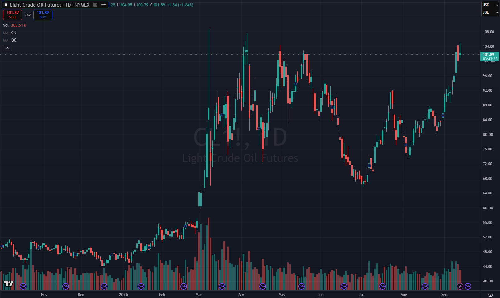
We are at the same level that we found ourselves at, during the beginning of the Iran war, and we could even potentially see its highest close yet since the war began.
The T2108 Chart measures the percentage of stocks trading above their 40-day moving average.
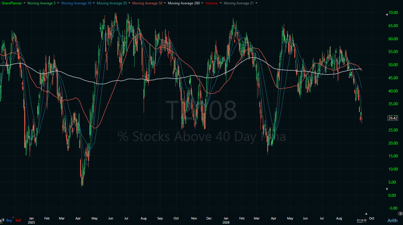
This indicator is one of my favorites, and it shows that while the S&P 500 remains near its all-time highs, the majority of stocks show a much different story, with 70% of stocks on the NYSE trading below their 40-day moving average. That is a staggering number, considering how close to all-time highs we remain.
The 10-year yield.
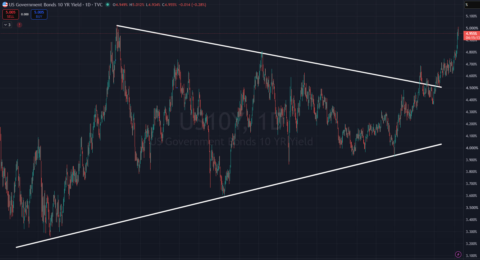
It tested its highs from 2023 and pulled back some, but if that level ultimately breaks, you’re looking at the highest levels since the Great Financial Crisis in 2008.
To put it mildly, I would be concerned about this market. There is a lot wrong here, and while price isn’t reflecting it, the internals are, and it should temper our expectations until conditions improve.
Comments
Log in or sign up to join the conversation.