The S&P 500 Index Is Expensive And Has Mostly Been So Since The Early 1990s
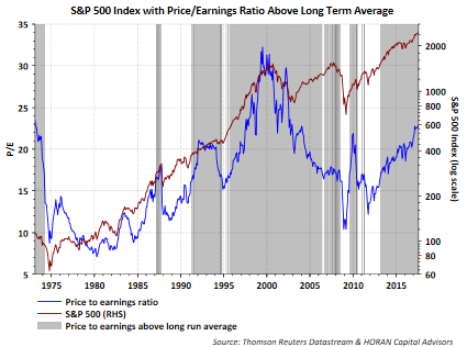
One can cite any number of stock valuation measures and conclude U.S. equities look expensive or are at least trading above their long term average valuation measures. In this environment one might conclude stocks are priced for perfection with little margin for error. Of course this might certainly be the case, but is this an uncommon position for the equity market? As the shaded areas in the below chart show, investors would have had a difficult time buying or holding onto stocks at valuation levels that were below their long term average valuation since the early 1990s.

It is hard to believe, but almost three years ago to the day I wrote a post, No Alternative Other Than Stocks, that featured an interview with Jason Trennert of Strategas Research Partners. In that interview, and I think it was Jason, he coined a term TINA, i.e., There Is No Alternative (TINA) to stocks. In other words, in the low interest rate world investors faced then (and still today), the only investment choice that made sense was stocks. It wasn't that bonds would be terrible investments, but simply that stock returns would far outpace bond alternatives. And boy did that theory turn out to be a correct one.
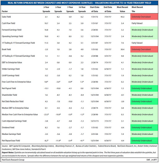
Today, when comparing absolute valuation measures of stocks they certainly appear more expensive then at any time since the end of the financial crisis. On the other hand, when evaluating most measures relative to bonds, in this case the 10-year US Treasury, valuations fall mostly in the undervalued categories. Ned Davis Research recently published two tables comparing absolute (the first table) and relative (the second table) valuations as can be seen below. Many undervalued (green) categories in the relative valuation table.


Source: Ned Davis Research (Twitter)
Placing valuation in perspective again, below is a chart of the forward P/E for the S&P 500 Index. The chart includes the P/E levels at plus or minus one standard deviation as well. The current forward P/E is nearing the +1 standard deviation mark.

Now going back to Jason Trennert's acronym, TINA, and Ned Davis' valuation measures relative to bonds, current interest rate levels seem supportive of further advances in stocks. The Fed has embarked on a path to move interest rates higher. Generally, the Fed does not raise interest rates if they believe the economy is not expanding. We have noted a number of times that we believe the Fed waited to long to begin the tightening process. Nonetheless, they are moving in that direction now.
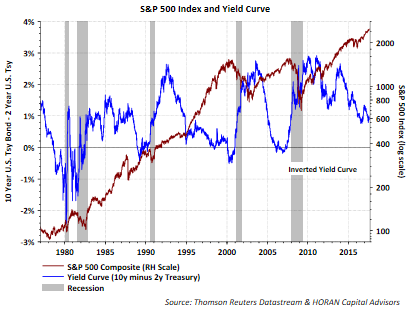
The reaction of market rates has been similar to past tightening cycles in that the yield curve has begun to flatten. A flatter yield curve means shorter rates are rising faster than long rates, and of course long rates could decline as we have seen this year. As the below chart shows, the yield curve (10-year minus 2-year Treasuries) has begun to flatten, i.e., a declining blue line. The S&P 500 Index is represented by the maroon line below, continues to perform well as the tightening cycle progresses. The equity market risk becomes most evident when the yield curve inverts and we are not close to that occurring at the moment. Equity investors might monitor the yield curve as one signal to incorporate into their process as to when to consider reducing equity exposure.

And finally, this post is not suggesting the market won't experiencing a pullback or correction. We seem overdue for that. However, in spite of the current economic expansion being the third longest, its low rate of growth might mean it could extend for longer, i.e., as many have been saying, no boom, no bust.
And I will end with one last positive, when it comes to corporate earnings, they are on a low double digit growth trajectory. And if what's past is prologue, then higher equity prices could be the result.

Disclosure: None.


