
How Do The Stock-Bond Charts Look Now?
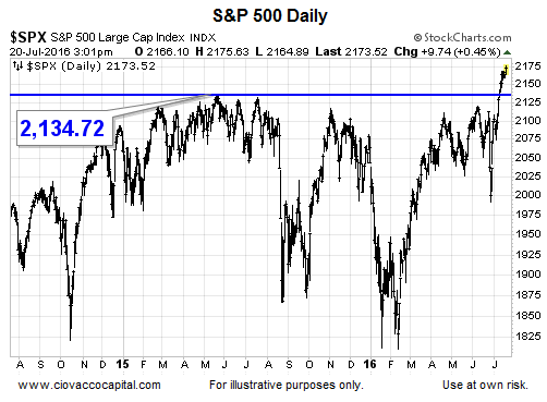
Retest Is One Of Many Scenarios
The big picture still looks good relative to the S&P 500’s breakout from a multiple-year consolidation pattern (see below). In terms of common action after breakouts, price often (not always) wants to retest the breakout area. The market will make the call over the next few days. The potential significance of the S&P 500’s breakout was outlined on July 12.
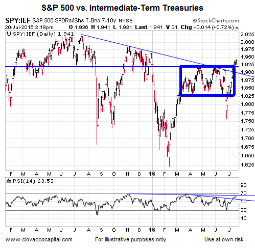
Stocks Make Progress Versus Bonds
The S&P 500 vs. intermediate Treasuries (IEF) chart below has cleared two hurdles this week: (1) the thin downward-sloping blue line, which dates back to the S&P 500’s 2015 peak, and (2) the multiple-month consolidation box. The longer those breakouts remain in place, the higher the odds the S&P 500 will hold its breakout above 2,134.
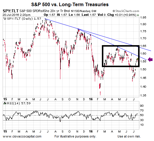
The S&P 500 vs. long-term Treasuries chart has not cleared the hurdles described above. Both charts remain helpful in terms of the sustainability of the bullish breakout in equities.
Energy Testing Overhead Resistance
If energy stocks (XLE) can break out from what may be a consolidation/bottoming process, it would also improve the bullish case for the broader stock market. For now, XLE is still below an area of potential resistance.

Disclosure: This post contains the current opinions of the author but not necessarily those of Ciovacco Capital Management. The opinions are subject to change ...
more
Comments
 No Thumbs up yet!

