
The Monetary Zero Hour Projections For 2015
Summary: Several graphical treatments in the years past have projected a U.S. monetary crisis for 2015. There are several current economic conditions supporting those projections. There is a 'zero hour' similarity in the global charts as well.
I did a couple of articles a few years back on a monetary phenomenon known as "zero hour". To see the discussion of it back then, click here. This is the main chart of interest:
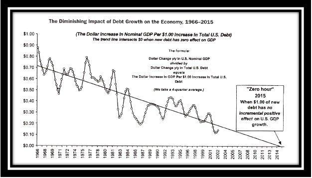
Dr. Marc Faber likes to show this in his presentations as it is real doom and gloom stuff. I think 2002 was the first year he started plotting it, and it basically shows the diminishing positive effects of money printing on GDP growth in the U.S. It points to the theoretical point where each newly added dollar of debt by our government adds zero new GDP growth. Because the projection of this and other similar charts all point to the year 2015 as this zero point, I thought I would review its implications and see how they stack up to the 2015 we now live in.
Another version of this showing the same thing was done by Chris Rupe, "according to the original Legg Mason format and methodology", as explained in an account of how this chart is calculated and its meaning on Nathan Martin's blog (Guest Post And More On The Most Important Chart Of The Century). I haven't run across any updates on Chris Rupe's chart anywhere:
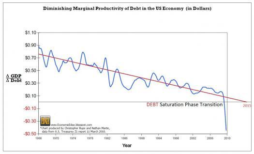
This plot shows the change in GDP/change in debt ratio and it also was pointing to 2015 as the "debt saturation" year.
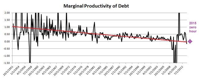
Another more recent plotting of this phenomenon was done by Keith Weiner a year ago in his article over at Forbes.com: "What's Wrong With Spending More And Getting Less ?"
(Click on image to enlarge)
I have added the 2015 zero point, and it is pretty much smack at the end of the line Weiner fitted through the data, which is from the St. Louis Fed.
So, are we now getting zero economic bang for the new debt buck here in 2015? Despite a parabolic rise in created money, the U.S. economy is sub-par at best, and teetering on the edge of recession if the most reliable recession predictors of the past are to be trusted as I showed in my article of two weeks ago.
In my 2012 zero hour article, I showed a gasoline usage chart showing it dropping over the course of the weak recovery. It continues to drop:

(Click on image to enlarge)
In this chart by Doug Short, he refines the raw gallons-burned figures to adjust for the car turnover to better mileage (using estimated miles driven) and adjusts for population growth in the over-16 driver group. This shows several interesting things. For an economic tell, you can look at all kinds of spending including the total retail spending. But the total includes mostly soap, cereal, Netflix (NASDAQ:NFLX), and whatever is bought whatever the economy is doing. If you look at the total retail charts, this is very evident, with the 2008 Great Recession involving just a minor one-year dip and mild recessions producing no effect at all.
Continue reading on Seeking Alpha.


