Tech Talk: The Cup And Handle Formation
TM editors' note: This article discusses a penny stock and/or microcap. Such stocks are easily manipulated; do your own careful due diligence.

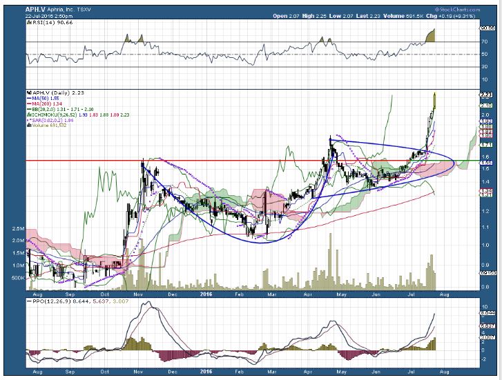
This chart illustrates the behaviour of Aphria Inc., a company based in Leamington, Ontario, which provides medical marijuana to individuals. It is listed on Canada’s Venture Exchange under the symbol APH.V. Other licensed medical cannabis producers are searching for opportunities to expand overseas while Ottawa works on its plan to legalize recreational marijuana next spring.
This article is the first in a series of articles I am writing on the use of technical analysis and stock-picking. The main reason I have taken an interest in this stock is that Canada will make pot legal within the next year. Companies like Aphria are in a good position to benefit from trade in this commodity, which has begun to boom in anticipation. (For the record, I own the stock but do not use the product.)
In the chart I have drawn in blue a cup and handle formation using two thick parabolic lines. This indicator is typically quite bullish – often the precursor to a big upward movement (a “breakout” which, of course, began a week ago.
There are a couple of other points you should note in the graphic. One is that it uses 200-day (red line) and 50-day (blue line) moving averages. The more volatile 50-day line dropped through the 200-day average last October, forming what is technically known as a “death cross.” However, the strength of this stock in recent days indicates that this situation will soon reverse itself. When that happens, the two indicators form a bullish “golden cross” – an indicator of future strength.
The relative strength index (top indicator) shows the stock as “overbought.” This will sort itself out as upward movement in the stock moderates, and the indicator moves beyond previous share price movements, which are still reflected in that indicator.
The lower indicator is the Percentage Price Oscillator (PPO). A “momentum oscillator,” it measures the difference between two moving averages as a percentage of the larger moving average. The Percentage Price Oscillator indicates activity through a signal line, a histogram and a centreline. In my view, it is the most powerful of the indicators I use.
This chart also uses a couple of other indicators that I find extremely helpful, including Parabolic SAR (stop and reverse) and Bollinger bands. I’ll discuss those indicators in a later post.
Just to be clear, my comments on stocks are not buy or sell recommendations. Their only purpose is to describe certain stock patterns and ideas, using current illustrations.
Disclosure: No positions.


