2017 Market Wrap-Up
This post will outline how the U.S. Major Indices, Major Sectors, S&P 500 Index and the SPX:VIX Ratio performed throughout 2017 and how they ended the year.
U.S. Major Indices
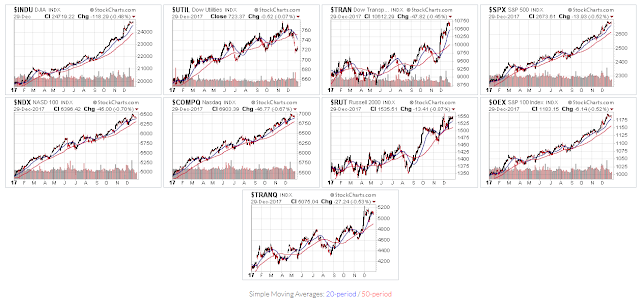
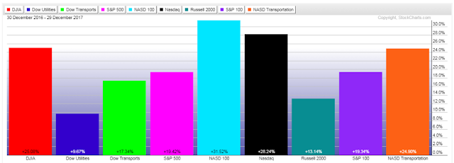
The following 1-year daily charts and year-to-date percentage-gained/lost graph show that all Major Indices, except Utilities, are trading well above their 50-day moving average, and that Technology made the most gains, followed by Transports, Large-Caps, Small Caps, and, Utilities.
Major sectors
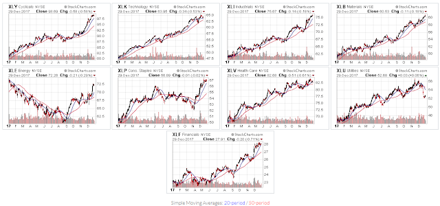
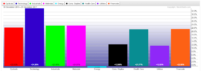
The following 1-year daily charts and year-to-date percentage-gained/lost graph show that all Major Sectors, except Utilities, are also trading above their 50-day moving average, and that Technology gained the most, followed by Materials, Industrials, Consumer Cyclicals, Financials, Health Care, Consumer Staples and Utilities, while Energy ended, essentially, flat, at -0.89%.
S&P 500 INDEX
The following four charts of the S&P 500 Index will depict how 2017 ended, on a yearly, quarterly, monthly, and weekly basis.
Each candle on the following chart represents a period of one year.
2017 extended gains made in 2016, mostly remained above 2250, and finished the year on an extremely bullish candle. Momentum hit an all-time high on this timeframe by year-end.

Each candle on the following chart represents a period of one quarter.
Each of the four 2017 quarters gained on the prior one, without much of a pullback in each. Momentum has yet to make a new swing high on this timeframe since it peaked in 2014.

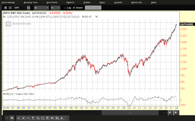
Each candle on the following chart represents a period of one month.
With the exception of March, each candle closed higher, with a bit more candle overlap. Momentum also closed out the year at an all-time high on this timeframe.
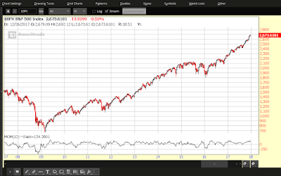
Each candle on the following chart represents a period of one week.
There are several minor pullbacks evident throughout 2017 and some profits were taken in the last two weeks. Momentum dipped a couple of times, but remained above zero, and ended in a strong uptrend.
SPX:VIX RATIO
The following four charts of the SPX:VIX Ratio will depict how 2017 ended, on a yearly, quarterly, monthly, and weekly basis.
Each candle on the following chart represents a period of one year.
2017 extended gains made in 2016, and finished the year on an extremely bullish candle (illustrating low volatility), as it closed about 20 points off its all-time high. Momentum hit an all-time high on this timeframe by year-end.

Each candle on the following chart represents a period of one quarter.
Volatility rose on this timeframe, as evidenced by the long tailed candles, as price remained, essentially, above 150. All candles, except Q4, closed higher. Momentum hit an all-time high in Q3 and remains strong.

Each candle on the following chart represents a period of one month.
Half of the 12 candles closed higher (on moderate volatility), but the general trend is still up. Momentum is still in a strong uptrend on this timeframe, as an all-time swing high was made in October.

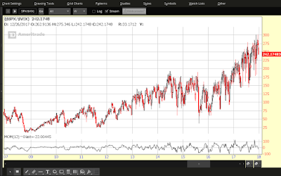
Each candle on the following chart represents a period of one week.
Zigzag price action illustrates higher volatility on this timeframe, as some profit-taking occurred several times this year, but remains in an uptrend. Momentum closed the year below zero, after spiking to an all-time high at the end of October.
SUPPORT & RESISTANCE LEVELS
SPX
The SPX is mashed up against major resistance in the form of an external Fibonacci retracement level, as shown on the Monthly chart below. It's also trading above a +2 standard deviation level of a long-term uptrending Regression Channel (formerly major resistance/now support around 2600).
Such a channel breakout has not occurred since it began at its lows of 2009, so any further buying that occurs at/above these levels would be unusual and, potentially, lead to over-exuberant parabolic spikes.
The next major support level sits at 2485 (a confluence of two external Fibonacci retracement levels and the +1 channel deviation level. A pullback of 7% from its 2017 closing price of 2673 would send it down to that level.

SPX:VIX Ratio
Price on the following Monthly ratio chart of SPX:VIX closed in the lower half of the long-term uptrending (green) channel.
It will be important for price on this ratio to reach and hold above the 280 major resistance level, and for theSPX to hold above its near-term 2600 major support level, in support of a convincing argument that favors the sustained entry of the SPX into a new bull-market phase.
Otherwise, if price drops and holds below major support at 200, expect volatility to increase dramatically and weakness to set in on the SPX.

Conclusions
2017 was a year of low to moderate volatility (depending on the timeframe), but managed to generate steady quarterly gains in the SPX through to year-end. In last year's Market Forecast for 2017, I had anticipated an increase of around 11% in equities, in general, as well as low volatility. In fact, the S&P 500 Index closed out the year 19.42% higher (20.16% at its highest for the year on December 18).
Technology and Large Caps led the markets to new highs throughout the year (supported by a strong Financials sector), while Small Caps made modest gains, in comparison.
Next year's U.S. mid-term Congressional election, coupled with two to three possible interest rate hikes, will likely generate an increase in market uncertainty and volatility. So, we may see larger weekly swings occur, and, possibly, a 7% pullback at some point, to generate an overall increase of about half of what we saw in 2017...to propel the SPX approximately 10% higher to around 2940 by year-end.
A look into the future

In closing, I'd mention that my Market Forecast for 2018 can be found at this link for further details. Since writing that post, the following record-breaking news arose:
- The S&P 500 Index came within 5 points of hitting 2,700 and the Nasdaq Composite Index hit 7,000 on December 18. In my post of November 26, 2016, I had projected an SPX target of 2,700 (in anticipation of the 2020 Presidential election), so, to see it nearly hit three years early illustrates what an unusually strong year this has been).
- President Trump signed the Tax Cuts and Jobs Act on December 22 (the new lower corporate rate of 21% will take effect January 2018). Following this, many major companies announced pay raises and bonuses for employees, as well as plans to hire more workers and increase infrastructure spending.
- Of course, I realize that a forecast is, simply, one possibility of many. However, it can be a useful tool in order to track, assess and learn from one's future successes and failures on a short, medium and long-term basis. And, it can be modified/updated during its duration, depending on world and domestic influences at the time.


