United States Cash Deficit - A Better Calculation
 Over the last ten years, specifically between September 2004 and August 2014, according to official government reports, the United States Government ran a deficit of $7,524,990,000,000 ... just over $7.5 Trillion dollars if you don’t feel like zooming in your browser to count the zeros. It’s bad ... really bad, but you already knew that.
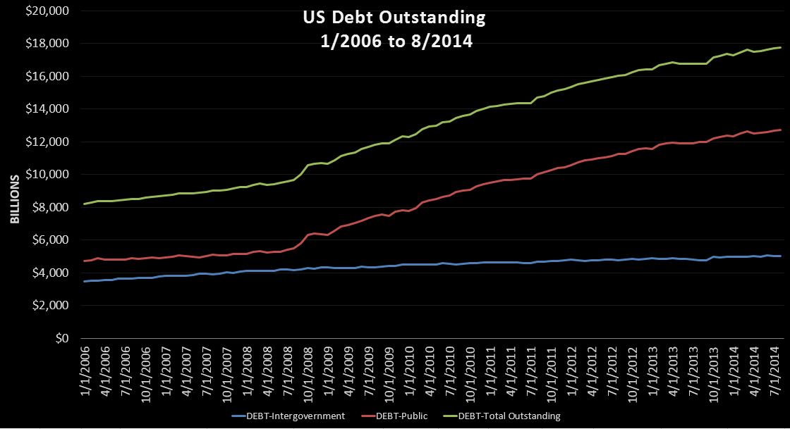
Here is something you may find curious. Over that same period, Public Debt outstanding increased $910 billion more than the reported deficit at +$8.435T and total debt (including intragovernmental) increased $2.873T more at +$10.398T. As an accountant, this intrigues me, because in theory, calculating the deficit is extraordinarily simple thing to do. Just for fun, let''s pencil it out. All we need is four numbers to calculate the cash deficit for a given period: beginning and ending cash balances, and beginning and ending debt outstanding. For this exercise we will ignore the $5T of “intragovernmental debt” because shuffling IOU’s from one pocket to the next has zero effect on cash.
Starting with debt, September 2004 began with $4.298T of public debt outstanding and August 2014 ended with $12.733T. The difference is $8.435T (BAD), which is what we would expect the reported deficit to be if cash were equal. However, looking at the cash statement, we can see that the cash balance increased from 3B to begin September 2004 to $49B ten years later, a $46B gain GOOD. We then subtract this gain from the change in debt, and get a calculated cash deficit over the last 10 years of $8.389B, $864B higher than the reported deficit.
Interested yet? On the surface, it looks a lot like the official government deficit report is systematically understating the deficit by over $85B per year. Now to be clear, I’m not claiming anything illegal is going on. However, if you give an organization the ability to define their own accounting policies, it’s not too hard to imagine that a few clever accountants will find a few ways to make 2% of a $3.8T annual budget disappear. One prominent example is the likely exclusion of the US Post Office from the official numbers under the silly claim that it is an independent organization. So when Treasury floats USPS a $15B loan ... rather than counting that in the deficit ... they probably book it as an asset, even if we all know it will never be repaid. Now, the Post Office alone doesn’t come close to explaining the $841B of missing deficit, but I think you get the idea. At the end of the day, the simple conclusion I have come to is that the government deficit figures simply can not be trusted and that an alternative metric is needed.
Fortunately, the Treasury Department publishes a little nugget of gold every business day at 4PM EST called the Daily Treasury Statement (DTS). The DTS is essentially a daily cash flow statement for the entire US government containing hundreds of daily data points. Cash in, cash out, daily, monthly, year to date, and most importantly beginning and ending cash and debt, which is all we really need to recalculate the deficit on a cash basis. Fortunately for us, it has so much more than that. In my mind, the DTS is the daily financial history book of the United States going back to 1998.
And so, a few years ago I set about first compiling the historical data back to 1998, and then capturing it daily on a go forward basis. I started my personal web site USDailyDeficit.com in November of 2012 just in time to start live blogging the fiscal cliff and debt limit … good times.
While I generally discuss the daily and weekly play by play, let me take this opportunity in my first Talk Markets post to take a step back to look at the big picture.
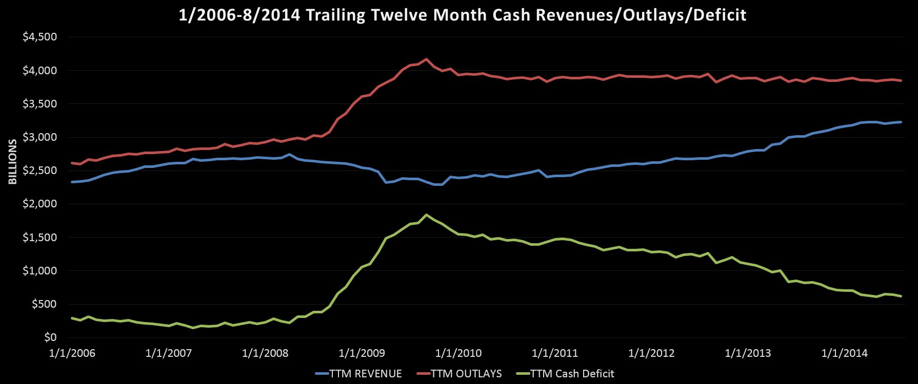
The chart above shows us the trailing twelve month (TTM) cash revenues, outlays, and deficit from January 2006 to August 2014.
Revenues:
Cash revenues, in blue, hit a peak in April of 2008 at $2.75T before falling 17% to a low at $2.29T 19 months later in November of 2009. Today, after nearly 5 years of growth TTM cash revenues stand at $3.23T, 41% above of their 2009 low and 17% over the 2008 peak.
Outlays:
Cash outlays, in red, started 2006 at about a $2.6T run rate that grew steadily before spiking over $1T between the fall of 2008 and 2009 as the government increased spending to save our banks and destroy our “clunkers”. After the initial spike, spending leveled off at about $3.9T, and has stayed flat at that rate for nearly 5 years now. Within that number, there is a lot going on, but basically cuts in defense, education, payroll, and other miscellaneous programs are being offset by increases in Social Security, healthcare, and interest expense, keeping overall spending flat, at least for now.
Deficit:
In green we have the cash deficit, simply the difference between cash revenues and cash outlays (charted as a positive #). In 2006 the deficit starts off in the $200-$300B range before spiking to a $1.8T rate in September 2009. From there, we have near continuous improvement down to the latest rate of $621B.
So where does that leave us? Clearly we have made huge positive strides since 2009 by knocking off $1.2T from our annual burn rate. If we project current trends forward, that is ~5% annual revenue growth and roughly flat outlays, we could be running surpluses in 3-4 years. Unfortunately, I don’t expect it to play out like that. Instead, I expect revenue gains to continue slowing and cost pressures to start pushing up over the next few years. So rather than heading toward a surplus, I think it is far more likely that cash deficit will bottom out at around a $400-$500B annual rate in the next year or two before heading back up.
In the meantime, I will continue chronicling this slow-motion train wreck I like to call the US Cash Deficit. After following it daily for over two years now, I will admit my pessimism has diminished somewhat. However, while the timing may have changed, the likely ending of this story remains the same…one way or another, the US government will ultimately default on its liabilities.
At this point in time, the “official” balance of unsecured national debt is nearly $17.8T. To put this in perspective, that’s about $125k per working American ... whose median wage is about $50k. I rest my case.
Disclosure: None.


