
Why Is The VIX Not Screaming Higher
If you thought Monday was ugly for global equities, it didn’t get any better on Tuesday. U.S. equity indexes fell sharply, again, on Tuesday with the Dow Jones Industrial Average (DJI) leading the way lower by 2.2 percent. The Dow was down more than 630 points intraday at its lows. The Nasdaq (NDX) fell 1.7% and the S&P 500 (SPX) fell back to its October lows, finishing down 1.8% on the trading day. The VIX rose roughly 12% on Tuesday followed by a much lesser move in the Volatility of Volatility Index (VVIX), which was only up by .45 percent.
As the market declines have persisted since October and after a brief relief rally, some market participants are a little confounded as to why the VIX has remained elevated, but not expressing the extremes the equity market is expressing in price level value. Let’s face it, an almost 2% move lower on the S&P 500 Tuesday and the VIX only jumped 12% on the day. Another question investors are pondering along the same lines is that the VIX has not reached the peaks it reached at the October SPX lows, even though the SPX has essentially revisited the same low levels.
On Tuesday, the SPX “double-bottomed”, at least for now. This indicates that the lows from October were hit once again and after several weeks. More often than not, during a correction period, the initial lows are retested before either the SPX moves higher or lower. The chart below depicts the SPX (blue line) with a VIX layover (purple line). What is very clearly indicated in this chart is that the VIX did not reach its peak from the SPX October lows even though the October lows have been tested here in November. Why?
Firstly, the VIX is a stochastic process, a derivate reading of S&P 500 (SPX) options. The VIX is priced from a portfolio of S&P 500 options defined by the CBOE, and the futures price from the market’s expectation (Implied Volatility) of where the VIX Index will settle at expiration. One component in the price of SPX options is an estimate of how volatile the S&P 500 will be between now and the option’s expiration date.
There is no one reason as to why the VIX has achieved the October peak level, but a confluence of reasons to consider. If anybody says the VIX is relatively lower than the October level when the SPX is at the same levels today, this would be a farce. Some of the variables we look at when drawing conclusions about the VIX are further explained.
S&P 500 Tail Risk
One of the factors we look at in deciphering VIX probabilities or levels near-midterm is the SKEW Index. What is the SKEW Index? Here is how the CBOE describes it best.
“The crash of October 1987 sensitized investors to the potential for stock market crashes and forever changed their view of S&P 500® returns. Investors now realize that S&P 500 tail risk - the risk of outlier returns two or more standard deviations below the mean - is significantly greater than under a lognormal distribution. The Cboe SKEW Index ("SKEW") is an index derived from the price of S&P 500 tail risk. Similar to VIX®, the price of S&P 500 tail risk is calculated from the prices of S&P 500 out-of-the-money options. SKEW typically ranges from 100 to 150. A SKEW value of 100 means that the perceived distribution of S&P 500 log-returns is normal, and the probability of outlier returns is therefore negligible. As SKEW rises above 100, the left tail of the S&P 500 distribution acquires more weight, and the probabilities of outlier returns become more significant. One can estimate these probabilities from the value of SKEW. Since an increase in perceived tail risk increases the relative demand for low strike puts, increases in SKEW also correspond to an overall steepening of the curve of implied volatilities, familiar to option traders as the "skew".”
The SKEW Index is also commonly referred to as the “Black Swan Index”. Like the exampled characterization of SKEW Index, it assumes to offer a probability of tail risk to come for forward returns. It is a fear gauge, like the VIX, of sorts. The following is the historic chart of the SKEW Index.
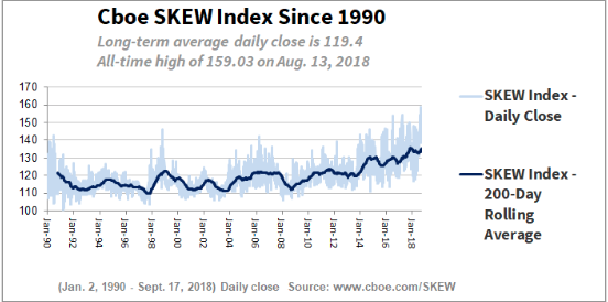
As one can see from the chart above, the average close for the SKEW Index is 119.40. So with the SPX retesting the October lows, would you expect to see the SKEW Index higher, the VIX higher. The following chart shows the current closing reading of the SKEW Index.
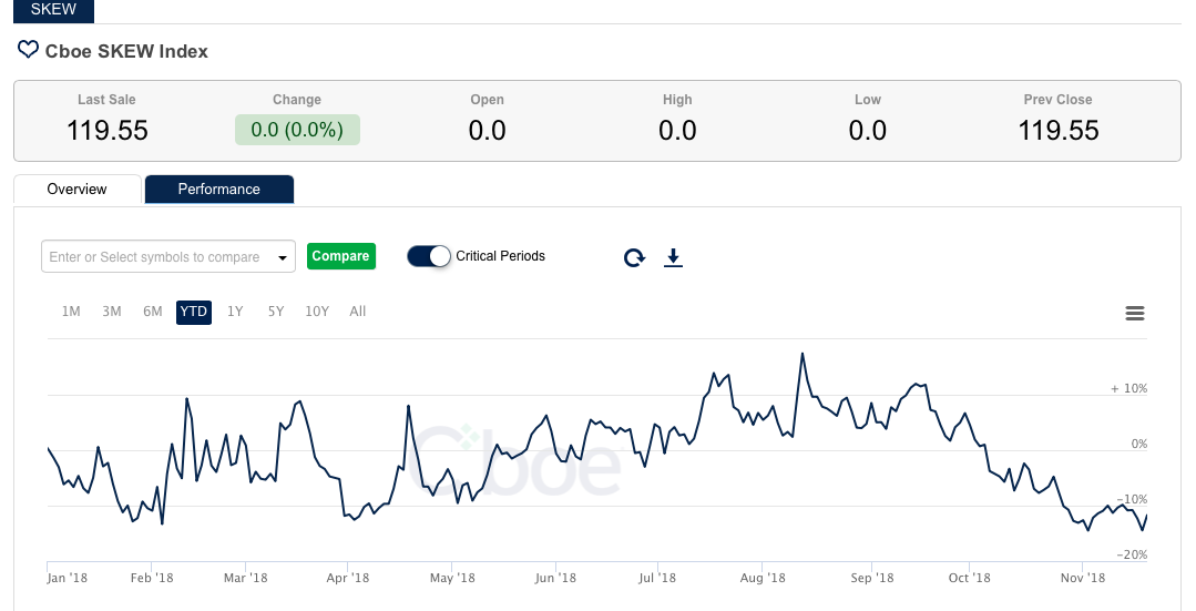
Pretty cool huh? That’s right; the SKEW Index is presently reading 119.55 right near the long-term average closing. This basically indicates only modest tail risk, but nothing out of the ordinary. It’s even significantly lower than the September period. Speaking of September, the period leading up to the October-present correction for the SPX, let’s minimize the duration of the SKEW Index chart to see what SKEW was telling us back in September.
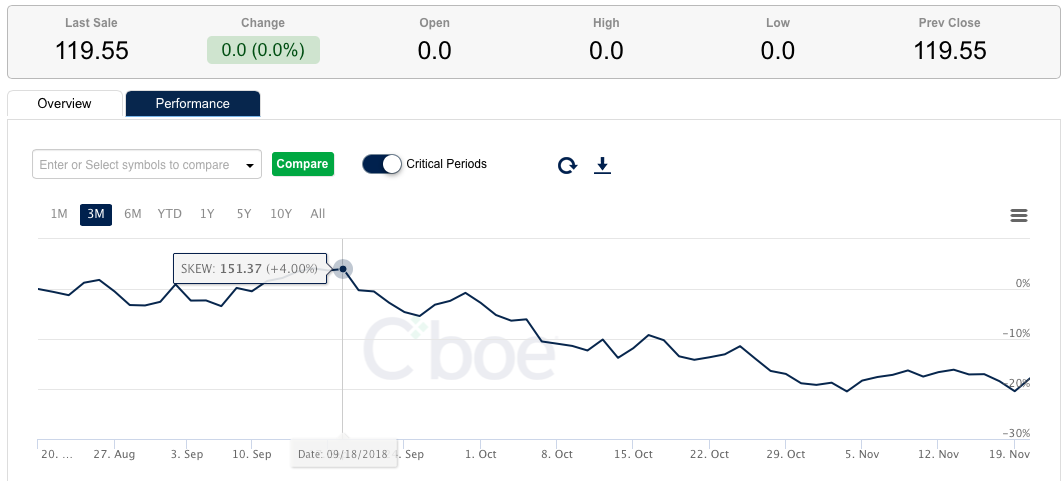
The SKEW Index chart above from September-present shows the peak level of SKEW occurred around 151 in mid-September. Additionally, SKEW had remained elevated and achieved a record high on August 13, 2018 at 159. The SKEW Index was definitively warning that something was coming to the general market in September, but since has plunged to its long-term average. A warning is not necessarily a crystal ball as warnings rarely come to fruition. In looking at several months and present levels of the SKEW Index we conclude that tail risk to forward returns, despite the declines in the S&P 500, are not at extremes. This correlates to why the VIX, while elevated since October, is also not expressing extremes. The SKEW Index and VIX are somewhat similar images of the psychology of the market or gauges of implied fear in the market.
Another variable we consider when drawing conclusions about the VIX and current or future readings for the VIX is by analyzing the Volatility of Volatility Index or (VVIX). So what exactly is VVIX? Again, for the best verbiage to define VVIX we turn to the CBOE.
The VVIX is a volatility of volatility measure in that it represents the expected volatility of the 30-day forward price of the VIX. It is this expected volatility that drives the price of VIX nearby options. The VVIX is calculated from the price of a portfolio of liquid at- and out-of-the-money VIX options. The calculation method is the same as for the VIX. CBOE also calculates a term structure of the VVIX associated with different VIX option expirations. In contrast to the VIX, the VVIX derives its value/reading from VIX options, not S&P 500 options; this is an important distinction for newcomers. VIX derived from .SPX options, VVIX derived from .VIX options.
Based on the construction or underlying of VVIX, it tends to be used as a leading indicator of future VIX levels. It mirrors the movement of the VIX itself but peaks and declines, usually, before the VIX ensues its decline. Based on this understanding, recent movement in VVIX has indicated that the VIX “isn’t to be bought” or the VIX isn’t finding outsized fear even as SPX retests its October lows. How do we draw this conclusion? Firstly, let’s understand that the average reading of VVIX is 86 and ranges between 60 and 145. Since the flash crash of 2010, however, VVIX has very rarely dipped below 80. As such, we tend to consider a reading below 100 as expressing modest or median fear in the market.
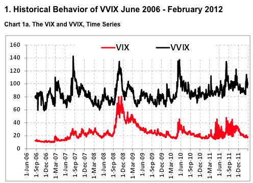
The chart above is of the VIX and VVIX, showing they’re very much correlated moves, as one would assume and based on their definitions and inputs. As noted above, we stated that VVIX tends to be a leading indicator of the future move in the VIX, very near future. Can that be seen in charts you might be asking and what should I be looking for? The chart below answers that question with a resounding YES!
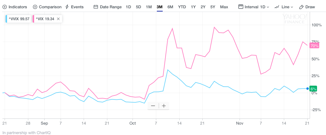
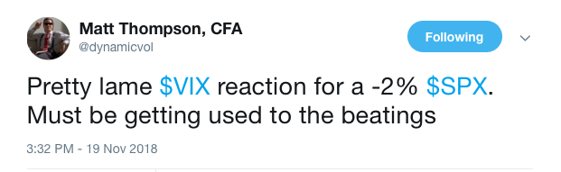
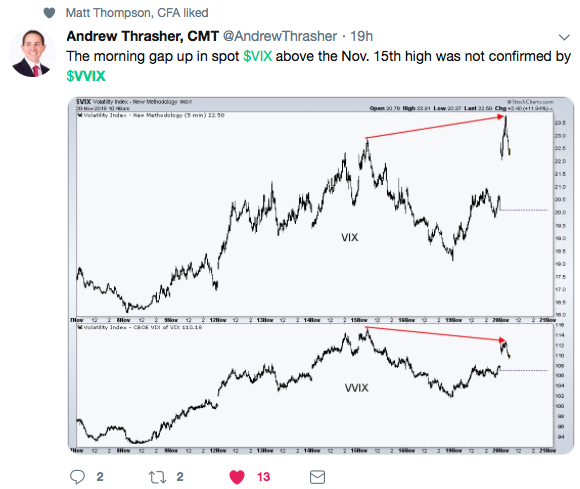
As one can see from the chart above of VIX (purple line) and VVIX (blue line), the VVIX peaks or points slant more to the left and lean left through its decline when compared to the VIX, which tends to peak in a more direct/straight manner and decline in a similar, direct manner. The chart above defines why many traders and investors who participate in the VIX complex maintain a watchful eye on VVIX to “confirm” moves in the VIX itself. The following tweet from Andrew Thrasher of Thrasher Analytics is an example of how market participants draw conclusions on the VIX from what VVIX is reading/leading.
Why is this all relevant? As we began this article, we aimed to explain why the VIX hasn’t reached its prior October peak level even as SPX has reached its October low level. A simple explanation would be that hedging via VIX options and SPX options haven’t taken place to the degree it had been leading up to the October SPX lows. But that would mean very little without the additional context and definitions as to what equates to the overall VIX level. In short and recently, investors have greatly deleveraged and, therefore, there is less hedging via SPX options in need. Brokerage cash account levels are elevated, which indicates there is money on the sidelines, unaffected from the recent market sell-off and rise in volatility. As such, less capital invested is in need of protective hedging.
Tom Peterffy, billionaire founder of Interactive Brokers, told CNBC in October that he may soon change his bearish tune about the stock market. Peterffy, who turned negative on stocks in June, said right now his firm's customers have more than $50 billion of idle cash in their accounts, calling it a historic high.
"That enormous pile of cash is there waiting to come into the [equities] market," Peterffy said on "Squawk Alley."
Moreover, we can also look at brokerage margin debt to see what investors are or have been doing with respect to the overall market performance and how that lends itself to volatility in the market. What is margin debt? Margin debt is debt a brokerage customer takes on by trading on margin. The portion the investors borrow is known as margin debt; the portion they fund themselves is the margin, or equity (not to be confused with the securities the customer is trading, which may themselves be equities).
Margin debt always climbs as the market (SPX) climbs. Margin debt falls as the market falls. As such, the historic chart of margin debt and SPX looks like the following chart of the two…
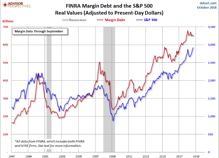
What investors should consider is what margin debt and cash on the sidelines, as depicted from Tom Peterffy of Interactive Brokers, is telling us and how it relates to the VIX. To draw a conclusion we offer the following chart from Ed Yardeni of Yardeni Research.
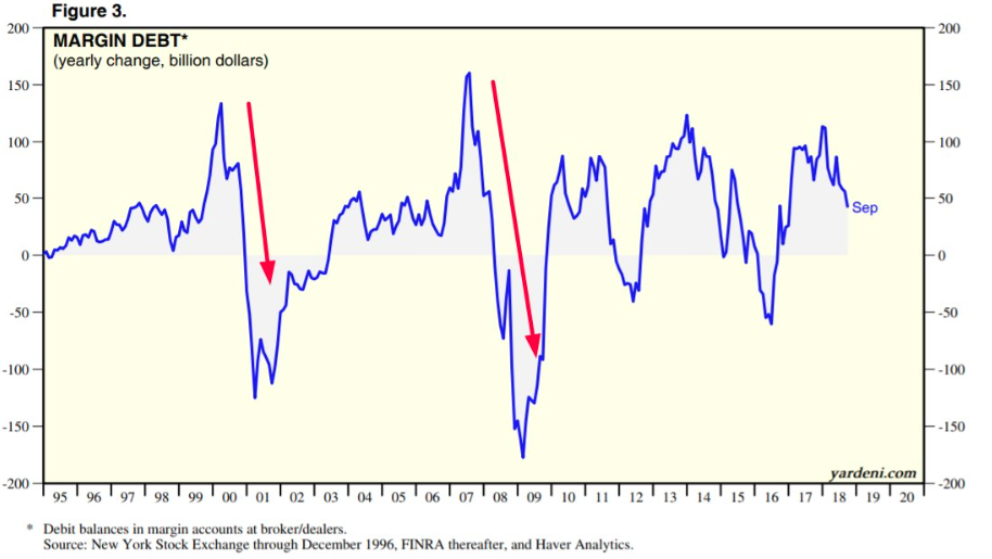
As one can see, since January of 2018, margin debt has actually fallen for the better part of the year. Typically before bull market tops, you get a surge in margin debt growth. That has not occurred as of yet. We haven’t achieved new highs in margin debt, as we saw prior to the dotcom peak and Great Financial Crisis peak. Maybe this time will be different; it would otherwise have to be if we don't see new highs again. But more importantly, as it relates to the VIX and volatility trading, margin debt levels validate that traders have already deleveraged since January 2018 and more recently in the latter parts of Q3 2018. Less invested capital and more cash on the sidelines equates to less hedging, less invested capital demanding hedges and a lesser VIX reading than there would otherwise be if the aforementioned variables were present in the market. Lastly, if you’ve been wondering why we haven’t seen that panic “flush” of selling pressure in the market during this correction period (something many suggest has to happen to signal a bottom), well, there you have it. That doesn’t mean it can’t happen in the near future, but the orderly sell-off that we’ve experienced during the present correction period is explained within this narrative to some degree, at least.


