Which States Did The Best Or The Worst During The Coronavirus Pandemic?
For most Americans, the coronavirus pandemic has had two dimensions. The first dimension involves the excess deaths per capita recorded during the pandemic. The second dimension involves the direct economic impact from how people and governments responded to the pandemic, which for many, meant job losses.

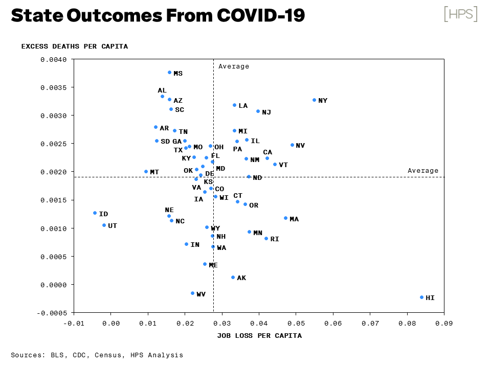
The analysts of Hamilton Place Strategies came up with a way to visualize both dimensions for all 50 states in a single chart. Here it is!
The chart indicates each state's COVID deaths per capita on the vertical scale, and each state's job loss per capita on the horizontal scale. By showing the national averages for both dimensions, it divides the 50 states into four quadrants.
The lower left hand quadrant is the best one in which to find your state. The states in this sector experienced both low rates of COVID deaths and low levels of job lossses during the pandemic. The best performing states are those that are furthest away from the intersection of the national averages for COVID deaths per capita and job loss per capita, where Idaho, Utah, and West Virginia having the best outcomes (Idaho and Utah with respect to job losses, West Virginia with respect to COVID deaths).
By contrast, the states in the upper right hand quadrant experienced the worst outcomes. Here, the combination of high COVID death tolls and high job losses indicates poor performance. Once again, the states furthest away from the intersection of the national average COVID death toll and job losses are the ones who ranked the worst.
Here, we find four states performing worst than almost all others. Louisiana, New Jersey, Nevada, and New York were the worst performing states in the U.S., with New York having by far the worst outcome of all states for both measures.
States falling in the other two quadrants had mixed outcomes, with high rates of COVID deaths per capita combined with lower than average job losses per capita, or vice versa.
With respect to COVID deaths per capita, Mississippi had the worst outcome in upper left quadrant. For the measure of job loss per capita, Hawaii had the worst performance in the lower right quadrant.
All in all, it's a neat bit of analysis. We wish we had thought to frame the data this way!
Disclaimer: Materials that are published by Political Calculations can provide visitors with free information and insights regarding the incentives created by the laws and policies described. ...
more


