
Where Do Things Stand Now?
To be sure, it is rare to see the mood of the market swing from the depths of despair seen on Christmas Eve to the "happy days are here again" feeling of last week in such a short period of time.
To review, starting December 3rd, stocks began moving down - in a straight line - with the S&P 500 falling -15.23% in just 15 days. Then, in an abrupt change of heart, the index rallied +13.59% in the ensuing 17 days. Talk about a mood swing!
So, over the 32 trading days spanning December 3, 2018, through January 18, 2019, the S&P 500 traveled a total of 28.8%, which is a pretty impressive feat. Oh, and in the process, the recent rally erased the vast majority of the December debacle. Wow.
Looking at the action from a longer-term perspective, we see that the S&P fell -19.8% from the high-water mark set on September 20, 2018, through December 24, 2018 - and has since proceeded to recover a little more than half of the overall decline.
S&P 500 - Weekly
(Click on image to enlarge)
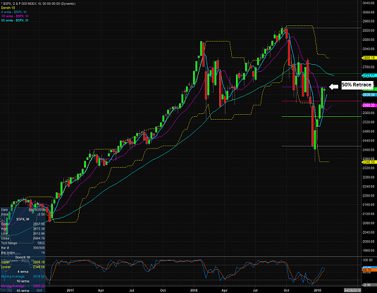
Given the intensity of the relentless decline and then the impressive bounce to the upside, which wound up triggering some "breadth thrust" buy signals along the way, the question of the day is, what the heck is going on and where do we stand now?
Trying to predict what happens next in Ms. Market's game can be challenging at best. So, instead of attempting to guess what comes next, I have been focusing on getting a handle on the meaning of the recent action. My thinking is that if I can come to understand the "why" behind these volatile moves, I can then look at history to try and find similar situations, which, might provide a clue in terms of what to expect next.
Thus, the first question we need to get our arms around is...
Why The Decline?
As we've discussed a time or two already, I believe there were three primary drivers to the market's dance to the downside. First and foremost was the fear of a Fed "overshoot" - i.e. fear of the Fed tightening monetary conditions too far and pushing the economy into recession. And lest we forget, the Fed actually has a long history of doing just that.
Next, there was the fear that the President's trade war with China would become prolonged. The big fear was the tariffs, which, as the textbooks tell us, are really just a tax on consumption, would wind up counteracting the good stuff that the tax stimulus had provided and the U.S. economy would wind up in recession.
And finally, there was the fear that the slowdown of corporate earnings and global economic growth would wind up gaining momentum to the downside, with the end result being, yep, you guessed it; a recession in the U.S.
So, despite the economic models I follow suggesting very little chance of a recession occurring in the good 'ol USofA, the fear was that the end of the current economic expansion might be artificially induced by these "policy missteps." And with the yield curve inching ever closer to inversion, the really big fear was that our policymakers were about to shoot themselves in the economic foot.
All About Fear
To be clear, the common denominator to all three issues here is the word "fear." Not the fear of what was actually happening in the economy or in corporate America, but rather the fear of what "might" happen in the future. And in my experience, this is the worst kind of fear as it allows traders to extrapolate the worst without any pesky evidence to back up the trade.
In my humble opinion (and with the aid of a healthy dose of hindsight), it appears that the December drubbing was a classic example of a fear-based, panic event. Aka a market freak out. So, with no real news to refute the Negative Nancy narrative and the algos all doing the same thing at the same time, WHOOSH, down prices went.
A Possible Historical Reference
In looking back at the various declines I've been a part of since 1980, I find the environment that most closely resembles the current fear-based situation was that of 2011.
If you will recall, during the summer of 2011, markets were fretting mightily about several issues including the latest iteration of the Greece/European Banking Crisis and, perhaps more importantly, the rating downgrade of U.S. Government debt.
The key here was that, as I believe is also the case today, the fear of what "might" happen in response to these dueling debacles was the primary driver of the action. And while we all know that history never repeats exactly, it does, as the saying goes, oftentimes rhyme.
On that note, take a look at the chart below from Nautilus Investment Research comparing the 2011 market action (the black line) with the current movement of the S&P 500 (the red line).
(Click on image to enlarge)
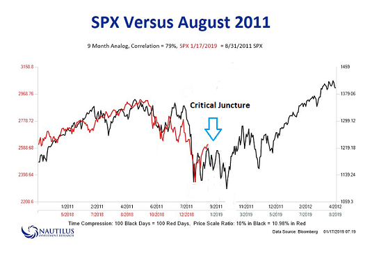
While clearly not a perfect correlation match (79% to be exact, according to Nautilus), the price action does appear to be largely similar. Thus, I'm going to opine that we've got a possible historical "rhyme" going here - well, through 1/17/19 anyway.
For me, the key takeaway from this analysis is what happened next in 2011. To review, the market first declined on the fear of all the bad stuff that might happen. Then the downgrade news broke, and the market flushed lower. From there, the indices enjoyed a couple of bounces, which were followed by a series of "retests." Then eventually, the secular uptrend resumed - and the major stock market indices went on to new highs.
One of the key differences today is that we don't have a singular "event" that created what is known as a "bad news panic." No, what we have today is what I will call a "Trifecta of Fears," two of which are tied to decisions and the news.
The good news is that two of the fears appear to be "resolved" or are at least on their way to being resolved. Hence the bounce back in stock prices.
As everyone knows by now, the Fed appears to have gotten the message from the markets and has blinked. In short, traders expect the Fed to now be "on hold" with regard to their rate hiking campaign and to be reasonable regarding their ongoing balance sheet reduction plans.
In addition, based on the news flow, the market appears to be positioned for a trade deal to get done with China in the near-term.
From my seat, the resolution of these two fears "explains" the 50% rebound in stock prices. The next question is, of course, where do we go from here?
Critical Juncture
As I pointed out on the chart above, it looks to me as if the market is currently at a critical juncture. As in, is it time for a retest phase or will the bulls simply continue to power ahead from a "V Bottom?" To help answer the question, I think it is important to note that there are a couple of near-term deadlines that could help confirm the current narrative, which assumes that everything will be fine.
First up is this week's FOMC meeting. Nobody expects any movement on rates. But it is fair to say that traders DO expect the recent dovish commentary regarding both the path of rates and the balance sheet runoff to continue. Anything to the contrary could be greeted with selling.
Next up in the Captain Obvious category is the March 1 deadline for a deal to get done with China. Thus, the headlines here are likely to create some volatility between now and then as the administration continues to negotiate through the press. But the key is the market appears to be in the process of pricing in a positive outcome. And again, anything substantive to the contrary could be problematic.
And finally, there is the #GrowthSlowing issue, both in terms of earnings and GDP growth. So far, the current earnings parade is being viewed "pretty good" due to the fact that the results have not been as bad as feared. This may be due to the fact that the Consensus GAAP EPS Estimates for 2019 have been knocked down more than 10% from where they stood last summer ($171 versus $153 - source Ned Davis Research). Thus, it appears that analysts have been busy pricing in the slowdown.
For the record, the consensus estimate for S&P 500 GAAP EPS growth for 2019 currently stands at 9.9% and the consensus estimate for S&P Operating Earnings growth is at 8.1%. The question is if the estimates have been reduced enough to reflect reality. We shall see.
In addition, now that the government is up and running again (at least for a while, anyway), the flow of economic data will resume tout suite. From my seat, it is safe to say that each report will be heavily scrutinized and that any evidence suggesting that economic growth is slowing more than currently expected will be met accordingly.
The Takeaway
While merely one man's opinion on the subject, my takeaway from the recent market action is that the current rally has undone or "corrected" a healthy portion (50%) of the overall decline (or viewed another way, the entirety of December's drubbing) in response to the worries over the Fed and Trade being "solved" or, at the very least, reduced.
Going forward, I believe traders will be pricing in the issue of growth slowing. And for that, we will need to see the data. Game on.
Weekly Market Model Review
Now let's turn to the weekly review of my favorite indicators and market models...
The State of the Big-Picture Market Models
I like to start each week with a review of the state of my favorite big-picture market models, which are designed to help me determine which team is in control of the primary trend.
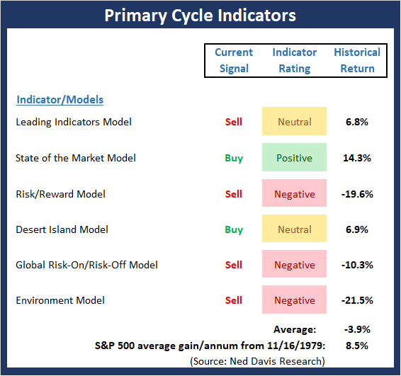
The Bottom Line:
- For the fourth week in a row, there is an important change on the Primary Cycle board - this time, positive. Last week, I wished for some green on the board in the Indicator Rating column. So, it is encouraging to seek the State of the Market Model - which measures the technical status of the primary cycle - move up into the positive zone. However, it is important to recognize that technical models have been "fooled" fairly often in recent years and that, overall, the board leaves a lot to be desired.
This week's mean percentage score of my 6 favorite models improved to 47.8% from 41.9% (2 weeks ago: 46.1%, 3 weeks ago: 40.3%, 4 weeks ago: 36.5%) while the median rose to 45% from 40% (2 weeks ago: 55%, 3 weeks ago: 50%, 4 weeks ago: 44%).
The State of the Trend
Once I've reviewed the big picture, I then turn to the "state of the trend." These indicators are designed to give us a feel for the overall health of the current short- and intermediate-term trend models.
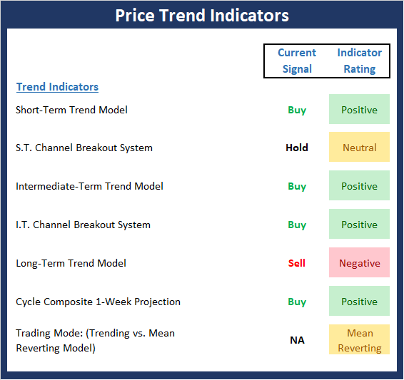
The Bottom Line:
- There can be little argument that the stock market's trend has improved as both the short- and intermediate-term trend models are now rated as positive. However, from a near-term perspective, prices appear to have paused. And from the long-term point of view, there remains a fair amount of work to do before the bulls can claim control of the game again.
The State of Internal Momentum
Next up are the momentum indicators, which are designed to tell us whether there is any "oomph" behind the current trend.
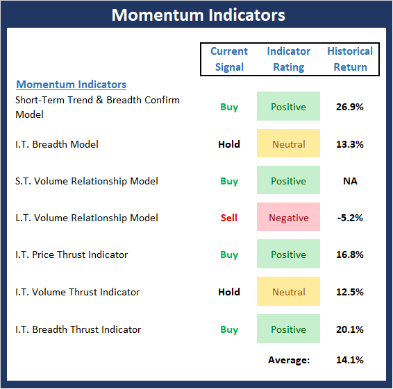
The Bottom Line:
- The Momentum board continues to improve as this week, the Short-Term Volume Relationship Indicator flashed a buy signal and improved to positive. And while the Long-Term Volume Relationship indicator has yet to do the same, the reading is very close to turning green. It is also worth noting that the average historical return of the board is now well above the historical norm.
The State of the "Trade"
We also focus each week on the "early warning" board, which is designed to indicate when traders might start to "go the other way" -- for a trade.
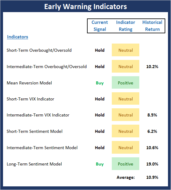
The Bottom Line:
- Stocks remain overbought from a short-term perspective and as I mentioned last week, almost any decline will trigger a sell signal from our s.t. overbought/sold model. The bottom line remains the same; stocks are ripe for a pullback. However, it is also very important to remember that when a market reaches an overbought condition and then stays overbought for an extended period of time, it is a positive.
The State of the Macro Picture
Now let's move on to the market's "environmental factors" - the indicators designed to tell us the state of the big-picture market drivers including monetary conditions, the economy, inflation, and valuations.

The Bottom Line:
- Despite the rather violent price action seen over the past few months, the External Factors board is actually in pretty good shape. And while I wouldn't call the current status of the board overwhelmingly bullish, green does appear to be the dominant color. As such, the odds would appear to favor the bulls from a macro perspective. However, the news cycle is likely to continue to drive the action from a near-term point of view.
Disclosure: At the time of publication, Mr. Moenning held long positions in the following securities mentioned: none - Note that positions may change at any time.
The opinions and forecasts ...
more

