
When Does A 9-Week Market Rally Produce Fear Amongst Investors And Why?
It’s not often that such a market rally, now nearly 2 months in the making, can frighten investors, but this particular rally has served to uncover some strange happenstance when we look under the hood. With the FOMC/Fed on the sidelines and a China/U.S. trade deal seemingly on the horizon, the market fundamentals will eventually have to stand on their own accord and strength or fall due to their weakness.
Last week proved a rather uneventful week, even with the FOMC minutes released on Wednesday afternoon. The S&P 500 (SPX) didn’t move all that much last week, barely 15 points higher and well within the $35/point weekly expected move. The S&P 500 was up a scant .62% last week and is up roughly 11.5% year-to-date. Probably most importantly is that the benchmark index has rallied nearly 18% since the 2018 Christmas Eve bottom and is within 148 points of its all-time high (As of Friday's close). The S&P 500 is now higher in 8 of the last 9 weeks and has moved higher with record-setting breadth. The NYSE Advance/Decline (AD) line made another new all-time high this past week. The following chart is of the SPX (top) and the NYSE A/D line (bottom).
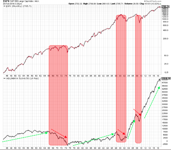
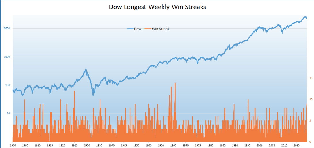
This is a very good sign, as market breadth tends to lead stock prices. Also, breadth breaks down ahead of major market peaks. Moreover, the Dow Jones Industrial Average (DJIA) index also broke above 26,000 for the first time since early November and posted its 9th consecutive weekly gain, its longest streak since May 1995.
I usually care very little for the Dow and its movement as it holds just 30 stocks, but something interesting has happened inside of the Dow that has forced me to recognize the liquidity that I had thought would prove favorable for equities in Q1 2019, really isn’t what has driven the market place. I'll get into that force factor in a bit, but in studying the breadth of the market rally I'm are also forced to discuss what are overbought conditions and the statistical probabilities for the market going forward.
“Yes, stocks are quite extended near -term,” explained LPL Senior Market Strategist Ryan Detrick, “but historically, extended markets have tended to deliver continued outperformance over the next several months.”
In suggesting that the S&P 500 is overbought, I look at the number of stocks that are trading over their 50-DMA. Recently 90% of stocks within the index, which was one of the highest readings ever, have cleared their 50-DMA.
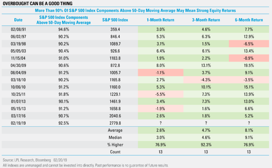
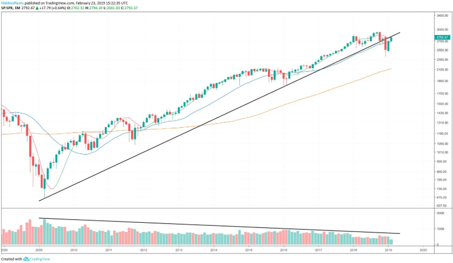
As depicted in the table above, after 90% of stocks in the S&P 500 go above their 50-DMA, their 1-, 3-, and 6-month returns actually have shown continued strength. In fact, three months after hitting that 90% mark, the S&P 500 has been higher 12 of the previous 13 times going back to 1990. Given the historical context, there is such thing as “favorable overbought conditions”. But will history be a guide for the current market rally; this remains to be seen. Many statistical probabilities proved faulty in 2018. And that brings us to a critical test for the S&P 500, as shown in the chart below from The Lyons Share.
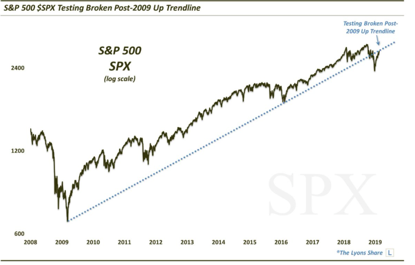
The chart above gives us a longer-term perspective on what has already occurred within the S&P 500, as it broke below a long-term trend line. From that vantage point, we are forced to recognize one of two things, if not both. 1. A broken trend line often proves a bearish signal. 2. Breaking back above the trend line would likely serve to validate that a new bull market began recently. With some historical and technical context to the S&P 500 and Dow rally YTD, what about those ever-important fundamentals?
Economic Fundamentals
Unfortunately, much of the economic data being released in 2019 has an element of unreliability and incompleteness to it and due to the government shutdown. Nonetheless, the delta we can surmise within the data being released suggests a slowing economy both abroad and domestically.
Global economic data continues to slide amid waning demand. Markit’s Eurozone Purchasing Managers’ Index (PMI) slid to 49.2 this month, the first time manufacturing activity in the region has fallen into contractionary territory (below 50) in five years. Markit and Nikkei’s Japan manufacturing PMI also slid to the lowest in more than two years. Separate data showed Japanese exports declined 8.4% year over year in January. Exports to China were particularly weak, falling 17.4% year over year. We continue to expect economic and earnings growth in foreign developed markets to trail those of the U.S. and emerging markets (EM), and we continue to prefer exposure to U.S. and EM equities over developed international stocks.
One of the more concerning data points issued in the past week was from the Philly Fed. The Philadelphia Fed manufacturing index in February dropped sharply into negative territory. The index fell to a seasonally adjusted reading of -4.1 from 17 in the prior month. This is the first negative reading since May 2016.
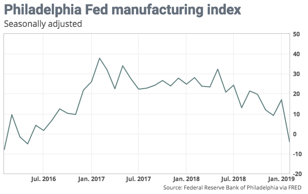
Below the headline, the indexes for new orders and shipments dropped into negative territory. The employment indicator remained positive. Firms were generally optimistic about the outlook for the next six months. The question remains as to why the employment indicator and sentiment remained positive? I’ll answer that question shortly.
The sharp drop in the monthly index fits with other manufacturing data suggesting the U.S. is now succumbing to the global industrial downturn. The Empire State index rebounded in February but remained close to a two-year low. The flash U.S. manufacturing PMI fell to the worst level in 17 months.
“We read the sharp drop in February orders and shipments alongside a modest inventory build as likely reflecting the effects of the government shutdown...and the concerns about the budget process that could have led to a second shutdown in February. If so, we could expect a rebound in current conditions in March,” said Michael Gapen, chief U.S. economist at Barclays.
In studying and analyzing the shortcomings in the manufacturing data sets I was moved to look at the actual factory orders and shipment data provided by the Census Bureau.
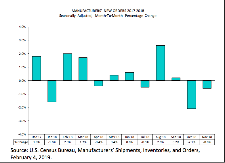
What is depicted in the chart above is rather anomalistic in nature and a direct effect of the implemented/levied U.S. tariffs on Chinese goods. It was in July 2018 that the U.S. began collecting tariffs on a wide range of Chinese goods. The tariffs forced many vendors to front-load orders and as such we discover the outsized durable goods orders in August 2018, which rose roughly 4.5% during the period. Since that time and in each successive month, orders have been on the decline.
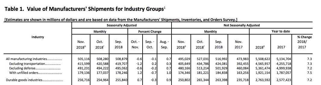
Given all that we’ve laid before you with empirical evidence, we can now understand why the inner components of the Philly Fed manufacturing index have remained with a positive outlook and as a U.S./China trade resolution is assumed on the horizon. But most importantly is that while some of the manufacturing data has been declining on a month-to-month basis, it’s important to note that orders, actual orders on a YOY basis, continue to rise. (See factory/durable goods orders table below)
The last chart suggesting the manufacturing data sets are concerning, but manageable and seeking resolution on trade disputes comes via the Baltic Dry Index. Global shipping rates are under pressure. The Baltic Dry Index is close to its lowest level since August 2016.
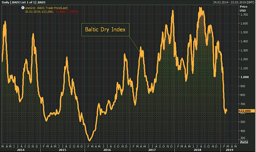
But as we can clearly see within the chart, much like factory orders spiked in August, so did the Baltic Dry Index. This was all front loading orders folks, all front loading. But it proves amazing that such outsized orders and rates from August are so easily forgotten and the tariff implementation that caused such orders and rates have been dismissed now with both manufacturing slowing and rates near 2016 levels.
With respect to economic data points of consideration and their lacking for completeness, the Leading Economic Indicators data was delivered in the week that was. Economic conditions in the U.S. fell in January and reflected a recent slowdown in growth, but there was a catch: The latest results were incomplete because of the recently ended government shutdown.
The leading economic index slipped 0.1% in January, the privately run Conference Board said Thursday. It was flat in December and rose 0.1% in November.
“The decline in the leading index stemmed mostly from an increase in initial jobless claims and “weaknesses in the labor market,” said Ataman Ozyildirim, director of economic research at the privately run board.
Based on preliminary data, the US LEI declined very slightly in January and December’s decline was revised up to no change,” said Ataman Ozyildirim, Director of Economic Research at The Conference Board. “In January, the strengths in the financial components were offset by the weaknesses in the labor market components. The US LEI has now been flat essentially since October 2018. The Conference Board forecasts that US GDP growth will likely decelerate to about 2 percent by the end of 2019.”
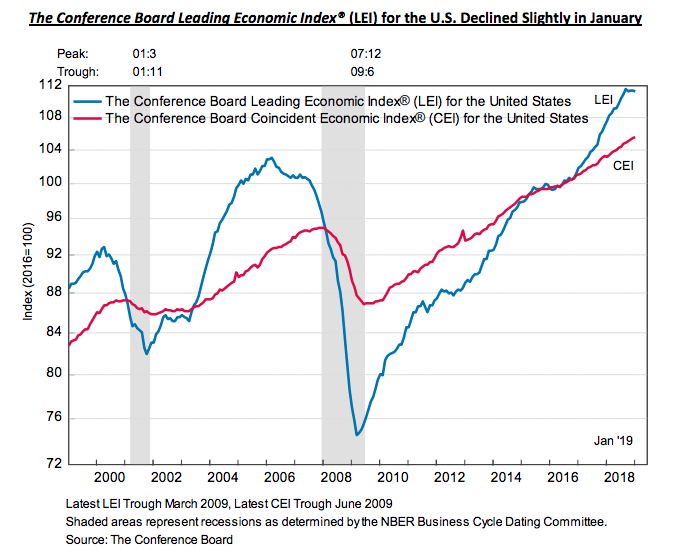
The report contains a notable caveat, however. Three of the 10 components — building permits and new orders for consumer and capital goods — were missing due to the 35-day partial federal shutdown. The impasse delayed a slew of government reports on the economy. What’s more, the government on Thursday said jobless claims sank by 23,000 to 216,000, returning close to pre-recession lows.
This coming week there is a litany of housing data. In addition to the housing data we’ll get a look at Personal Income and Expenditures (PCE) data, the most heavily relied upon by the FOMC with respect to their gauge of inflation in the economy. Since the summer of 2018, most inflationary data has ticked lower. On Thursday, FOMC Chairman Jerome Powell will be testifying before Congress as Q4 GDP rolls in. This may prove market-moving not only as the Powell led FOMC has committed some errand messaging in the past, but as Q4 GDP estimates have been revised lower of late. As shown in the graphic below, the Atlanta Fed GDPNow estimate of Q4 2018 has come down from 2.7% only two weeks ago to just 1.4% presently.

Much of the lowered forecast came on the heels of a severe drop in December 2018 retail sales disseminated by the Census Bureau. Many economists and analysts have scrutinized the retail sales data, suggesting it is either incomplete and/or should be revised higher in the sequential release.
S&P 500 Earnings Estimates Decline Further
According to FactSet, for the 1st quarter the S&P 500 is projected to report a year-over-year decline in earnings of 2.7%, but year-over-year growth in revenues of 5.2 percent.
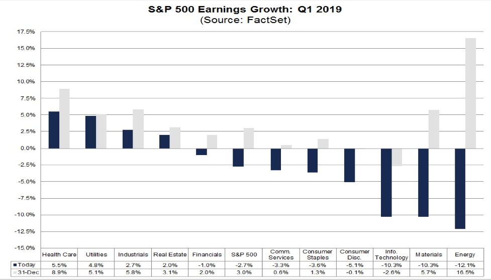
Given the dichotomy in growth between earnings and revenues, there are concerns in the market about net profit margins for S&P 500 companies in the first quarter. What are the expectations for net profit margins for the S&P 500 for Q1?
The estimated net profit margin for the S&P 500 for Q1 2019 is 10.8 percent. If 10.8% is the actual net profit margin for the quarter, it will mark the first year-over-year decline in the net profit margin for the index since Q4 2016. It will also mark the lowest net profit margin reported by the index since Q4 2017.
It is interesting to note that analysts expect the index to report higher net profit margins over the next few quarters. Based on current earnings and revenues estimates, the estimated net profit margins for the next three quarters (Q2 2019 through Q4 2019) are 11.5%, 11.9%, and 11.7%, respectively.
Looking ahead, analysts predict:
- For Q1 2019, analysts are projecting a decline in earnings (-2.7%) and revenue growth of 5.2%. For Q2 2019, analysts are projecting earnings growth of 0.7% and revenue growth of 4.7%.
- For Q3 2019, analysts are projecting earnings growth of 2.2% and revenue growth of 4.5%.
- For Q4 2019, analysts are projecting earnings growth of 8.8% and revenue growth of 5.4%.
- For CY 2019, analysts are projecting earnings growth of 4.5% and revenue growth of 4.9%.
- The forward 12-month P/E ratio is 16.2, which is below the 5-year average but above the 10-year average.
- During the upcoming week, 39 S&P 500 companies (including 1 Dow 30 component) are scheduled to report results for the fourth quarter.
When we consider net profit margins and earnings we can’t forget about sales and the strength of the U.S. Dollar, given that some 50% of corporate sales are generated overseas. When the dollar rises in value, the value of sales earned abroad (in foreign currency) falls. The chart below compares changes in the dollar (blue line; inverted) with growth in S&P sales (red line): a higher dollar corresponds with lower sales (from Yardeni).
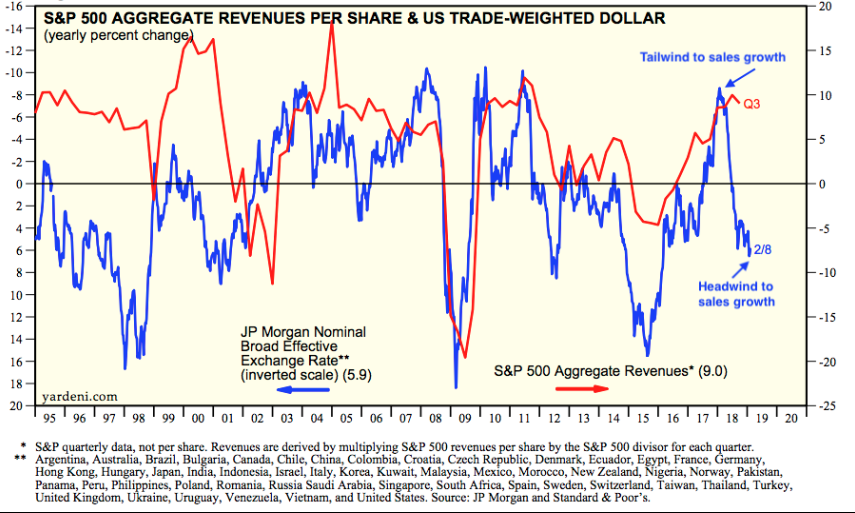
Unfortunately, on a YOY basis, the dollar hasn’t weakened enough to provide a tailwind for sales or net profit margins. The dollar is expected to weaken through the year, but turbulence and economic slowing in the Eurozone continue to buoy the U.S. Dollar Index.
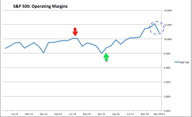
Unfortunately again, what we are witnessing in the overall earnings picture is a slowdown from what may have finally proved a peak in the earnings cycle during Q3 2018. Likewise, overall S&P profit margins are expected to come in at 10.8% in 4Q18, a decline from a high of 12.1% in 3Q18.
But even with the slowing of S&P 500 earnings estimates, the market has rallied significantly. Is it because of corporate buybacks? Some of this comes into play, but far less than is promoted by market pundits. As it pertains to buybacks, they make up a very small portion of EPS growth.
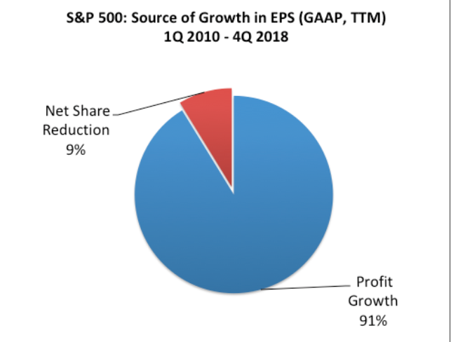
As shown in the pie chart above, over 90% of the growth in earnings in the S&P 500 over the past 9 years has come from better profits, not a net reduction in shares. And as we’ve mentioned before, this has been true over the past 17 years, during which the net change in corporate shares has accounted for just 3% of EPS growth (from JPM).
Even with the proof at-hand dispensing with the myth that the bull market has been dependent on corporate buybacks, I can’t dismiss that they do have a small role to play. With that, we recognize that buybacks have already been prolific in 2019.
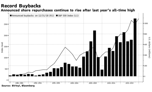
Seven weeks into the year, U.S. companies have announced plans to repurchase $140 billion of their own stock, up 28 percent from a year ago, according to data compiled by Birinyi Associates Inc. While the pace trails the 58 percent increase for all of 2018, it’s more than double the average rate seen during the past five years.
What’s Moving the Market Higher?
It has been a bit disturbing to see a positive correlation between the usual inverse correlation in stocks and bonds. As one can see in the chart below, the 10-year Treasury yield has moved inversely to the S&P 500, creating a “megaphone” technical pattern. Typically, when equities are in favor/rising, bonds are sold, thus yields rise.
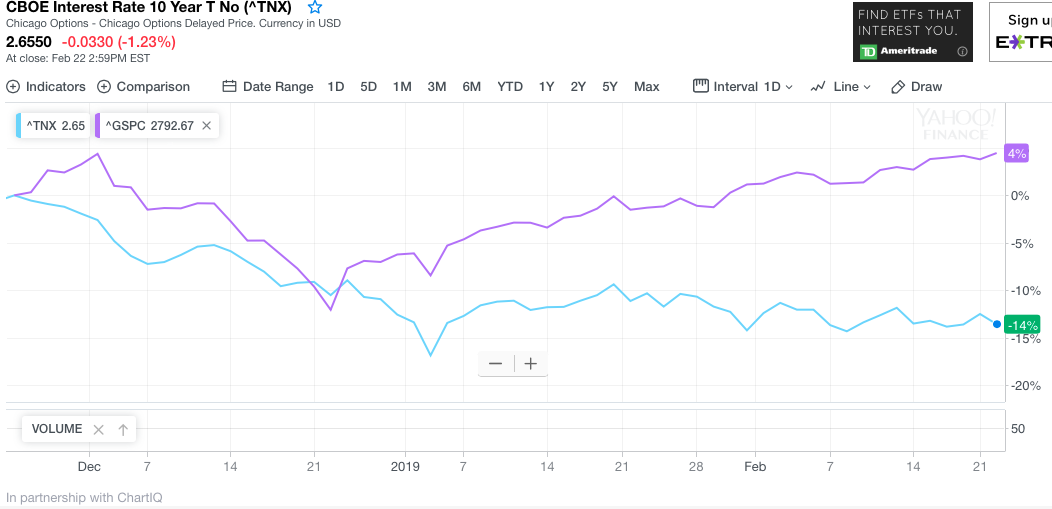
But as we can see in the chart, equities are rising while yields are falling, which usually signals that there is still much angst amongst investors and thus they are seeking a flight to quality or safety via bonds. Even as this has been commonplace in 2019, all 3 indices have rallied. It seems an enigma and thus bears more in-depth discovery.
While bonds are rallying with prices moving higher and equity markets off to their best start in decades, the Dow is actually leading the S&P 500 in terms of percentage gains year-to-date. And how is it doing this? Just five of the stocks of the Dow 30 have carried it back within reach of record highs. Boeing, IBM, United Technologies, Goldman Sachs and Home Depot have rallied double digits to start the year, contributing around 50% of the year’s gains to the price-weighted index. Boeing is up 30% all by itself.
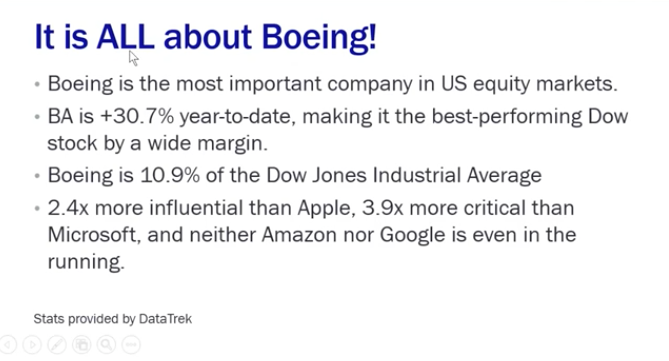
That term, price-weighted, is where we have been forced to focus our attention. It identifies the strength of Boeing (BA) shares performance and its relative importance to the entire market.
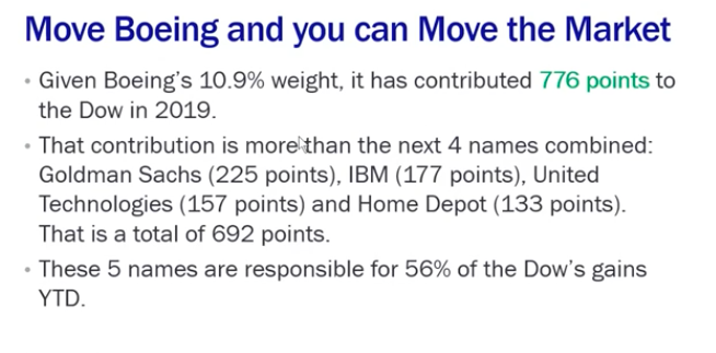
The fact is that there might be a group of firms out there in the fund “management sphere” that are simply so large they understand that if they target one of the most heavily price-weighted stocks in the market, they can essentially move the entire market. That means they cannot only move the Dow but the S&P 500 and Nasdaq (NDX ). If you can drive order flow into the 5 top weighted names in the Dow index you can essentially dictate order flow throughout the markets as an arbitrage activity.
Keep in mind that I have disseminated in the past that during the current market rally, there was no less consequential algorithmic trading at work. Given what we’re seeing in Boeing shares, the lack of supporting fund flows for equities YTD and the positive correlation between stocks and bonds, I suggest to continue to watch those 5 stocks mentioned and especially Boeing. This is not liquidity folks and as such bears caution. Speaking of those fund flows, take a look at the YTD chart of specific fund flows into index and bond funds.
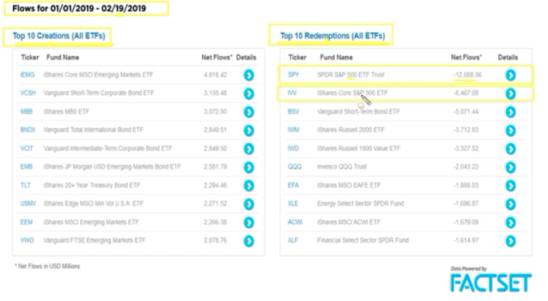
It’s clear from the table above that all of the major index ETFs has negative fund flows to date while emerging market funds and bond funds are capturing the inflows. But of late we have seen mixed inflows for the equity ETFs noted. Unfortunately, for the past week, outflows were once again the theme for equity funds.
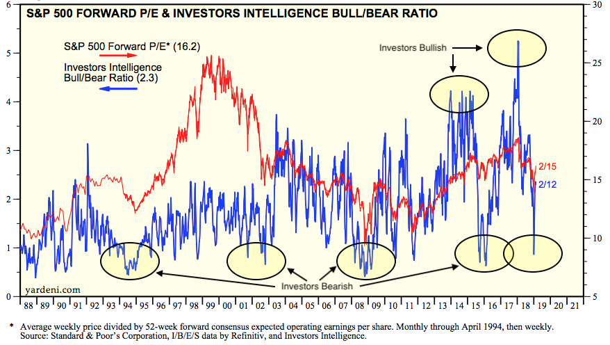
Fund flows are somewhat indicative of investor sentiment. Bullish sentiment is barely above its historical average of 38.5 percent. And if investors once again become overtly bullish, there is room for valuations to expand. When investors become bullish, valuations rise. Investors had been pessimistic in early 2016 and then became far too optimistic at the market peak in January 2018. Importantly, that was greatly reset by the end of December 2018 (from Yardeni).
Investor Takeaways
The S&P 500 is looking to achieve 2,800 this week after a somewhat uninspiring week that was, but with it edging closer to critically important level. The S&P 500 weekly expected move is only $29/points and now expressing very little fear in the market with the VIX falling below 14 to end the week.
If the VIX itself were an indicator of a bear or bull market, historically the fear gauge would suggest that we are still in a bull market. (See chart below provided by Urban Carmel)
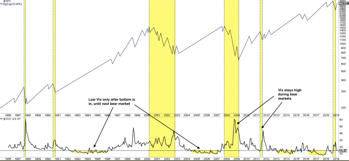
The VIX normally stays elevated during a bear market. Historically, the VIX has never fallen below 15 during an ongoing bear market in the past 30+ years or since the invention and implementation of the index.
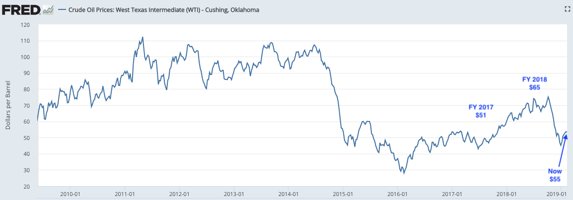
Earnings and net profit margins are sliding and this remains a key concern for the overall market performance in 2019 and as earnings guide the market over time. The oil sector is an important sector with respect to sales and earnings being viewed as a tailwind or headwind. The U.S. Dollar was weak in the first half of 2018; the strength of the U.S. Dollar is now a headwind in 2019. Similarly, the price of crude oil in 2018 was higher than it is in the first half of 2019 and now also a headwind to earnings and sales. Crude has some heavy lifting to do in order to climb back to at least $65 and it will likely take some improvement in global growth to do so.
With regards to Boeing, I encourage investors to understand that this stock is another cornerstone to the market presently and one that hopefully does not give way. Should that happen, it would likely create a vacuum effect in the market whereby investors more predominantly focus on the price of crude oil, the strength of the U.S. Dollar and of course fund flows. It’s a trader’s market out there right now folks! And if you think everyone is participating and there’s plenty of market liquidity beyond the preponderance of evidence already articulated, check out the chart below:
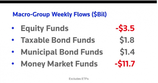
In 2018, the market experienced net outflows and in 2019 we’ve pretty much started off in the same fashion. As the market has trended higher, volume has trended lower (lower chart). This may be a sign of things to come or simply a shift in bond-equity ratios amongst fund managers whom largely believe the cycle is coming to an end. But that’s kind of the point and something that underlines a trader’s market.


