
Wage Inflation Isn't Coming, It's Already Here
George Soros has a great line that we’ve used a lot in Epsilon Theory notes. When he was asked how he could possibly have predicted what would happen when he famously “broke the Bank of England” in 1992, he replied: "I’m not predicting. I’m observing."
It’s the perfect catchphrase for the modern, narrative-savvy investor. It’s the perfect catchphrase for the Three-Body Problem market, where there is no algorithm for predicting markets (no closed-form solution, in the lingo), but only tools for calculating markets. Where there is no answer for successful investing. But there is a process.
I'm not predicting. I'm observing, and here’s what I am seeing: over the past four quarters, the United States has generated more wage inflation than at any point over the past 40 years. Seeing is believing, so here’s the chart of average weekly earnings (weekly earnings, not hourly) for Americans in private sector jobs from 1963 through today, measured quarterly.
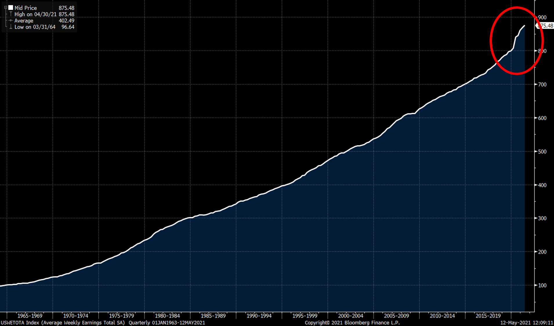
Bloomberg: US Average Weekly Earnings SA, Quarterly Jan 1, 1963 – Mar 31, 2021
And here’s the same data on a monthly basis over the past 14 years:
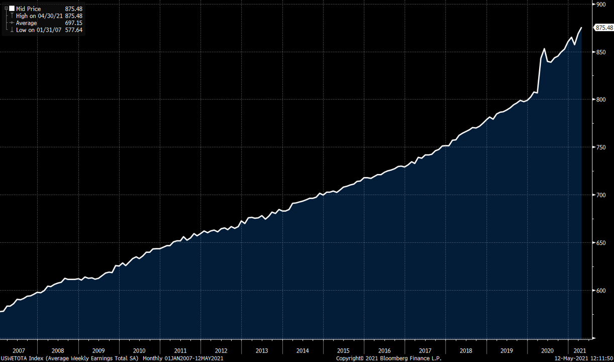
Bloomberg: US Average Weekly Earnings SA, Monthly Jan, 2007 – April, 2021
These are the facts. These are not predictions. This is what has already occurred.
- Q1 2021 wages were 7.7% higher than Q1 2020 wages.
- Q4 2020 wages were 7.7% higher than Q4 2019 wages.
- Q3 2020 wages were 6.2% higher than Q3 2019 wages.
- Q2 2020 wages were 6.5% higher than Q2 2019 wages.
These are also facts:
- Over the past 10 years prior to the past 4 quarters, the highest single quarterly year-over-year wage growth was 3.6% in Q4 2018.
- Over the past 20 years prior to the past 4 quarters, the highest single quarterly year-over-year wage growth was 4.5% in Q4 2006.
- Over the past 30 years prior to the past 4 quarters, the highest quarterly year-over-year wage growth was 4.8% in Q4 1997.
You have to go back 40 years – to Q3 1981 – to find a higher quarterly year-over-year wage growth number (+8.5%). This is not an anomaly. This is not a single quarter aberration. This is not transitory. This is four straight quarters of the highest wage growth numbers in 40 years. For those keeping score at home, the US inflation rate in 1981 was 10.3%.
Now I know what you’re thinking. You don’t believe me. Surely, you say, if this were true, we would have heard some mention of this not-in-forty-years wage growth phenomenon. I think I know why you’ve heard nothing about this. The reason no one recognizes that remarkable wage inflation has already occurred is largely because of the intentional 'cartoonification' of unemployment and wage data.
I’m using the word ‘cartoon’ in its technical sense here, as an abstraction of an abstraction. I’ve written about these cartoons of macroeconomic data in service to political ends quite a bit (in fact, earlier this week we published a note on the cartoon that is CPI). And here’s an extended money quote from an older note:
"In the beginning, there was a desire to model the employment patterns of the U.S. economy to help policymakers figure out what was actually going on. So in 1884, Congress established the Bureau of Labor Statistics (BLS) to do some counting and abstracting, and since 1915, the BLS has been surveying employers to estimate how many Americans are working and how much they’re being paid. On the first Friday of every month, the BLS releases its report on the real-world employment patterns in the U.S. for the prior month. This data is an abstraction, to be sure, full of seasonal adjustments and model estimations, but it is a first level abstraction. This is not the cartoon.
"One of the standard calculations that the BLS reports is the percentage change on a year-over-year basis in how much workers are being paid. Usually this wage growth report takes a backseat to the more famous 'jobs report' of how many jobs were added or subtracted from the U.S. economy in the prior month and the even more famous “unemployment report” (which is actually based on an entirely different survey) of the percentage of Americans who were actively looking for work but were unable to find jobs. But when everyone and his cousin is either worried about wage inflation or hoping for wage increases, then the wage growth 'number' takes on enormous importance. It’s the depiction and the narrative around the BLS wage growth calculation that is the cartoon. And that cartoon is everything for markets today.
"The most basic way to look at wages for a monthly report would be to count up how much all workers got paid in that prior month. But that doesn’t work for a month-to-month comparison because different months have meaningfully different numbers of days. Unless you’re getting paid on a monthly or twice-monthly basis, then you’re going to be making less in February than you are in January. So the BLS uses the work week as their basic apples-to-apples comparison basis.
"As far back as I can trace the theater of BLS reports — and that’s how one should think about these market data reports, as theatrical productions consciously designed to impact behavior — the 'number' that’s reported isn’t the apples-to-apples comparison of weekly wages. Instead, it’s hourly wages. Why? Because back in 1915 this is how most people got paid. The abstracted idea of hourly wages connects with people more than the abstracted idea of weekly wages. It’s a more effective tool for eliciting a behavioral response, so that’s why our theatrical effort focuses on it every month.
"But here’s the problem with the hourly wage abstraction. It requires introducing a new data estimation into the mix, one that has nothing (or at least very little) to do with the real-world concept we’re trying to represent, which is whether you’re taking home more money today than you did last year. That additional layer of abstraction is the average length of the work week.
"Now this data estimation changes very little from month to month. Unlike the difference in work days from month to month, which can be meaningful and is incredibly easy to measure, the difference in work hours from week to week is an immaterial and almost certainly statistically spurious estimation. Here are the average number of hours in the work week since 2012.

"Since 2012, the average length of the work week has been as low as 34.3 hours and as high as 34.6 hours. For more than six years, the maximum deviation from the mean has been less than nine minutes, less than one-half of one percent of the total work week. This is the flattest line you will ever see in any time series, and any month-to-month deviation from the mean is almost certainly a spurious statistical estimation. Meaning that the month-to-month differences in the average work week are so far inside your margin of error for this sampling and estimation process that you can have zero confidence that you are abstracting anything real. This is as bogus of an abstraction as you will ever see.
"And yet it makes all the difference in the world for hourly wage calculations. Why was the February wage growth number reported on March 9 as 2.6% rather than 2.9%? Because the average work week in February 2018 was randomly estimated as being six minutes longer than it was a year ago.
"Everything you read about what the March 9 wage growth number meant for your portfolio — the entire Goldilocks narrative of a 'contained' wage inflation number combined with strong job growth — is based on a statistically spurious result.
"And yet, on the basis of the Goldilocks narrative, which was the all-day headline of the Wall Street Journal and the talking point of every Missionary on CNBC that Friday, the S&P 500 was up more than 1.7% on the day. That’s $415 billion of market wealth created in the S&P 500 alone, in one day, from a cartoon representation of annualized wage growth in the U.S. economy."
I wrote that in 2018. Here’s a chart of what’s happened since then to that average hourly work week that changes weekly earnings to hourly earnings:

Bloomberg: US Average Weekly Hours All Employees Private Sector SA, Monthly Jan, 2006 – April, 2021
You see what’s happening? We are now at an all-time high of estimated average weekly hours worked, which artificially depresses the average hourly earnings cartoon. If you just make your percentage comparisons off hourly earnings data, wage inflation doesn’t look nearly as bad. It’s still quite noticeable, but seems more of an anomaly, more of something that is “transitory.”

Bloomberg: US Average Hourly Earnings All Employees Private Sector SA, Y-o-Y %, Monthly Jan, 2007 – April, 2021
Again, there is absolutely no fundamental reason to report an hourly earnings number instead of a weekly earnings number. The BLS itself calculates the weekly number as their primary dataset to see what is truly happening with wages, and only converts to hourly wages because that was politically advantageous back in 1915.
The investment question you hear constantly today is whether or not supply-driven inflation will eventually make its way into wage and price inflation. This is the wrong question. Or rather, it was the right question to ask a year ago, but now it’s been answered. Wage and price inflation aren’t coming. They’re already here.
The right question to ask today is how bad this wage and price inflation cycle will be. I think it’s going to be pretty bad, in large part because it’s not yet common knowledge. It’s not yet what everyone knows that everyone knows. It’s not yet contemplated as a potential outcome by the Federal Reserve, who remains trapped – not by policy but by narrative – in its insistence that this cannot possibly be the start of a wage-price inflation cycle.
“Inflation is transitory” is the new “subprime is contained.”
Do I think we will continue to see wage inflation running at 7% year-over-year? I don't know, I really don’t. I’m not here to predict. These things are always over-determined, and if you want to tell me that last spring’s wage increases were a constructed illusion based on many low-wage workers getting booted and higher-wage workers staying on the job, I can’t say that you’re wrong. But I can tell you that month-over-month wage increases this spring are running at more than 10% annualized.
More importantly, I can tell you that it doesn’t matter.
Are all of these government wage and price reports constructed artifacts of a whole host of nudging? Yes, that is my point. They are all cartoons. Intentionally so. Why? Because cartoons work. The cartoons work in both directions, to encourage deflationary expectations and inflationary expectations.
When I observe the narrative coming out of last Friday’s jobs reports, I see employers coming to grips with the fact that they need to lift wages even more to satisfy their labor needs in a reopening economy. I see a new ballgame when it comes to wages and prices. A new ballgame that we haven’t played in forty years. A new ballgame where we are only in the first inning.
Disclosure: This commentary is being provided to you as general information only and should not be taken as investment advice. The opinions expressed in these materials represent the personal ...
more

