
Ugly Manufacturing Numbers And Recessions: The Key Factor To Watch
Manufacturing data in the U.S. has been showing weakness in recent months, and the ISM Manufacturing Index showed no light at the end of the tunnel. The indicator came in considerably below expectations on Monday, generating recession concerns and triggering a sharp selloff in stocks.
The ISM Manufacturing Index came in at 48.1 in November, down from 48.3 in October and below market expectations of 49.4. A level below 50 is indicating a contraction in manufacturing activity, so the data is exacerbating recession fears among investors.
The table below summarizes the evolution of the key components in the ISM manufacturing index, and the data is not pretty at all, with most of the components moving in the wrong direction. The decline in new orders, which is a leading indicator, looks particularly ugly.
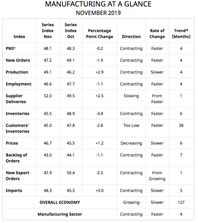
Source: Manufacturing ISM Report On Business
Adding to the concerns, this decline in manufacturing activity comes at a time when the S&P 500 is close to record highs. In fact, the index made historical highs last week. There has been a material disconnect between the manufacturing indicator and the S&P 500 recently.
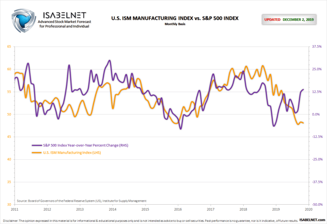
Source: Isabelnet
These kinds of divergences are quite unusual, and they typically don't last for too long. This leaves us with two broad possibilities going forward: Either the S&P 500 is correctly anticipating a rebound in manufacturing activity or the index is trading at delusional levels and set for a crash sooner rather than later.
The PMI Indicator Is Looking Much Better
When trying to understand this conundrum, it's important to note that other manufacturing indicators look much healthier than the ISM data.
The IHS Markit PMI index for the United States was revised up to 52.6 in November from a preliminary number of 52.2 and 51.3 in October. The reading pointed to the strongest expansion in factory activity in seven months.

Source: TradingEconomics
Not only that, manufacturing is deeply integrated on a global scale, and the global manufacturing PMI data from IHS Markit and JPMorgan is clearly showing improvements lately.
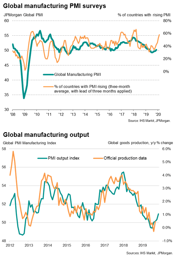
Sources: IHS Markit and JPMorgan
In a recent interview, Chris Williamson, Chief Business Economist at IHS Markit, provided some potential explanations for this divergence between the ISM and the IHS Markit indicators.
Our analysis highlights how the IHS Markit PMI has outperformed the ISM survey in providing more accurate indications of actual manufacturing trends in recent years...Most likely due to differences in panel structure and questionnaire design... ISM uses a straight average of its five components whereas IHS Markit uses a system such that forward-looking components carry a higher weight. These weights can therefore lead to divergences between the two PMIs.
In other words, the ISM manufacturing indicator looks bad and getting worse, while IHS Markit is signaling some improvements, not only in the US but also on a global scale. Only time will tell for sure which indicator is more accurately telling the story, but this divergence between manufacturing indicators from different sources is worth noting.
The Consumer Remains Healthy
Manufacturing currently represents 11% of GDP in the United States, the smallest share in data going back to 1947. Granted, manufacturing can be an important leading indicator for other sectors of the economy, but the direct impact of manufacturing on broad economic activity has been steadily declining over the years.
The consumer sector is a much more crucial driver than manufacturing nowadays. This excellent chart from MRB Partners puts some data into perspective in order to analyze the impact of manufacturing and the probabilities of a recession in the middle term.
When the ISM Manufacturing Index declines but consumer sentiment remains high, this is mostly a benign environment, and recessions are generally avoided. On the other hand, when both manufacturing and the consumer are under pressure, the chances of a recession are significantly increased.
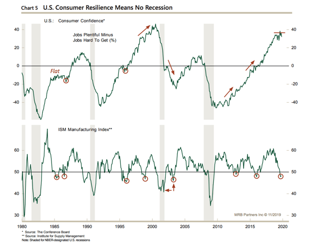
Source: MRBPartners
Looking at variables such as consumer confidence, income expectations, and personal consumption expenditures, the consumer sector still looks quite healthy. As long as this remains the case, the chances for a recession remain contained in spite of the weakness in manufacturing.
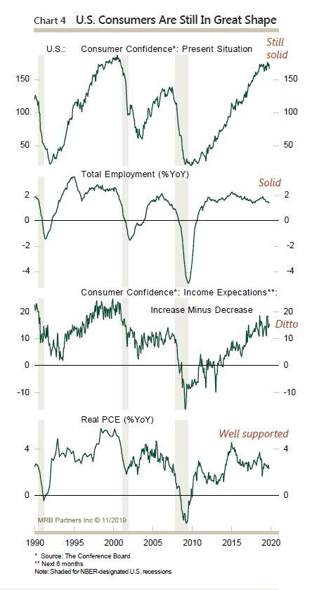
Source: MRBPartners
A Key Indicator To Watch: Credit Spreads
There has been a consistent dynamic in the current economic cycle since 2009. Manufacturing slows down, but the consumer remains healthy, and a more flexible monetary policy from the Fed provides the stimuli to avoid a full-blown recession.
Credit spreads and financial conditions are a key piece of the puzzle in this dynamic. When businesses and consumers have abundant access to credit, lower interest rates provide a boost to the economy. Conversely, when credit is contracting, which is reflected in rising credit spreads, lower rates are much less effective.
The chart below shows the evolution of high yield credit spreads and recessions in grey in the chart. It is easy to see that major increases in credit spreads tend to be a key leading indicator for recessions.
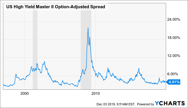
Data by YCharts
In order to quantify the risk signals from the credit market, we can consider the Credit Market Model. This is basically a quantitative strategy that manages risk exposure by rotating between stocks and bonds based on the risk appetite signals from the debt markets.
When the stock market falls and credit spreads remain stable, this is many times a short-term dip and ultimately a buying opportunity. On the other hand, if credit spreads are increasing as the stock market is falling, this can signal that the situation is far more serious and concerning.
We start by creating a ratio that measures the relative performance of iShares iBoxx $ High Yield Corporate Bond (NYSEARCA:HYG) versus iShares 7-10 Year Treasury Bond ETF (NASDAQ:IEF).
When this ratio is rising, it means that high-yield bonds are outperforming Treasury bonds, so risk appetite is increasing, and credit spreads are falling. Rising risk appetite in the bond markets is usually good for stocks too.
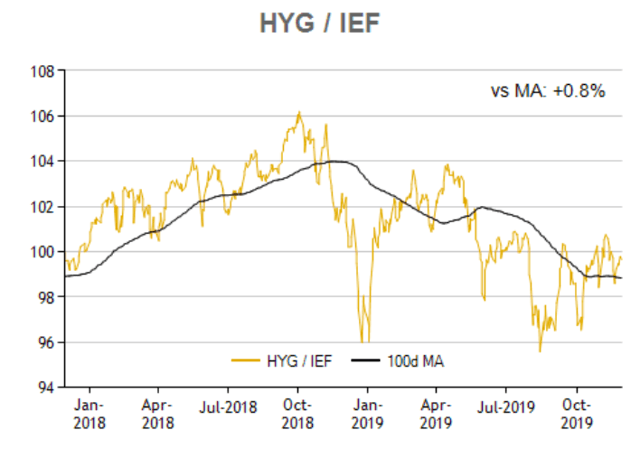
Source: ETFReplay
When the ratio is above the 100-day moving average, meaning that credit spreads are falling and risk appetite is rising in the credit markets, the system is invested in SPDR S&P 500 (SPY). Conversely, when the ratio is below the 100-day moving average, the system goes for safety, buying iShares 20+ Year Treasury Bond ETF (TLT).
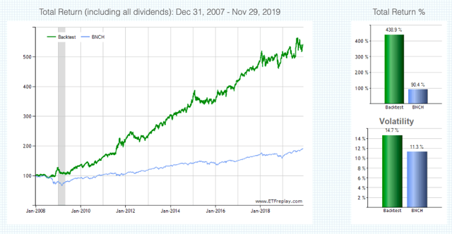
The chart below shows the backtested performance numbers for the quantitative strategy since 2008. The portfolio is rebalanced monthly, and the benchmark is a diversified portfolio holding 60% in global stocks and 40% in bonds.
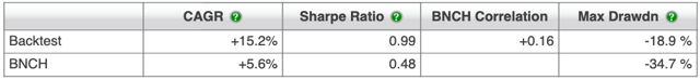
From 2008 until November of 2019, the quantitative strategy produced a cumulative gain of 438.9% versus 90.4% for the benchmark. In annual terms, this means 15.2% for the strategy per year and 5.6% for the benchmark.
Source: ETFReplay
Such as important, the maximum drawdown, meaning the maximum decline in capital from the peak, is -18.9% for the strategy versus 34.7% for the benchmark.
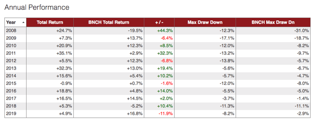
Looking at the annual performance numbers, we can see that the strategy tends to produce positive returns most of the time. The only negative year was 2015, with a marginal loss of 0.9%. However, the Credit Market Model can significantly lag the benchmark in some particular years, this is the case in fact during the current year 2019.
Source: ETFReplay
Because of its own nature, the strategy is unlikely to stay wrongly positioned in either stocks or bonds for too long. However, in years in which asset classes are moving sideways and the trends in prices are short-lived, the strategy can be expected to underperform versus buy and hold.
In a nutshell, the strategy follows trends in risk appetite. When risk appetite has a well-defined direction, either up or down, the strategy will probably do well by investing in either stocks or Treasuries. However, when risk appetite trends are shifting, the strategy will end up buying high and selling low, which ultimately hurts performance in comparison to buy and hold.
That limitation being fully acknowledged, a strategy such as this one can be quite effective at detecting the main big trends in risk appetite based on hard observable data as opposed to opinions, and this makes it a remarkably valuable tool for decision making. As of the time of this writing, credit spreads remain low, and the credit market model is still favoring stocks versus bonds.
The Bottom Line
The ugly ISM numbers should not be overlooked, and we need to keep closely watching the economic data in the manufacturing sector over the coming months. However, it's worth noting that other manufacturing indicators such as the IHS Markit PMI are looking much better.
Besides, the economy is about much more than manufacturing alone nowadays. The consumer remains strong, and this is a much bigger driver of the economy. Besides, as long as credit remains abundant and credit spreads stay subdued, the decline in interest rates can buffer the slowdown in manufacturing to a good degree.
In other words, the decline in manufacturing as reflected by the ISM indicator deserves some serious considerations. However, credit conditions and the labor market - two variables that have a big impact on the consumer sector - can be far more relevant to watch. As long as the consumer remains strong, market pullbacks can be considered buying opportunities as opposed to a reason to sell stocks.
Disclosure: I/we have no positions in any stocks mentioned, and no plans to initiate any positions within the next 72 hours.
Disclaimer: I wrote this article myself, and it expresses my ...
more

