
Top 5 Charts Of The Week: Global Economic Pulse And Investor Sentiment
Here are some of the standout economic and markets charts on my radar. I aim to pick a good mix of charts covering key global macro trends, and ones which highlight risks and opportunities across asset classes.
Hope you enjoy!
1. China vs the USA -- Economic Pulse: This chart combines the official and Markit manufacturing PMIs for China and the US. With the latest results, the standout is the slight rebound in China and drop in America.
But the bigger picture observations are
- China is below the critical 50-point mark (growth has clearly been softening there); and
- the US has started to catch down to this softer growth impulse in China; and
- it may well be that China has to recover first before the US will likewise regain momentum.
In other words, say what you will, but the economies of China & the USA remain intimately linked.
(Click on image to enlarge)

2. EM vs DM -- The Crossover: This one follows a similar vein, but bringing in the rest of DM where the slowdown has been much more accentuated, and the rest of EM where the slowdown has not been as distinct as in China.
If you can't see it, the February results have seen the composite emerging markets PMI break ever so slightly above the composite developed markets PMI.
This is a rare phenomenon which frankly usually only happens during a weak patch (at least in the post-GFC world). But with EM central banks holding much more rate cut ammunition, and USD strength on the backburner, it could be a sign of things to come for EM. Certainly, one to think about.
(Click on image to enlarge)

3. Futures Positioning -- A Compound Bet Unwinds: This chart got a lot of interest last year when a sort of "compound bet" emerged. Speculators were heavily long equities and heavily short bonds: if you think about the macro signal i.e. equities tend to benefit from higher growth and inflation and bonds typically suffer in an environment of higher growth and inflation, it effectively amounted to an extreme in reflation optimism.
This compound bet has now unwound, which begs the question... if they were wrong on the optimistic side, will they be wrong in capitulating?
(Click on image to enlarge)

4. Global Investor Confidence Lagging Behind: The State Street investor confidence index, which is based on the buying/selling activity of clients of the State Street global custodian business, remains in the doldrums. Judging by this and a few other surveys and anecdotes, institutional investors continue to run reduced risk-asset exposure after notably de-risking into the correction.
Basically what you might say is the dovish pivot by the Fed and slightly better sounding political noise (e.g. trade deal promise) are clearly not enough to move the dial as concerns about US recession risk, and the slowdown in China/Europe linger (and perhaps even a bit of GFC PTSD).
(Click on image to enlarge)

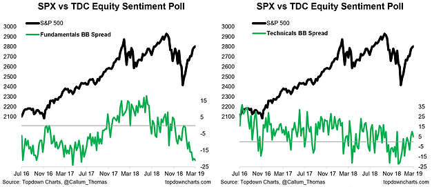
5. Twitter Survey: The last chart this week comes from the weekly survey I run on Twitter. In the survey, I ask respondents to denote their equities view/positioning (bullish or bearish) and the main reason (fundamentals vs technicals).
The chart shows the bulls vs bears spread for fundamentals and technicals... the basic takeaway is that investors are bearish on the fundamentals and (reluctantly) bullish on the technicals. But the other interesting thing in the results is there has been a persistent bearishness, with overall net-bulls only being positive in 2 of the past 22 weeks since the correction began.
While this bearishness could turn out to be well-justified, it makes it plain to see that the pain trade is for stocks to go higher.
(Click on image to enlarge)
For more and deeper insights on the global markets, good charts, and actionable investment ideas you may want to more


