
Top 5 Charts Of The Week: Economic Trends, Market Signals, Expected Returns
Here's some of the standout economic and markets charts on my radar. I aim to pick a good mix of charts covering key global macro trends, and ones which highlight risks and opportunities across asset classes.
Hope you enjoy!
1. Philly Fed Fakeout? This chart should seem familiar to regular readers, I featured the full version of it a few weeks ago in musing on whether it was a case of "Recession or Reset?" for the US economy. I show here the composite economic confidence indicator for the USA and one component of it; the Philly Fed Index - which is a regional business survey.
There is an interesting pattern for the Philly Fed index to be somewhat manic-depressive, and it seems from first glance that sharp and extreme movements in this indicator often mark exhaustion of the prevailing trend, i.e. a turning point.
So the implication is that this here could be is as bad as it gets for the US economy and that the "reset theory" may win out...

2. China -- What Stimulus? Another one from a few weeks ago, this chart shows China monthly TSF growth (Total Social Finance - a broad measure of credit), normalized against GDP. You can see the spike in Jan that got everyone talking, but as I cautioned the February results saw zero follow-through.
To be fair I did say we need to see Feb *AND* March results to get the real picture, in reference to the fact that at least 1 week of February was taken out by Chinese New Year holidays. So just as I didn't get too excited about the Jan surge, I'm not abandoning ship on the Feb slump.

3. China PPI vs Emerging Market Equities: China PPI inflation has moved decisively toward deflation, and that could be a problem for emerging markets. EM equities tend to do well when China PPI inflation is stable/accelerating, and less well when PPI inflation is too high or in deflation. The exception to the deflation comment was the 2009 China superstimulus.
Anyway, it's one of a few key charts and indicators I'm watching closely on EM right now, as the short-term situation bumps up against the medium term case.

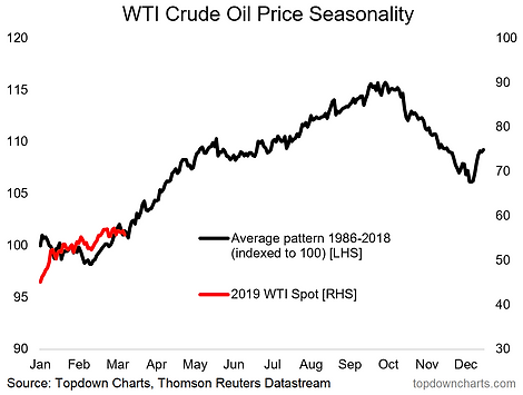
4. Tis the Season for Crude Oil: Seasonality is one of those odd indicators which are often best used as a "cherry on the top" of an existing investment thesis... i.e. you never want to rely solely on the averages of history.
That said, this chart shows (focus on the black line) the average seasonal price pattern of WTI crude oil across the year by business day for the past 30 years. Key point: a seasonal tailwind is coming into play for crude oil prices...
5. Capital Market Assumptions -- What to expect with expected returns: This chart provides an extract of a few key asset classes from our new Capital Market Assumptions dataset.
While you may or may not agree with the absolute levels, I think the standouts here are: a. US equities expected returns look very similar to fixed income; b. cash looks better than government bonds; and c. global ex-US equities look better than US equities.
Given some of the traditional set-and-forget asset allocation models, were things to turn out exactly as expected here it could leave some investors scratching their heads...


