
The Ratio Of Part-Time Employed: February 2019
Let's take a closer look at the latest employment report numbers on Full and Part-Time Employment. Buried near the bottom of Table A-9 of the government's Employment Situation Summary are the numbers for Full- and Part-Time Workers, with 35-or-more hours as the arbitrary divide between the two categories. The source is the monthly Current Population Survey (CPS) of households. The focus is on total hours worked regardless of whether the hours are from single or multiple jobs.
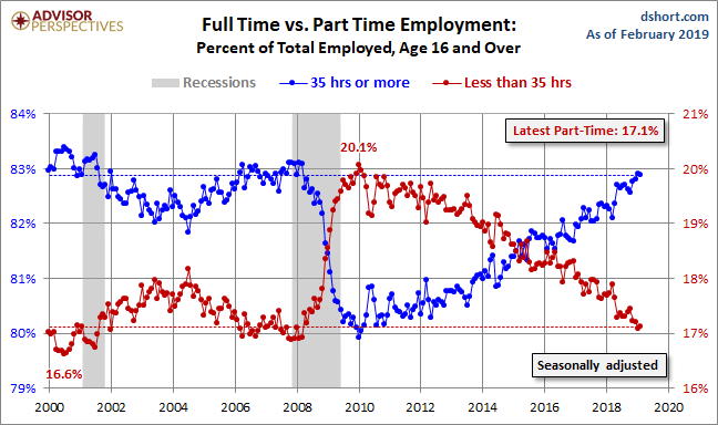
The Labor Department has been collecting this since 1968, a time when only 13.5% of US employees were part-timers. That number peaked at 20.1% in January 2010. The latest data point, over eight years later, is lower at 17.1% last month.
Here is a visualization of the trend in the 21st century, with the percentage of full-time employed on the left axis and the part-time employed on the right. We see a conspicuous crossover during the Great Recession.
Since early 2016, the two cohorts have slowly drifted apart, with full-time employment gaining.
(Click on image to enlarge)
The Impact of the Great Recession
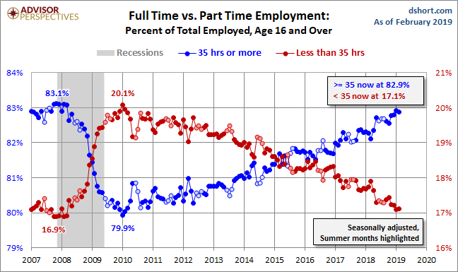
Here is a closer look since 2007. The reversal began in 2008, but it accelerated in the Fall of that year following the September 15th bankruptcy of Lehman Brothers. In this seasonally adjusted data, the reversal peaked in January of 2010.
(Click on image to enlarge)
A Closer Look at the Core Workforce, Ages 25-54
The two charts above are seasonally adjusted and include the entire workforce, which the CPS defines as age 16 and over. A problem inherent in using this broadest of cohorts is that it includes the population that adds substantial summertime volatility to the full-time/part-time ratio, namely, high school and college students. Also, the 55-plus cohort includes a subset of employees that opt for part-time employment during the decade following the historical peak earning years (ages 45-54) and as a transition toward retirement.
The next chart better illustrates summertime volatility by focusing on the change since 2007 in full- and part-time employment for the 25-54 workforce. Note that the government's full-time/part-time data for this cohort is only available as non-seasonally adjusted. To help us recognize the summer seasonality, the June-July-August markers are shown in a lighter color. These months are more subject to temporary shifts from part-time to 35-plus hours of employment. The 12-month moving averages for the two series help us identify the slope of the trend in recent years. The moving averages are, so to speak, moving in the right direction, but they have yet to meet continuously.
(Click on image to enlarge)
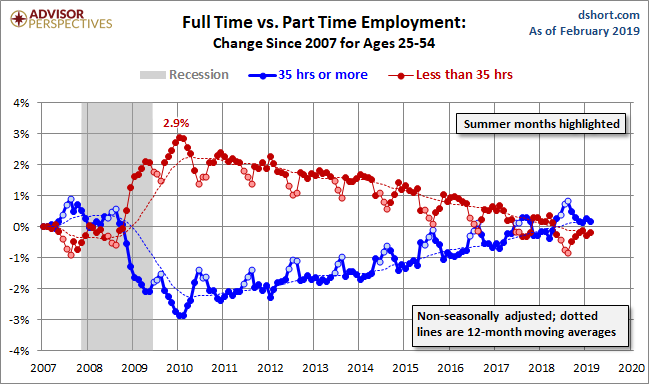
Like the 16-and-over version, this chart depicts a current situation that is considerably different from the era before the Financial Crisis, although the trend has been slowly improving since early 2010, as illustrated by the dotted-line moving averages. In this is non-seasonally adjusted data, the summer months are obvious outliers, with full-time employment spiking during the June-August period.
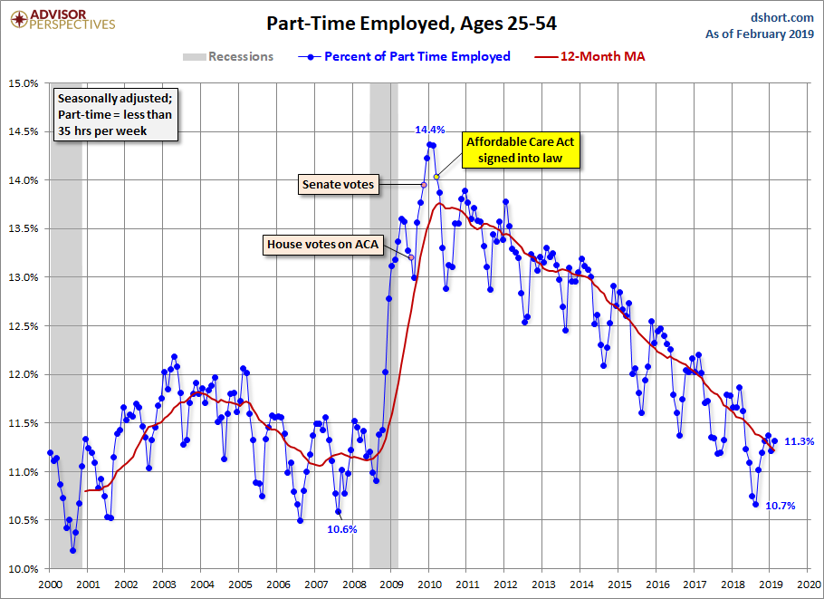
Obamacare and Part-Time Employment
Many have speculated that the Affordable Care Act (aka Obamacare) has played a role in company decisions about full-time versus part-time employment. The $2,000 per employee penalty for companies that do not comply with regulations has influenced some to rethink their employment policies. In July 2013 the government pushed the start of the penalty from January 2014 to January 2015. But the anticipation of the penalty, even though delayed a year, no doubt influenced the decisions of private employers.
With regard to Obamacare and part-time employment, the surge in part-time employment was triggered by the recession, not by the Affordable Care Act, as the next chart clearly illustrates.
(Click on image to enlarge)
The Bureau of Labor Statistics' monthly employment report is a hodgepodge of data. The full-time/part-time ratio is but a tiny piece of the whole, and the magic 35-hour threshold is arguably arbitrary. But this is, nevertheless, a metric that bears close watching as we try to understand where the economy is headed. The question is whether the ratio shift is to some extent a structural change initially triggered by the Great Recession but now influenced by a combination of factors, not least of which are workplace demographics and ongoing increases in technology-driven productivity with less dependence on human workforce participation.
The data source for the charts and numbers in the commentary is the BLS's Databases & Tools page -- specifically the Labor Force Statistics here.


