
The Q Ratio And Market Valuation: December Update
Note: This update includes the December close data and the Q3 Fed Financial Accounts data.
The Q Ratio is a popular method of estimating the fair value of the stock market developed by Nobel Laureate James Tobin. It's a fairly simple concept, but laborious to calculate. The Q Ratio is the total price of the market divided by the replacement cost of all its companies. Fortunately, the government does the work of accumulating the data for the calculation. The numbers are supplied in the Federal Reserve Z.1 Financial Accounts of the United States of the United States, which is released quarterly.
Extrapolating Q
The ratio subsequent to the latest Z.1 Fed data (through 2018 Q3) is based on a subjective process that factors in the monthly closes for the Vanguard Total Market ETF (VTI).
Unfortunately, the Q Ratio isn't a very timely metric. The Z.1 data is over two months old when it's released, and three additional months will pass before the next release. To address this problem, our monthly updates include an estimate for the more recent months based on changes in the VTI price (the Vanguard Total Market ETF) as a surrogate for Corporate Equities; Liability.
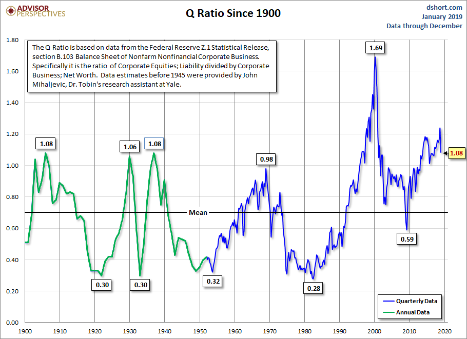
The first chart shows Q Ratio from 1900 to the present.
Interpreting the Ratio
The data since 1945 is a simple calculation using data from the Federal Reserve Z.1 Statistical Release, section B.103, Balance Sheet and Reconciliation Tables for Nonfinancial Corporate Business. Specifically, it is the ratio of Market Value divided by Replacement Cost. It might seem logical that fair value would be a 1:1 ratio. But that has not historically been the case. The explanation, according to Smithers & Co. (more about them later) is that "the replacement cost of company assets is overstated. This is because the long-term real return on corporate equity, according to the published data, is only 4.8%, while the long-term real return to investors is around 6.0%. Over the long-term and in equilibrium, the two must be the same."
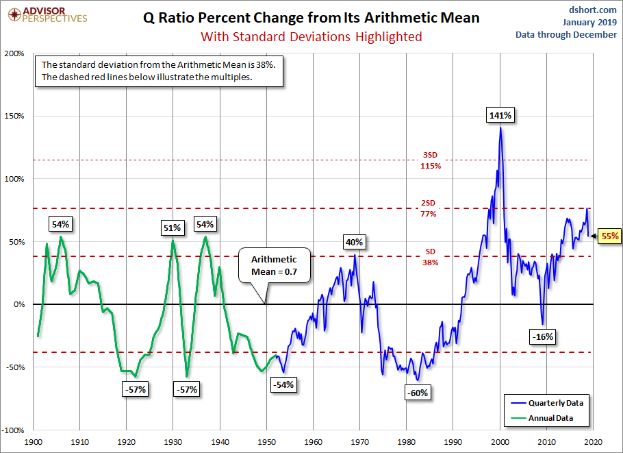
The average (arithmetic mean) Q Ratio is about 0.70. The chart below shows the Q Ratio relative to its arithmetic mean of 1 (i.e., divided the ratio data points by the average). This gives a more intuitive sense to the numbers. For example, the all-time Q Ratio high at the peak of the Tech Bubble was 1.61 — which suggests that the market price was 136% above the historic average of replacement cost. The all-time lows in 1921, 1932 and 1982 were around 0.30, which is approximately 55% below replacement cost. That's quite a range. The latest data point is 55% above the mean and now in the vicinity of the range of the historic peaks that preceded the Tech Bubble.
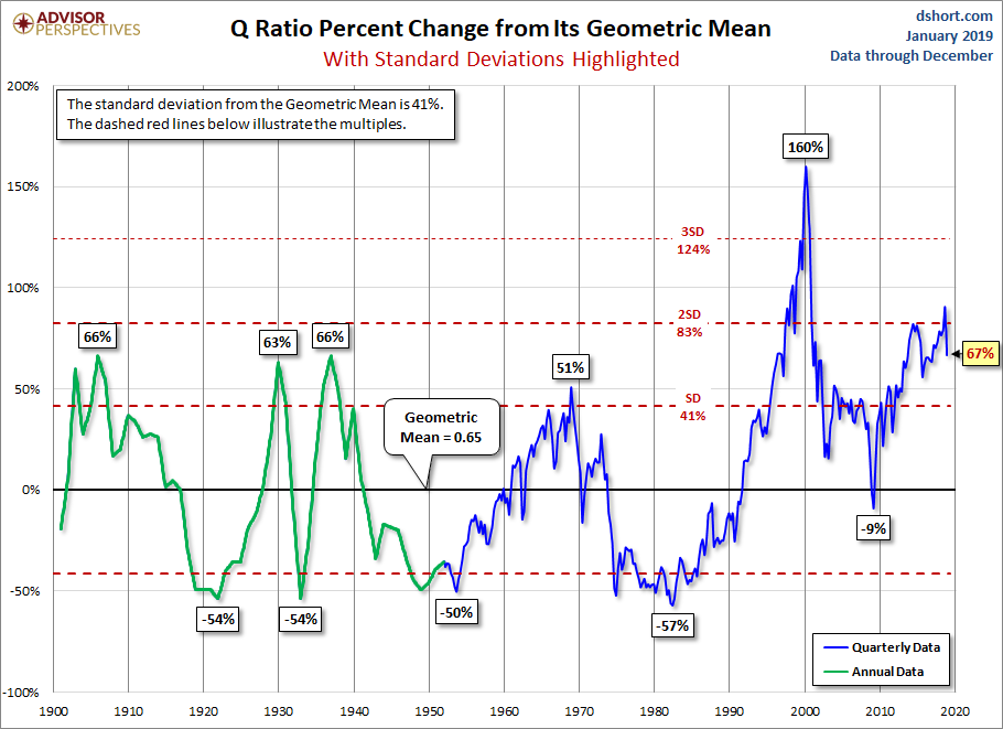
Another Means to an End
Smithers & Co., an investment firm in London, incorporates the Q Ratio in their analysis. In fact, CEO Andrew Smithers and economist Stephen Wright of the University of London co-authored a book on the Q Ratio, Valuing Wall Street. They prefer the geometric mean for standardizing the ratio, which has the effect of weighting the numbers toward the mean. The chart below is adjusted to the geometric mean, which, based on the same data as the two charts above, is 67%.
The Message of Q: Overvaluation
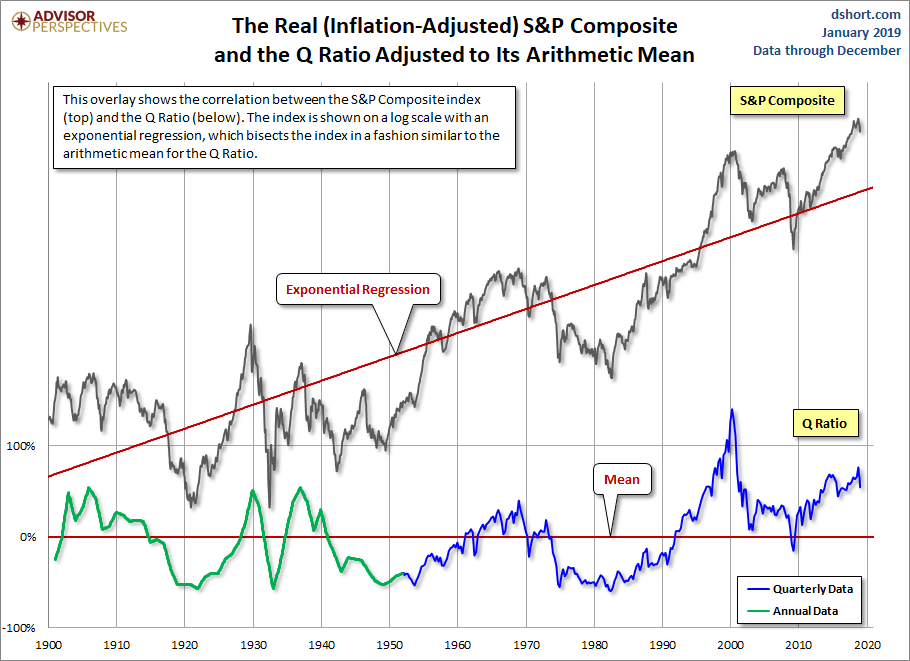
Of course, periods of over- and under-valuation can last for many years at a time, so the Q Ratio is not a useful indicator for short-term investment timelines. This metric is more appropriate for formulating expectations for long-term market performance. As we can see in the next chart, peaks in the Q Ratio are correlated with secular market tops, the Tech Bubble peak being an extreme outlier.
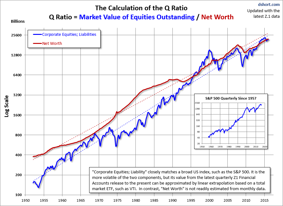
For a quick look at the two components of the Q Ratio calculation, here is an overlay of the two since the inception of quarterly Z.1 updates in 1952. There is an obvious similarity between the Fed's estimate of "Corporate Equities; Liabilities" and a broad market index, such as the S&P 500 or VTI. It is the more volatile of the two, but this component can be easily extrapolated for the months following the latest Fed data. The less volatile underlying Net Worth is not readily estimated from coincident indicators.
The regressions through the two data series to help to illustrate the secular trend toward higher valuations.


