
The Four Totally Bad Bear Recoveries: Where Is Today's Market?
In response to a standing request, here is an updated comparison of four major secular bear markets. The numbers are through the March 31 close.
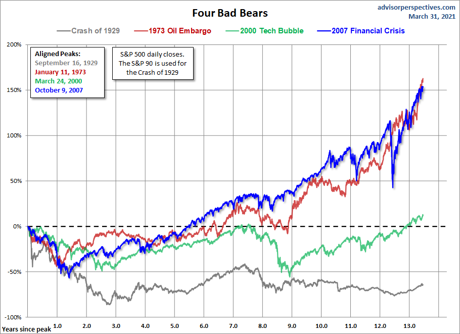
This chart series features an overlay of the Four Bad Bears in U.S. history since the equity market peak in 1929. They are:
- The Crash of 1929, which eventually ushered in the Great Depression,
- The Oil Embargo of 1973, which was followed by a vicious bout of stagflation,
- The Tech Bubble crash and,
- The Financial Crisis following the record high in October 2007.
The series includes four versions of the overlay: nominal, real (inflation-adjusted), total return with dividends reinvested, and real total return. The starting point is the aligned peaks prior to the four epic declines. We've used an interval of 252 days for the x-axis as it is roughly the number of market days in a calendar year.
The first chart shows the price, excluding dividends for these four historic declines and their aftermath. We are now 3,393 market days from the 2007 peak in the S&P 500.
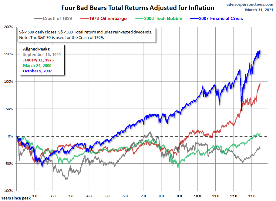
Inflation-Adjusted Performance
When we adjust for inflation, the gap between our current recovery and the other three widens, thanks to exceptionally low inflation in recent years.

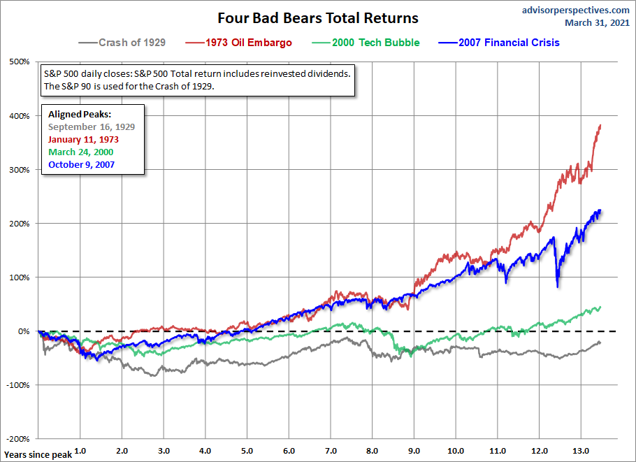
Nominal Total Returns
Now let's look at a total return comparison with dividends reinvested. The 1973 Oil Embargo Bear recovery is the top performer, up 383%. The 2007 crisis recovery is in second place, up 225%.
Real Total Returns
When we adjust total returns for inflation, the picture significantly changes. The spread between three of the four markets narrows dramatically, and the current real total return since the 2007 crisis has pulled far ahead of the others, up 156.3%. Second place, by this metric, goes to the post-Oil Embargo rally, with 96.4%.
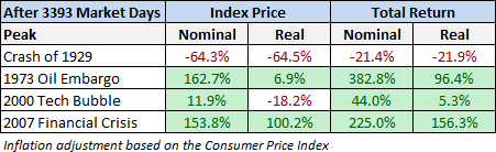
Here is a table showing the relative performance of these four cycles at the equivalent point in time.
For a better sense of how these cycles figure into a larger historical context, here's a long-term view of secular bull and bear markets, adjusted for inflation, in the S&P Composite since 1871.
These charts are not intended as a forecast but rather as a way to study the current market in relation to historic market cycles.
Footnote: When we first began featuring this comparison about nine years ago, we used the Dow for the first event and the S&P 500 for the other three. However, we're now including a pair of total return versions of the chart, which requires dividend data. Thus we're now using the S&P 90 for the first bear market which we have dividend data. The S&P 90 was a daily index launched by Standard & Poor's in 1926 and preceded the S&P 500, which dates from March 1957.
Inflation adjustment is based on the Consumer Price Index.


