
The Civilian Labor Force, Unemployment Claims And The Business Cycle - Friday, Jan. 4
Note: We've updated this commentary to include the latest labor force data in this morning's employment report.
Every week we post an update on new unemployment claims shortly after the BLS report is made available. Our focus is the four-week moving average of this rather volatile indicator. The financial press generally takes a fairly simplistic view of the latest number, and the market often reacts, for a few minutes or a few hours, to the initial estimate, which is always revised the following week.
One of our featured charts in the update shows the four-week moving average from the inception of this series in January 1967.
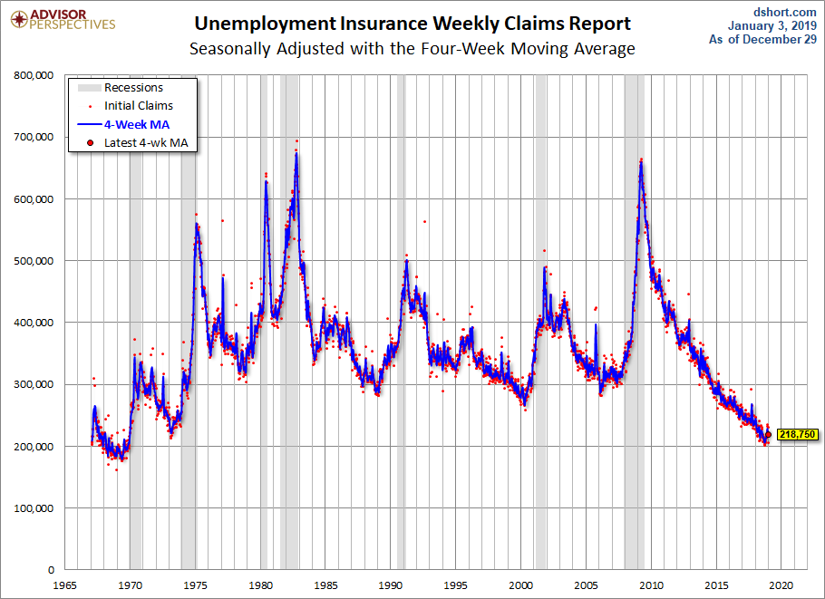
The chart, above, however, gives a rather distorted view of Initial Claims. Why? Because it's based on a raw, albeit seasonally adjusted number that doesn't take into account the substantial growth in the Civilian Labor Force since January 1967, as illustrated here:
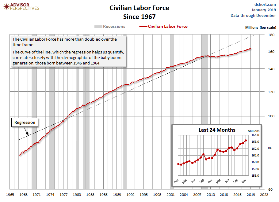
The Civilian Labor Force in the chart above has more than doubled from 76.5 Million in January 1967 to 163.2 Million today. The curve of the line, which the regression helps us visually quantify, largely reflects the employment demographics of the baby boom generation, those born between 1946 and 1964. In 1967 they were starting to turn 21. The oldest are now eligible for full retirement benefits. Another factor is the curve is the rising participation of women in the labor force (see this commentary).
For a better understanding of the weekly Initial Claims data, let's view the numbers as a ratio of the Civilian Labor Force.

The latest ratio of 0.14% means that out of 10,000 workers, fourteen made an initial application for unemployment insurance payments in the latest data. The latest ratio of 0.137% to three decimal points is just above its all-time low (of 0.128%).
What about Continued Claims? Here is the ratio to the Civilian Labor Force.
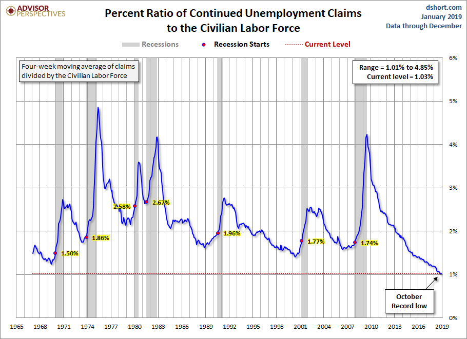
With this indicator, we're just above a historic low (1.01%) with a reading of 1.03%. Approximately one hundred and three persons per 10,000 are receiving continuing unemployment insurance benefits.
Unemployment Claims as a Recession Indicator
A particularly interesting feature of this Unemployment Claims ratio series is its effectiveness in the past as a leading indicator for recession starts and a virtually dead-on coincident indicator for recession ends. In both of the ratio charts above, we've highlighted the value at the month a recession starts. In every instance, the trough in claims preceded the recession start by a few too many months, but the claims peaks were nearly identical with recession ends. Here is a table showing the actual numbers.
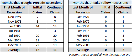
The least lead time from a claims trough to a recession start was three months. That was for the second half of the double-dip that began in July 1981. As we've discussed elsewhere, this was basically a Fed engineered recession to break the back of inflation. The Effective Fed Funds Rate hit its historic monthly average high of 19.1% in June of 1981 and its all-time daily high of 22.4% on July 22, the month the NBER subsequently identified as the recession start.
The Business Cycle and Current Recession Risk
What does the ratio of unemployment claims tell us about where we are in the business cycle and our current recession risk? At present, the ratio for Continued Claims has been trending down. Excluding the 1981 recession, the Initial Claims trough lead time for a recession has ranged from 7 to 22 months with an average of 12 months if we include the 1981 recession and 14 months if we exclude it. Admittedly, the last recession is an extreme example, but the Initial Claims trough preceded its December 2007 onset by a whopping 22 months.


