
The Bulls Push To 3,000 Is Breadth-Y
For the year, the S&P 500 is down just 8.5%, but 12.7% below its all-time closing high set in mid-February of this year. Looking at the big picture in price action, the S&P 500 continues to print greater relief rally highs but remains in a 6-week long trading range with the low being 2,727 on April 21st and the high being 2,980 on May 20th this past trading week. (This is an abridged version of our weekly, full-scale Research Report at finomgroup.com)
At the sector level, we can see what drove the S&P 500 by way of the index ETF (SPY). If thought tech continued to lead, you would have been mistaken.
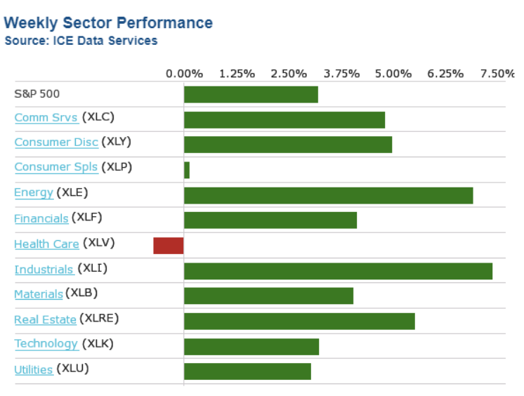
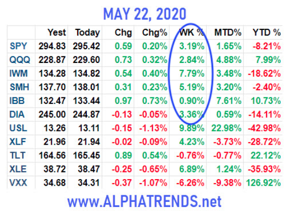
We keep hearing a good deal about the defensive positioning in the market of late, but that has largely proven the case during week's when the market is down. According to the sector performance chart above for this past week, cyclical proved the sought after stocks/sectors. In fact, for all the concerns over Industrial Production data, the Industrials (XLI) lead the market this past week. The worst performers were the defensive sectors of the market like Health Care (XLV), Consumer Staples (XLP), Utilities (XLU), and even Technology (XLK) underperformed.
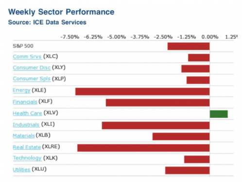
When markets are in rally mode, cyclical and growth stocks are in favor, but as noted above, safety sectors come in favor when markets have been in retreat as they were 2 weeks ago. (Sector performance 2 weeks ago, chart below)
All Things S&P 500 Related
After an impressively strong start to the week, where equities opened higher and kept going from there, turnaround Tuesday showed up once again with a reversal off the highs of the day. The reversal was headline-driven, of course. Those headlines came from the STAT News and basically suggested that Moderna said, “much to do about nothing” and didn’t actually publish any results that could be discerned or validated.
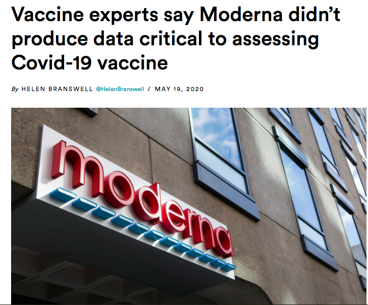
While STAT News simply critiqued Moderna's early data related to the phase 1 human trials, the market remains uneasy about the path forward and algorithms remained tuned to key words in the headlines. Nonetheless, the dampening sentiment of Moderna's positive data proved short-lived and by the end of the week both Scott Gottlieb and Dr. Anthony Fauci stood tall and in favor of Moderna's favorable data.
"Dr. Anthony Fauci expressed "cautious optimism" Friday about the initial results from a coronavirus vaccine trial, which were widely celebrated this week, and said it remains "conceivable" that a vaccine for the deadly pathogen could be available by the end of the year.
"The vaccine induced what we call neutralizing antibodies, as opposed to just binding antibodies, and neutralizing antibodies are antibodies that actually can block the virus. The results were "even better than we thought,and they did it at a moderate dose of the vaccine."

Fauci said full results would be submitted to a peer-reviewed journal, most likely within a few weeks. If all goes according to plan, Fauci said it is possible that a vaccine could be available within a matter of months, a timeline that would shatter the years-long process typically required to produce a vaccine.
"I think it is conceivable if we don't run into things that are, as they say, unanticipated setbacks, that we could have a vaccine that we could be beginning to deploy at the end of this calendar year, December 2020 or into January 2021."
Due to the headline-driven nature of the market and the sentiment tied to medical advancement delivering a vaccine to eradicate the fears surrounding COVID-19, it will remain an important discipline to follow the news flow regarding this subject matter. While the delivery and inoculation timelines are likely to shift, I'm of the opinion science will prove triumphant and fears surrounding the reopening of the economy will dissipate over the coming months.
The tight trading range over the last 6 weeks has presented a reasonably strong trader's environment but ultimately the market will demand a breakout to the upside or a breakdown, expressing a correction. A correction would be welcomed by many investors given what appears lofty market valuations historically. With that being said, let's go to the charts... First, recall from last week the following insights regarding the S&P 500:
(Click on image to enlarge)
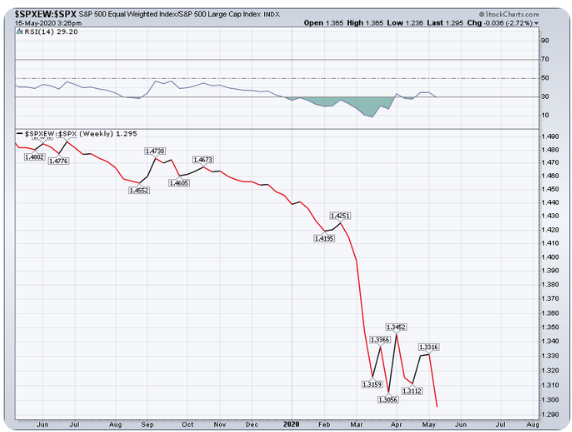
"Since we recognize market structure is top-heavy, the chart above asks for investors to consider, “What if it weren’t”. For Finom Group newcomers and those unfamiliar with the S&P 500’s structure, understand that it is “market cap-weighted“. It is not an index that represents each stock within the index as being equal. As such, an index ETF has been created to resemble if it were. We can utilize this equal-weight ETF to compare relative strength with the Cap-weighted S&P 500 itself. In doing so, we can decipher the true strength or weakness of the overall index, not just the top handful of stocks with the largest market caps.
As shown in the chart above (SPXEW:SPX), this comparison identifies how weak stocks are underneath those top-weightings within the S&P 500. In fact, the SPXEW:SPX put in a new all-time low on Thursday. Don’t let the market rally off of the bottom in March, the performance through April and the recent run back to the 61.8% Fibonacci level fool you into thinking the market rally is healthy. If I was to characterize it, based on the SPXEW or the Equal-Weight index ETF (RSP), I would say it is better than awful, but not good enough to push my sentiment from cautiously optimistic to full-on bullish."
What we want to see is broader market breadth during up moves in the market. Is that what we got with the S&P 500 advancing 3.2% this past week?
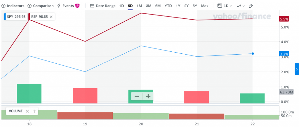
As we can see from the chart above, indeed, that is exactly what we saw during the upward trend this past week. The cap-weighted SPY rallied 3.2% while the equal-weighted RSP rallied 5.5% on the week.
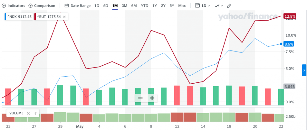
Not only did equal-weight lead the cap-weight S&P 500, but small-caps lead large-caps this past week. This is something we also want to see as a signal post suggesting this is not just another bear market rally. While the Nasdaq (NDX) led the major large-cap indices higher during the week, the Russell 2000 (RUT), otherwise known as the small-cap index, led all major averages with a 7.84% advance on the week. At the index and/or sector ETF level, small-cap ETFs carried that breadth as well. Keep this in mind, KEEP THIS in mind, KEEP THIS IN MIND!!
Industrials, small-cap and equal-weighted ETFs leading are the tell-tale signs of risk-on appetite and indicative of something more than just your average bear market rally. But, we do have to recognize a week does not make a trend, right?
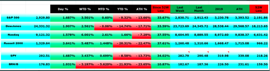
The table above denoted the index moves since the 52-week low on March 23rd. The Russell 2000 slightly edged out the Nasdaq with the largest percentage gain off of the lows. With last week's performance, the Russell has increased its performance gap for the better when compared to the Nasdaq. In fact, over the last 30 days, the RUT is up nearly 13% while the NDX is up nearly 9 percent.
While this is a bear market rally it is only one in name as it carries all the characteristics of a bull market presently. Beyond the index level performances since the March lows and that from what we've seen in the way of equal vs. cap-weighted performance, we also continue to review the sectors most heavily correlated with the consumer.
(Click on image to enlarge)
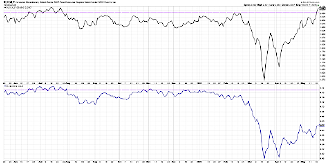
The TOP panel shows the ratio of the XLY (Consumer Discretionary Sector SPDR) versus the XLP (Consumer Staples). The ratio is relatively flat with Consumer Discretionary (travel, hotel, retail) and Consumer Staples (beverages, personal products) essentially in line. They were moving in a similar pattern in the 4th quarter of last year, and slightly accelerated into the market high in February. After that, the ratio took a downturn. But recently...
- The ratio rallied and put in a higher low the first week of April, and since then has continued higher.
- The last couple days this ratio has gone to a new swing high above its February high, which illustrates a rotation back to traditional offense.
- But there's more!
The BOTTOM panel shows the same ratio of Consumer Discretionary vs Consumer Staples, but it’s using the equal-weighted version. RCD is an equal-weighted Consumer Discretionary ETF, and RHS is an equal-weighted Consumer Staples ETF. Until the March low, both ratios were pretty similar.
- They both broke down through their most recent swing lows, although you’ll notice the equal-weighted version actually broke down first.
- In mid-February, the equal-weighted version was already rolling over while the cap-weighted version was still above its low from January.
- This happens more often than not, where the equal-weighted version tends to lead and signals first.
- Equal-weighted chart identifies a series of higher lows, but not quite yet higher highs. It does appear we are on the cusp of that happening.
- Recent swing high was $84.99. Closed $83.20 on Friday this past week.
Right now while the cap-weighted version is going to new highs for 2020, the equal-weighted version is nowhere near its peak from the beginning of the year. This is because of the outsized weight within the Consumer Discretionary ETF of a couple mega-cap names.
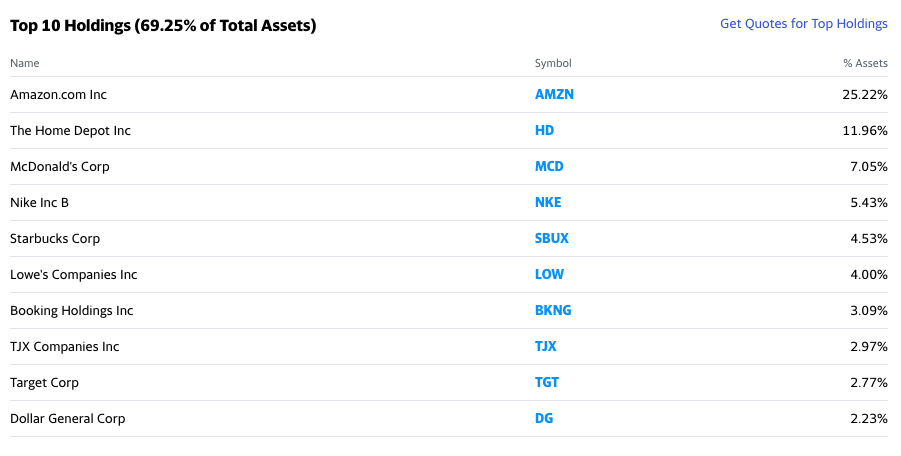
Names like Amazon (about 25% of the ETF) and Home Depot (about 12% of the ETF) dramatically affect the value of the cap-weighted XLY. Based on the chart of the XLP/XLY, I think it's safe to say that the equal-weighted study has some work to do but has leaned bullish over the last couple of months and points in favor of the S&P 500 getting to its 200-DMA. How's that for a segue?
A new bull market would be best identified with the percentage of stocks within the S&P 500 trading above their 50-DMA hitting 85% when the S&P 500 itself was able to achieve its 200-DMA. In other words 85% above 50-DMA + SPX hitting 200-DMA = NEW BULL MARKET! And folks, that's what finds the coming week so compelling.
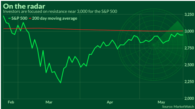
Throughout this bear market and self-induced pandemic causing a recession, equities have found a bottom that has still been called into question. As the economy reopens, the economic recovery will gain scrutiny in much the same manner as the market recovery has and still is found for criticisms on many fronts. With this in mind, mile marker achievements like the breadth study offered by Andrew Thrasher go a long way to improving investor sentiment and distinguishing a bear market rally that ultimately fails and finds new lows vs. a bear market rally that leads to a new bull market. So let's see where we stand with regards to the percentage of S&P 500 stocks trading above their 50-DMA and in relation to the S&P 500 which finished the week at 2,955. The 200-DMA for the benchmark index resides at 2,999, just 1.5% away.
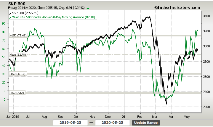
In order to meet the standard of a new bull market, the percent of stocks trading above their 50-DMA needs to be 85% or better. To end the week, the index achieved just over 82% of stocks. Moreover, the breadth indicator (green line) has made a higher high and successive higher low, indicating broad breadth improvement throughout the relief rally period. If we were to combine the breadth of the S&P 500 with the offensive sector participation amongst investors of late, we could suggest that the S&P 500 was poised to achieve the 200-DMA as early as the coming week and with 85% of stocks trading above their 50-DMA. There are no guarantees, but a goodly amount of the technical and breadth analysis appears to favor this outcome, barring any exogenous headlines.
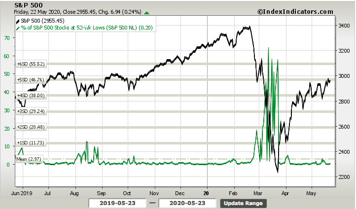
In addition to the positive breadth taking place this past week, we've been keeping an eye on the number of stocks making a new 52-week low, which is basically flatlined at the lows. We definitely want to see this breadth indicator, albeit not the most significant, indicate stocks have been trending higher with few if any stocks at 52-week lows.
It's important to keep in mind, as we review technicals and market breadth, that such analysis is extremely fluid and prone to week-over-week volatility. One week breadth and technicals deteriorate and the next they can improve. Technical analysis is largely about the following price, while searching for identifiable patterns in order to obtain probabilities going forward. Technicals can be overridden by exogenous events and headlines in much the same way these factors can deepen a trend.
The bulls have been doing a great deal of work as of late and with a reasonable amount of due diligence as history suggests that when central banks shore up credit markets, equity markets find a bounce. Now that the market has bounced 32%+ since the lows (give or take a %) and may achieve that critical 200-DMA near-term, what comes next may enhance portfolio performance through year's end.
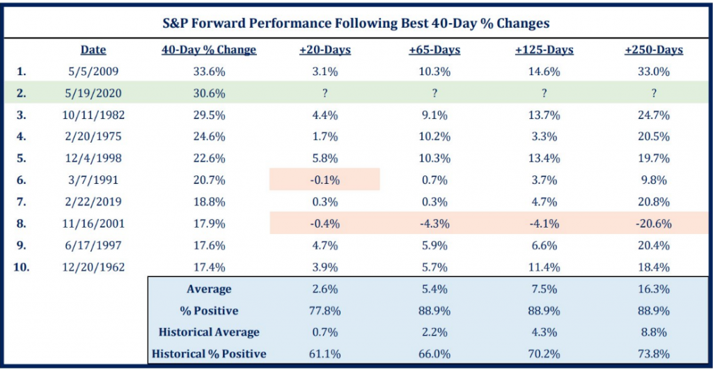
As of Tuesday this past week, the S&P 500 Index is now up more than 32% in 40 trading days. As impressive as the rally has been, we do have some near-term concerns that are likely to linger. Higher valuations, US-/China relations seem to be flaring up, topping technicals, and the historically troublesome summer months all could play a part in potential weakness after the record rally. For some greater context, here is a table of such bear market rallies from LPL Financial:

“In 40 trading days, the S&P 500 gained 32%, which is second only to the 40 days off the March 2009 lows,” explained LPL Financial Senior Market Strategist Ryan Detrick. “Looking back at history shows that after the initial surge off of bear lows, stocks tend to correct about 10%, which is something we could see this time around.”
- As shown in the LPL Chart of the Day, the S&P 500 rallied nearly 21% in 30 days after ALL major bear markets.
- Once those initial rallies ended, there was a correction of more than 10% on average.
- The market, bear or bull, is still in a bottoming process.
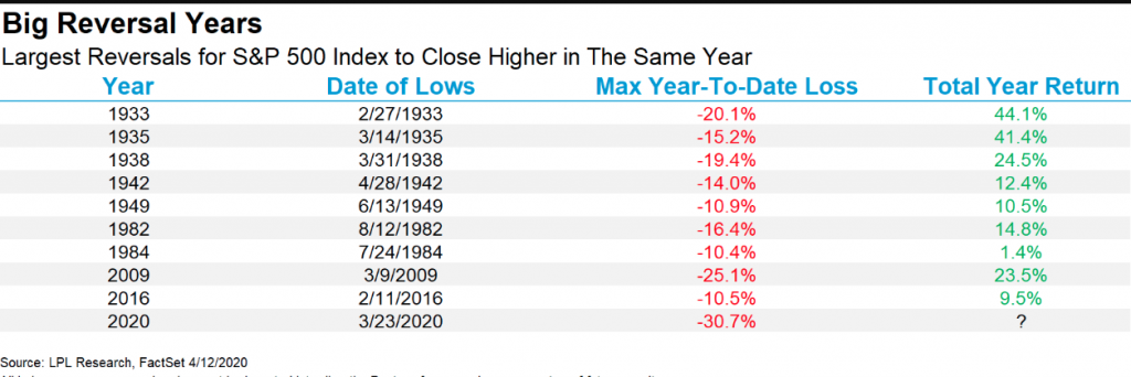
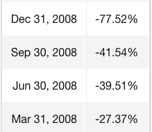
In conjunction with the probability of a correction, and keeping in mind that 2 weeks ago we had a 2.5-trading day correction of 5.5%, the probabilities that the S&P 500 will just keep climbing and wind up positive for the year are improbable, but not impossible! There has never been a year that was down as much as 30%-to date and which came all the way back to green. Here are the previous largest reversals below:
We utilize the historic data to assign probabilities and based on the historic data, the risk/reward proposition to be long the market is narrowing for the interim period. But longer-term, it certainly looks like any dip is a strong buying opportunity. Check out the chart below from Strategas:
To date, the short positioning in S&P 500 futures has simply proven the catalyst for the market trending higher. This commentary is evidenced in CTA (Commodity Trading Advisor) positioning outlined by Nomura's quant analyst Charlie McElligott:
“After recently dictating partial covering in prior legacy shorts across many global Equities futures, yesterday’s CTA Trend model outright ‘flipped’ from the prior -53% Short signal to a +100% Long one on the trade above 2964, generating an estimated +$17 billion of futures to buy”, he writes, before cautioning that “we remain near [a] ‘trigger’ level for more chop in the signal at 2959, which is teetering near spot”.

The added short positioning this past week obviously has the potential to produce profits if the market does correct sooner rather than later, but last week it proved a bullish catalyst oddly enough. This is besides the point and as we look forward to a holiday-shortened trading week that proves light on the economic data front as well. The following graphic is probably the most relevant and discussed topic taking place this weekend. I think MarketWatch highlights it the best on the home page of the website as follows:
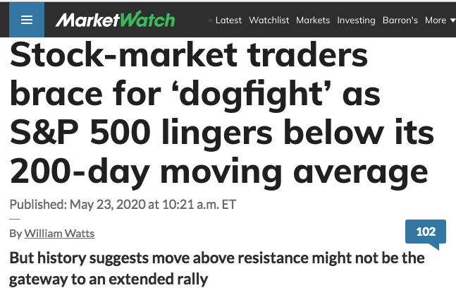
The market remains quite delicate and quite illiquid. As I have identified many a time before, the illiquidity of the market aids in solidifying a trend, but also finds reversals of trend quite severe. Given the dynamism of the market that proves very unlike any market of past cycles, bear or bull, we suggest that investors/traders remain open to a wide variety of market outcomes and hold a comfortable level of cash in one's portfolio in order to take advantage of lower prices in the future. While the trend remains friendly, the probabilities over the coming 30-day period prove less favorable against historical data.
It's The Economy "Not So Bright"
So speaking of the economic data calendar for the week ahead... Indeed, the jobless claims data and GDP revision will be front of mind with investors. As we mentioned last week, Connecticut put that they had 10 times the number of initial jobless claims that they actually had. That was a huge mistake which made the results look worse than they were. That was resolved this week as the number of initial claims was revised down from 2.981 million to 2.687 million.
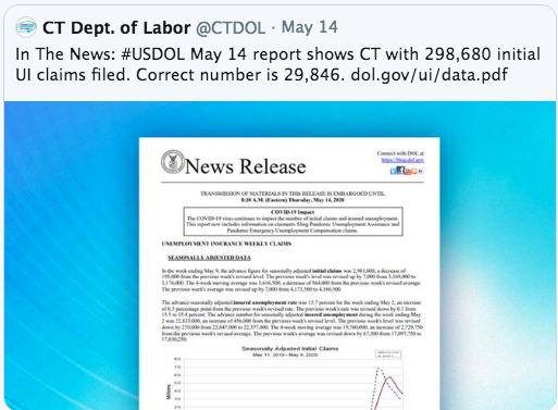
For the seventh week in a row, jobless claims have been falling, coming in at 2.438 million and above forecasts of 2.4 million. This week’s 2.438 million number is the lowest claims data point since the first spike in March. That is certainly a positive as those declines are a sign of improvement, but claims also continue to print at much higher levels than anything observed prior to COVID-19 as the running total since the first print over one million in March now stands at 38.6 million. That is roughly 11.8% of the U.S. population or 23.5% of the labor force.
There was only a 249,000 decrease WoW, which is much less than the prior week’s decline of 489,000. This coming week, we don’t have a big revision lower to lean on either. Because of how many jobs have already been lost, it’s almost a given that initial claims will fall. We need them to fall more rapidly!
As previously mentioned, this was the seventh consecutive week in which jobless claims declined week over week. As shown in the chart below from Bespoke Investment Group, that is an unprecedented streak. In the data going back to the late 1960s, there have only been two other stretches of seven weeks of declines: one ending in October of 1980 and another ending in November of 2013. Given jobless claims are at such extremely high levels and have very far to fall until they return to normal, this streak certainly could keep growing.

I'm not expecting miracles from the coming week's release of jobless claims, but I am anticipating steady improvement. Fewer and fewer jobless claims and more and more people are going to be needed to get back into the workforce as the economy reopens. As employees are reattached to their jobs, paychecks will prove forthcoming, which should fuel consumer spending.
The combination of consumer sentiment and spending in the next two months will give us the first indications as to the mindset and habits of U.S. consumers with a fully opened economy, which will serve as benchmarks for the growth that will be needed for an economic recovery. As such, investors will want to see an improvement in these economic data points alongside PMIs improving.
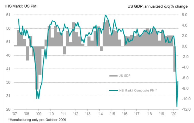
U.S. private sector firms reported a slightly slower rate of contraction in activity in May, according to latest PMI data from IHS Markit. The firm said its flash manufacturing purchasing index rose to 39.8 in May from 36.1 in April. Meanwhile the flash services purchasing managers index rose in May to 36.9 from 26.7. The data is already improving, but this is to be expected as the economy slowly reopens. The objective over the coming months is to get back above 50, the key level that separates contraction from expansion activity.
- Key findings:
- Flash U.S. Composite Output Index at 36.4 (27.0 in April). 2-month high.
- Flash U.S. Services Business Activity Index at 36.9 (26.7 in April). 2-month high
- Flash U.S. Manufacturing PMI at 39.8 (36.1 in April). 2-month high.
- Flash U.S. Manufacturing Output Index at 34.1 (28.8 in April). 2-month high.
Commenting on the flash PMI data, Chris Williamson, Chief Business Economist at IHS Markit, said:
“The severe drop in business activity in May comes on the heels of a record downturn in April, adding to signs that GDP is set to suffer an unprecedented decline in the second quarter.
“Encouragement comes from the survey indicating that the rate of economic collapse seems to have peaked in April. In the absence of a second wave of COVID-19 infections, the decline should moderate further in coming months as measures taken to contain the coronavirus are steadily lifted.
“However, the sheer scale of the current downturn and associated job losses, and the fact that some restrictions will need to stay in place until an effective treatment or vaccine are found, highlights how a full recovery is unlikely to be swift.
We anticipate that GDP will decline at an annualized rate of around 37% in the second quarter, and it will take the economy two years to regain the pre-pandemic peak.”
This is not the early 1990s economic slowdown or even the recession that occurred alongside the Great Financial Crisis of 2008. There aren't any play books or models for a self-induced recession with lingering fears over a pandemic. Given the unique set of circumstances before the American economy, consumer and investors of all types, it behooves us to look at the traditional and non-traditional measures of economic output.
Given the aforementioned, I'll be looking at more recent surveys from Gallup as a measure of economic activity by way of the firm's weekly surveys. With all 50 states now relaxing social distancing guidelines and easy commuter travel restrictions and activities, the latest Gallup poll identifies fewer Americans that say they are avoiding public places, with the largest weekly declines seen to date in Gallup's trends.
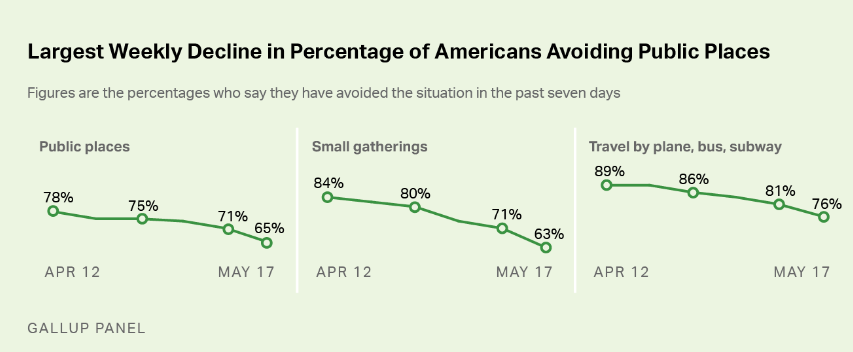
These include an eight-point decline in the percentage avoiding small gatherings, a six-point decline in the percentage avoiding public places and a five-point decline in the percentage avoiding air travel or public transportation.
In addition to the fewer Americans avoiding public places, Gallup now finds a new low of 55% saying they are "completely" or "mostly isolating" themselves from people outside their household, continuing an ongoing decline. The current figure is now lower than the 58% recorded in late March, before most states had issued shelter-in-place orders. In recent weeks, most states have let those shelter-in-place orders lapse or have eased stay-at-home restrictions.
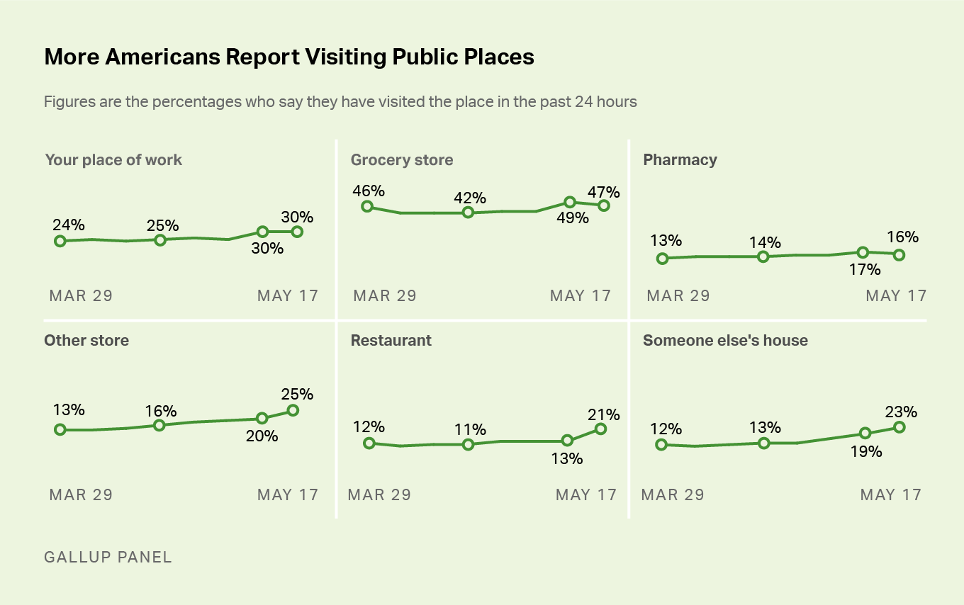
Last week, 21% of U.S. adults indicated they had visited a restaurant in the past 24 hours, a sharp increase from 13% the week before. The question did not indicate whether people dined at the restaurant or got takeout, but the increase indicates people feel more comfortable about going outside their home to get food than at any point during the coronavirus situation. The increase in restaurant visits is generally observed in every major demographic subgroup.
Last week also saw a further increase in Americans' reports of visiting someone else's home, now 23%, up from 19% a week ago and 13% near the end of April.
Meanwhile, reported visits to work and grocery stores have leveled off after recent increases, but the poll did find an uptick last week from 20% to 25% in the percentage who report visiting other types of stores.
Another, nonconventional yet growing in popularity means for assessing the reopening of the economy's activity is through OpenTable's state of the restaurant industry report. The firm is updating this report daily, which lends itself, in conjunction with the Gallup survey, to identifying improving or weakening consumer activity.
This data shows year-over-year seated diners at restaurants on the OpenTable network across all channels: online reservations, phone reservations, and walk-ins. For year-over-year comparisons by day, we compare to the same day of the week from the same week in the previous year. For example, we’d compare Tuesday of week 11 in 2020 to Tuesday of week 11 in 2019. Only states or cities with 50+ restaurants in the sample are included. All such restaurants on the OpenTable network in either period are included.
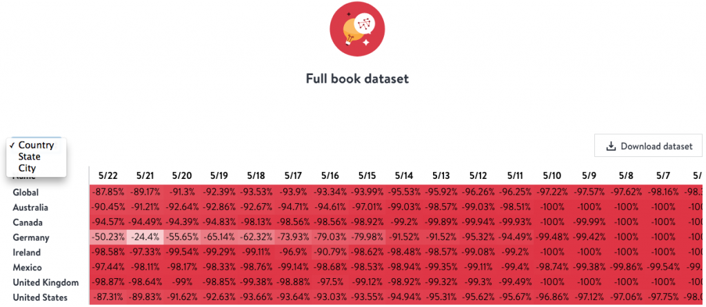
As we can see from the table's daily data above, which can be viewed by country, city and/or state, the U.S. is showing improvement each day and since the first week of May. We would expect the data to show increasing levels of improvement over the next couple of months and as more economic opportunities resume, absent shelter-in-place guidelines.
When the economy returns to normal, which we would presume will take at least 12-18 months, it will demand consumer spending and investment. Thus far, believe it or not, the data collected by Cowen Research suggest the consumer is already spending above levels seen in China and Europe post the lockdown periods in the respective regions.
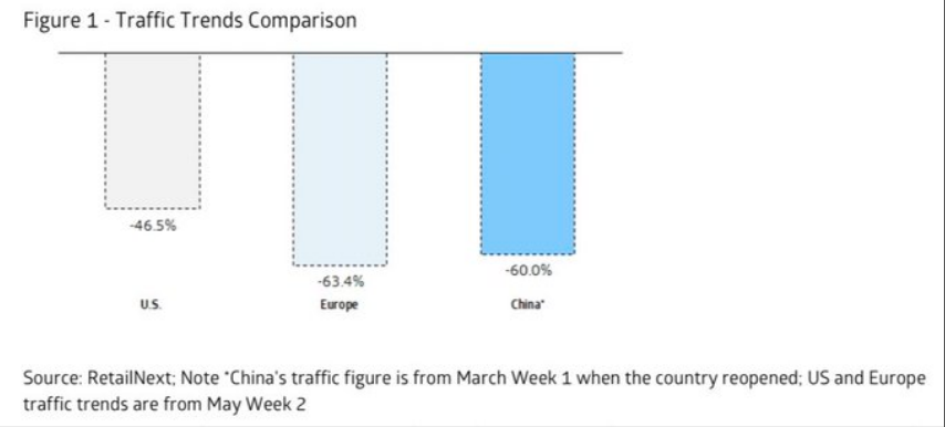
"US retail traffic is “better than feared, and encouragingly, the U.S. is tracking better than Europe and China when it first reopened. .. Jewelry and apparel are among the worst-performing categories, while footwear is performing better.”
Furthermore, while it would prove beneficial for the U.S. to show itself as recovering more quickly than it's peer developed nations, we can and should continue to monitor China's rebound. After all, it is the second largest economy in the world. China migration and traffic congestion data shows an acceleration after the May holiday period
Traffic Congestion in Chinese Cities in 2020 Relative to 2019

Movement Between Provinces in China – Change y/y

Movement Out of Provinces in China

- Traffic congestion in major cities has been rising and was as high as ~70% of last year's level before dipping in early May.
- Wuhan has lower relative congestion but has been recovering more rapidly.
- The latest migration data shows a year-over-year decline in movement between Chinese provinces in early May followed by a recovery to 20% below last year's level.
- Movement out of Chinese provinces has been accelerating but remains below year-ago levels.
- A month ago, movement out of most provinces was still decelerating y/y.
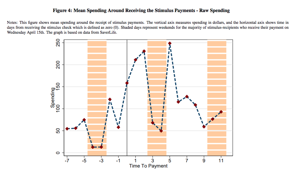
Be it in China or domestically, we understand that fiscal relief is aiding in the economic recovery, firstly stemming from consumer spending. I recently obtained the latest working papers from the NBER (National Bureau of Economic Research). It leaves no doubt as to the benefits to the economy produced by the Cares Act. The NBER looked at data that identified the direct deposits from the Cares Act relief aid and the consumers' marginal propensity to consume or MPCs. Below are some notes from the working papers and correlated charts. If you didn't think that money coming into tax payer accounts was needed and on-target with what consumers eventually and always prove to do...
We use this high-frequency detailed data to look at stimulus payments distributed by mid-April. The first stimulus payments were made on April 9th via direct deposit from the IRS, and we can observe spending at a high frequency before and after stimulus payments are made. The fact that we observe payment amounts and the exact timing of payments allows us to identify MPCs. We see sharp and immediate responses to the stimulus payments, and continued elevated spending even ten days after payments were received. Within ten days, users spend 29 cents of every dollar received in stimulus payments. The largest increases in spending are on food, non-durables, and rent and bill payments. In contrast to the 2008 stimulus payments, there is relatively little increase in spending on durables.
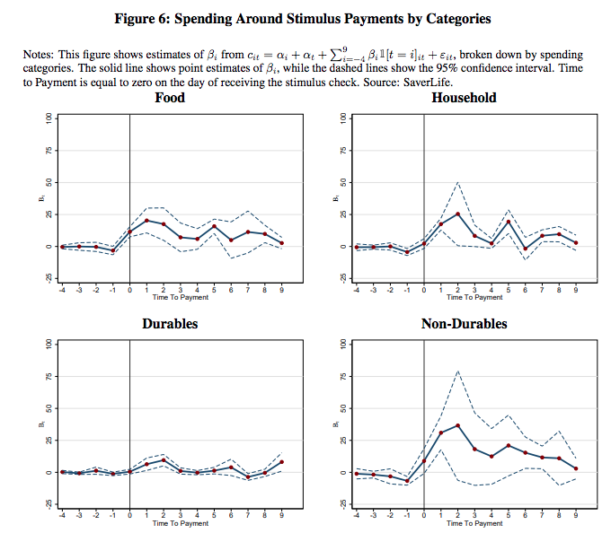
One notable difference from the stimulus program during the 2008 recession is the range of spending responses across categories. Previous research has found strong responses of durables spending to tax rebates and large stimulus programs, especially on automobiles (about 90% of the estimated impact on durables spending in the 2008 stimulus program was driven by auto spending).
In contrast, despite a sizable response in non-durables and service spending, we see little immediate impact on durables. Even if we attribute the entirety of our observed response in the ‘Payments’
category to spending on durables, the magnitude is much smaller than the combined response in food and non-durables categories. Moreover, the payments category also includes rent and bill payments which compose a portion of the ‘Payments’ category increase. This difference becomes even starker if we consider the fact that some prior literature has shown that larger payments often result in spending responses that skew more towards durables. Given the size of the 2020 stimulus checks, we might have expected large impacts on categories like automobile spending, electronics, appliances, and home furnishings. Instead it seems that individuals are catching up with rent and bill payments as well as engaging in spending on food, personal care, and non-durables.
In part, this discrepancy with past recessions may be driven by the fact that automobile use and spending is highly depressed, with many cities and states being under shelter-in-place orders and car use being restricted. Similarly, as these orders hinder home purchases, professional installment, and moves, spending on home furnishings and other related durables may be lower as well (the stimulative effects of home purchases on home durables are demonstrated in Benmelech, Guren and Melzer (2019)).
In the coming months, investors will be watching for a pickup in the purchases of durable goods, which is currently lacking based on the NBER working papers. This would likely demand improving labor force conditions and a favorable increase in consumer sentiment. Quite literally, the trifecta of various economic measures and activity are correlated and interdependent.
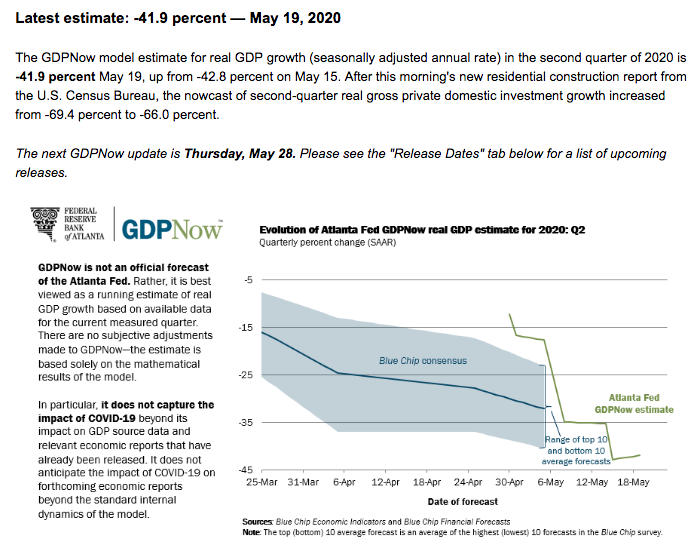
Come Thursday, investors will have more information for which to add to the stockpile of record setting economic data. Estimates for initial jobless claims will be made by Tuesday and Q1 2020 GDP is expected to be revised lower, but by how much remains to be seen. As we are now halfway through the Q2 2020 period, investors are largely looking forward as well and toward the Q2 GDP estimates. GDP is reported at a seasonally adjusted annual rate (SAAR). So a 40% Q2 decline is around 9% decline from Q1 (SA).
- From Merrill Lynch: We are tracking 2Q GDP at -40% qoq saar, down from -30% earlier. [SAAR May 22 estimate] emphasis added
- From Goldman Sachs: We left our Q2 GDP forecast unchanged at -39% (qoq ar) but raised our estimate of the initial vintage by 0.3pp to -31.5% (released on July 30th). [May 22 estimate]
- From the NY Fed Nowcasting Report: The New York Fed Staff Nowcast stands at -30.5% for 2020:Q2. [May 22 estimate]
The latest Atlanta Fed GDPNow tracker for Q2 GDP came in at -41.9% to end the week. Keep in mind that these estimates will update weekly and are prone to sharp moves.
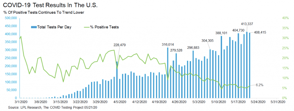
It's most probable that the economy bottomed during the economic shutdown in May and for every $1 more that is spent for each passing day since the reopening began, in earnest last week, the economy is on a growth path. How fast that growth path becomes depends on further reopening and the infection rate curve for COVID-19. Thus far and with 10 days having passed, the infection rate curve has continued to decline. More than 400k COVID-19 tests have been performed for two days in a row for the U.S., the first time ever. Also, the percent of positive tests is still only 6.2 percent.
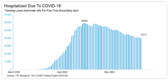
Less than 40k people are currently hospitalized due to COVID-19 in the U.S. This is the lowest since April 6th.
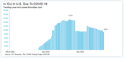
Last, but certainly not least, this is the lowest number of people in the ICU due to COVID-19 since early April.
To be clear, I do not anticipate another shutdown or shelter-in-place order on a national scale even if a secondary spread of the coronavirus appears in the fall-winter months. The cost to the economy has outpaced the mortality rate from COVID-19 and for which the Federal government is likely to find the cost/benefits analysis an unproven measure. While this certainly can be characterized as a heartless undertaking by the Federal government, as investors we are removed from such considerations and must foster the most logical outcomes. Secondly, we would likely recognize the timelines in consideration by the Federal government regarding a vaccine and drug treatment that usurp a demonstrated need to re-shutter the economy.
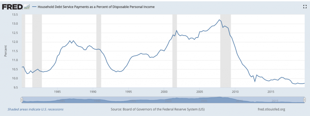
While I believe the recovery process to be a slow one, possibly slower than the post-GFC period, the consumer came into the recession with a better balance sheet and higher wages that are likely to provide the economy with a stronger base than the post-GFC period. (Chart of Household debt service payments as a percent of disposable income)
With my opinions and analysis put forth, let's now look at what Merrill Lynch's chief investment officer had to say about the path forward for the economy:
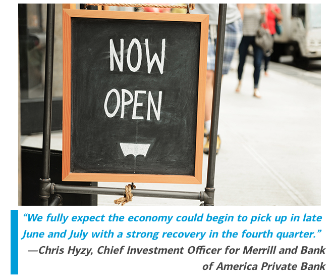
"DESPITE IMMENSE CHALLENGES facing many sectors of the economy, some encouraging signs suggest “green shoots” of a recovery that could begin as early as this summer, says Chris Hyzy, Chief Investment Officer for Merrill and Bank of America Private Bank. As all 50 states begin to take steps toward reopening after months of coronavirus-related lockdowns and consumer spending and unemployment slowly start to stabilize, “We fully expect the economy could begin to pick up in late June and July with a strong recovery in the fourth quarter.”
All Right Let's Wrap It Up Folks
The market can be characterized in many ways, but is mostly understood to be a forward discounting mechanism. But economics plays a role in our understanding of markets, as investors or traders. The cornerstone of economics is that things change over time because as we have seen, the situation doesn't stay too good or too bad indefinitely. Things indeed change! However, the last situation we experience, like the end of a movie or a sporting event will stay with us for a long time. It's why so many people just could not buy into the fact that the financial crisis was over and things were about to change, for the better. How much worse could they get given the dire circumstances back then? The stock market signaled that the worst was over, but few listened. Then, when there was a rebound that indicated a true change was taking place in March of 2009, many still would not believe it to be true or get on board the train as it left the station. They were convinced the train was going to go over a cliff. But something quite the opposite took place!
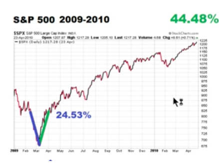
The current market rally is extremely similar to that of 2009, which did continue to march higher into 2010. The gain indicated atop the S&P 500 chart of 44.48% was not from the bottom but after the 24.53% V-bottom. Having said that, we can see the hiccups in the advance along the way, which begs of investors to expect an uneven advance in the market over time. Some investors and traders are of the opinion that if the S&P 500 achieves that elusive yet alluring 200-DMA, it would prove a sell signal for institutional investors. Federated Hermes’ Phil Orlando believes a “cleansing correction” could spark a 10% drop or more within weeks.
“You’ve got some investors who are bearish by nature and got sucked into this 36% rally. If the market starts to pull back in coming weeks, they’ll throw in the towel and say ‘Ah! I knew I shouldn’t have gotten into the market. The market is going down. This coronavirus is killing me.’ And then, they will wash their shares into the market.”
“A cleansing correction washes out the weak hands, and it allows the strong hands that understand the economic cycle to participate in the next up leg.”
The reality is that most institutional firms and portfolio managers don't have any meaningful exposure to the market. It's part of the reason that pullbacks get bought so quickly. Recall that two weeks ago the intra-week peak-to-trough drop was 5.5% before finishing down just 2.26% on the week.
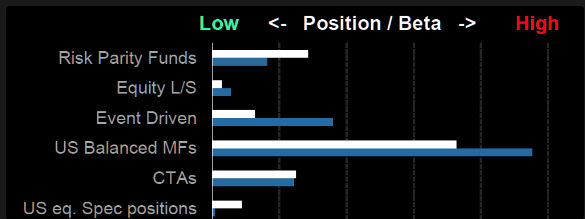
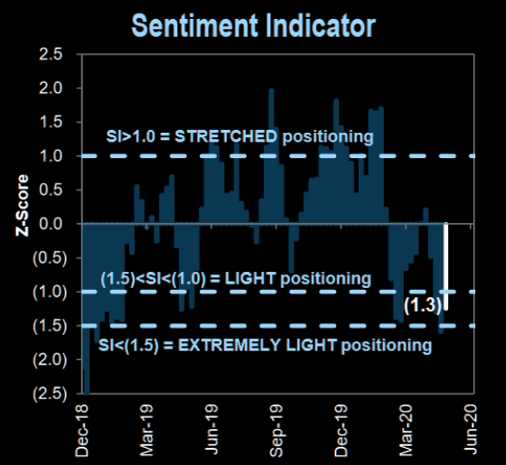
And let's not forget that GS Sentiment Indicator measures stock positioning across retail, institutional, and foreign investors versus the past 12 months. Readings below -1.0or above +1.0 indicate extreme positions that are significant in predicting future returns. Right now, although sentiment improved, it's still expresses extremely low market positioning.
Regardless of market illiquidity or positioning, investors should be mentally prepared for any outcome. Ultimately, the main consideration is what an active portfolio manager should do if the market continues to melt up and above the 200-DMA or falls 7-10 percent. I'm of the opinion that lightening volatility exposure or high beta positioning (fast and percentage moving) into a 200-DMA advance would prove optimal given Finom Group's 30-day outlook that anticipates consolidation. To reiterate: Consolidation can take the form of time and/or price. Over the last 6 weeks, the market has exacted a good amount of time consolidation while the S&P 500 traded in a tight range.
Moreover, I remain of the opinion that dips are to be used as long-term buying opportunities. In no particular order we outline our 5 REASONS underlying our BUY THE DIP premise:
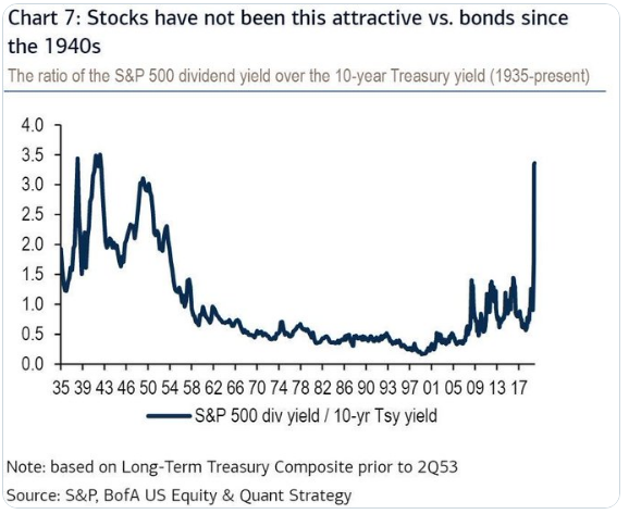
1. One of the most glaring reasons why investors should buy the dip is with respect to the equity risk premium (ERP) and or the relative value of stocks:bonds.
2. Cash levels remain elevated on retail platforms, and money fund balances of $4.7tr allocations are also elevated. Suggests capacity for more cash to come into the market.
3. Another reason why we are of the opinion that market pullbacks are buying opportunities is due to the fact that despite essentially shutting down some 90% of the economy, earnings are not nearly as bad as they were through the Great Financial Crisis. For 2008, S&P 500 EPS declined 46% annualized and without timely fiscal monetary and fiscal policy implementation.
Through the first quarter to-date, S&P 500 EPS is tracking down 14.6% according to FactSet data. The forward 12-month P/E ratio or the S&P 500 is 21.0. This P/E ratio is above the 5-year average (16.8) and above the 10-year average (15.1). Ok, we're not saying the market isn't expensive, but to refer to our prior point concerning ERP...
- For Q2 2020, analysts are projecting an earnings decline of -42.9% and a revenue decline of -11.5%.
- For Q3 2020, analysts are projecting an earnings decline of -24.8% and a revenue decline of -5.7%.
- For Q4 2020, analysts are projecting an earnings decline of -12.4% and a revenue decline of -1.4%.
- For CY 2020, analysts are projecting an earnings decline of -20.8% and a revenue decline of -3.9%.
- For CY 2021, analysts are projecting earnings growth of 27.8% and revenue growth of 8.6%.
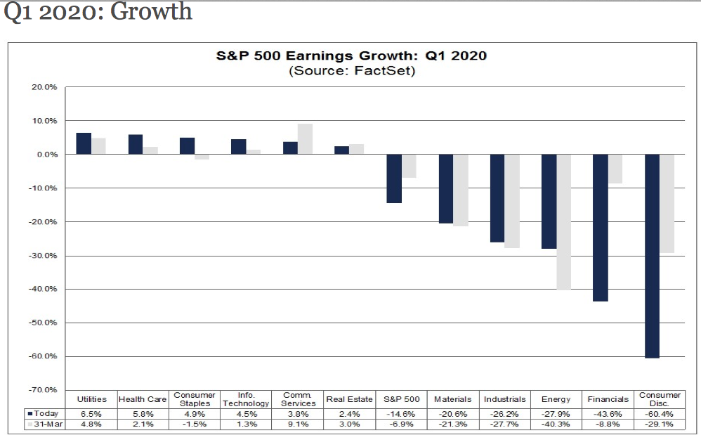
As noted above, earnings are forecast to trough in the Q2 period and FY2020 EPS is forecast to decline just 20 percent. Goldman Sachs estimates show an EPS forecast of down 33% YoY. None of the aforementioned forecast are as poor as the actual EPS decline in 2008 or the sequential Q4 2008- Q3 2009 period for that matter. Investors have seen how this story has played out in the past when the federal government and central banks step up to the plate and flood the financial markets with liquidity and stimulate the economy. Speaking of stimulating the economy...
4. At present and as discussed in last week's Research Report, the House and Senate are in talks for a new round of stimulus and Morgan Stanley's Chief Public Policy Strategist Mike Zezas expects U.S. Congress and the President to come together and deliver one more dose of fiscal stimulus, and then hold on further action until the election. Mike’s base case for ‘CARES Part 2’ is for an extension of $700bn-$1.1trn, while his bull case would be for a $1.6-$2.4tn extension of fiscal relief/stimulus.
After downplaying the need for more federal spending, the GOP-held Senate has started to open the door to a more narrow aid proposal. Senate Majority Leader Mitch McConnell told Trump this week that the next bill should not cost more than $1 trillion, according to Axios. The president has generally showed more comfort with free spending than his Republican allies in Congress.
And there remains a very good reason that the Trump Administration is warming up to a new round of relief monies to be delivered to tax payers. The Administration likely knows their history. If history serves as any indication, and with one exception, a recession in a presidential
incumbency race is a guarantee of the sitting administration’s demise.
Based on the results of presidential elections since the early 1900s with running incumbents, the Merrill Lynch tables show that the incumbent presidents who presides over a recession within the two years leading up to Election Day do not win re-election.
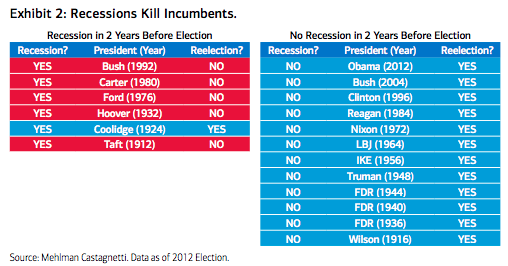
No recession? Quite the opposite destiny with reelection. Historical comparisons aren't perfect, however. The unknown impact of the reopening of states and risk to a second wave remains a huge unknown. As it stands, BofA Global Research is predicting the U.S. will experience a -30% QoQ SAAR decline in economic growth in the second quarter followed by a -1.0% decline in the third quarter and, through Election Day, 25% growth for the fourth quarter of this year.
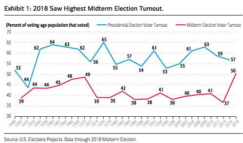
As we work our way through the health pandemic this close to election time, the election outcome may be determined not by which candidate rallies the most support but which voter base is willing to cast a ballot (all things considered, mail-in ballots, vote-by-mail and other unconventional means could play out). There is reason to expect record voter turnout judging by the record 2018 midterm election across all voting age and major racial and ethnic groups (Exhibit 1). 50.3% of the voting-age population voted in 2018, the highest in four decades. Voter turnout is regularly lower in midterm elections as compared to presidential cycles. In 2008, for instance, 63% of the voting-age population cast ballots, electing Barack Obama. Two years later, 41% of voters voted in the midterm election.
I would be of the opinion that another fiscal relief package arrives by the end of June. Neither political party desires to be blamed for curtailing relief to those who need it the most during an election year. The existing relief is already 4X greater than that delivered during the Great Financial Crisis, combine that much more stimulus with a vaccine by year's end, and we might finally see animal spirits and fund flows into equities on scale. Need more reasons to be a dip buyer?
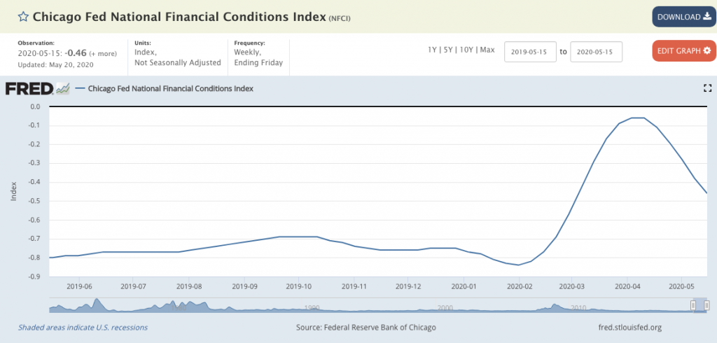
5. The Fed may be about to put any doubt about a potential credit crisis to rest in the coming week according to Bank of America Merrill Lynch's latest notes and analysis. This, at a time when the central bank's activity has already seemingly staved off a credit crises and eased financial conditions.
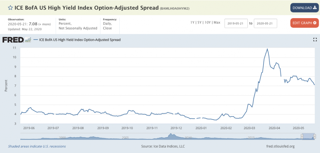
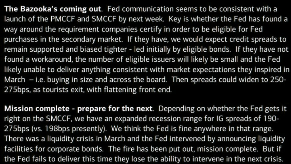
Nonetheless, here is what Bank of America Merrill Lynch offered to clients on the subject matter of the Fed's Primary Market Corporate Credit Facility. For those not familiar with the PMCCF...
"Primary Market Corporate Credit Facility (PMCCF) is a special purpose vehicle (SPV) created on March 23, 2020 by the Federal Reserve designed to maintain the flow of credit to large employers in the face of the COVID-19 coronavirus crisis. The Fed will lend money to the SPV, which will make loans to investment grade corporations and buy corporate bonds to help them continue to function through the crisis. The loans will have a maturity of up to 4 years and corporations can defer payment for 6 months, possibly longer if the Fed decides to extend the deferment.1 The purpose of the program is to ensure companies have enough credit to keep functioning so they can limit layoffs, which would further worsen the recession.
So what will drive a pullback to take shape? The list of culprits is just as long as that which could drive the market above 3,000 near-term. One may come from a simplistic chart pattern. Andy Nyquist offers the following chart and sentiment suggesting the market is topping and may falter soon.
"Today’s chart, however, warns that the rally may be nearing a pause / pullback as the S&P 500 is showing signs of a broadening formation."

By the way, the above chart is indeed a "chart crime". Any number of headlines and failures to reopen without stabilizing the epidemic curve could prove devastating to investment sentiment, but ultimately we are of the opinion that science and human ingenuity will overcome in short order, proving any fears in the interim to be short-lived and best treated for long-term opportunity.
There is no real mystery to the markets folks! In order to have rallies, you need to have declines and vice versa. Investors need to take this one day and or one week at a time. Nobody should be a permabull or a permabear. Having said that, I can't deny that the markets do one thing over time, "They trend from the lower left-hand corner to the upper right-hand corner." Given this truism of markets, if you must err to one side or the other, as a default setting of sorts, the right way to lean is obvious and shared by most successful investors. Optimism as a default setting is the only way to successfully fund a retirement over the long haul. In this example, I believe history will prevail and repeat.
As we embark upon this Memorial Day holiday weekend, not all people can understand why we should celebrate it. What should we do in this situation? Inspirational quotes about Memorial Day can help you to understand the deep essence of the holiday! In addition to this, you’ll see that an American soldier bears a great responsibility in the face of the state and its population. The truth is that our happiness has been built on the deaths of many military people! I am not going to teach you how to live, after all, this is a Research Report on the macro-environment, but I want you to say “thank you” to all of them!

"Ceremonies are important, but our gratitude has to be more than visits to the troops and once a year Memorial Day ceremonies. We honor the dead best, by treating the living well!"


