
The Big Four Economic Indicators: Industrial Production Up 0.5% In March
Official recession calls are the responsibility of the NBER Business Cycle Dating Committee, which is understandably vague about the specific indicators on which they base their decisions. This committee statement is about as close as they get to identifying their method.
There is, however, a general belief that there are four big indicators that the committee weighs heavily in their cycle identification process. They are:
- Nonfarm Employment
- Industrial Production
- Real Retail Sales
- Real Personal Income (excluding Transfer Receipts)
The Latest Indicator Data
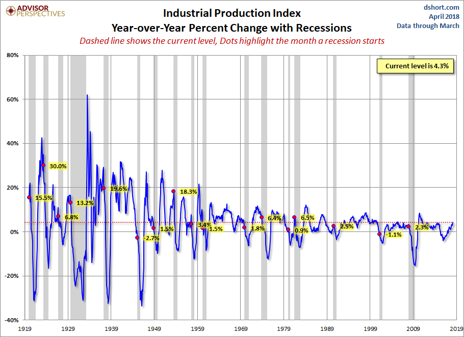
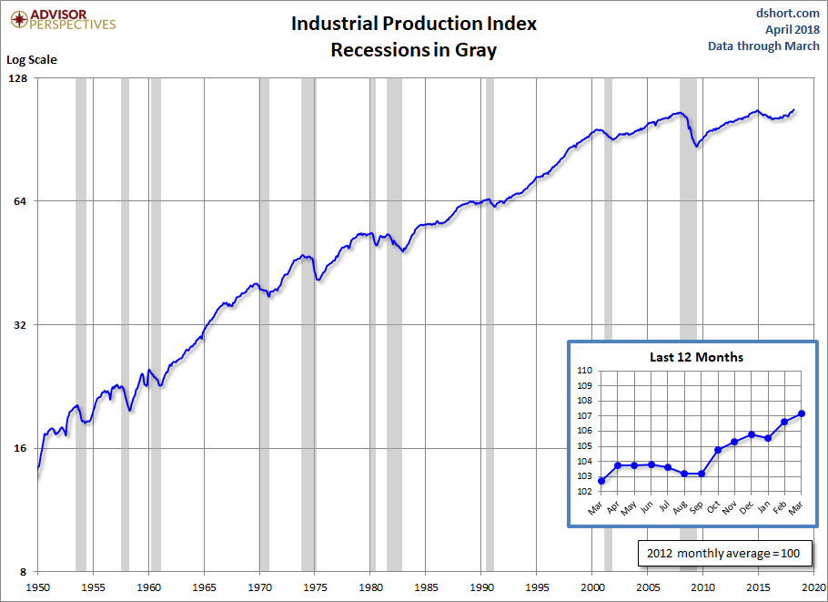
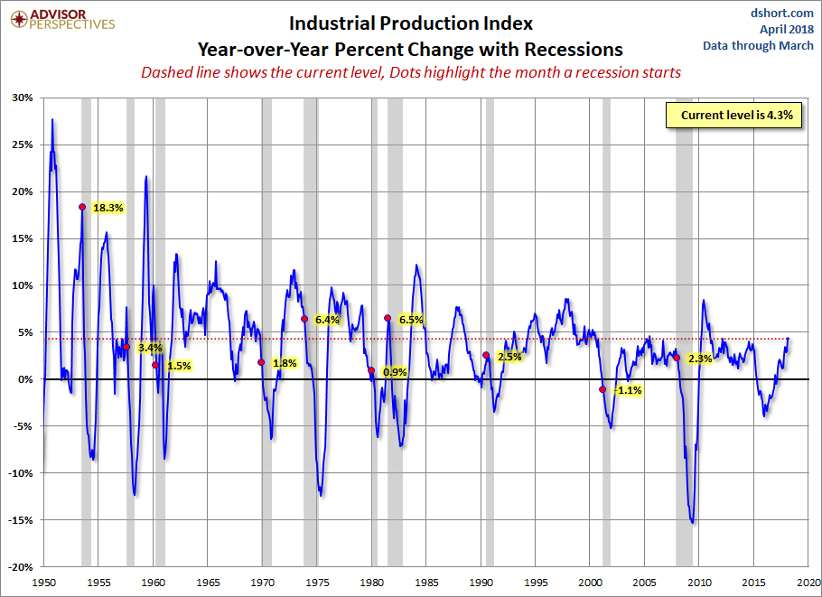
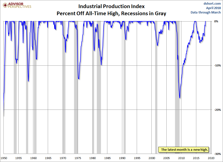
Today's report on Industrial Production for March shows a 0.5% increase month-over-month, which was better than the Investing.com consensus of 0.3%. The year-over-year change is 4.33%, down slightly from last month's YoY increase. The indicator is currently at an all-time high.
Here is the overview from the Federal Reserve:
Industrial production rose 0.5 percent in March after increasing 1.0 percent in February; the index advanced 4.5 percent at an annual rate for the first quarter as a whole. After having climbed 1.5 percent in February, manufacturing production edged up 0.1 percent in March. Mining output rose 1.0 percent, mostly as a result of gains in oil and gas extraction and in support activities for mining. The index for utilities jumped 3.0 percent after being suppressed in February by warmer-than-normal temperatures. At 107.2 percent of its 2012 average, total industrial production was 4.3 percent higher in March than it was a year earlier. Capacity utilization for the industrial sector moved up 0.3 percentage point in March to 78.0 percent, a rate that is 1.8 percentage points below its long-run (1972–2017) average. [view full report]
The chart below shows the year-over-year percent change in Industrial Production since the series inception in 1919, the current level is lower than at the onset of 8 of the 17 recessions over this time frame of nearly a century.
Capacity Utilization
The Fed's monthly Industrial Production estimate is accompanied by another closely watched indicator, Capacity Utilization, which is the percentage of US total production capacity being used (available resources includes manufacturing, mining, and electric and gas utilities). In addition to showing cycles of economic growth and demand, Capacity Utilization also serves as a leading indicator of inflation.
Here is a chart of the complete Capacity Utilization series, which the Fed began tracking in 1967. The linear regression assists our understanding of the long-term trend. We've highlighted the post-recession peak in November 2014.
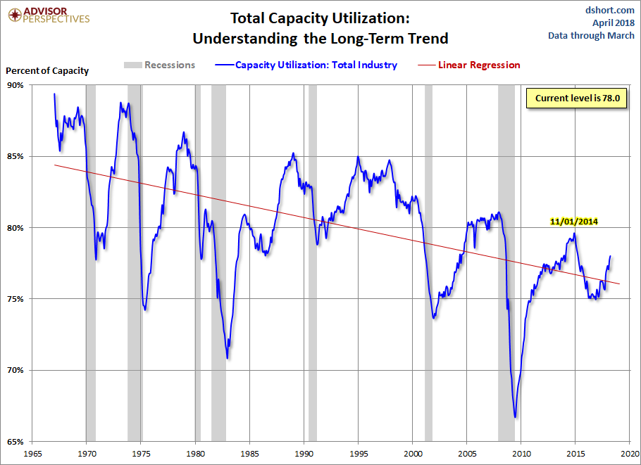
The latest reading is off its interim peak, but climbed above the regression in late 2017.
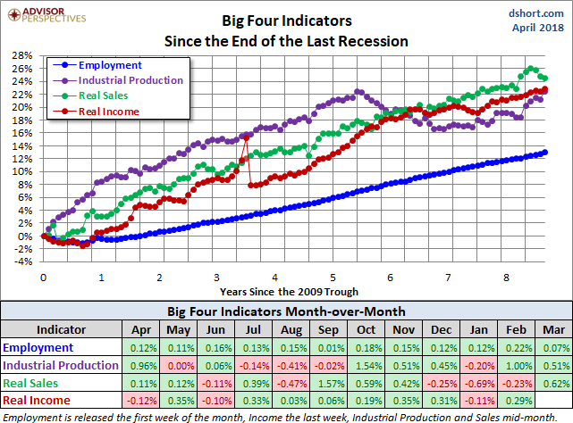
The Generic Big Four
The chart and table below illustrate the performance of the generic Big Four with an overlay of a simple average of the four since the end of the Great Recession. The data points show the cumulative percent change from a zero starting point for June 2009.
Assessment and Outlook
The US economy was slow in recovering from the Great Recession. Employment and Income have been relatively strong. Real Retail Sales have been rising but below trend. Industrial Production has taken much longer to rebound since 2009.
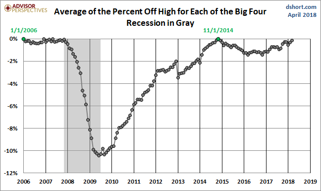
Here is a percent-off-high chart based on an average of the Big Four. The average of the four set a new all-time high in November 2017. The previous high was in November 2014.
The next update of the Big Four will be the latest numbers for Personal Income.
Background Analysis: The Big Four Indicators and Recessions
The charts above don't show us the individual behavior of the Big Four leading up to the 2007 recession. To achieve that goal, we've plotted the same data using a "percent off high" technique. In other words, we show successive new highs as zero and the cumulative percent declines of months that aren't new highs. The advantage of this approach is that it helps us visualize declines more clearly and to compare the depth of declines for each indicator and across time (e.g., the short 2001 recession versus the Great Recession). Here is our four-pack showing the indicators with this technique.
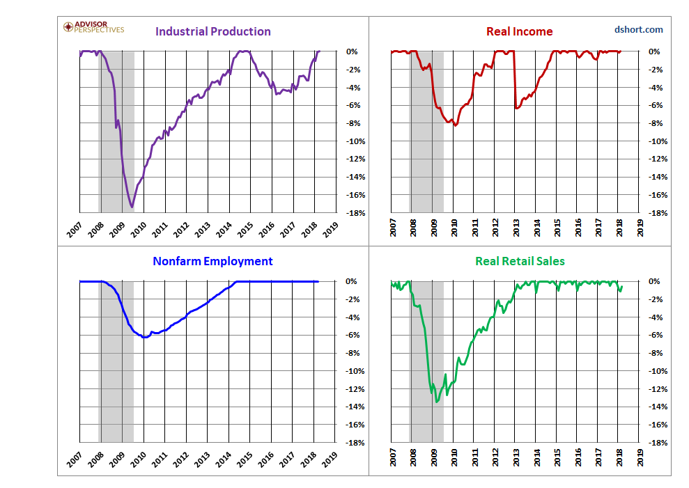
Now let's examine the behavior of these indicators across time. The first chart below graphs the period from 2000 to the present, thereby showing us the behavior of the four indicators before and after the two most recent recessions. Rather than having four separate charts, we've created an overlay to help us evaluate the relative behavior of the indicators at the cycle peaks and troughs. (See the note below on recession boundaries).
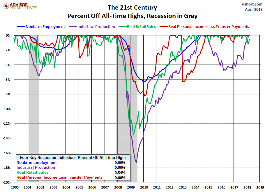
The chart above is an excellent starting point for evaluating the relevance of the four indicators in the context of two very different recessions. In both cases, the bounce in Industrial Production matches the NBER trough while Employment and Personal Incomes lagged in their respective reversals.
As for the start of these two 21st century recessions, the indicator declines are less uniform in their behavior. We can see, however, that Employment and Personal Income were laggards in the declines.
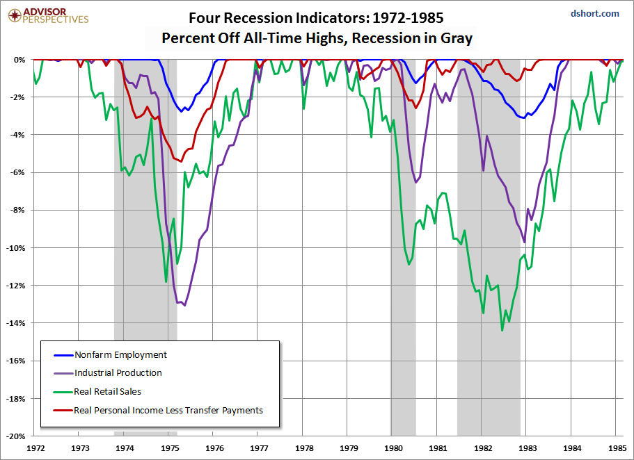
Now let's look at the 1972-1985 period, which included three recessions -- the savage 16-month Oil Embargo recession of 1973-1975 and the double dip of 1980 and 1981-1982 (6-months and 16-months, respectively).
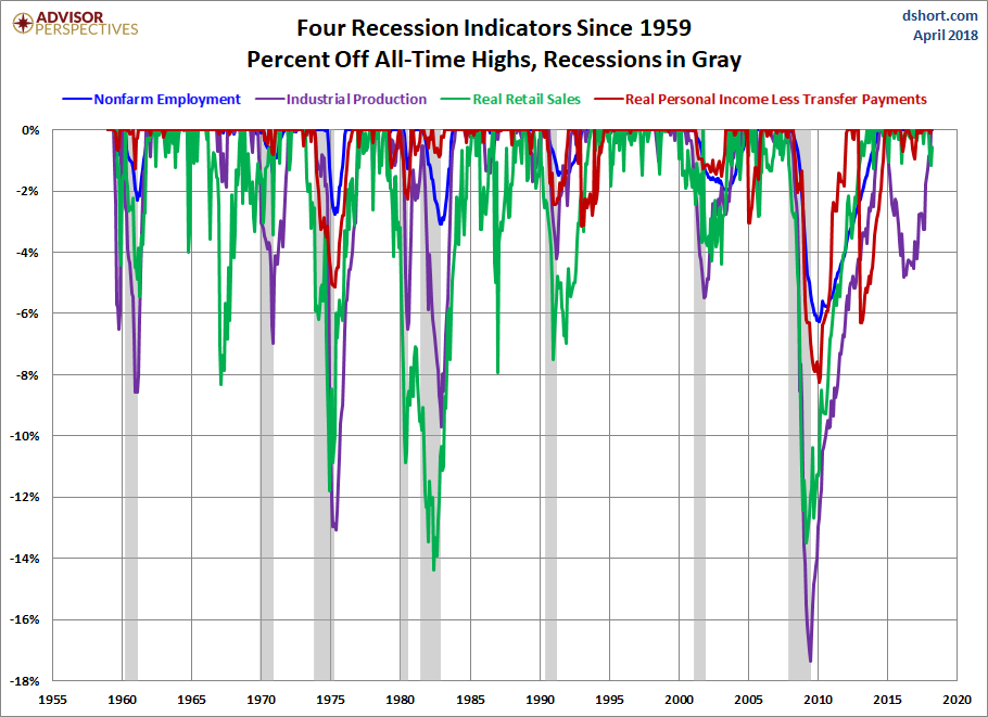
And finally, for sharp-eyed readers who can don't mind squinting at a lot of data, here's a cluttered chart from 1959 to the present. That is the earliest date for which all four indicators are available. The main lesson of this chart is the diverse patterns and volatility across time for these indicators. For example, retail sales and industrial production are far more volatile than employment and income.
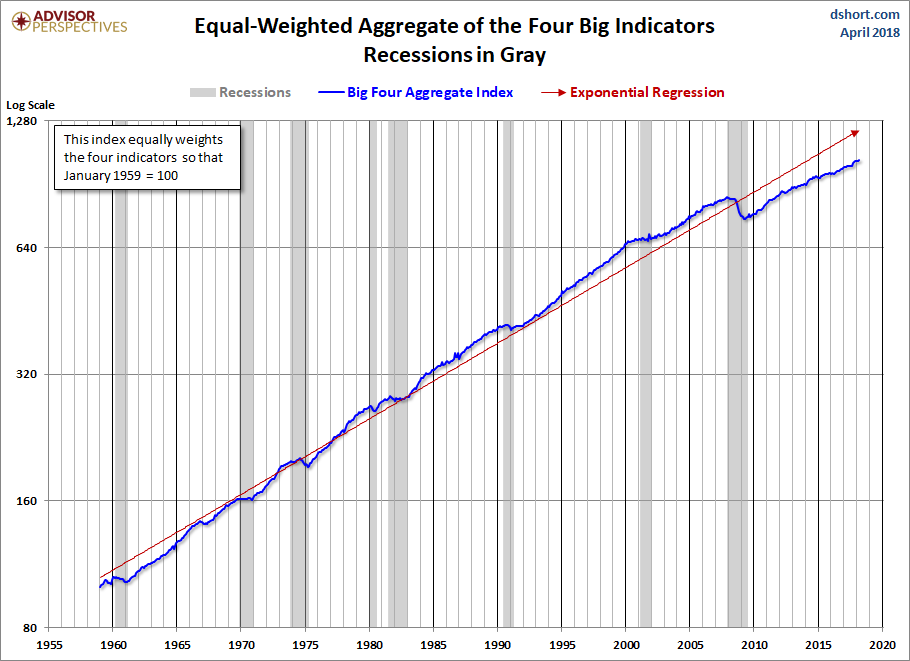
The charts above focus on the Big Four individually, either separately or overlaid. Now let's take a quick look at an aggregate of the four. The next chart is an index created by equally weighting the four and indexing them to 100 for the January 1959 start date. We've used a log scale to give an accurate indication of growth and also added an exponential regression to assist us in seeing the secular patterns of faster and slower growth. As we can readily see, growth of this aggregate indicator has slowed dramatically since the end of the last recession.
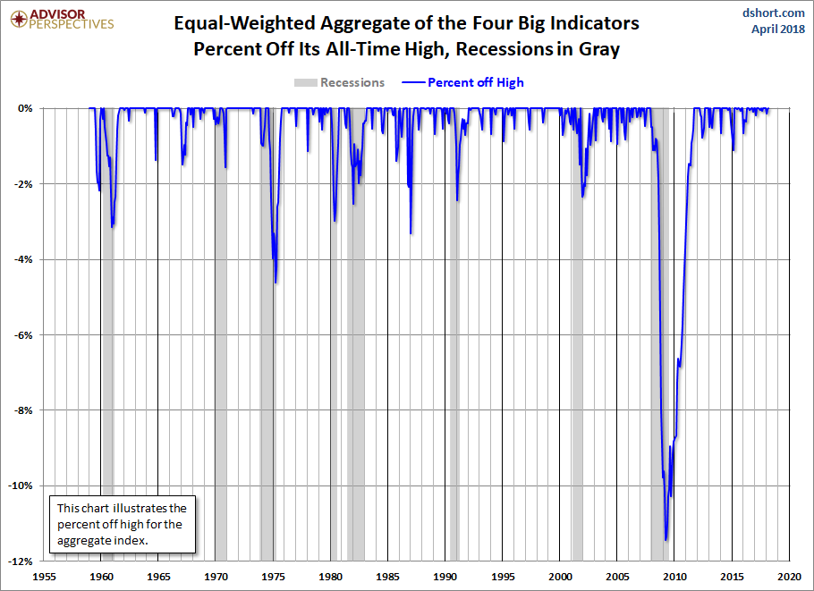
Now let's plot the percent off high for this aggregate index. As we immediately recognize, it is completely worthless as leading indicator of recessions. The aggregate index set a new high the month before the recession began for five of the eight recessions since the early 1960s.
We can construct a better leading indicator by plotting the average of the percent off highs for each of the four, which is the technique we've used in the next chart. Here we've highlighted the months when all four indicators were at all-time highs. The dashed line shows the -0.93% average of the four at recession starts.
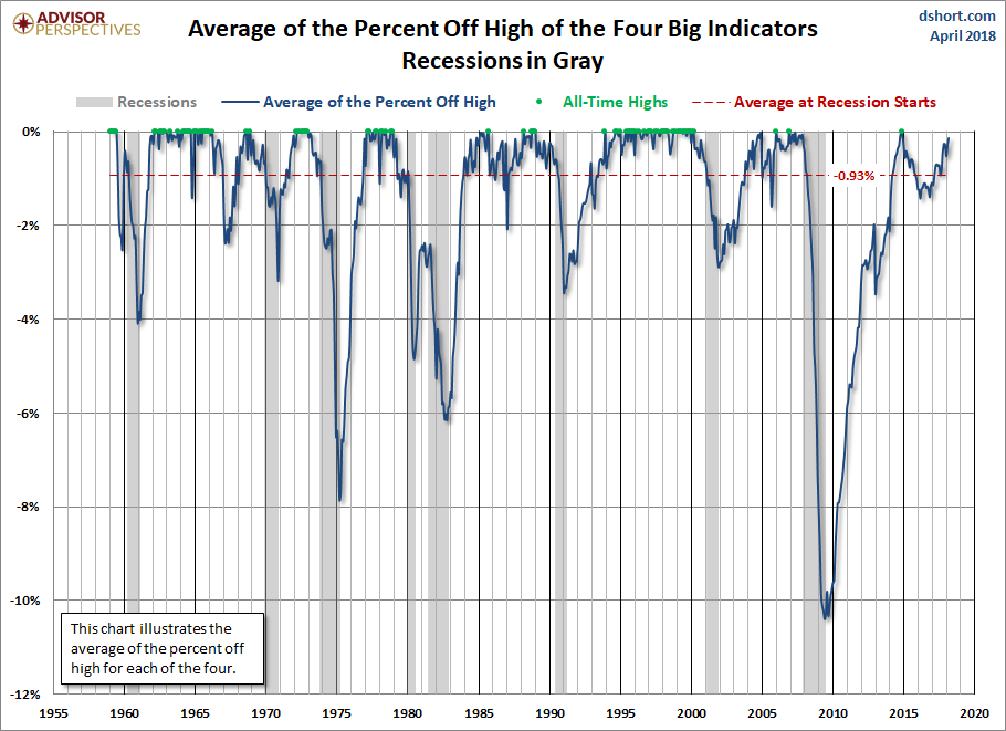
The chart clearly illustrates the savagery of the last recession. It was much deeper than the closest contender in this timeframe, the 1973-1975 Oil Embargo recession.
Appendix: Chart Gallery with Notes
The indicator discussed in this article is illustrated below in three different data manipulations:
- A log scale plotting of the complete data series to ensure that distances on the vertical axis reflect true relative growth. This adjustment is particularly important for data series that have changed significantly over time.
- A year-over-year representation to help, among other things, identify broader trends over the years.
- A percent-off-high manipulation, which is particularly useful for better understanding of trend behavior and secular volatility.
Industrial Production
The US Industrial Production Index (INDPRO) is the oldest of the four indicators, stretching back to 1919, although we've dropped the earlier decades and started in 1950.
A Note on Recessions: Recessions are represented as the peak month through the month preceding the trough to highlight the recessions in the charts above. For example, the NBER dates the last cycle peak as December 2007, the trough as June 2009 and the duration as 18 months. The "Peak through the Period preceding the Trough" series is the one FRED uses in its monthly charts, as explained in the FRED FAQs illustrated in this Industrial Production chart.
Note: This commentary has been updated to incorporate the March data for Industrial Production.
Disclosure: None.


