
Technically Speaking: You Carry An Umbrella In Case It Rains
With the markets closed yesterday, it gives us a chance to review the short, intermediate, and long-term signals the markets are currently sending.
Brett Arends recently wrote an excellent piece for MarketWatch with respect to investors feeling like they “missed out,” on the recent rally. To wit:
“Sure, if you’d bought and held you’d have been sitting in stocks during the boom since Jan. 1. But you’d also have been sitting in stocks when they tanked last quarter. The Dow has risen more than 2,000 points this year, but it fell more than 3,000 in the fourth quarter. Even after the rally, the Standard & Poor’s 500 is still 6% below last September’s peak. The average level on the S&P 500 during 2018 was 2,744, says FactSet. The level today: 2,745. It’s a wash. Meanwhile, the rest of the world has done even worse. The MSCI All Country ex-US index is still 12% below its 2018 average.”
This is an important point, because it is the “psychological” drivers, like the “Fear of Missing Out (F.O.M.O)” and “Get Me The F*** Out (G.M.T.F.O),” which are the primary cause of investing mistakes over time.
But, the recent rally sure “feels” like the worst is over as the Fed “Put” seems to be back on the table.
Or is it?
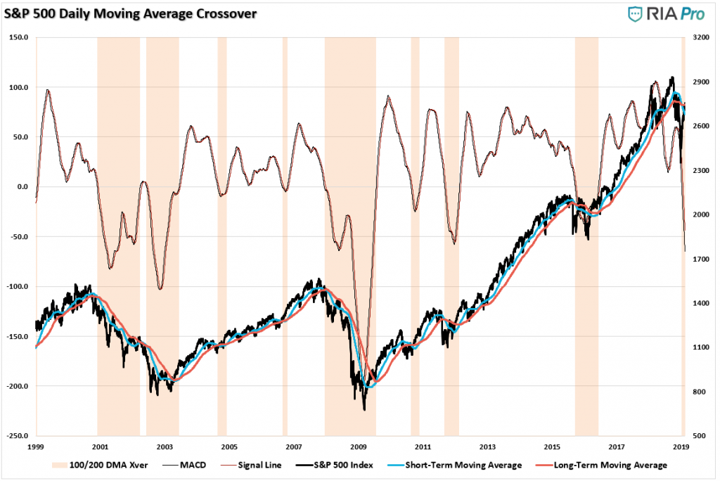
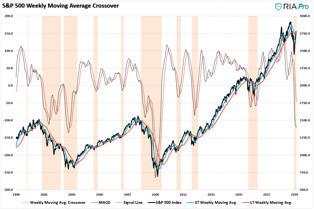
The following six charts are each identical in their design. The only difference is the time frame of the data being analyzed from Daily to Weekly, to Monthly. For our purposes, we use the three time frames for making different determinations:
- Daily – “warning signals” – Like a “yellow light” at an intersection, it suggests whether an extra-layer of caution should be applied or not.
- Weekly – portfolio allocation changes with respect to equity risk.
- Monthly – understanding whether the overall “trend” of the market changed. (While a “rising tide lifts all boats,” the opposite is also true.)
As shown below, you can see that the daily indicator provides an abundance of signals. While many are timely in suggesting you should have less risk in the markets, there are also plenty of false signals along the way as well. Currently , the “sell signal” has been, and remains, in place since late September of 2018. But the recent rally suggests this signal could soon reverse if the rally persists.
The following series of charts come courtesy of RIA PRO.
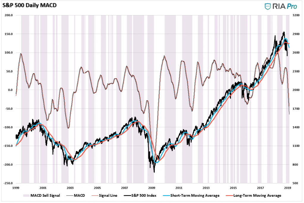
Likewise, the secondary, or confirming indicator, is also suggesting “caution” with respect to chasing the market currently. But, as I stated above, these very short-term indicators are like “yellow lights at a busy intersection.” As investors we have a choice, “slow down” or “step on the gas.“
But which action do you take? The recent rally certainly “feels” like you should “shove your foot in the carburetor”and “hang on for the ride.”
This is why we use confirming indicators. Like any good process, we want to have one signal “confirmed” by others which increase the probability of getting more accurate signals over time.
(Note: I said “probability” of “more accurate” signals over time. There are no “perfect” indicators or processes that work 100% of the time. It is the discipline of adhering to a process dogmatically over time, even when it seems broken, which has the highest probability of success.)
Even on a “weekly” basis, there can be a lot of signals, and as stated above, “false” signals are not uncommon. Currently, as the purple highlight shows, despite the recent rally, the signal suggests a higher level of caution currently.
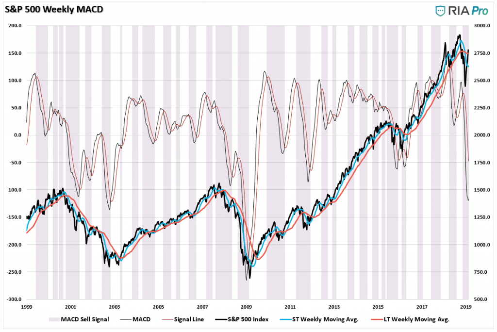
But could it just be a “false signal?” Maybe. The signal in 2011 and 2012 were certainly false signals due to the interventions of massive rounds from “QE” from the Fed. However, given the Fed is only potentially pausing the reduction of, and not injecting, liquidity, the current “signal” is likely worth giving more weight to.
Stepping back to a monthly basis, we can “confirm” the daily, and weekly, signals further. Again, as with all signals, you can get some false indications, but those were small prices to pay for the “savings” when the signals were right as during 2018.
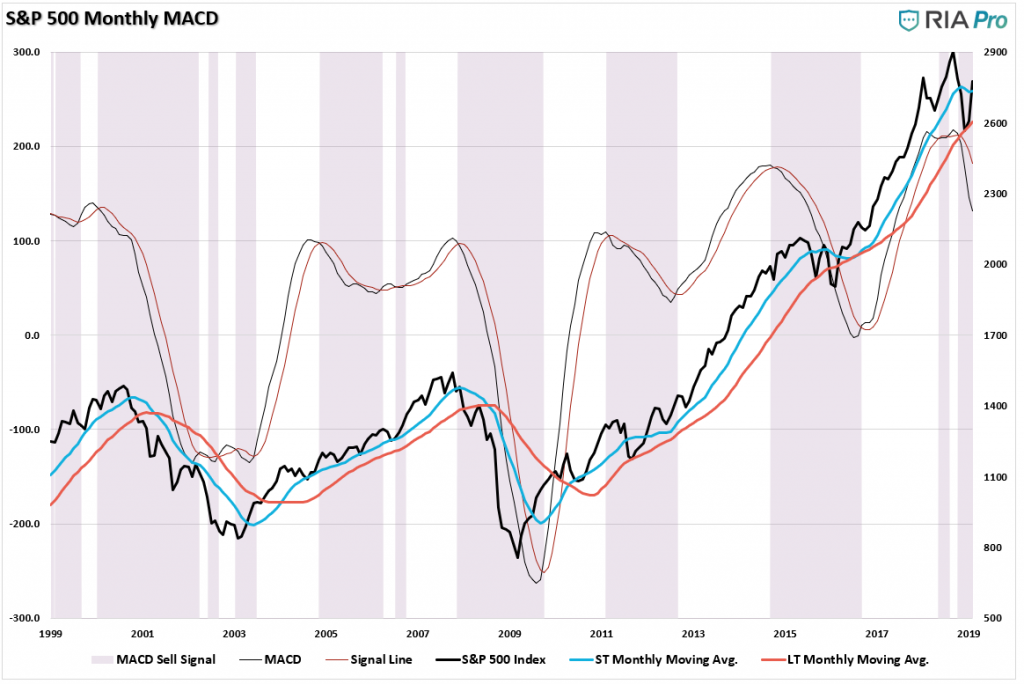
Currently, the ONLY signal which is NOT confirming the other five is the long-term month indicator which continues to confirm the current “bull market” trend from the 2009 lows remains intact.
This last indicator is why our portfolios remain primarily allocated to equity risk currently (although the first 5-signals have us running at reduced levels of equity risk, higher cash levels, and fixed income at targets.)
Currently, as Brett notes, the current rally has all of the “earmarks” of a “bull rally in a bear market.”
“Yes, certainly, the biggest “up” days on the market have historically accounted for a big chunk of long-term returns.
‘One of the most common rhetorical bulwarks in the defense of buy and hold investing is to demonstrate the effects of missing the best 10 days in the market, and how that would affect the compounded return to investors. This is perhaps one of the most misleading statistics in our profession.’ – Meb Faber , Cambria Investments
The reasons? Most of the biggest ‘up’ days took place during bear markets, when the smart move was to be on the sidelines, he says. Oh, and missing the worst days was just as good for your wealth as catching the best ones, he found. From 1928 through 2010, he calculated, the 1% best days gained you, on average, 4.9% each. What about the worst 1% of days? They cost you about 4.9% each.'”
While we looked at daily, weekly, and monthly indications, taking a look at “quarterly” data can give us clues as to the “real risk” investors are taking on at any given time. Is this the beginning of a major bull market cycle? Or, are we nearing the end of one? How you answer that question, given the relatively short time frame of the majority of investors (hint – you don’t have 100-years to reach your goals), can have an important impact on your outcome.
As I wrote in “Investors Are Dealt A Losing Hand:”
“The problem for investors is that since fundamentals take an exceedingly long time to play out, as prices become detached “reality,” it becomes believed that somehow “this time is different.”
Unfortunately, it never is.
The chart of the S&P 500 is derived from Dr. Robert Shiller’s inflation adjusted price data and is plotted on a QUARTERLY basis. From that quarterly data I have calculated:
- The 12-period (3-year) Relative Strength Index (RSI),
- Bollinger Bands (2 and 3 standard deviations of the 3-year average),
- CAPE Ratio, and;
- The percentage deviation above and below the 3-year moving average.
- The vertical RED lines denote points where all measures have aligned”
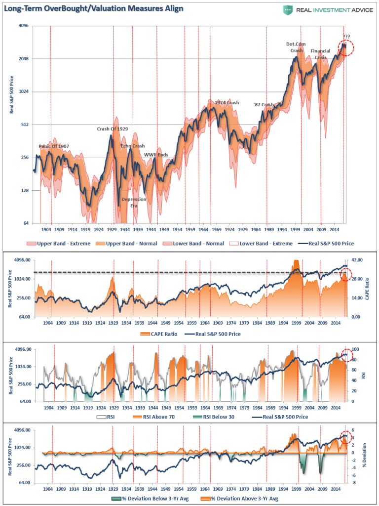
Even after the recent correction, long-term extensions and deviations remain at historically high levels which, historically speaking, have not been extremely kind to investors. But valuations, despite the recent correction, as still pushing 30x earnings as well. As Brett noted:
“From the viewpoint of long-term investment, major risks remain according to some long-term strategists. Yes, conventional wisdom on Wall Street tells you that stocks are likely to gain an average of around 9% a year. And yes, that’s based on the historic average going back at least to the 1920s. But, say some financial historians, that’s a misreading of the past. Stocks, they say, typically produced ‘average’ returns if you bought them at roughly ‘average’ valuations in relation to things like net assets and net income. And U.S. stock valuations today, they warn, are anything but average.
According to price-to-earnings or ‘PE’ data tracked by Yale University finance professor and Nobel Prize winner Robert Shiller, the S&P 500 is about 75% above its historic average valuation. ‘
Today, with valuations still near the most expensive 10% of starting valuations, 10-year forward returns will likely be very disappointing.
But, valuations are a “horrible” investment timing device. Which is why we use a specific set of price indications over varied time frames to determine short-term risk versus reward.
Currently, the markets are rallying. so we have to pay attention to what is happening now. As investors, we have to make money when the “sun is shining.” But that doesn’t mean to do it with reckless abandon, and as Brett pointed out, the same things that caused the sell-off in 2018, still exist currently.
- Economic slowdowns in China and Europe
- Rising interest rates
- Trade war fears
- Looming conflicts between a Democratic Congress and President Trump
- Weaker corporate earnings.
(You wouldn’t lay on the beach butt naked on a blistering summer day without any sunscreen would you? You could, but the consequences could be painful.)
The same is true for investing. Currently, the markets are rallying on a lot of “hope” and short-term “optimism.”However, longer-term fundamental and technical indicators are suggesting investors take some cautionary measures.
This doesn’t mean sell everything and hide in cash. But it does suggest adding some portfolio hedges, raising cash levels a bit, and holding fixed income.
You may appreciate having an umbrella if it begins to rain.
RIA PRO. (Get a free 30-day trial with code PRO30)


