
Technically Speaking: This Is Still A “Sellable Rally”
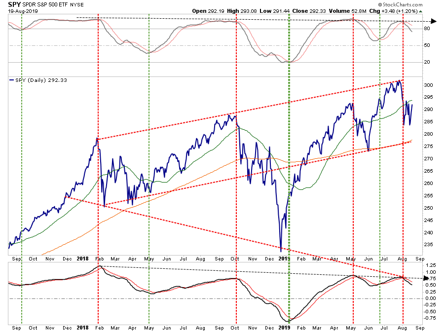
In last Tuesday’s “Technical Update,” I wrote that on a very short-term basis the market had reversed the previously overbought condition, to oversold.
“This could very well provide a short-term ‘sellable bounce’ in the market back to the 50-dma. As shown in the chart below, any rally should be used to reduce portfolio risk in the short-term as the test of the 200-dma is highly probable. (We are not ruling out the possibility the market could decline directly to the 200-dma. However, the spike in volatility and surge in negative sentiment suggests a bounce is likely first.)”
Chart updated through Monday’s close
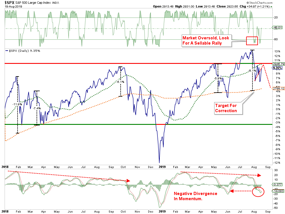
This oversold condition is why we took on a leveraged long position on the S&P 500, which we discussed with our RIAPRO last Thursday morning.
“I added a 2x S&P 500 position to the Long-Short portfolio for an ‘oversold trade’ and a bounce into the end of the week.”
I followed that statement up, saying we would hold the position over the weekend as:
“Given the President is fearful of a market decline, we expect there will be some announcement over the weekend on ‘trade relief’ to support the markets.”
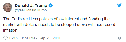
That indeed came to pass as the President announced he extended the ability of U.S. companies to sell product to Huawei for another 90-days. (China gave up nothing in return.) Furthermore, President re-engaged against the Fed on Twitter:
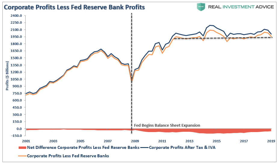
Neither point is positive over the longer-term. As noted on Monday, investors are continuing to pay near-record prices for deteriorating corporate profits.
“Despite a near 300% increase in the financial markets over the last decade, corporate profits haven’t grown since 2011.”
This Is Still A “Sellable Rally.”
On Monday, we closed out 25% of our long trading position. We will also continue to sell into any further rally as the market challenges overhead resistance. The rest of our portfolios remain defensive, hedged, and are carrying an overweight position in cash.
The reason we suggest selling any rally is because, until the pattern changes, the market is exhibiting all traits of a “topping process.”
My colleague Charles Hugh Smith summed this up nicely on Monday:
“As the saying goes, a market-topping is not an event, it’s a process. There are a handful of historically useful characteristics of topping markets:
- Declining volume / liquidity
- Increasing volatility–major swings up and down that increase in amplitude and frequency
- Inability to break decisively above previous resistance (i.e. make sustainable new highs in a stairstep that moves higher).
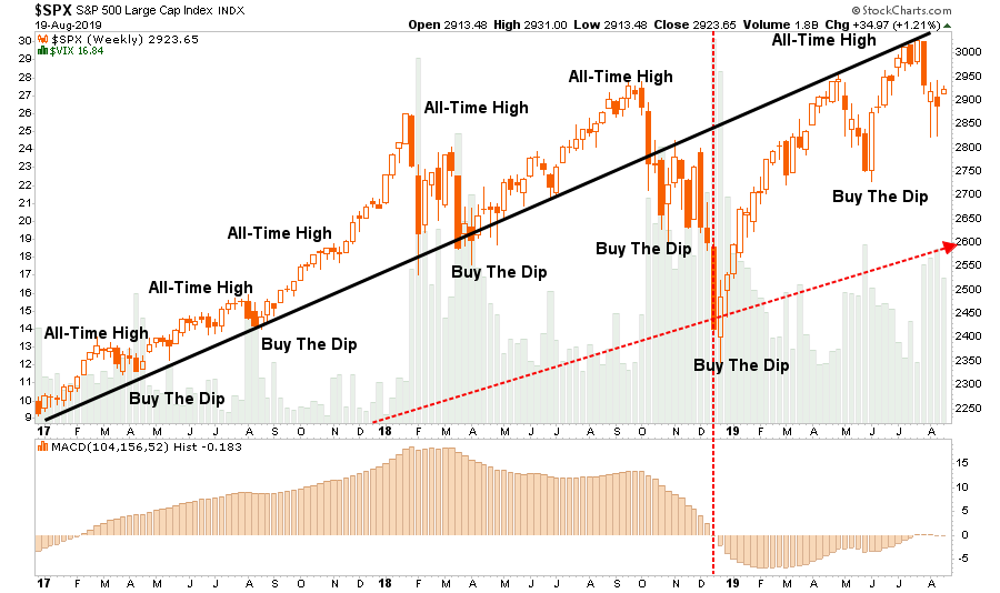
We see all these elements in the S&P 500 over the past few years. A healthy, stable advance in 2017, led to a manic blow-off top that crashed in February of 2018, setting off a period of high volatility.
This set up another stable advance that was shorter than the previous advance, and also steeper. This led to the multi-month period of instability that concluded in a panic crash in December 2018.
Since then, advances have been shorter and steeper, suggesting a more volatile era. Three advances to new highs have all dropped back to (or below) the highs of January 2018. In effect, the market has wobbled around for 18 months, becoming more volatile after every rally.”
Adding to his comments, you can also see that bullishness by investors still remains aggressive even as the market trades below its accelerated trendline.

Here is a closer look.
There repeated failures along the previous uptrend line suggests a change of trend is potentially underway. As Charles notes, “topping processes” are a function of time, and previous violations of the bullish trend were clear warnings for investors to become more cautious.
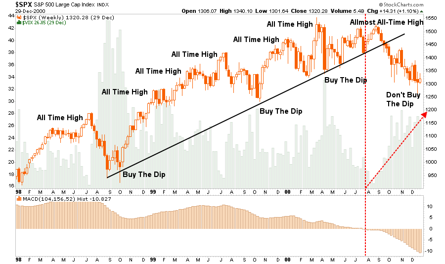
1998
2006
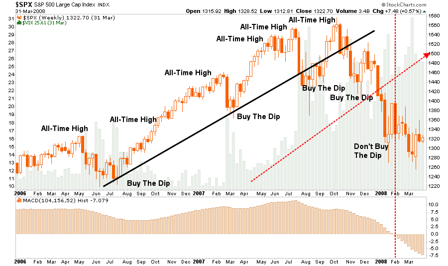
You will notice that in each previous case, the “bullish story” was the same.
- Earnings are still strong
- Economic data suggests there is “no recession” insight
- It’s a “Goldilocks Economy” (Fed hiking rates is bullish, Fed cutting rates is bullish.)
- The Fed is cutting rates
However, the primary warning signs to investors were also the same:
- A break of the longer-term bullish trend line
- A marked rise in volatility
- A yield curve declining, and ultimately, inverting as the Fed cuts rates.
The last point we discussed in more detail in this past weekend’s missive:
“While everybody is “freaking out” over the “inversion,” it is when the yield-curve “un-inverts” that is the most important.
The chart below, shows that when the Fed is aggressively cutting rates, the yield curve un-inverts as the short-end of the curve falls faster than the long-end. (This is because money is leaving “risk” to seek the absolute “safety” of money markets, i.e. “market crash.”)”
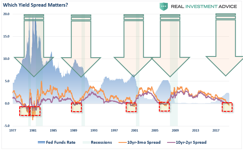
In other words, while a bulk of the mainstream media keeps pointing to 1995 as “the” example of when the Fed cut rates and the market kept rising afterward, it is important to note the yield curve was NOT inverted then. However, when the Fed did begin to aggressively cut rates, which collided with the inverted yield curve, the “bear market” was not too far behind.
Lastly, Helene Meisler wrote yesterday:
“Over the course of the last week, we saw the TRIN reach 2.10 a week ago on Aug. 12, followed by an extraordinary reading of 3.72 a few days later on last Wednesday. At the time, I explained that we don’t often get over 2.0, so a reading at almost 4.0 was literally “off the charts.”
This brings us back to the 10-day moving average, which as you can see, has skyrocketed to over 1.50. The first thing to note is that this is higher than it got even in the fourth-quarter decline. It’s more than the January and February 2018 decline as well. In fact, we have to go all the way back to 2015 and 2016 to see the kind of selling we saw last week, using this indicator. I have boxed those off in red on the left side of the chart.
Notice that these types or readings don’t occur often and they tend to occur in violent markets. All the way on the left, in July 2015, you can see this indicator reached over 1.50. The S&P 500 enjoyed a rally– a small one, but still a rally. But then you can see we came back down.
The second spike up that took the indicator to just over 1.70 arrived in August of 2015, which was accompanied by the plunge you see in the S&P of nearly 10%. Now squint even further, and you can see the rally in September – off that August low — and how we came back down in late September and early October to form a “W” in the S&P.
All of those instances are examples of a rally and back down again. I’m sure if I went back in time I could find a few examples when this indicator got this high and did not rally and come back down, but this is more typical as you can see.
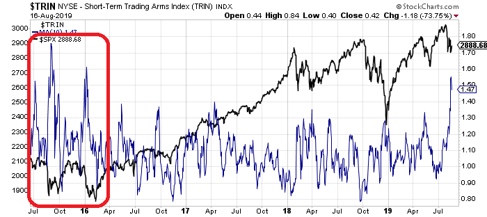
All of this data supports the idea of a “sellable” rally for now.
Could that change?
Certainly, and if it does, and our “onboarding” model turns back onto a “buy signal,” we will act accordingly and increase equity risk in portfolios. However, for now, the risk still appears to be to the downside for now.
“But the Central Banks won’t let the markets fall.”
Maybe.
But that is an awful lot of faith to put into a few human beings who spent the majority of their lives within the hallowed halls of academia.
There is a rising probability that Central Banks are no longer as effective is supporting asset markets as they once were. As noted by Zerohedge yesterday:
“The Fed meeting on July 31st was a sell the news event because it had been so telegraphed, and priced. The fact that the Fed arguably disappointed with only a 25bps cut means they are now behind the curve; until they get in front of it, multiples are unlikely to expand again. The Fed put expired on July 31st.”
If you disagree, that is okay.
However, given we are now more than 10-years into the current bull market cycle, here are three questions you should ask yourself:
- What is my expected return from current valuation levels? (___%)
- If I am wrong, given my current risk exposure, what is my potential downside? (___%)
- If #2 is greater than #1, then what actions should I be taking now? (#2 – #1 = ___%)
How you answer those questions is entirely up to you.
What you do with the answers is also up to you.
Ignoring the result, and “hoping this time will be different,” has never been a profitable portfolio strategy. This is particularly the case when you are 10-years into a bull market cycle.
Disclaimer: Real Investment Advice is powered by RIA Advisors, an investment advisory firm located in Houston, Texas with more than $800 million under management. As a team of certified and ...
more

