
Tech Soars, Energy Sinks So Far In 2020 Equity Sector Horse Race
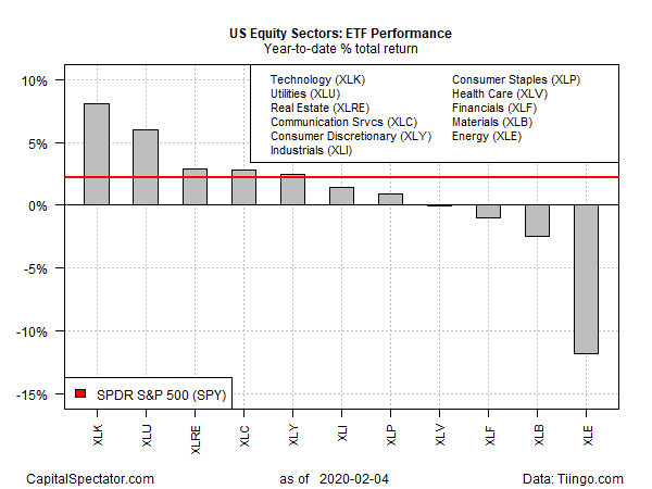
US equity sector performance in 2020 is a study in contrasts. At the high end of year-to-date results: technology shares. Meanwhile, energy continues to suffer as the big loser, based on a set of ETF proxies.
Technology Select Sector SPDR (XLK) has surged 8.1% year to date through Tuesday’s close (Feb. 4). After yesterday’s strong 2.6% rally, XLK ended the session at a new high for the fund.

Tech’s gain is even more impressive in relative terms: XLK’s 8.1% gain is far ahead of the US stock market’s 2.2% year-to-date rise, based on SPDR S&P 500 (SPY).
As for red ink, nothing compares with the loss for energy, which is currently posting the worst sector performance in 2020: Energy Select Sector SPDR (XLE) has tumbled 11.8% so far this year.
Energy shares are suffering from a combination of worries over softer global growth linked to the spread of the coronavirus and rising caution on the future for fossil fuels as investors increasingly focus on the blowback from global warming.
“It’s a real challenging environment for every energy company,” advises Doug Terreson, who analyzes the sector at Evercore ISI. “The real wild card is if the coronavirus is going to get much worse.”
For now, a demand shock is roiling the energy business, as Bloomberg reported earlier this week:
Chinese oil demand [for crude oil] has dropped by about 3 million barrels a day, or 20% of total consumption, as the coronavirus squeezes the economy, according to people with inside knowledge of the country’s energy industry.
The drop is probably the largest demand shock the oil market has suffered since the global financial crisis of 2008 to 2009, and the most sudden since the Sept. 11 attacks. It could force the hand of OPEC and its allies, which are considering an emergency meeting to cut production and staunch the decline in prices.
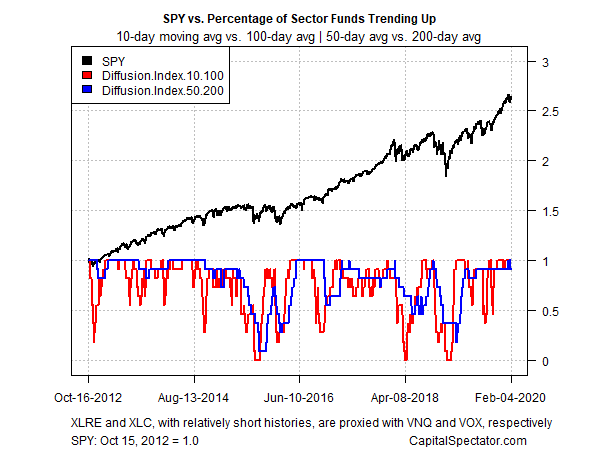
With the exception of energy, bullish momentum continues to dominate the sector ETFs listed above, based on two sets of moving averages. The first compares the 10-day moving average with its 100-day counterpart — a proxy for short-term trending behavior (red line in chart below). A second set of moving averages (50 and 200 days) represents an intermediate measure of the trend (blue line). Through yesterday’s close, all the ETFs (save XLE) are posting upside trending behavior.
Disclosure: None.


