
S&P 500 Risk Profile - Friday, Jan. 21
The US stock market is knee-deep in another one of its periodic bouts of selling. Is this the big one or just another short-term correction? The only honest answer, as always: unclear. But whenever the market dives it’s useful to refresh our perspective on how the slide stacks up vs. history. This is no panacea or crystal ball, but developing context for a real-time event is preferable to allowing extremist narratives du jour dominate your thinking.
Let’s start with a graph of the S&P 500. Clearly, the latest downdraft is more than a trivial retreat. For some technicians, the decline that’s brought the market close to the 200-day average deserves attention in the days ahead. A slide below this average will lead some to forecast deeper trouble ahead. The record on this trigger is mixed, but that won’t stop some tactical-oriented traders as treating it as a high-probability forecast. A more robust trend profile is look for periods when the 50-day average falls below the 200-day average. Noise is still a factor here, too, but less so. In any case, this yardstick still leaves a long way to go before a dark signal is triggered.
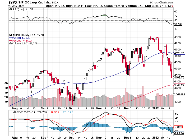
Another way to look at the current slide is through a drawdown lens. On that basis, the current retreat is a moderate -6.5% (as of Jan. 20). History suggests that degree of decline is noise. Indeed, a -6.5% peak-to-trough retreat for the S&P 500 is common terrain: since 1960, the median drawdown is only slightly milder at -6.1%.

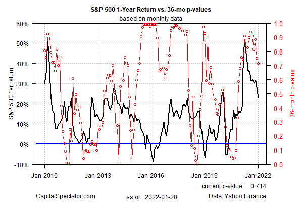
Some pundits are wondering if the current decline is the start of a bear market, which is to say an extended slide in the market. Much depends on your definition of ‘bear market’. Let’s avoid that rabbit hole here and instead use a technique for letting the data speak for itself, based on a Hidden Markov model (HMM), which looks for econometric evidence that a bear-market regime is in progress, or not. On this basis, HMM reports that the probability that a bear market is underway as virtually nil. (For some background on how the analytics is calculated in the chart below, see this primer.)

Meanwhile, there’s been a lot of bubble talk lately. Is the stock market in a bubble? Maybe, but the subject is a black hole of variation and debate and so trying to devise clear, quantitative rules for defining bubbles is like trying to grab air. One way to start the analysis is with some relatively objective quantitative profiling. It’s hardly a silver bullet, but using a rolling 36-month ADF test to quantify the state of bubble risk for the US stock market is a reasonable first approximation, in part because its has shown a degree of traction for identifying “bubbles” in real time (see this 2014 post for some background). The main takeaway: bubble risk for the S&P has been elevated recently, but at the moment the risk has pulled back and doesn’t look extreme. Only when this metric is close to 1.0 does the near-term outlook appear unusually risky. On that basis, the current reading suggests that bubble risk is has returned to the garden-variety zone.
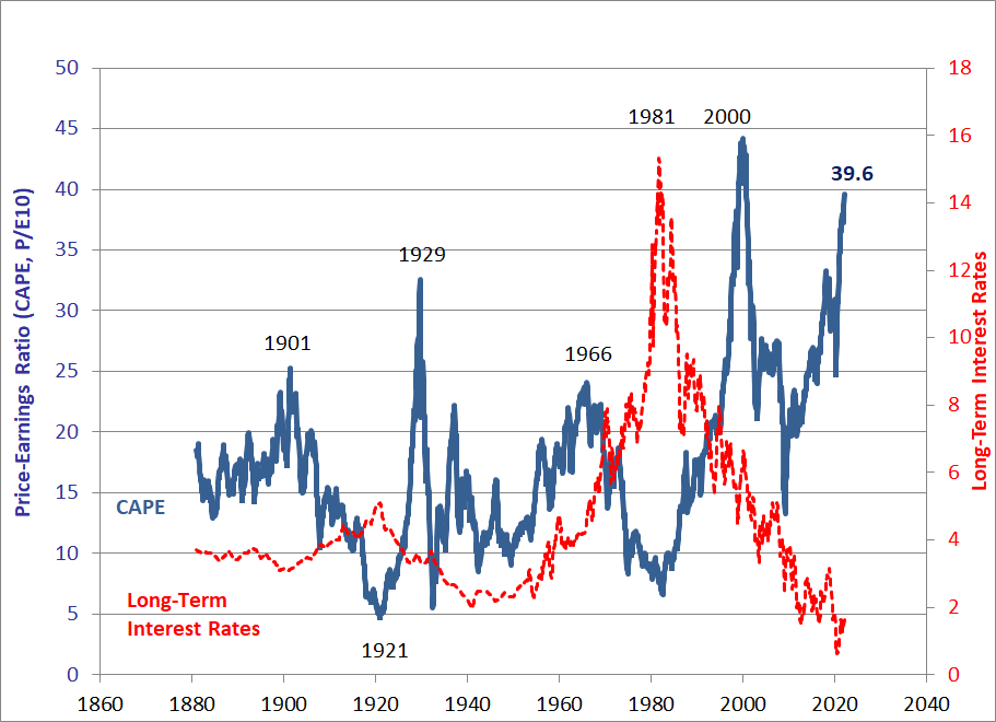
The counterpoint is that stock market valuation is high and therefore expected return is low, or even negative, depending on how you define valuation. A common methodology is using Professor Robert Shiller’s Cyclically Adjusted Price Earnings ratio (CAPE), which is currently at the second-highest level on record. Critics point out that CAPE has been elevated for years and the market’s continued to run higher. Is it different this time? The only thing we know for sure is that high valuations don’t matter… until they do. Timing, alas, is forever a mystery.
Another risk dimension to monitor is the economy. On a basic level, as long as recession risk is low, that’s one less reason to expect an extended bear market for stocks. No guarantees, of course, but in terms of estimating probabilities it’s a variable that deserves to be on the short list. A prudent way to start this analysis is by monitoring the 3-month average of the Chicago Fed National Activity Index. Using the latest update (through Nov.) points to low recession risk. Until/if this benchmark drops near the -0.7 level (red line in chart below), the probability is high that the economic expansion will roll on. (For a deeper dive into real-time recession-risk monitoring, see the weekly updates of The US Business Cycle Risk Report.)

Perhaps a more compelling way to assess market risk in the cause of deciding if its time become more defensive is to review your asset allocation. For example, how does your target allocation to equities compare with the current weight? If you’re holding a substantially higher weight in stocks relative to what you originally signed up for, it’s probably a good time to rebalance, regardless of what the metrics above (or from other sources) suggest.
Disclosures: None.


