
Regression To Trend: Another Look At Long-Term Market Performance - Wednesday, Jan. 2
Quick take: At the end of December the inflation-adjusted S&P 500 index price was 97% above its long-term trend, down from 109% the previous month.
About the only certainty in the stock market is that, over the long haul, over performance turns into underperformance and vice versa. Is there a pattern to this movement? Let's apply some simple regression analysis (see footnote below) to the question.
Below is a chart of the S&P Composite stretching back to 1871 based on the real (inflation-adjusted) monthly average of daily closes. We're using a semi-log scale to equalize vertical distances for the same percentage change regardless of the index price range.
The regression trendline drawn through the data clarifies the secular pattern of variance from the trend — those multi-year periods when the market trades above and below trend. That regression slope, incidentally, represents an annualized growth rate of 1.84%.
(Click on image to enlarge)
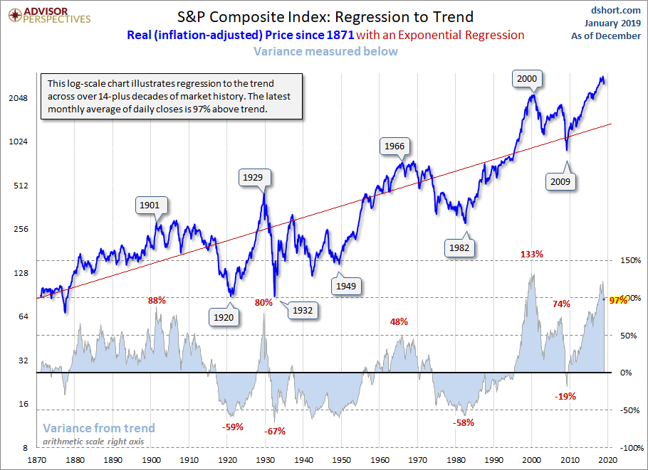
The peak in 2000 marked an unprecedented 137% overshooting of the trend — substantially above the overshoot in 1929. The index had been above trend for two decades, with one exception: it dipped about 15% below trend briefly in March of 2009. At the beginning of January 2019, it is 97% above trend, exceeding the 68% to 90% range it hovered in for 37 months. In sharp contrast, the major troughs of the past saw declines in excess of 50% below the trend. If the current S&P 500 were sitting squarely on the regression, it would be at the 1300 level.
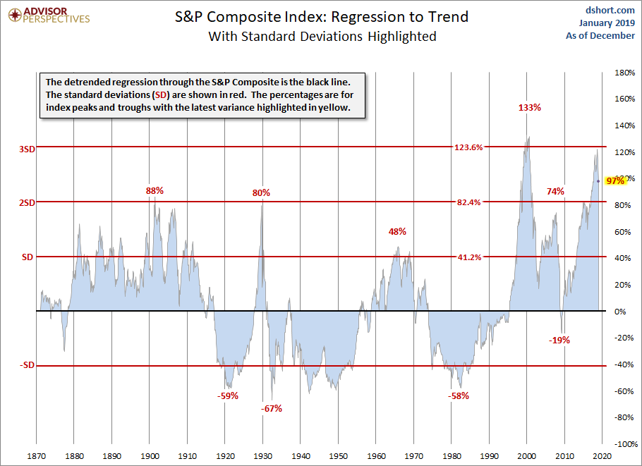
Incidentally, the standard deviation for prices above and below trend is 41.27%. Here is a close-up of the regression values with the regression itself shown as the zero line. We've highlighted the standard deviations. We can see that the early 20th-century real price peaks occurred at around the second deviation. Troughs prior to 2009 have been more than a standard deviation below trend. The peak in 2000 was well north of 3 deviations, and the 2007 peak was around two deviations, below the level of the latest data point.
(Click on image to enlarge)
Footnote on Calculating the Regression: The regression on the Excel chart above is an exponential regression to match the logarithmic vertical axis. We used the Excel Growth function to draw the line. The percentages above and below the regression are calculated as the real average of daily closes for the month in question divided by the Growth function value for that month minus 1. For example, if the monthly average of daily closes for a given month was 2,000. The Growth function value for the month was 1,000. Thus, the former divided by the latter minus 1 equals 100%.


