
Questions About The “Stellar” June Jobs Report (Which Also Confirm The Fed’s Concerns)
On Wednesday, Jerome Powell testified before Congress the U.S. economy is “suffering” from a bout of uncertainty caused by trade tensions and slow global growth. To wit:
“Since [the Fed meeting in mid-June], based on incoming data and other developments, it appears that uncertainties around trade tensions and concerns about the strength of the global economy continue to weigh on the U.S. economic outlook.”
That outlook, however, would seem to be askew of the recent employment report for June from the Bureau of Labor Statistics last week. That report showed an increase in employment of 224,000 jobs. It was also the 105th consecutive positive jobs report, which is one of the longest in U.S. history.
However, if employment is as “strong” as is currently believed, which should be a reflection of the underlying economy, then precisely what is the Fed seeing?
Well, I have a few questions for you to ponder concerning to the latest employment report which may actually support the Fed’s case for rate cuts. These questions are also important to your investment outlook as there is a high correlation between employment, economic growth, and not surprisingly, corporate profitability.
Let’s get started.
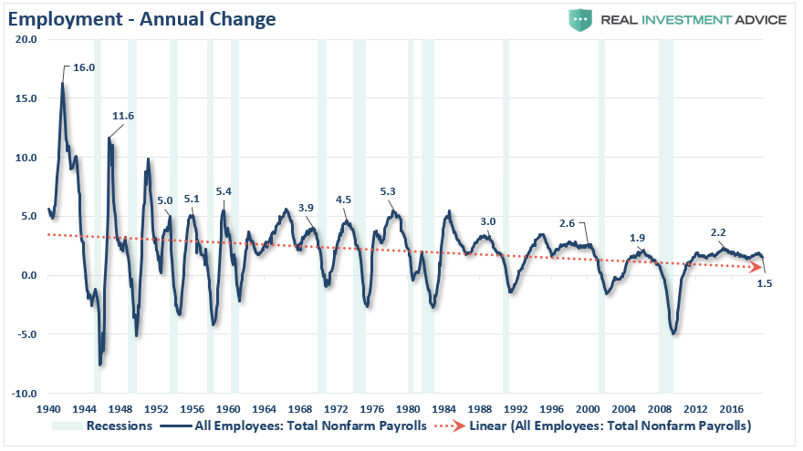
Prelude: The chart below shows the peak annual rate of change for employment prior to the onset of a recession. The current annual rate of employment growth is 1.5%, which is lower than any previous employment level prior to a recession in history.
More importantly, as noted by Lakshman Achuthan and Anirvan Banerji via Bloomberg:
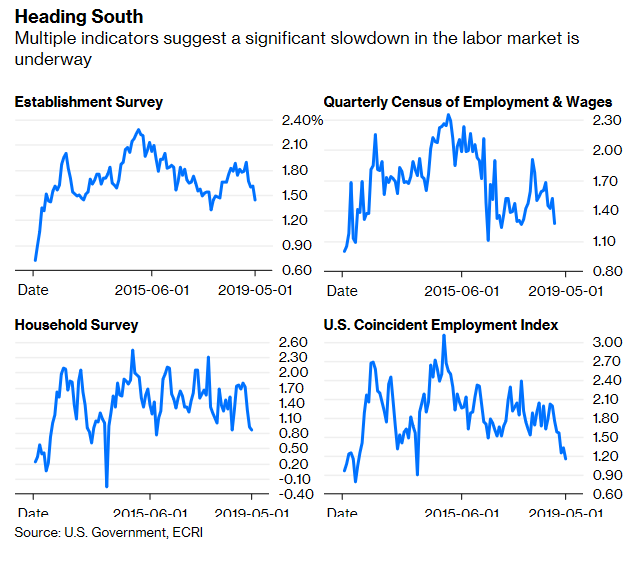
“A key part of the answer lies with jobs ‘growth,’ which has been slowing much more than most probably realize. Despite the better-than-forecast jobs report for June, the fact is the labor force has contracted by more than 600,000 workers this year. And we’re not just talking about the disappointing non-farm payroll jobs numbers for April and May.
Certainly, that caused year-over-year payroll growth, based on the Labor Department’s Establishment Survey – a broad survey of businesses and government agencies – to decline to a 13-month low. But year-over-year job growth, as measured by the separate Household Survey – based on a Labor Department survey of actual households – that is used to calculate the unemployment rate is only a hair’s breadth from a five-and-a-half-year low.”
Question: Given the issues noted above, does it seem as if the entirety of the economy is as robust as stated by the mainstream media? More importantly, how does 1.5% annualized growth in employment create sustained rates of higher economic growth going forward?
Prelude: One thing which is never discussed when reporting on employment is the “growth” of the working-age population. Each month, new entrants into the population create “demand” through their additional consumption. Employment should increase to accommodate for the increased demand from more participants in the economy. Either that or companies resort to automation, off-shoring, etc. to increase rates of production without increases in labor costs. The next chart shows the total increase in employment versus the growth of the working-age population.
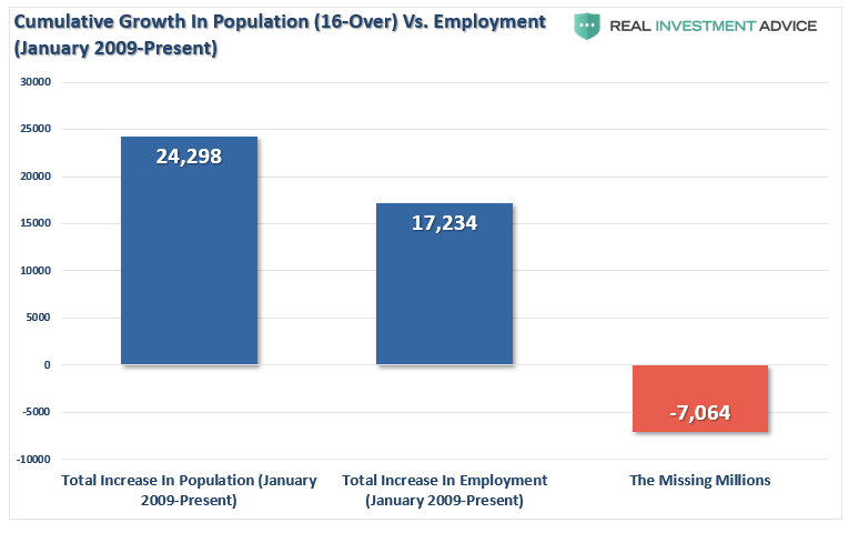
Question: Just how “strong” is employment growth? Does it seem that 96%+ of the working-age population is gainfully employed?
Prelude: The missing “millions” shown in the chart above is one of the “great mysteries” about one of the longest economic booms in U.S. history. This is particularly a conundrum when the Federal Reserve talks about the economy nearing “full employment.”
The next several charts focus on the idea of “full employment” in the U.S. While Jobless Claims are reaching record lows, the percentage of full time versus part-time employees is still well below levels of the last 35 years. It is also possible that people with multiple part-time jobs are being double counted in the employment data.
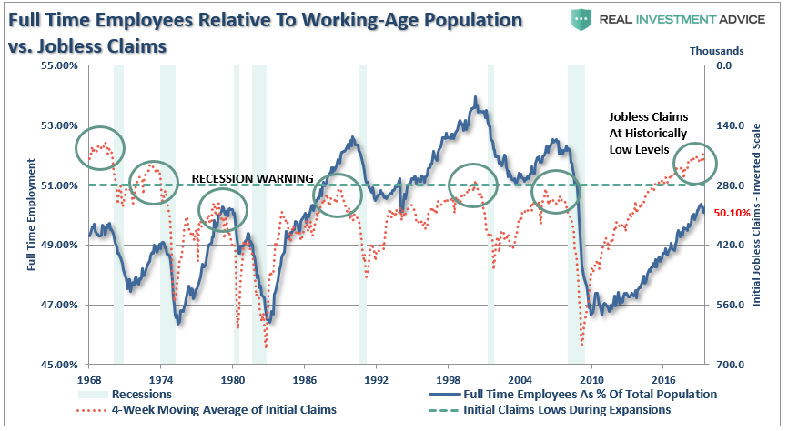
Question: With jobless claims at historic lows, and the unemployment rate below 4%, then why is full-time employment relative to the working-age population at just 50.10% (Only slightly above the 1980 peak)?
Prelude: One of the arguments often given for the low labor force participation rates is that millions of “baby boomers” are leaving the workforce for retirement. This argument doesn’t carry much weight given the significantly larger “Millennial” generation that is simultaneously entering the workforce.
However, for argument sake, let’s assume that every worker over the age of 55 retires. If the “retiring” argument is valid, then employment participation rates should soar once that group is removed. The chart below is full-time employment relative to the working-age population of 16-54.
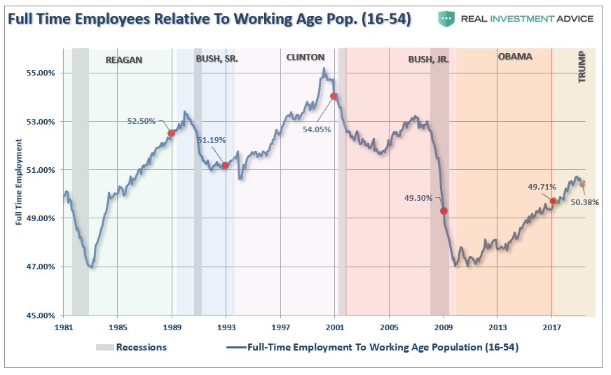
Question: At 50.38%, and the lowest rate since 1981, just how big of an impact are “retiring baby boomers” having on the employment numbers?
Prelude: One of the reasons the retiring “baby boomer” theory is flawed is, well, they aren’t actually retiring. Following two massive bear markets, weak economic growth, questionable spending habits, and poor financial planning, more individuals over the age of 55 are still working than at any other time since 1960.

The other argument is that Millennials are going to school longer than before so they aren’t working either. The chart below strips out those of college age (16-24) and those over the age of 55. Those between the ages of 25-54 should be working.

Question: With the prime working-age group of labor force participants still at levels seen previously in 1988, just how robust is the labor market actually?
Prelude: Of course, there are some serious considerations which need to be taken into account about the way the Bureau of Labor Statistics measures employment. The first is the calculation of those no longer counted as part of the labor force. Beginning in 2000, those no longer counted as part of the labor force detached from its longer-term trend. The immediate assumption is all these individuals retired, but as shown above, we know this is not exactly the case.
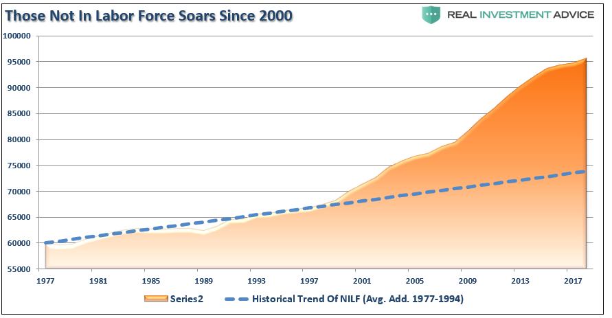
Question: Where are the roughly 95-million Americans missing from the labor force? This is an important question as it relates to the labor force participation rate. Secondly, these people presumably are alive and participating in the economy so exactly how valid is the employment calculation when 1/3rd of the working-age population is simply not counted?
Prelude: The second questionable calculation is the birth/death adjustment. I addressed this in more detail previously, but here is the general premise.
Following the financial crisis, the number of “Births & Deaths” of businesses unsurprisingly declined. Yet, each month, while the market is glued to the headline number, they additions from the “birth/death” adjustment go both overlooked and unquestioned.
Every month, the BLS adds numerous jobs to the non-seasonally adjusted payroll count to “adjust” for the number of “small businesses” being created each month, which in turns “creates a job.” (The total number is then seasonally adjusted.)
Here is my problem with the adjustment.
The BLS counts ALL business formations as creating employment. However, in reality, only about 1/5th of businesses created each year actually have an employee. The rest are created for legal purposes like trusts, holding companies, etc. which have no employees whatsoever. This is shown in the chart below which compares the number of businesses started WITH employees from those reported by the BLS. (Notice that beginning in 2014, there is a perfect slope in the advance which is consistent with results from a mathematical projection rather than use of actual data.)
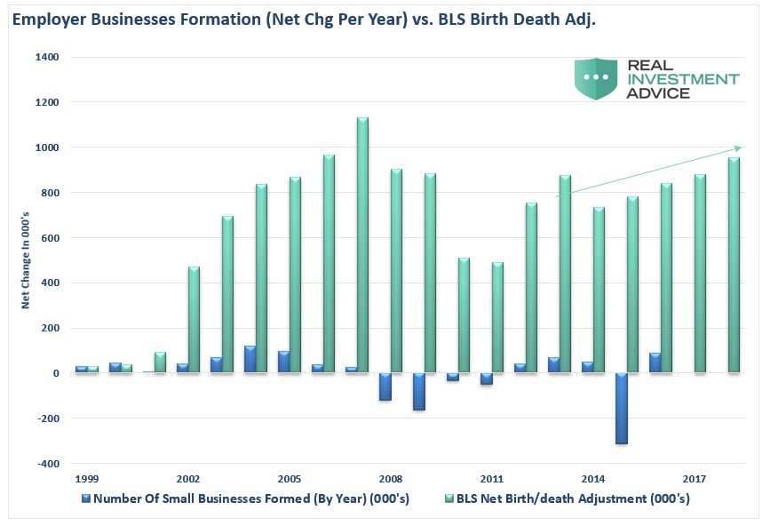
These rather “fictitious” additions to the employee ranks reported each year are not small, but the BLS tends even to overestimate the total number of businesses created each year (employer AND non-employer) by a large amount.
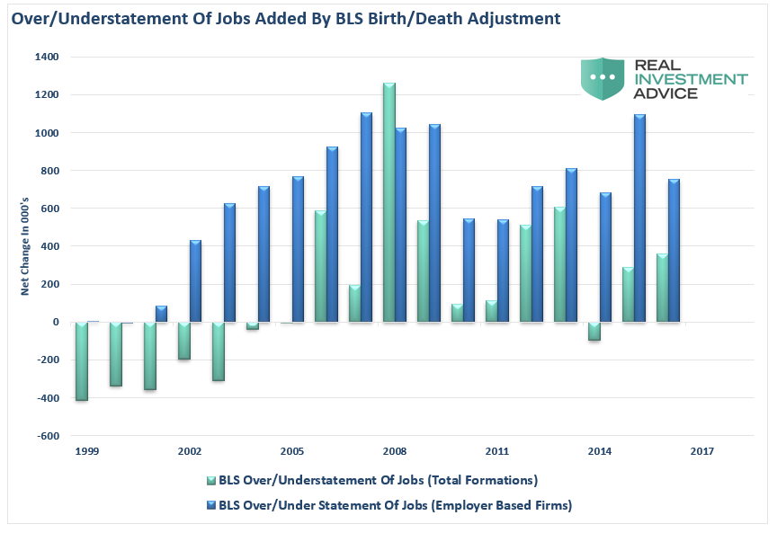
How big of a difference are we talking about?
Well, in the decade between 2006 and 2016 (the latest update from the Census Bureau) the BLS added roughly 7.6 million more employees than were created in new business formations.
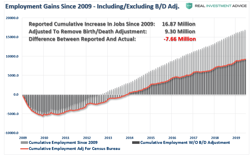
This data goes a long way in explaining why, despite record low unemployment, there is a record number of workers outside the labor force, 25% of households are on some form of government benefit, wages remain suppressed, and the explosion of the “wealth gap.”
Question: If 1/3rd of the working-age population simply isn’t counted, and the birth-death adjustment inflates the employment roles, just how accurate is the employment data?
Prelude: If the job market was as “tight” as is suggested by an extremely low unemployment rate, the wage growth should be sharply rising across all income spectrums. The chart below is the annual change in real national compensation (less rental income) as compared to the annual change in real GDP. Since the economy is 70% driven by personal consumption, it should be of no surprise the two measures are highly correlated.
Side Question: Has “renter nation” gone too far?
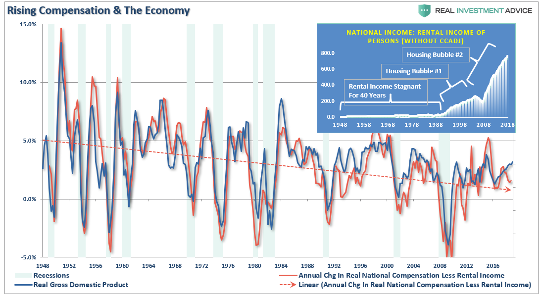
Question: Again, if employment was as strong as stated by the mainstream media, would not compensation, and subsequently economic growth, be running at substantially stronger levels rather than at rates which have been more normally associated with past recessions?
I have my own assumptions and ideas relating to each of these questions. However, the point of this missive is simply to provide you the data for your own analysis. The conclusion you come to has wide-ranging considerations for investment portfolios and allocation models.
Does the data above support the notion of a strongly growing economy that still has “years left to run?”
Or, does the fact the Fed is considering cutting interest rates to stimulate economic growth suggests the economy may already be weaker than headlines suggest?
One important note to all of this is the conclusion from Achuthan and Banerji:
“But there’s even more cause for concern. Months from now, the Establishment Survey will undergo its annual retrospective benchmark revision, based almost entirely on the Quarterly Census of Employment and Wages conducted by the Labor Department. That’s because the QCEW is not just a sample-based survey, but a census that counts jobs at every establishment, meaning that the data are definitive but take time to collect.
The Establishment Survey’s nonfarm jobs figures will clearly be revised down as the QCEW data show job growth averaging only 177,000 a month in 2018. That means the Establishment Survey may be overstating the real numbers by more than 25%.”
These facts are in sharp contrast to strong job growth narrative.
But then again, maybe the yield-curve is already telling the answer to these questions.


