
'Prepare For Breakout': Assault On SPX's 3025 All-Time High May Succeed On Second Attempt
Assault on the all-time highs ((ATH)) of SPX at 3020 - 3025 is probably on course over the next two to three trading days. Looks like the consolidation pattern for the 10yr yield has been completed, or is about to, and risk assets are again ready to test the mettle of the risk asset bears. Many market analysts say that the behavior of risk assets during the long awaited test of the S&P 500 Index ATH will likely determine the near-term course for equities and bond yields, as well as Gold, the US Dollar and Crude Oil. We agree.
We discuss the likely behavior of these risk assets, at the all-time highs, with guidance from our various risk asset models. This article continues the themes discussed in an earlier Seeking Alpha article, published on October 13, 2019: 'We Have Lift-Off`: Yields Lead The Charge Higher; Load Up On Equities, Exit Gold, Sell The U.S. Dollar
`Prepare for breakout'.
SPX
We expect initial setbacks during the first test of the SPX all time highs. We see that being flagged by the High Frequency models shown below. That means that if we see a test of the ATH early this week, (could be Tuesday or Wednesday), the rest of the week could be lower (green line).
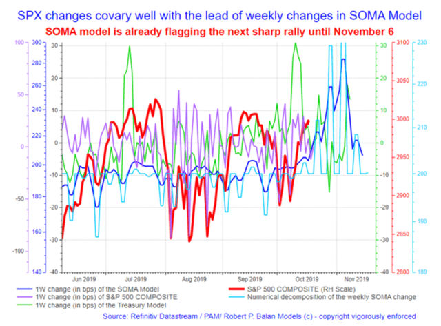
But the more important point is that after a couple of days of pullback, the assault resumes, and will likely go through at the second attempt. That is what the HF models, juxtaposed with the historical models (shown below), are telling us as well.
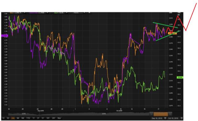
The breakout trajectory in detail: a probe of the 3025 ATH peaks early this week (Tuesday or Wednesday) will likely fail; it would be followed by two to three days of pullback. Then the attack on the SPX ATH continues, and next time, the assault should go through. It may trigger a humongous number of stoploss orders along the way, and that could impart a slingshot effect on the SPX price upwards (see illustrated effect in the chart below).
A rally after a breakthrough should go up all the way up until circa November 6 (dates provided by the SOMA High ((HF)) Frequency model), and crests at just below SPX 3100 levels.
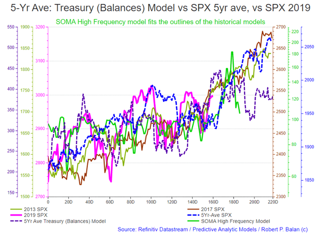
The information provided by the HF model is fully supported by the broad outlook we get from the historical models (illustrations of all the models shown in the chart above). We are already past a dangerous inflection point shown in the 5yr average of the SPX, so it looks like the 2019 SPX trajectory will be similar to those in earlier years (2017 and 2013).
That means brief correction stages along the way, as systemic liquidity inflows wax and wane, but the stage has been set for a Santa Rally until just before Christmas Day.
This is where we illustrated and discussed the entire breakout scenario in the PAM market report of October 17 (here):
PAM is partial to TQQQs and SPXLs in trading the opportunity provided by a breakout from SPX all-time highs.
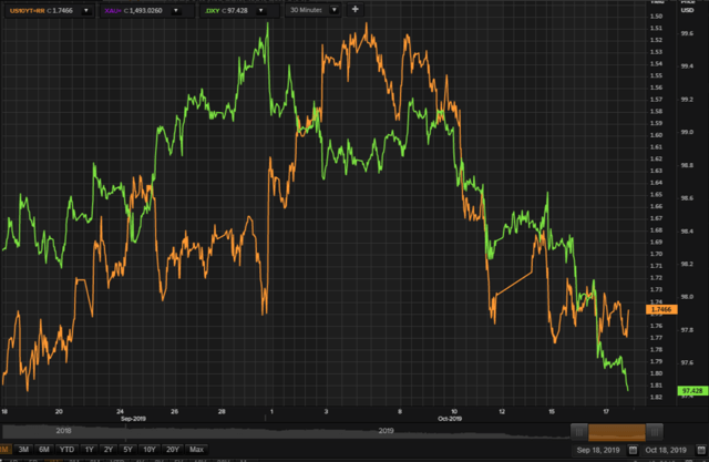
10YR YIELD
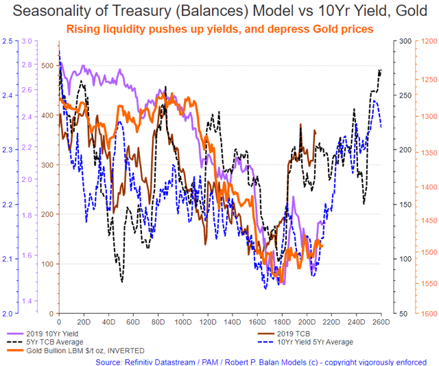
The projected current course of the 10yr yield should not be different from the trajectory of the 5yr average of the Treasury (Balances) model, and the 5yr average performance of the 10yr yield, shown below (illustrated by the green line and black dashed line, respectively).
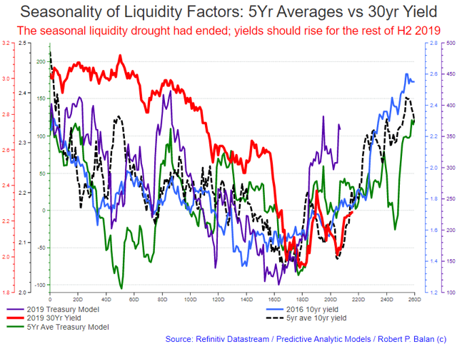
The 10Yr yield is also due for a minor decline for a couple of days after the test of the SPX all-time high. The models and historical averages of the 10yr yield support the scenario of a sharp uptake in bond yields after SPX major technical resistance levels are breached.
Bond yields may also find a temporary peak circa November 6, when the SPX is expected to top out for a week or so. The 10yr yield may run-up to circa 2.1% or higher.
TBTs and TMVs (3X Bear Bond ETFs) should do well during the strong take-off phase in yields after breach of SPX all-time highs.
THE MACRO VIEW: CESI and CFNAI
Our confidence on the forecasts of the systemic liquidity models are bolstered by the improvements that we are starting to see in broad metrics of US economic activity. It lifts sentiments to see that the US Citi Economic Surprise Index ((CESI)) has been performing so well since May this year.
Tagging along on the way up is CFNAI, the broadest measure of economic activity in the US, which is now just a smidgen away from showing normal economic conditions (at zero line); see chart below.
CFNAI
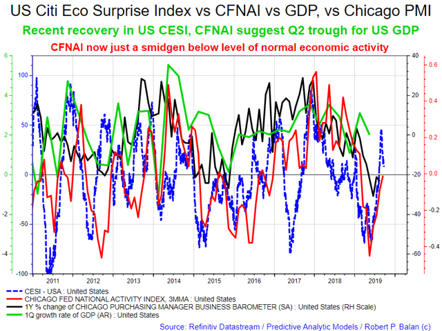
The CFNAI is a weighted average of 85 existing monthly indicators of national economic activity. It is constructed to have an average value of zero and a standard deviation of one. Since economic activity tends toward trend growth rate over time, a positive index reading corresponds to growth above trend and a negative index reading corresponds to growth below trend.
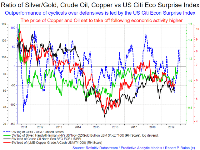
CESI, CYCLICALS
The US CESI also leads the outperformance of cyclicals over defensives, our proxies for this measure being the ratio between Silver and Gold, and the price of major commodities like Crude Oil and Copper. The Silver/Gold ratio has already been rising for the past three months (see chart below).
While the prices of Crude Oil and Copper are still stabilizing at lower levels, the lead of the US CESI suggests that it is just a matter of time before the prices of these major commodities will be upwards bound once again (see chart below).
WTI CRUDE OIL, GASOLINE
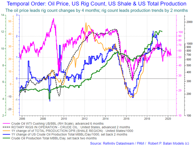
WTI CLc1 late last week decisively broke through previous resistance areas, and is now apparently trying to make up for its underperformance over the past weeks.
WTI Crude oil has been de-rated due to the fear that the US oil sector may be on the way to produce more oil than the market can absorb, as they have done year after year. But we have been seeing some reduction in oil rigs lately, and MECHANICALLY, oil production has to slow at some point. That juncture may be here now, or if not yet, it will be here very soon. Oil production tends to decline two months after oil rig counts fall; and the number of rigs in operation has been falling for the past 6 months (see chart below).
OPEC last week said they intend to keep oil production low, a credible statement as even Russia now finds slower output desirable after recent, sustained oil price declines. If that is the case, then it might just allow slowing demand to balance with slowing production. In such conditions, if demand picks up anywhere in the world, the variance between global supply and global demand would swing towards tightening, and that should push oil prices higher.
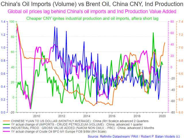
We see such developments taking place in China at present. China oil imports have been higher over the past several months, as a significantly weaker CNY (yellow line) revived leading industrial production measures like Gross Value Added (month over month, blue line). That in turn sparked higher importation of crude oil in volume terms (green line); see chart below.
That is very significant to us because three months after China oil imports pick up, global oil prices likewise rise (see all that in the chart below).
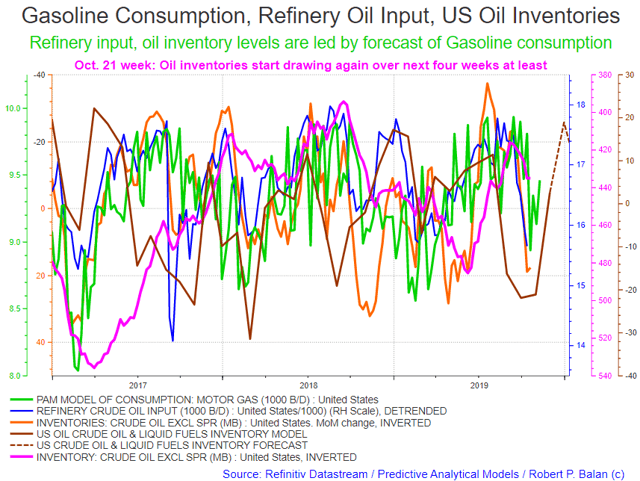
US domestic gasoline consumption may also play a role in pushing up oil prices. Our model of gasoline consumption (green line) shows rising demand over the next several weeks (from October 21 week). With that, refinery oil inputs should rise and oil inventories should draw (pink and yellow lines, see chart below).
Our Crude oil & Liquid Fuels US total inventories summary also shows there had been sharp draws in previous weeks (brown line), and our modeled data further shows demand rising until year end (brown dashed line, see chart below).
We put all these factors together, and that brings increasing enthusiasm for the long crude oil trades which were initiated when equities and yields initiated lift off. For PAM, a new oil and gasoline price rally seems due; therefore we intend to add further to long oil holdings in our portfolios.
PAM used UWT in initial long trades in WTI crude oil, and UGA for long gasoline trades.
GOLD
Gold has been remarkably stable, staying above the 1475 support, even as yields continue to drift lower (see chart below).
However, this situation could be temporary as Gold remains slaved to the vagaries of the long bond yield (10yr yield). Since the start of 2019, Gold prices has had very close inverse covariance with the 10yry yield, and that relationship is likely to hold, as yields are repriced higher (see chart below). Inevitably, gold prices have to be repriced lower. If yields rise until year-end as we expect, then gold price should be under pressure until that time, too.
We used DGLD in expressing our gold-bearish sentiment.
DXY
The DXY's current decline has started to make 5th-wave extensions -- not a good sign for the US Dollar. The safe haven trade is unwinding quickly, as liquidity pushes up yields and the price of risk assets. The need for the US Dollar (DXY) as safe haven wanes when US government bond prices fall. Falling demand should therefore make bond yields rise.
Other forces are also at work, which undercuts the value of the US Dollar. More systemic liquidity infusions from the Fed and Treasury lower the unit value of a dollar via the Quantity Theory of Money (QTM) -- therefore the exchange rate of the US greenback has to fall (see chart below).
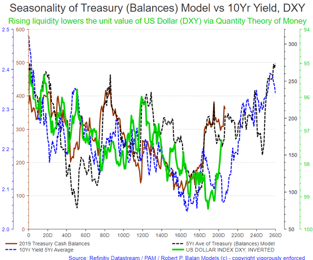
The best indicator to watch in forecasting the progress of the DXY for the rest of the year is the inverse of 5yr average of the Treasury (Balances) Model, meaning the US Dollar is predisposed to weakening until year-end, with intermediate firming up periods (see black, dashed line, chart above).
Disclosure: I am/we are long OIL, EUROS, EQUITIES. I wrote this article myself, and it expresses my own opinions. I am not receiving compensation for it. I have no business relationship ...
more

