
Measuring Unemployment And Labor-Force Participation
The underlying data from which the U.S. unemployment rate and labor-force participation rate are calculated contain numerous inconsistencies– if one of the numbers economists use is correct, another must be wrong. I’ve recently completed a research paper with Hie Joo Ahn that summarizes these inconsistencies and proposes a reconciliation.
The data that everyone uses are based on a survey of selected addresses. An attempt is made to classify each adult living at that address as employed E, unemployed but actively looking for a job U, or not in the labor force N. The next month the surveyors try to contact the same address and ask the same questions. In any given month, some households are being asked the questions for the first time, others for the second time, and so on up to eight different rotation groups. The statistics for a given month come from summing the data obtained for that month across the eight different groups.
One of the well-known inconsistencies in these data is referred to in the literature as “rotation-group bias;” see Krueger, Mas, and Niu (2017) for a recent discussion. One would hope that in a given month, the numbers collected from different rotation groups should be telling the same story. But we find in fact that the numbers are vastly different. In our sample (July 2001 to April 2018), the average unemployment rate among those being interviewed for the first time is 6.8%, whereas the average unemployment rate for the eighth rotation is 5.9%. Even more dramatic is the rotation-group bias in the labor-force participation rate. This averages 66.0% for rotation 1 and 64.3% for rotation 8. Halpern-Manners and Warren (2012) suggested that admitting month after month that you’ve been continually trying to find a job but keep failing may carry some stigma, causing fewer people to admit to being unemployed in later rotation groups. Other respondents may believe they would be asked fewer or less onerous follow-up questions if they simply say they’re not actively looking for a job the next time they are asked.
Our solution is to model this feature of the data directly rather than sweep it under the rug. By studying how the answers across rotation groups differ systematically, we can translate the statistics for any given month into the answers that would have been given if they were based solely on people being interviewed for the jth time. For example, we model the tendency for people tend to be counted as N instead of U the more times they are contacted and find that this tendency has increased over the sample. Our model allows us to calculate all statistics from the perspective of the answers that would be given by any given rotation group. We find that the answers people give the first time they are asked are easier to reconcile with other features we observe in the data, and the adjusted numbers reported below are based on the first-interview concept of unemployment.
A second problem in the data, originally noted by Abowd and Zellner (1986), is that observations are missing in a systematic way. The surveyors often find when they go back to a given household in February that some of the people for whom they collected data in January no longer live there or won’t answer. The standard approach is to base statistics for February only on the people for whom data is collected in February. But it turns out that people missing in February are more likely than the general population to have been unemployed in January. If the people dropped from the sample are more likely to be unemployed than those who are included, we would again underestimate the unemployment rate.
Our solution is to add a fourth possible labor-force status for each individual, classifying everyone as either employed E, unemployed U, not in the labor force N, or missing M. By combining this with our characterization of rotation-group bias, we develop the first-ever version of the underlying data set in which all the accounting identities that should hold between stocks and flows are exactly satisfied. By looking at what we observe about M individuals in the months when they are observed, we can adjust the data for the bias that comes from nonrandom missing observations.
A third inconsistency in the underlying data comes from comparing the reported labor-force status with how long people who are unemployed say they have been looking for a job. Consider for example people who were counted as N the previous month but this month are counted as U. The histogram below shows the percentage of these individuals who say they have been actively looking for work for an indicated number of weeks. Two-thirds of these people say they have been looking for 5 weeks or longer, even though the previous month they were counted as not in the labor force. Eight percent say they have been looking for one year, and another 8% say they have been looking for two years.
(Click on image to enlarge)
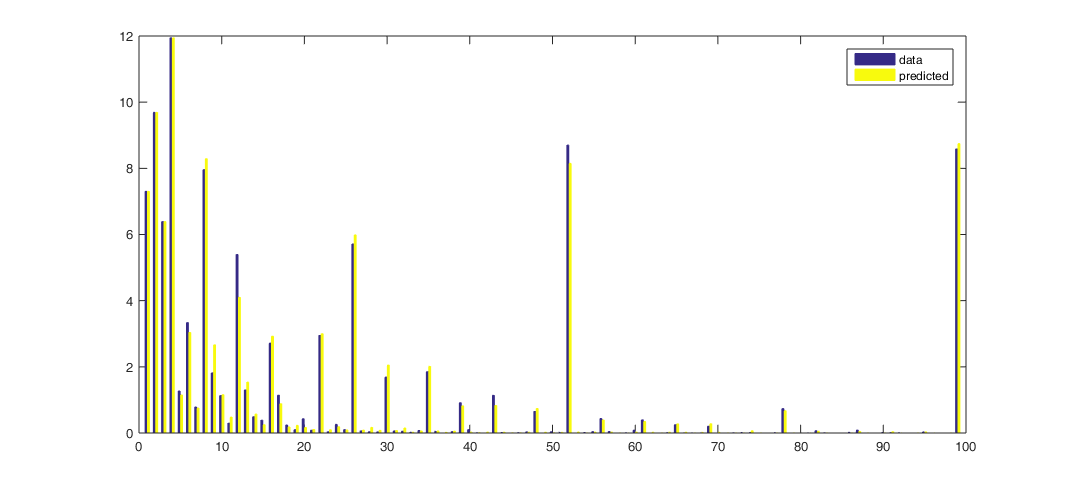
Horizontal axis: duration of unemployment spell in weeks. Vertical axis: of the individuals who were not in the labor force in rotation 1 and unemployed in rotation 2, the percent who reported having been searching for work at the time of rotation 2 for the indicated duration. Source: Ahn and Hamilton (2019).
A related inconsistency arises from what we observe the next month for individuals who are unemployed this month and say as of this month that they have been looking for six months or more. Far fewer of these individuals are counted as unemployed the following month than would be consistent with their reported unemployment durations. Either some of the labor-force designations are wrong, or people misreport how long they have been looking for work. In our analysis, we conclude that both errors contribute to the published data.
One of the adjustments we make to reconcile these inconsistencies is to reclassify those individuals who report job search of 5 weeks or longer in the figure above as having been U rather than N the month before. We show that this also means that some of the individuals who are characterized as having “exited” long-term unemployment by becoming N should really be viewed as experiencing continuing spells of unemployment. In addition to the individuals’ own retrospective assessment at date t, we find that those people we reclassify from N to U have similar job-finding probabilities, and similar dependence of those job-finding probabilities on unemployment duration reported in month t, as do individuals who were classified by BLS as U rather than N in t – 1. Nearly half of those we reclassify from N to U at t – 1 were already characterized by BLS as “marginally attached to the labor force” in t -1 based on some of the other answers they gave in t – 1. Moreover, we find from the American Time Use Survey that many individuals who are N and not classified as marginally attached in fact spend as much time looking for a job as those classified as U.
A final issue with the underlying data can also be seen in the figure above– people seem to prefer to report some numbers more than others. On average, more people say they have been unemployed for 2 weeks instead of 1, and more people say they have been unemployed for 6 weeks instead of 5, even though in reality no one could be unemployed for 2 weeks if they weren’t first unemployed for 1 week. Our solution to this issue is to start with a coherent, smoothly decreasing representation of perceived durations and assume that people report those numbers with a particular form of censoring. Related approaches were taken by Baker (1992), Torelli and Trivellato (1993), and Ryu and Slottje (2000). Our approach differs from earlier studies in that we furthermore directly link data on stocks, flows, and durations. The numbers that our model predicts individuals would report are shown as the yellow bars in the figure above. We can describe the observed data very accurately.
The figure below gives one illustration of why all this matters. It considers a very fundamental question: if someone was unemployed last month, what is the probability that person will still be unemployed this month? Economists have used the data underlying the official statistics to answer this question in two different ways. One measure is based on number of people who are counted as unemployed in any given month. It calculates the number of people in the current month who say they have been unemployed for longer than one month as a fraction of the total number of people who were unemployed last month. This way of calculating the probability is plotted as the solid black line in the figure below. An alternative measure, based on labor-force flows, looks at the subset of individuals who were U last month and either E, N, or U this month. This measure calculates the number of UU continuations as a fraction of the sum UU + UE + UN. This flows-based measure is plotted as the dashed green line. If all magnitudes were measured accurately the two estimates should give the same answer. But in practice they are wildly different. The duration-based measure averages 70.7% over our sample, while the flows-based measure averages 53.7%. Our paper describes how the multiple problems mentioned above introduce biases into both of the measures and develops the reconciled estimate shown in the dotted blue line.
(Click on image to enlarge)
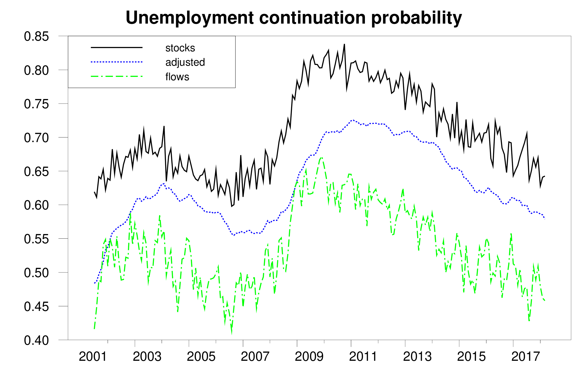
Probability that an unemployed individual will still be unemployed next month as calculated by: (1) ratio of unemployed with duration 5 weeks or greater in month t to total unemployed in t – 1 (solid black); (2) fraction of those unemployed in t – 1 who are still unemployed in t (dashed green); (3) reconciled estimate (dotted blue). Source: Ahn and Hamilton (2019).
We conclude that the true unemployment rate in the U.S. is 1.9% higher on average than the published estimates.
(Click on image to enlarge)

Unemployment rate as calculated by BLS (solid black), adjusted estimate (dotted blue), and difference (bars).
Source: Ahn and Hamilton (2019).
We also conclude that the Bureau of Labor Statistics has underestimated the labor-force participation rate by 2.2% on average and that the fall in participation has been slower than suggested by the BLS estimates.
(Click on image to enlarge)
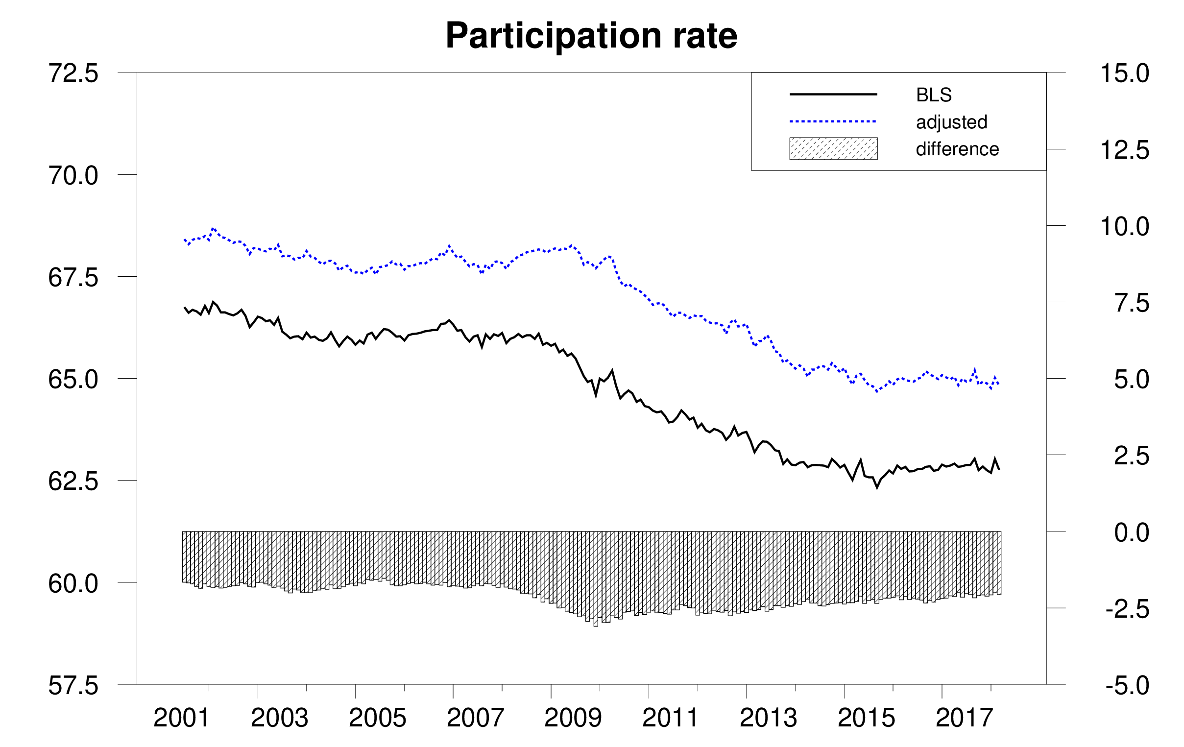
Labor-force participation rate as calculated by BLS (solid black), adjusted estimate (dotted blue), and difference (bars).
Source: Ahn and Hamilton (2019).
On the other hand, we find that reported average unemployment durations significantly overstate the average length of an uninterrupted spell of unemployment. A big factor in this appears to be the fact noticed by Kudlyak and Lange (2018) that some individuals include periods when they were briefly employed but nonetheless looking for a better job when they give an answer to how many weeks they have been actively looking for a job.
(Click on image to enlarge)
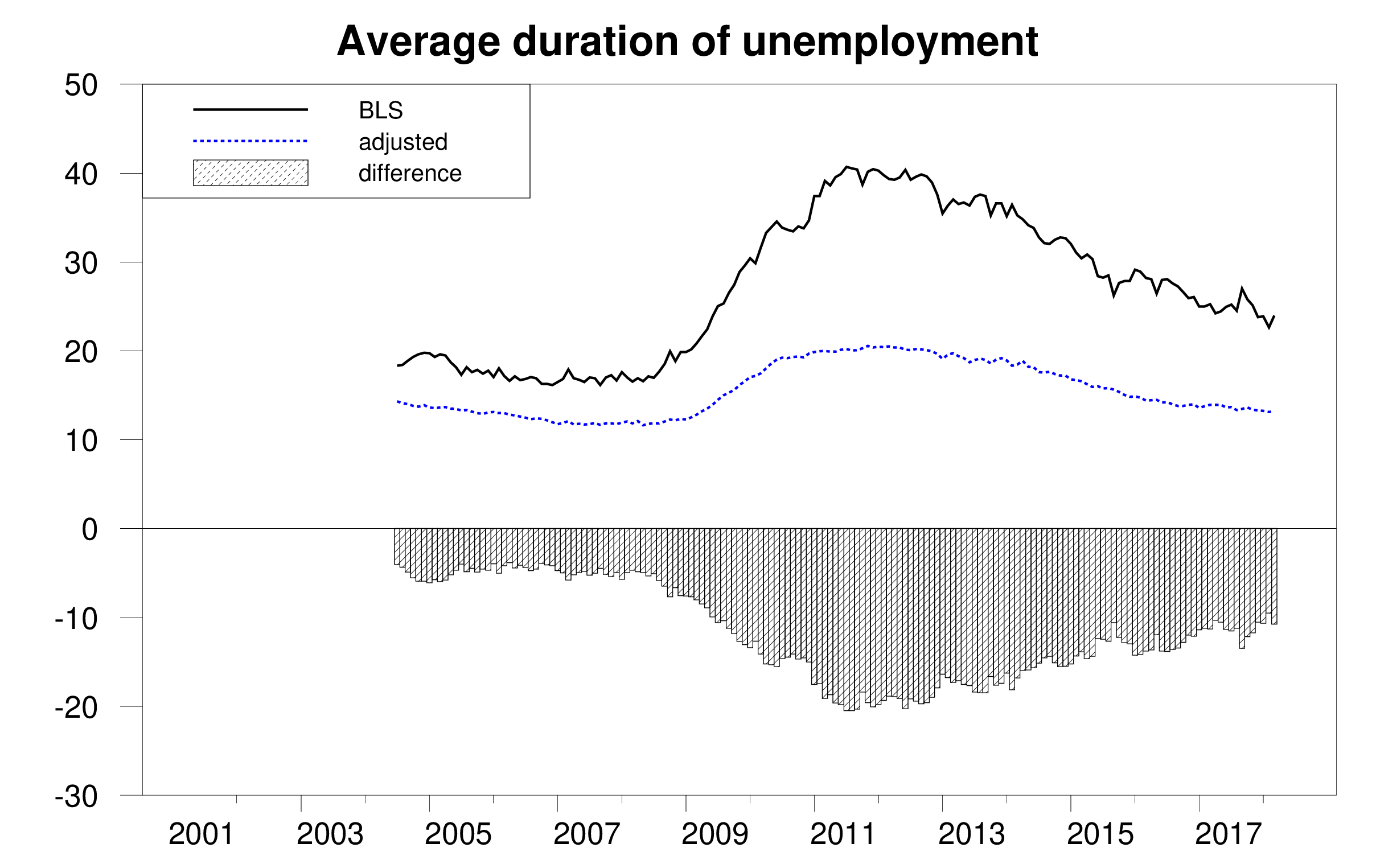
Average duration of unemployment in weeks as calculated by BLS (solid black), adjusted estimate (dotted blue), and difference (bars). Source: Ahn and Hamilton (2019).
Here is our paper’s conclusion:
The data underlying the CPS contain multiple internal inconsistencies. These include the facts that people’s answers change the more times they are asked the same question, stock estimates are inconsistent with flow estimates, missing observations are not random, reported unemployment durations are inconsistent with reported labor-force histories, and people prefer to report some numbers over others. Ours is the first paper to attempt a unified reconciliation of these issues. We conclude that the U.S. unemployment rate and labor-force continuation rates are higher than conventionally reported while the average duration of unemployment is considerably lower.
Disclosure: None.


