Market Cap To GDP: An Updated Look At The Buffett Valuation Indicator - Tuesday, March 5
Note: This update incorporates the Q4 GDP 'Initial' Estimate and the February close data.
Market Cap to GDP is a long-term valuation indicator that has become popular in recent years, thanks to Warren Buffett. Back in 2001, he remarked in a Fortune Magazine interview that "it is probably the best single measure of where valuations stand at any given moment".
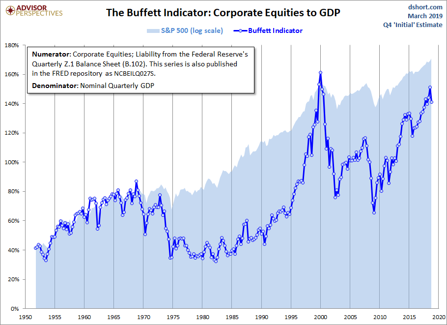
The four valuation indicators we track in our monthly valuation overview offer a long-term perspective of well over a century. The raw data for the "Buffett indicator" only goes back as far as the middle of the 20th century. Quarterly GDP dates from 1947, and the Fed's balance sheet has quarterly updates beginning in Q4 1951. With an acknowledgment of this abbreviated timeframe, let's take a look at the plain vanilla quarterly ratio with no effort to interpolate monthly data.
The strange numerator in the chart title, NCBEILQ027S, is the FRED designation for Line 41 in the B.103 balance sheet (Market Value of Equities Outstanding), available on the Federal Reserve website. Incidentally, the numerator is the same series used for a simple calculation of the Q Ratio valuation indicator.
The Latest Data
The denominator in the charts below now includes the 'Initial' Estimate of Q4 GDP and the February close data. The latest numerator value, when the latest data is not yet available, is extrapolated based on the quarterly change in the Wilshire 5000. The current reading is 140.9%, down from 151.0% in the previous quarter.
(Click on image to enlarge)

Here is a more transparent alternate snapshot over a shorter timeframe using the Wilshire 5000 Full Cap Price Index divided by GDP. We've used the St. Louis Federal Reserve's FRED repository as the source for the stock index numerator (WILL5000PRFC). The Wilshire Index is a more intuitive broad metric of the market than the Fed's rather esoteric "Nonfinancial corporate business; corporate equities; liability, Level".
(Click on image to enlarge)
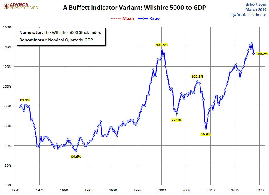
A quick technical note: To match the quarterly intervals of GDP, for the Wilshire data we've used the quarterly average of daily closes rather than quarterly closes (slightly smoothing the volatility) when the latest data is not yet available.
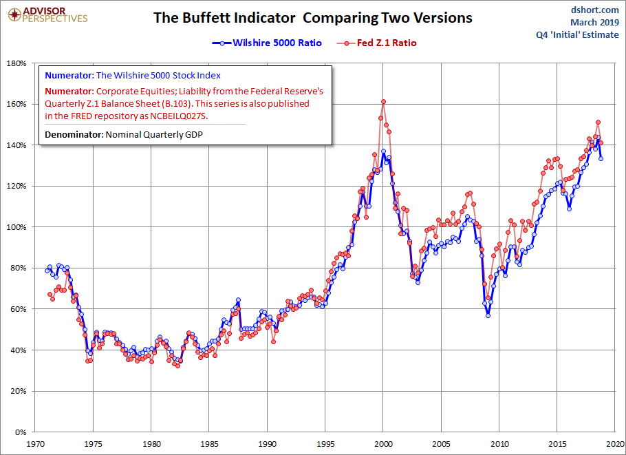
How Well do the Two Views Match?
The first chart above uses Fed data back to the middle of the last century for the numerator, the second uses the Wilshire 5000, the data for which only goes back to 1971. The Wilshire is the more familiar numerator, but the Fed data gives us a longer timeframe. And those early decades, when the ratio was substantially lower, have definitely impacted the trend.
To illustrate the point, here is an overlay of the two versions over the same timeframe. The one with the Fed numerator has a tad more upside volatility, but they're singing pretty much in harmony.
(Click on image to enlarge)
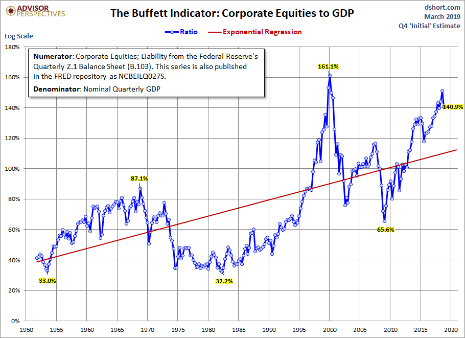
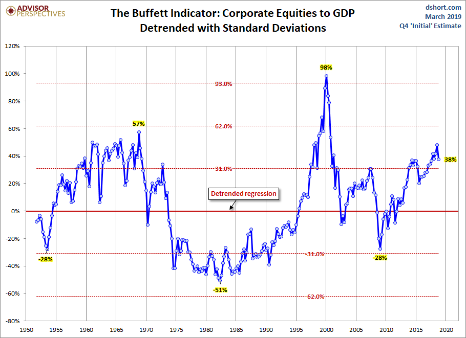
Detrending the Data
A conspicuous feature of the Buffett indicator is the upward trend over the decades since the start of the data series. For a better sense of valuation over time, let's detrend the data by letting Excel draw a regression through the series and eliminating the upward trend. First, let's draw the regression through the series.
(Click on image to enlarge)
Now let's detrend and add standard deviations.
(Click on image to enlarge)
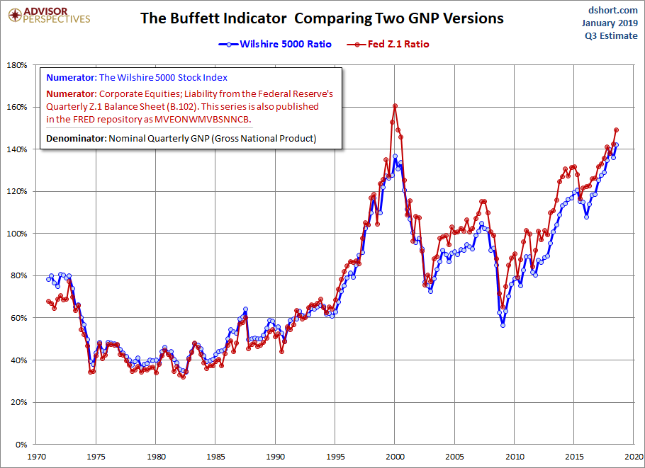
Wouldn't GNP Give a More Accurate Picture?
That is another question we've been asked many times. Here is the same calculation with Gross National Product as the denominator; the two versions differ very little from their Gross Domestic Product counterparts.
Here is an overlay of the two GNP versions -- again, very similar.
(Click on image to enlarge)
What Do These Charts Tell Us?
In a February 27 interview with CNBC, Warren Buffet expressed his view that the stock market is "on the cheap side". His opinion seems to imply that buying into the market is inexpensive. However, both the "Buffett Index" and the Wilshire 5000 variant suggest that today's market remains at lofty valuations — similar to the housing-bubble peak in 2007, although off its interim high in Q1 of 2015. Buffet's claim is merely referring to the fact that compared to other investment opportunities, such as fixed income, you'll get more bang for your buck in the stock market.
A question we're repeatedly asked is why we don't include the "Buffett Indicator" in the overlay of the four valuation indicators updated monthly. We've not included it for various reasons: The timeframe is so much shorter, the overlapping timeframe tells the same story, and the four-version overlay is about as visually "busy" as we're comfortable graphing.
One final comment: While this indicator is a general gauge of market valuation, it's not useful for short-term market timing, as this overlay with the S&P 500 makes clear.
(Click on image to enlarge)