
Longest Bull Market In U.S. Stocks Bid Adieu But Not Before Flashing Warning Signs
The longest bull market in U.S. stock market history abruptly came to an end last month. Between March 9, 2009 and February 19, 2020 – that is, 131 months – the S&P 500 large cap index rallied 401 percent, second only to the 417-percent jump in the October 1990-March 2000 bull.
In the current bear market, the S&P 500 already lost nearly 33 percent intraday and just under 30 percent on a closing basis. The speed with which this has occurred has surprised many. Were there warning signs? Turns out there were plenty, and they were getting more and more extended as time progressed.
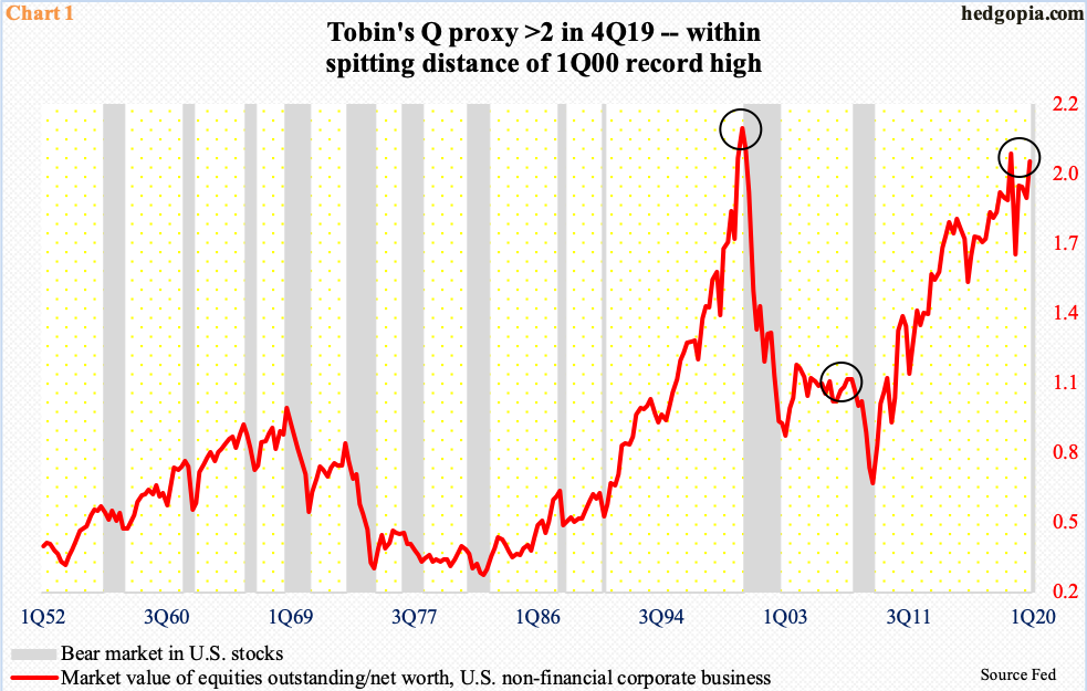
In finance, Tobin’s Q is a popular investment concept. Propounded by economist James Tobin, it compares an asset’s market value to its replacement cost. For our purposes here, a proxy of Tobin’s Q can be generated by dividing companies’ market value by their net worth (Chart 1).
In 4Q19, the market cap of U.S. non-financial companies was $33.9 trillion against $16.9 trillion in net worth. The resulting ratio of 2.01 was slightly less than the 2.04 reading recorded in 3Q18. These readings were a hair’s breadth away from the all-time high of 2.14 from 1Q00. The bear market that followed back then lasted 31 months, for a decline of 49 percent.
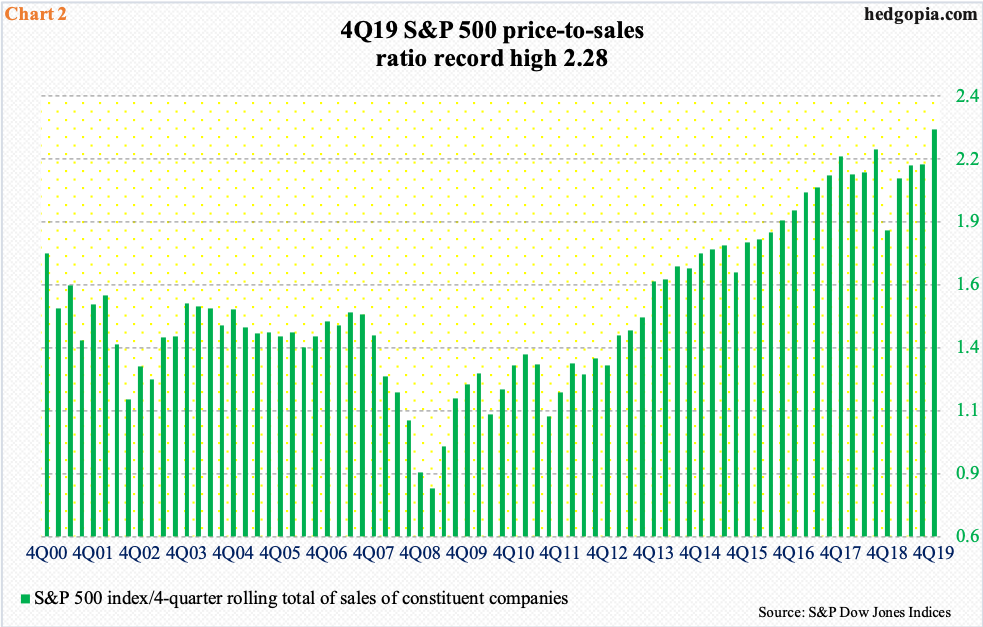
Another similar metric is the price-to-sales ratio. Unlike earnings, particularly non-GAAP, sales are less susceptible to manipulation.
In Chart 2, four quarters of sales of S&P 500 companies are divided into the index. In 4Q19, 12-month sales totaled $1,415.20/share, even as the index closed at 3230.78. The resulting ratio of 2.3 was the highest ever – higher than the 2000 dot-com bubble high and much higher than the 2Q07 housing bubble high. We know how stocks fared in the aftermath of those highs in both those occasions. The rubber band could only be stretched so far before it snapped. Fast forward to today, and this is precisely how things unfolded.
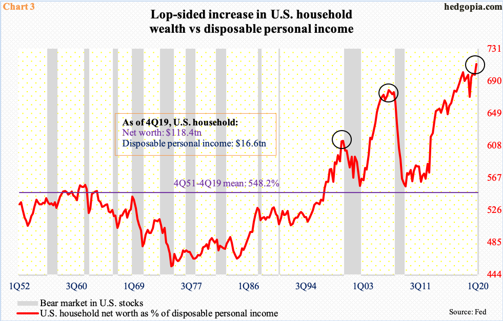
Speaking of a grossly extended metric, Chart 3 highlights the unsustainable way U.S. household wealth was growing.
In 4Q19, household net worth was $118.4 trillion – a record. Disposable personal income was $16.6 trillion – also a record. But growth in the latter was no match for the growth in the former. As a result, the red line in the chart, which calculates household net worth as a percent of disposable personal income, surged to a new high 712 percent in 4Q19.
For whatever it is worth, the average going back to 1952 is at 548 percent.
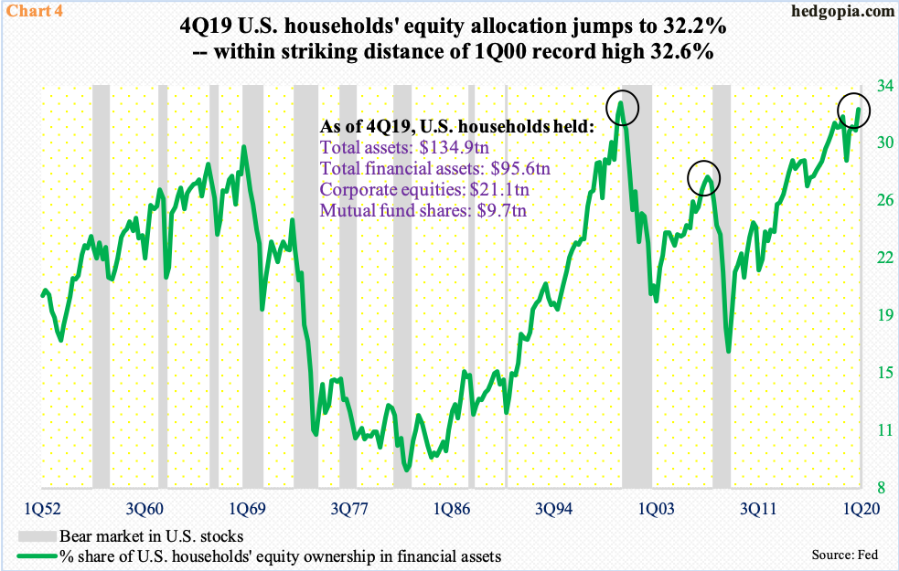
Households also aggressively raised their equity allocation.
The 4Q19 high of 32.2 percent did not make up a new high but was only four-tenths of a percentage point short of matching the prior record, which was set in 1Q00. As a matter of fact, in the 2007-2009 bear market, this metric began unwinding from a much lower level – 27.7 percent, to be precise, in 2Q07.
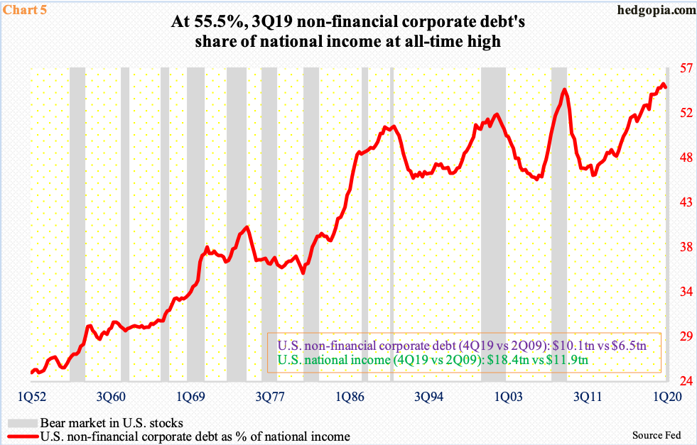
In the corporate world, growth in debt was similarly making – and breaking – new records. When Great Recession ended in 2Q09, non-financial corporate debt was $6.5 trillion. By 4Q19, this grew to $10.1 trillion – a new record. This made up 55.1 percent of national income of $18.4 trillion. At 55.5 percent, the all-time high in this metric was set in 3Q19.
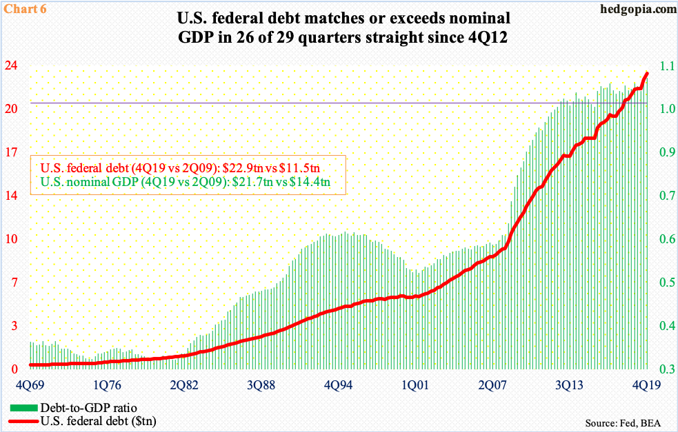
Speaking of leverage, nowhere is the buildup more threatening than in the government.
The U.S. national debt is currently $23.5 trillion – and counting – and was $23.2 trillion in 4Q19, which was 107 percent of the nominal GDP. In Chart 6, this is portrayed as a ratio between the two. The 4Q19 reading of 1.07 was the 17th consecutive quarter of one-plus reading. In fact, in 26 of the last 29 quarters, sovereign debt has matched or exceeded nominal GDP.
This is bound to get worse. The first five charts should begin to unwind as a bear market has begun and as the economy contracts. Using Wednesday’s closing price in the S&P 500, the price-to-sales ratio in Chart 2 is now 1.7. But Chart 6 is different.
The U.S. budget deficit just crossed $1 trillion. Then, the coronavirus hit. Fiscal help is imminent, and this will only grow as the economy downshifts in the quarters ahead. Translation: increased issuance of Treasury securities. The pace of debt buildup is accelerating, which can go on until markets revolt.
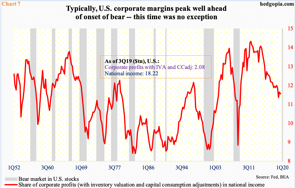
As far as equities are concerned, that process has begun. As suggested earlier, bulls did a very quick U-turn. The trailing P/E on 2019 S&P 500 operating earnings was 21x – not cheap by any stretch of the imagination. Nonetheless, bulls were willing to pay this multiple even as operating margins peaked a long time ago.
More often than not, margins tend to peak ahead of stocks. This time was no different. The red line in Chart 7 is essentially corporate operating margins, derived by dividing national income into corporate profits. The cycle high was reached as far back as 1Q12 and 3Q14 after that, followed by persistent downward pressure. Stocks are now catching up with it.
It is anyone’s guess as to how long the ongoing unwinding will last. Markets tend to undershoot as much as they like to overshoot.


