
Key Takeaway From Monday's Session - April 6
MAXIMUM FLEXIBILITY
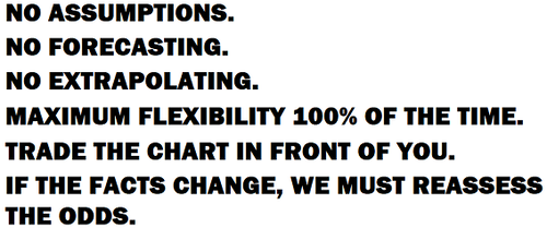
The last segment of the April 3 video covered the topics shown to the right. Closing with those bullet points was based partly on how the S&P 500 traded during the latter stages of last Friday’s session.
The S&P 500 had an excellent setup in place to sell off hard into the close last Friday. It did not. The S&P 500 had numerous setups in place over the weekend to sell off hard on Monday morning, including the rescheduling of an important oil production meeting. The market did not sell off on Monday morning and instead rallied hard. There is valuable information in any market setup that fails to follow through. The key takeaway from Monday’s session was a significant reduction in the odds that S&P 500 drops significantly below 2100 for an extended period in the coming weeks.
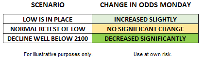
As shown in the table above, some type of backtracking or retest remains a reasonable outcome given the high degree of uncertainty regarding how and when the U.S. economy can start churning again. Recent market action, including shifts in the CCM Heat Maps on Monday, tells us the odds of the market making a stand between current levels and 2100 are significantly higher than they were last week. The shifts in our allocations today reflect the shift in the scenario odds in the table above. All three scenarios remain viable, something that is reflected in our allocations as of Monday’s close.
THE CHARTS IN FRONT OF US
During Monday’s session, we noted positive developments were starting to appear on numerous charts. The developments occurred in the context of a “90% up day”, which means 90% of NYSE volume was associated with advancing issues, an indication of strong market breadth.
The charts below provide a small sample.
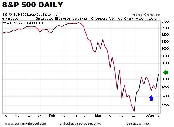
THE FIRST HIGHER HIGH
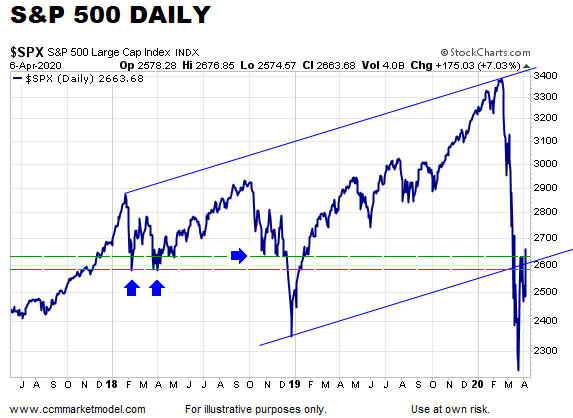
There is nothing earth-shattering about the developments during Monday’s session, but a wide range of subtle shifts took place. An uptrend is a series of higher highs and higher lows. If good things are going to happen, at a minimum, the market must print a higher high. The blue arrow (below) shows a higher low and the green arrow shows a higher high.
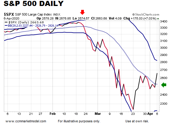
The chart below shows one of the prime bearish setups that the market chose not to act on. Last week, the S&P 500 rallied back to a logical area and stalled at a logical area. Instead of reversing hard at an area of possible resistance, the market rallied hard and closed above all three lines (two dotted-green lines and the upward-sloping blue line). Basically, the polar opposite to the setup that was in place last Friday.
Similar situation with the chart below that we covered in the April 3 video. Monday’s close recaptured the dotted green line.
During the entire decline from the February 19 high, the S&P 500 was unable to close above the Bollinger Band centerline, until today.
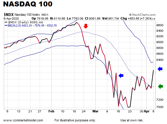
The NASDAQ 100 continues to provide leadership. Unlike the S&P 500, the NASDAQ 100 closed above the March 13 high on Monday (see blue arrows below). Another subtle shift is the Bollinger Band centerline turned back up for the first time since the major peak (green arrow).
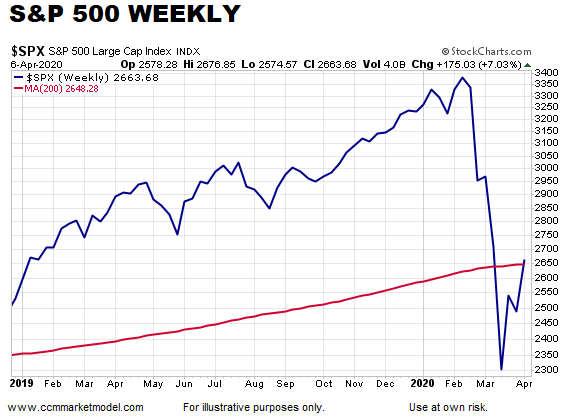
Last week, the S&P 500 was rejected below the 200-week moving average. Monday, it closed above the 200-week moving average.
SUBTLE SHIFTS IN BONDS
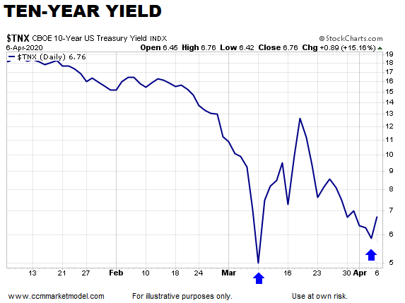
The charts below fall into the “nothing earth-shattering, but subtle” category. Ten-year yields, which move in the opposite direction of bond prices, are currently trying to nail down a higher low.
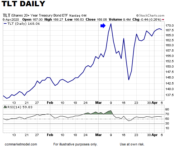
TLT, thus far, has been unable to exceed the closing high that was made in March. It is possible that if it goes on to make a new high, it will be accompanied by an RSI divergence (chart below). The CCM Heat Map for Ten-Year Yields is also flashing some yellow (not red) lights for bonds, something that was taken into account in today’s allocation tweaks.
Another subtle, but noteworthy development can be found on the chart of small caps relative to the S&P 500 (below). If small caps are to start to outperform, at some point they need to print a higher low relative to the S&P 500.
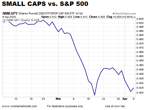
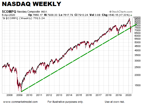
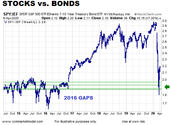
We have been watching the chart below for several weeks. It was covered in the April 3 video as a “reason to keep an open mind” form of evidence. There were two gaps left behind in 2016; both were retested and now the ratio is pushing higher. Regardless of whether or not the market backtracks in the coming days, the chart below says the odds are favorable that the S&P 500 will make a stand above or near 2100-ish.
ODDS SPEAK TO NUMEROUS POSSIBILITIES
No one knows with certainty which path the market will take in the coming days and weeks. Risk management is about assessing odds and making adjustments when the odds shift in a material manner. We believe the odds shifted between Friday around lunchtime and Monday’s close. Our adjustments today reflect those shifts. The resulting allocation respects the ongoing uncertainty related to the virus and any attempt to restart the U.S. economy.


