Is There A Relationship Between Inflation And Unemployment?
Or, old fogey downloads data, finds a negative relationship, a.k.a. the Phillips Curve…
Much was made of the meeting of minds of AOC and Larry Kudlow regarding the Phillips Curve, to wit (from Bloomberg):
… Ocasio-Cortez said many economists are concerned that the formula “is no longer describing what is happening in today’s economy” — and Powell largely agreed.
“She got it right,” Kudlow told reporters at the White House later on Thursday. “He confirmed that the Phillips Curve is dead. The Fed is going to lower interest rates.”
Well, since I’ve been teaching the Phillips Curve for lo these thirty odd years, I thought I’d check to see if I’d missed something. First, it’s important to remember that while we talk about the negative relationship between inflation and unemployment, or the positive relationship between inflation and output, the actual model we use is the expectations augmented Phillips curve including input price shocks. My preferred specification is:
πt = πet + f(ut-4 – un,t-4) + θzt
Where π is 4 quarter inflation, πe is expected inflation, u is official unemployment rate, un is natural rate of unemployment [ so (u-un) is the unemployment gap], and z is an input price shock, in this case the 4 quarter inflation rate in import prices. Each of these series is available from FRED; using the FRED acronyms, PCEPI for the personal consumption expenditure deflator, MICH for University of Michigan’s 1 year inflation expectations, UNRATE for unemployment rate, NROU for natural rate of unemployment, and IR for import prices.
Estimate this relationship using OLS over the 1987-2019Q2 period (first two months of 2019Q2 used to proxy for Q2). This sample period, after accounting for lags, spans the “Great Moderation”.
One obtains:
πt = -0.19 + 0.74πet – 0.18(ut-4 – un,t-4) + 0.15zt
Adj-R2 = 0.68, SER = 0.608, N = 130, DW = 0.40. bold numbers denote significance at 5% msl, using HAC robust standard errors.
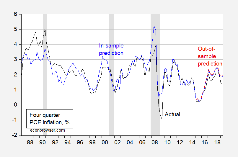
In other words, it’s not too hard to find the posited negative relationship between inflation and unemployment. That doesn’t mean that we explain inflation very well, however. In figure 1, I plot the actual, and the in-sample fit from the estimated regression.

Figure 1: Four quarter PCE inflation (black), in-sample fit from reported regression (blue), and out-of-sample fit from regression estimated 1987-2014 (red). Source: BEA, BLS via FRED, NBER and author’s calculations.
While the equation fits relatively well, clearly it’s not perfect. As of 2019Q2 (first two months), year-on-year PCE inflation is underpredicted by 40 bps. I estimated the equation on a restricted sample ending in 2014; this imparts only a marginal difference — so it’s not that something has changed substantially over the last 4 and a half years. Rather the specification could be improved.
In other words, perhaps a different measure of NAIRU, or a nonlinearity might improve the fit. However, these specification or measurement errors do not invalidate the concept of the Phillips curve.
For more on a cross country basis, see a recent working paper by Blanchard, Cerutti, and Summers (2015).
Disclosure: None.


