
Interpreting The Unemployment Numbers
The Bureau of Labor Statistics announced Friday that 2.5 million more Americans were working in May than in April. That’s the biggest monthly increase since 1946, both in terms of the number of workers and as a percentage of the workforce. The unemployment rate dropped from 14.7% in April to 13.3% in May, the biggest monthly drop since 1950. All this is very good news. But there are also indications that we are in a deeper hole than the headline numbers suggest. Here I explain why I believe the true unemployment rate in May was a number more like 19.8%.
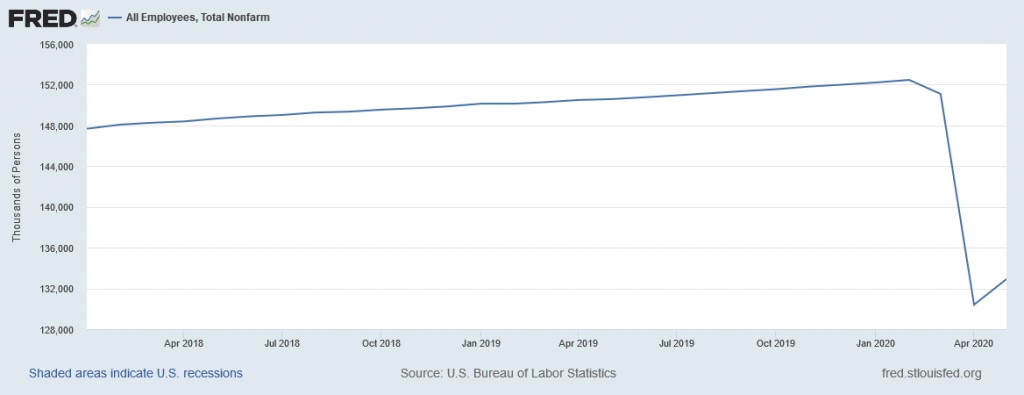
Seasonally adjusted number of people on nonfarm payrolls, Jan 2018 to May 2020. Source: FRED.
The strong employment report shocked many observers since so many other indicators had been very discouraging. Bill McBride, as always incredibly insightful, suggested that the good news on employment may have come from small businesses rehiring in order to take advantage of the half a trillion dollars that has been lent through the Paycheck Protection Program. The New York Times and Marketplace quoted some business owners who said PPP funds made all the difference for them.
Some analysts worry that PPP can’t be a sustained source of support for the labor market. But it doesn’t have to be. The whole idea was to keep workers on the payroll until customer demand picked back up as restrictions on activity begin to be relaxed. About half the May gains came from the leisure and hospitality sector. It’s hard to imagine that restaurants, bars, theaters, and hotels will see anything like their previous level of activity even after all official restrictions are lifted. And the employment gain in May did not come anywhere close to making up what was lost in April. But so far, so good.
But there are some other details of the May employment report, particularly those coming from the separate survey of individual households, that are hard to square with available facts. According to the BLS survey of households, 21 million Americans were still unemployed as of the second week of May. But during that week, states reported that 2.7 million new people filed for unemployment compensation, in addition to the 24.9 million who were already collecting. Not everyone who is unemployed is eligible for compensation, and not everyone who is eligible applies. In a typical month, the number of people unemployed is about three times as big as the number collecting compensation. But now in May, the number collecting is somehow larger than the total number who are unemployed. The headline unemployment numbers do not seem consistent with what we know about how many people are collecting unemployment compensation.
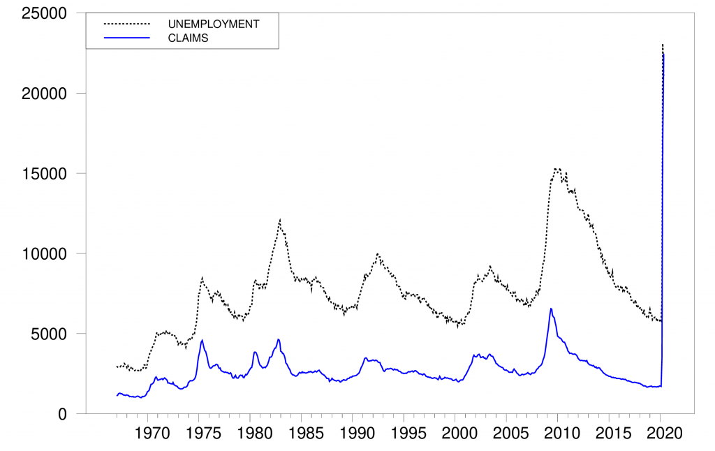
Dotted black: seasonally adjusted number of people who are unemployed according to the household survey (UNEMPLOY). Solid blue: sum of 4-week average of seasonally adjusted new claims for unemployment compensation (ICSA) and continuing claims (CCSA), in thousands of workers, Jan 1967 to May 2020.
Another striking feature of the headline numbers is the huge drop in the labor-force participation rate. The numbers claim that there were 6 million more Americans in May than in February who were not working and who were not looking for a job. Those people are not counted as unemployed but instead are counted as having dropped out of the labor force.
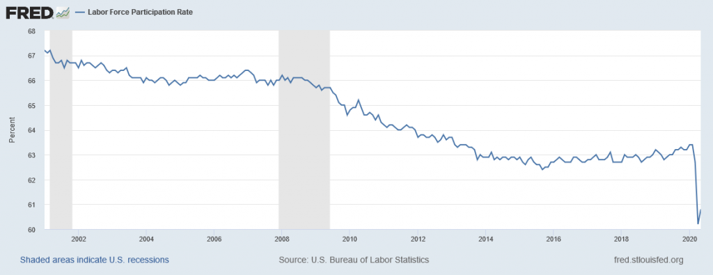
Labor-force participation rate, Jan 2001 to May 2020 (CIVPART).
Below I offer an interpretation of the latest numbers in terms of some of the findings I developed in a recent paper with Federal Reserve Economist Hie Joo Ahn. Our paper documents a number of internal inconsistencies in the employment numbers that economists rely on and reaches the conclusion that the headline numbers significantly understate the number of people who are unemployed. Below I use those results to interpret the May employment report. But before getting into that, I should emphasize that none of the statements we make in our paper, nor any of the statements I make in this blog post, should be interpreted as reflecting the views of the Board of Governors of the Federal Reserve System or of any other person associated with the Federal Reserve System.
Did 6 million people really drop out of the labor force between February and May? The historical correlations reported in our paper would lead to the prediction that of the 102 million Americans who were counted as not working and not looking for work in May, 2.7 million will be counted as unemployed in June and will say when asked in June that they were in fact looking for a job in May. The figure below summarizes some of the evidence that leads to that prediction. The vertical axis plots the percentage of people in a particular demographic group at a particular point in time who were counted as not in the labor force in one month yet were counted in the next month as unemployed and say that month that they having been looking for work for 5 weeks or longer. Every month there are many hundreds of thousands of people in this category, which we call NU5+ transitions. The incidence is higher for some demographic groups, such as younger workers, and lower for others, such as college graduates. But it was higher for everyone during the high unemployment rates of the Great Recession. For example, the percentage of college graduates with NU5+ transitions during the Great Recession (point C2 on the figure) was about the same as it had been for the overall population before the Great Recession (point A1 on the figure).
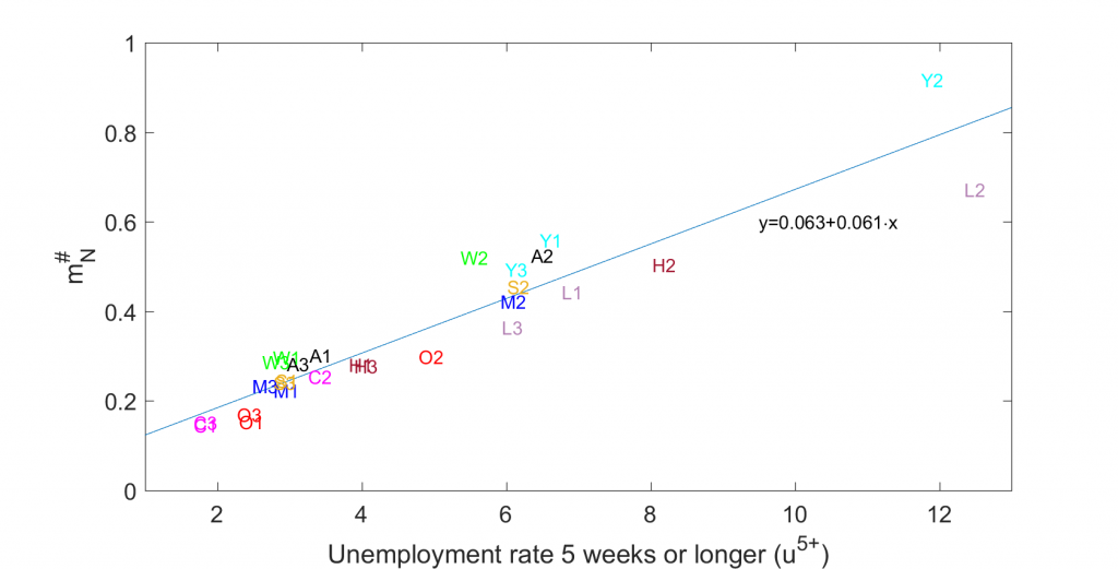
Vertical axis: percentage of group classified as N in month t-1 and U in month t with duration of job search in t reported to be 5 weeks or longer for different demographic groups and three different sample periods. Horizontal axis: Percentage of the labor force who are counted as unemployed in t-1 with duration of job search of 5 weeks or longer. Demographic groups: A: Total population, Y: aged 16-24; M: men aged 25-54; W: women aged 25-54; O: aged 55 and over; L: less than high school education, H: high school graduate; S: some college; C: college graduates. Sample 1: 2001:7-2008:6; sample 2: 2008:7-2014:6; sample 3: 2014:7-2020:1. Also shown is regression line fitted to the 27 observations. Source: Ahn and Hamilton (2020).
The horizontal axis plots the overall fraction of that group who are unemployed with duration greater than 4 weeks. There is a pretty close historical correlation between these numbers, with a regression R2 of 88%. One can use the coefficients from that regression, which is based on average differences between demographic groups, to give what turns out to be a quite accurate prediction of how many of this month’s N (not in the labor force) will be counted the next month as unemployed with reported unemployment duration of more 4 weeks. Applying the coefficients from the demographic regression above to the May 2020 number of people counted as unemployed with duration currently greater than 4 weeks gives the prediction of 2.7 million individuals who in May were counted as not in the labor force but in June be counted as unemployed and having been looking for work at that time for more than 4 weeks.
We know a number of other things about these NU5+ individuals based on the historical correlations. We know many of them said in May that they wanted a job, but were nevertheless not counted as unemployed in May because they did not say they took specific steps in May to get a job. We know that they have similar probabilities of getting a job in July, and similar probabilities of staying unemployed in July, as those who got counted as unemployed in May. And the numbers they will report in June for how long they’ve been looking for work will be strikingly similar to the numbers for others who are already counted as unemployed. Our paper concludes that these people really should have been counted as unemployed in May. Doing so would raise the May unemployment rate from 13.3% to 14.9%.
Disengagement with answering the survey. Another striking inconsistency in the data underlying the headline unemployment numbers is that the answers people give to the survey questions change the more times they are asked the same questions. For example, in February, the average unemployment rate (not seasonally adjusted) reported by people who were being asked the questions for the first time was 4.5%. The average unemployment rate in February reported by people who were being asked the questions for the eighth time was 3.2%. The seasonally unadjusted unemployment rate that the BLS reported for February (LNU03000000 divided by LNU01000000) was 3.8%, which is just an average of all the answers people gave in February.
This difference in answers based on the number of times people have been interviewed is seen in every demographic group and every time period. The vertical axis in the figure below plots a summary of how steeply the reported unemployment rate falls as a function of the number of times people have been interviewed for different demographic groups and different sample periods. A number of 0.1, for example, means that the average unemployment rate the second time people are asked is 0.1% lower than the first time and the number when they are asked the third time is 0.2% lower than the first time. The magnitude of the effect is biggest for demographic groups and points in time when the average reported rate of unemployment (plotted on the horizontal axis) is higher. The data are suggestive of universal law: given any group of individuals who indicate that they are unemployed the first time they are asked, 1.26% of those unemployed individuals will no longer be classified as unemployed in each subsequent interview. This law seems to hold for every education group, demographic group, and point in time.
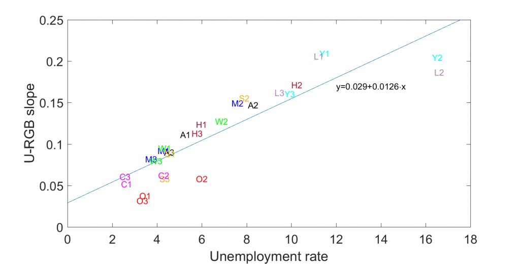
Horizonal axis: unemployment rate as reported by BLS. Vertical axis: average decline per interview in the reported unemployment rate. Demographic groups: A: Total population, Y: aged 16-24; M: men aged 25-54; W: women aged 25-54; O: aged 55 and over; L: less than high school education, H: high school graduate; S: some college; C: college graduates. Sample 1: 2001:7-2008:6; sample 2: 2008:7-2014:6; sample 3: 2014:7-2020:1. Also shown is regression line fitted to the 27 observations. Source: Ahn and Hamilton (2020).
What accounts for this phenomenon? We review a variety of evidence in our paper that persuades us that unemployed individuals feel more stigma and disengagement from the interview process. We observe the drop most sharply when people answer the questions for themselves than when someone else in the household answers for them. We also observe that people tend to give answers in subsequent interviews that they think might end the interview more quickly, such as indicating that they aren’t working because they are retired or disabled. Interestingly, people who report “retired or disabled” in interview 2 are more likely to return to the labor force in interview 3 than people who are “retired or disabled” in interview 1. Our conclusion is that the first-interview concept of unemployment is the best one to use. One can use the regression line above to calculate what that number would be, given any reported unemployment rate. Plugging the May value of 13.3% into the equation gives an unemployment rate normalized on the first-interview standard of 14.0% (13.3 + (3.5)[0.029+(0.0126)(13.3)] = 14.0).
Nonrandom missing observations. The BLS failed to reach some of the people it tried to survey in May. Over 2001 to 2019, we observed that people who were missed in month t-1 but successfully interviewed in month t had an unemployment rate that was 1.7 times as large as the overall population. People who weren’t successfully reached in May don’t show up in the numbers that get reported for May. Because those people are observably different from the rest of the population, this is another identifiable source of bias in the headline numbers.
The BLS employment situation summary indicated that the household survey response rate in May was about 15 percentage points lower than it had been prior to the pandemic. Obviously some factors outside of the ordinary were influencing the low response rate. But as a first guess, we could rely on the historical averages. If the May sample had been expanded by adding 15% more individuals who had an unemployment rate 1.7 times as high as those who were sampled, it would imply an unemployment rate of [0.133+(0.15)(1.7)(0.133)]/1.15 = 14.5% instead of the reported 13.3%.
Were that many people actually employed? A final issue has received a lot of coverage in the press because it was highlighted in the BLS report itself. There were large numbers of individuals who were classified as employed but absent from work due to coronavirus-related business closures. BLS intended to classify such individuals as unemployed, but stated in the report:
it is apparent that not all such workers were so classified…. If the workers who were recorded as employed but absent from work due to “other reasons” had been classified as unemployed on temporary layoff, the overall unemployment rate would have been about 3 percentage points higher than reported (on a not seasonally adjusted basis).
Summary. The headline unemployment rate in May likely understated the true unemployment rate by 1.6% as a result of overestimating the number of people who dropped out of the labor force, by an additional 0.7% as a result of repeated-interview bias, 1.2% as a result of missed individuals, and 3% as a result of people who were misclassified as employed,
13.3 + 1.6 + 0.7 + 1.2 + 3 = 19.8,
leading to the conclusion that the unemployment rate in May was more like 19.8% than the reported 13.3%.
None of this should be construed to mean that the improvement in May was not real. We see a dramatic improvement not just in the household survey numbers, but also in the establishment-based estimates. And, although still very high, the number of new and continuing claims for unemployment compensation dropped by 2.6 million between April 25 and May 23. So the good news is quite real.
But we still have a long, long way to go.
Disclosure: None.


