
Inflation – The Good & Bad
- Inflation The Good & The Bad
- What’s Driving Rates?
- Tailwind For Bonds
- Market & Sector Analysis
- 401k Plan Manager
The Good & Bad Types Of Inflation
Since the November election of Donald Trump, the investing landscape has gone through a dramatic change of expectations with respect to economic growth, market valuations and particularly inflation. It is the view of inflation that I want to touch on today as it relates to the belief the “Death Of Great Bond Bull Market” has finally arrived.
The chart below shows the massive surge in inflationary expectations as of late in both the 5-year and 10-year rates as well as the mean PCE inflation rate. (#SarcasmAlert)

As you can see, while expectations of a rise in inflationary pressures have risen since the election, the consumer price index (CPI) was already rising fairly strongly since the beginning of 2015.

So, if the rise in inflation expectations remains muted, what’s the reason for the recent surge CPI? That rise can be directly linked to the full onset of the Affordable Health Care Act which sent medical inflation costs surging. This is something I warned about many times in the past.
“The impact of the Affordable Care Act is now taking root. Unfortunately, for many, that impact is not a positive one as surging premiums absorb more of the discretionary budget of households.”

The Fed believes the rise in inflationary pressures is directly related to an increase in economic strength. However, as I will explain: Inflation can be both good and bad.
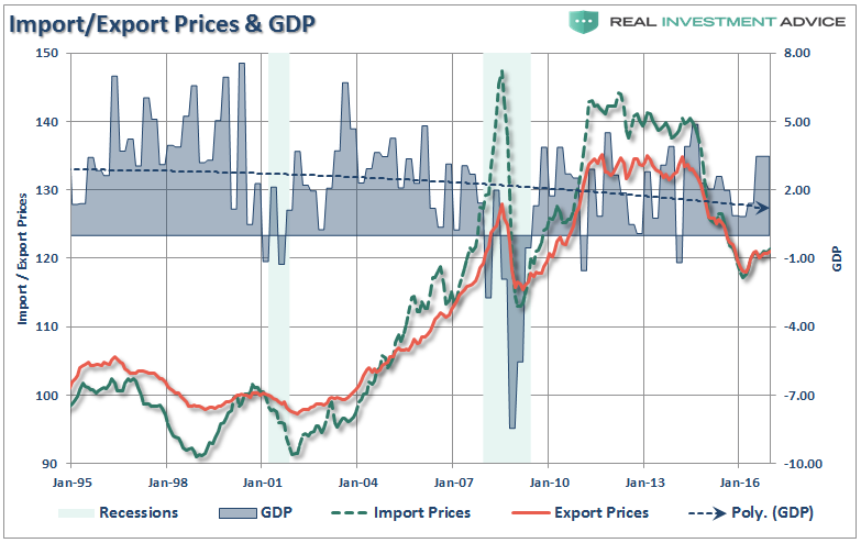
Inflationary pressures can be representative of expanding economic strength if it is reflected in the stronger pricing of both imports and exports. Such increases in prices would suggest stronger consumptive demand, which is 2/3rds of economic growth, and increases in wages allowing for absorption of higher prices.
That would be the good.
The bad would be inflationary pressures in areas which are direct expenses to the household. Such increases curtail consumptive demand, which negatively impacts pricing pressure, by diverting consumer cash flows into non-productive goods or services.
If we take a look at import and export prices there is little indication that inflationary pressures are present.
This lack of economic acceleration can be seen in the breakdown of the Consumer Price Index below. It can clearly be seen where inflationary pressures have risen over the last 5-months.
(Thank you to Doug Short for help with the design)
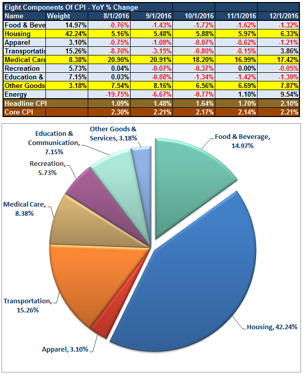
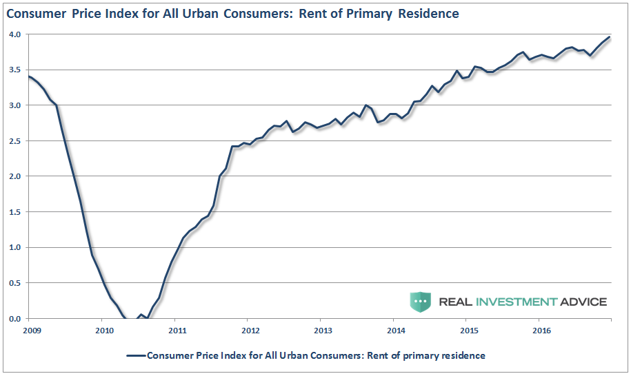
As is clearly evident, the surge in “health care” related costs, due to the surging premiums of insurance due to the “Un-affordable Care Act,” pushed both consumer-related spending measures and inflationary pressures higher. Unfortunately, higher health care premiums do not provide a boost to production but drain consumptive spending capabilities. Housing costs, a very large portion of overall CPI, is also boosting inflationary pressures. But like “health care” costs, rising housing costs and rental rates also suppress consumptive spending ability.
“For the middle-class and working poor, which is roughly 80% of households, rent, energy, medical and food comprise 80-90% of the aggregate consumption basket.” – Research Affiliates
The problem for the Fed is that by pushing interest rates higher, under the belief there is a broad increase in inflation, the suppression of demand will only be exacerbated as the costs of variable rate interest payments also rise.
With households already ramping up debt just to make ends meet, another increased expense will only serve to further suppress “consumer demand.”
The Rest Of The Story
By narrowly focusing on consumption, economists have lost sight of production. Such disregard for the supply curve is proving to be a costly error.
As monetary policy increasingly encouraged debt-financed consumption, corporations responded by expanding their capacity and operations to keep up with the policy-induced demand for their goods. Both the demand and supply curves shifted in unison, reflecting greater demand and production capacity. Unfortunately, over time, the consumers’ ability to take on additional debt has diminished and the demand curve shifted back. The supply curve, however, is less flexible as corporations cannot easily reduce their production capacity. Attesting to this overbuild is capacity utilization which, as graphed below, is trending lower and stands at a level that has been indicative of recessions in prior cycles.
Capacity Utilization
Data Courtesy: St. Louis Federal Reserve (FRED)
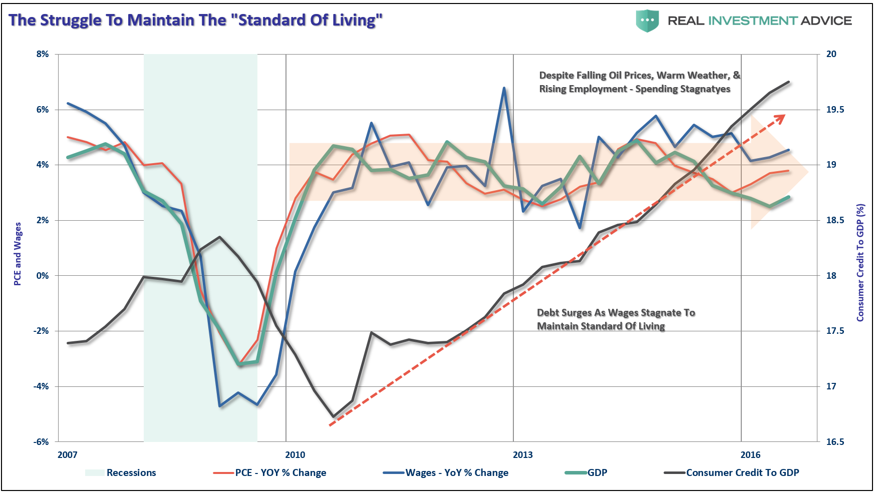
In response to weaker demand, corporations downsized employment, outsourced production and limited wage increases. Partially as a result of their actions, the labor participation rate lingers at 38 year lows and real median wages are at levels comparable to 1998. Corporations created a negative economic feedback loop as their employees are also consumers of their products.
Another unfortunate consequence of weaker demand is that instead of investing some profits towards productive activities, a majority of corporate cash flows have been diverted to shareholders to engineer better financial ratios and earnings per share to help compensate for weakening sales. The results may be optically appealing and supportive of equity market valuations in the short-term, but these decisions are decidedly not constructive for the long term health of the corporations and the economy.
The bottom line is that disregard for production oriented aspects of the economy (the supply side) and myopic over-emphasis on debt-financed consumption (the demand side) naturally limited potential corporate and national economic growth.
“By a continuing process of inflation, government can confiscate, secretly and unobserved, an important part of the wealth of their citizens” – John Maynard Keynes
So…What’s Driving Rates?
“If inflation, outside of healthcare and rent, isn’t really an issue then what’s been pushing interest rates higher over the last couple of months? “
Good question.
Here’s the short answer:
“Rates Are Rising Because Of China, Not Inflation”
Let me explain.
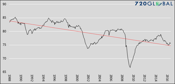
There has been a lot of angst in the markets as of late as interest rates have risen back to the levels last seen, oh my gosh, all the way back to last year. Okay, a bit of sarcasm, I know. But from all of the teeth gnashing and rhetoric of the recent rise in rates, you would have thought the world just ended. The chart below puts the recent rise in rates into some perspective. (You have to kind of squint to see it.)
While the bump in rates has been fastened to the recent election of Donald Trump, due to hopes of a deficit expansion program (read: more debt) and infrastructure spending which should foster economic growth and inflation, it doesn’t explain the global selling of U.S. Treasuries.
For that answer, we only need to look at one country – China.
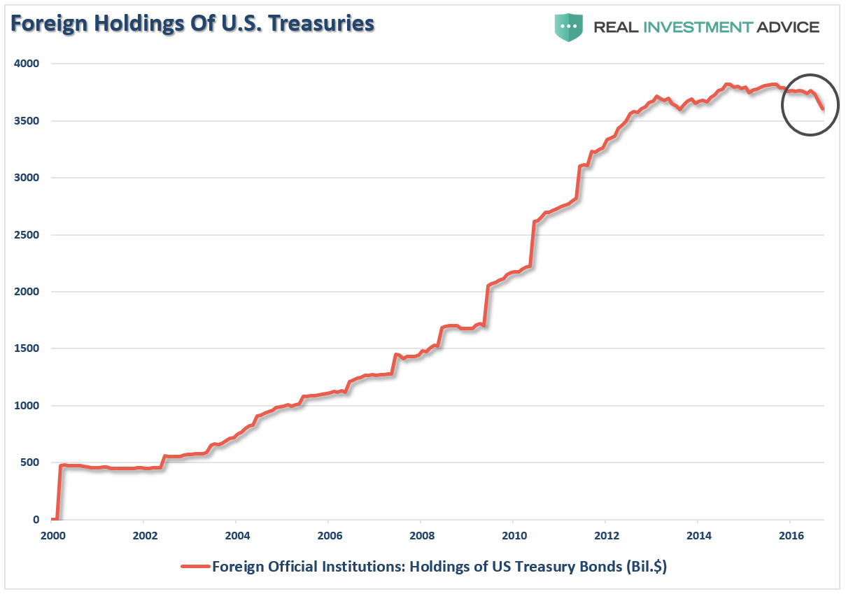
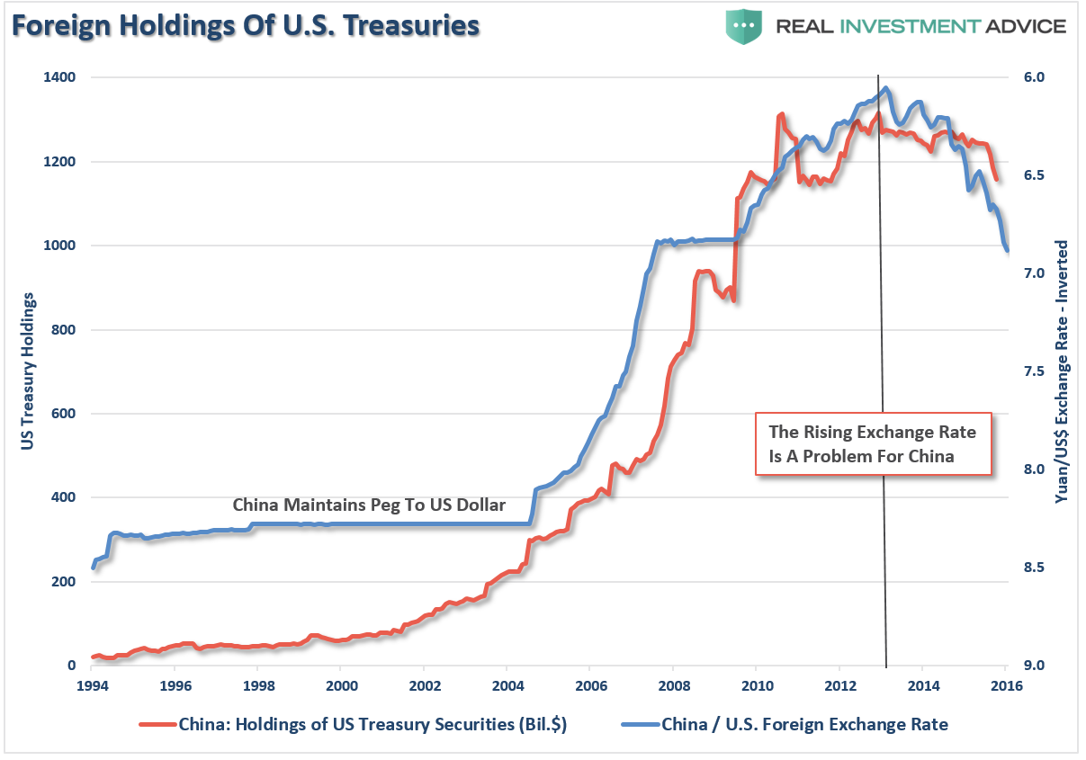
It is important to understand that foreign countries “sanitize” transactions with the U.S. by buying treasuries to keep currency exchange rates stable. As of late, China has been dumping U.S Treasuries and converting the proceeds back into Yuan in an attempt to stop the current decline.
The stronger dollar and weaker yuan increase the costs of imports into China from the U.S. which negatively impacts their economy. This relationship between the currency exchange rate and U.S. Treasuries is shown below. (The exchange rate is inverted for illustrative purposes.)
The selling of Treasuries by China has been the primary culprit in the spike in interest rates in recent months. As I will discuss in a moment with respect to the trade deficit, there is little evidence of a sustainable rise in inflationary pressures. The current push has come from a temporary restocking cycle following a very weak first half of the year economically speaking, and pressures from higher oil, health care, and rental prices.
As noted by Horseman Capital in their recent note to investors (Via Zerohedge):
“Asia is the source of most global demand for commodities, while also a huge supplier of goods into the US. Asian currencies have followed US bond yields higher and lower since the 1990s, as well as followed commodity prices higher and lower over that time. There has been one time when this relationship has broken down. In 2007 and 2008.
Today we are seeing the reverse, I believe. The Chinese financial system is showing signs of stress. Corporate bond yields are rising, the Chinese Yuan is weakening, and outflows are continuing. In my view, the Trump election has made a large Chinese devaluation more likely. Mainland Chinese investors are desperately trying to get out of the Yuan, and the People’s Bank of China is trying to defend the value of the Yuan. They are doing this by selling treasuries.”
This is shown, the annual rate of change in U.S. bond holdings by China is rapidly approaching historical lows (axis is inverted).
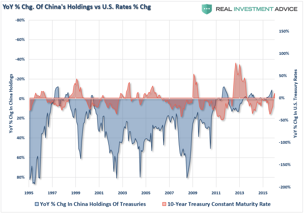
“The problem with this is that the more treasuries the PBOC sells, the more yields are likely to rise, putting more pressure on the Yuan. It seems to me that the PBOC is stuck in a doom loop. But as I noted in my market view, the PBOC is running out of options.
In my view, the macro model that I have been using to think about markets still looks valid, despite recent moves. The model indicates that it is impossible for countries that have engaged in QE to then normalize interest rates without causing financial crises with their trade partners. Since 2013, we have had the taper tantrum, devaluations in India, Russia, and Brazil, which all helped to drive long dated treasuries to new lows. Now the market is thinking the US will normalize rates, and the second biggest economy in the world is struggling. A rerun of 2007/8 is looking likely to me.”– Russell Clark, Horseman Global
While much of the mainstream media continues to protest the “Great Bond Bull Is Dead,” as expectations rise for a global resurgence in economic growth, there is currently scant evidence of such being the case. Since economic growth is roughly 70% dependent on consumption, then population, wage and consumer debt growth become key inputs into that equation. Unfortunately, with wage growth stagnant and on the decline, population growth weak and consumers already extremely leveraged, a surge in economic growth to sustain higher interest rates is highly unlikely.

The Tailwind For Bonds
As explained, my case for interest rates is lower rather than higher. China’s selling will eventually abate as either they run out of Treasuries to sell or they stem the tide of the currency decline. Furthermore, economic weakness will likely reassert itself this year as a recessionary spat approaches pushing rates lower.
Regardless of which occurs first, the setup for a push towards 1% on the 10-year Treasury, or lower, is already baked into the cake. As my friend Dana Lyons pointed out this past week:
“As one might imagine, the collapse in bond prices has had quite an impact on traders’ sentiment and positioning. In fact, if we shift to the 10-Year T-Note futures market, we find that Speculators have pulled a 180 and now hold their largest net-short position of all-time – by a lot. At a net-short position of nearly 400,000 contracts, it is more than 100,000 larger than any other in history.”
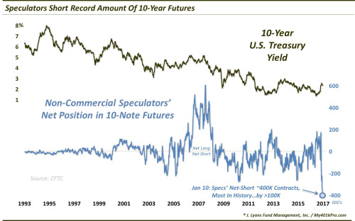
If the market corrects, OR the economy hits a speed bump, OR something happens in the Eurozone, OR…OR…OR…the covering of short positions in bonds will cause an extremely fast drop in yields.
Sure, anything can happen. If yields on the 10-year Treasury break above 3% it will be coincident with a sharp rise in consumer spending, wages, inflationary pressures that are broad based and surging economic growth. In such a case it will make sense to reduce bond holdings in favor of equities.
However, given the fact we are already in the 3rd longest economic expansion in history, combined with the second highest levels of valuation on stocks, the odds of such an outcome are extremely low.
I remain long bonds as a hedge against my long equity exposure.
#PortfolioHedgesMatter
Market & Sector Analysis
Data Analysis Of The Market & Sectors For Traders
S&P 500 Tear Sheet
The “Tear Sheet” below is a “reference sheet” provide some historical context to markets, sectors, etc. and looking for deviations from historical extremes.
If you have any suggestions or additions you would like to see, send me an email.
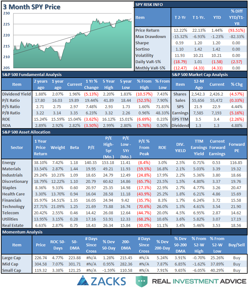
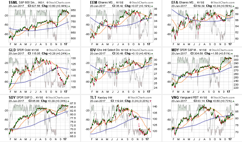
Sector Analysis
Comments
With the “inauguration” now behind us, the markets will likely return its focus to earnings, the economy and will keep a close eye on policy indications and changes coming from the White House.
For the second consecutive week, the S&P Index finished lower by 0.15% or -3.33 points. This crushing of investors follows the previous week’s smashing of .1% or -2.74 points. (Once again: #SarcasmAlert)
From last week in case you missed it.
“The video below shows the historical “rotation” of sectors over the last 3-years. As you will notice sectors have consistently “swarmed” in a clockwise rotation going from strongly outperforming the S&P 500 index to strongly underperforming. If you watch to the end of the video you will see the post-presidential election anomaly form.”
I have notated on the Sector Rotation model below, the early stages of the reversion process of the extreme bifurcation between sectors below. Notice interest rate sensitive sectors and Financial’s are beginning to trade momentum.

This rotation is likely very early in its movement. As noted above, while RISK bullishness has reached extremes, SAFETY has been completely disregarded. Reversions tend to be rapid.
Importantly, notice that while Financials, Small and Mid-cap stocks, Energy, Materials, and Industrials continue to lead the S&P 500, their overall strength has begun to weaken.
From a position view, Technology pushed higher last week along with Discretionary, Industrials, Materials, and Staples pushing above it 50-dma. Energy, Financials, and Health Care turned lower.

From the broader index positioning:
Small Caps and Bonds turned lower and are testing their 50-dma. Emerging and International markets stagnated even though the dollar weakened a bit as these markets are extremely overbought. Dividend yielding stocks, REIT’s and Mid-Caps stalled while Gold turned up and broke above its negative trending 50-dma.
The table below shows thoughts on specific actions related to the current market environment. (These are not recommendations or solicitations to take any action. This is for informational purposes only related to market extremes and contrarian positioning within portfolios. Use at your own risk and peril.)

Seven weeks ago, as suggested, we hedged our long-equity positions with deeply out-of-favor sectors of the market (Bonds, REIT’s, Staples, Utilities) which have continued to perform well in reducing overall portfolio volatility risk.
As I have been warning over the last couple of months, the stronger dollar and the rise in rates should not be dismissed.
Everything is currently pointing to this being a very late stage advance, so profit taking, hedging, and rebalancing remains strongly advised.
THE REAL 401k PLAN MANAGER
The Real 401k Plan Manager – A Conservative Strategy For Long-Term Investors

There are 4-steps to allocation changes based on 25% reduction increments. As noted in the chart above a 100% allocation level is equal to 60% stocks. I never advocate being 100% out of the market as it is far too difficult to reverse course when the market changes from a negative to a positive trend. Emotions keep us from taking the correct action.

Inauguration Behind Us
Well, fortunately, the inauguration of Donald Trump went off without any significant complications. With that all now behind us, as stated above, the markets will return their focus to earnings, economic data and policy actions coming from the White House. Trump has stated that his “executive order pen” will be working hard over the next couple of weeks so volatility in the markets remains a risk.
As I stated two weeks ago:
“With buy signals on all three indicators registered currently, any corrections are likely to be somewhat limited back to the rising short to intermediate-term moving averages. This would suggest a correction back to 2200 would likely be a ‘buyable’ trading level. As noted in the chart above, the current extension above the moving average will likely be corrected in fairly short order and we can use that correction to rebalance allocation models for the beginning of this year.”
That still remains the plan for the moment, however, I would NOT be surprised for the markets to have a “relief rally” next week and make a push for “Dow 20,000.”
As noted in the main body of this week’s missive, the current extremes on many fronts suggest investment risk remains elevated which is why I have not increased the allocation model to 100% as of yet. This is also why I have suggested over the last couple of weeks to use this current advance, and extension, as an opportunity to clean up portfolios. (Use guidelines noted previously.)
- Tighten up stop-loss levels to current support levels for each position.
- Hedge portfolios against major market declines.
- Take profits in positions that have been big winners
- Sell laggards and losers
- Raise cash and rebalance portfolios to target weightings.
If we can get a correction that resolves the overbought, extended and excessively bullish backdrop to the markets currently, I WILL increase the allocation model to 100%. For now, we will wait and let the markets tell us what it wants to do next.
If you need help after reading the alert; don’t hesitate to contact me.
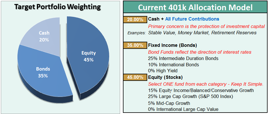
Current 401-k Allocation Model
The 401k plan allocation plan below follows the K.I.S.S. principal. By keeping the allocation extremely simplified it allows for better control of the allocation and a closer tracking to the benchmark objective over time. (If you want to make it more complicated you can, however, statistics show that simply adding more funds does not increase performance to any great degree.)
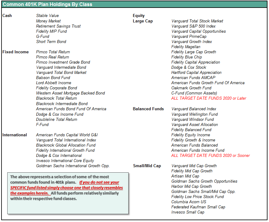
401k Choice Matching List
The list below shows sample 401k plan funds for each major category. In reality, the majority of funds all track their indices fairly closely. Therefore, if you don’t see your exact fund listed, look for a fund that is similar in nature.
Disclosure: The information contained in this article should not be construed as financial or investment advice on any subject matter. Streettalk Advisors, LLC expressly disclaims all liability in ...
more

