Demographic Trends For The 50-And-Older Work Force - Wednesday, Jan. 9
Note: This commentary has been updated with the latest numbers from Friday's Employment Report.
Our earlier update on demographic trends in employment included a chart illustrating the growth (or shrinkage) in six age cohorts since the turn of the century. In this commentary, we'll zoom in on the age 50 and older Labor Force Participation Rate (LFPR).
But first, let's review the big picture. The overall LFPR is a simple computation: You take the Civilian Labor Force (people age 16 and over employed or seeking employment) and divide it by the Civilian Noninstitutional Population (those 16 and over not in the military and or committed to an institution). The result is the participation rate expressed as a percent.
For the larger context, here is a snapshot of the monthly LFPR for age 16 and over, stretching back to the Bureau of Labor Statistics' starting point in 1948 (the blue line in the chart below) along with the unemployment rate.
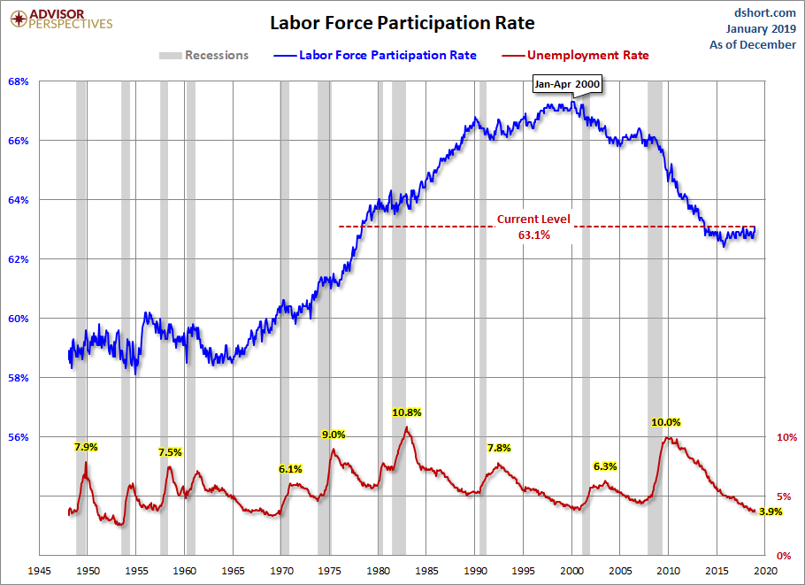
The overall LFPR peaked in early 2000 at 67.3% and gradually began falling. The rate leveled out from 2004 to 2007, but in 2008, with the onset of the Great Recession, the rate began to accelerate. The latest rate is 63.1%, off its interim low of 62.4%. The demography of our aging workforce has been a major contributor to this trend. The oldest Baby Boomers, those born between 1946 and 1964, began becoming eligible for reduced Social Security benefits in 2008 and full benefits in 2012. Job cuts during the Great Recession certainly strengthened the trend.
The Growing Ratios of Older Workers
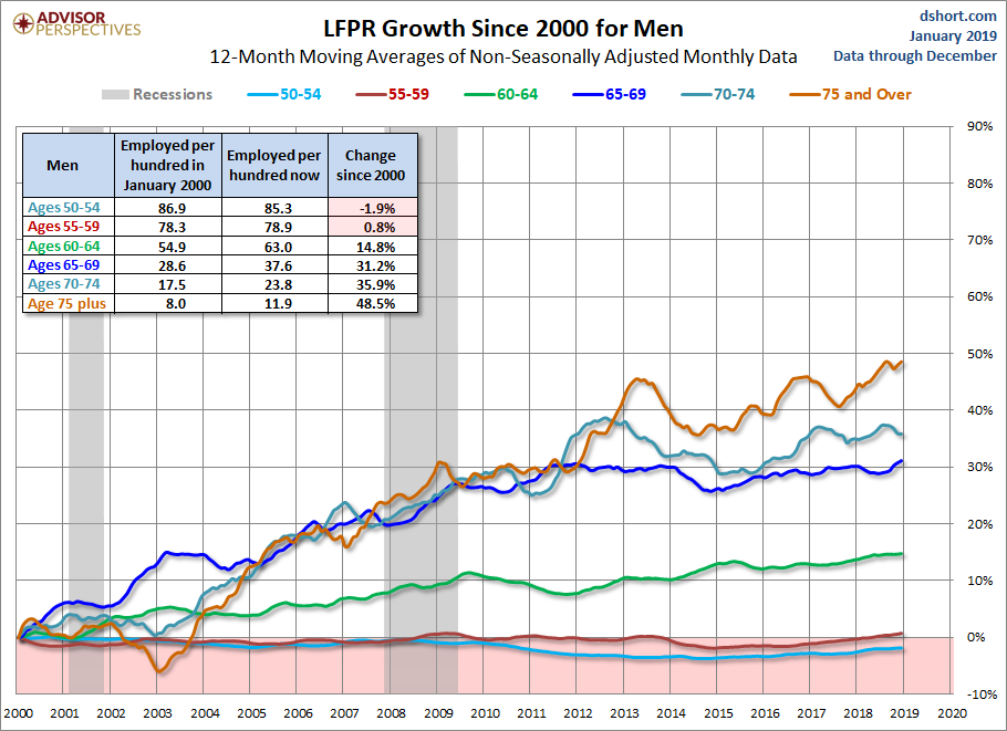
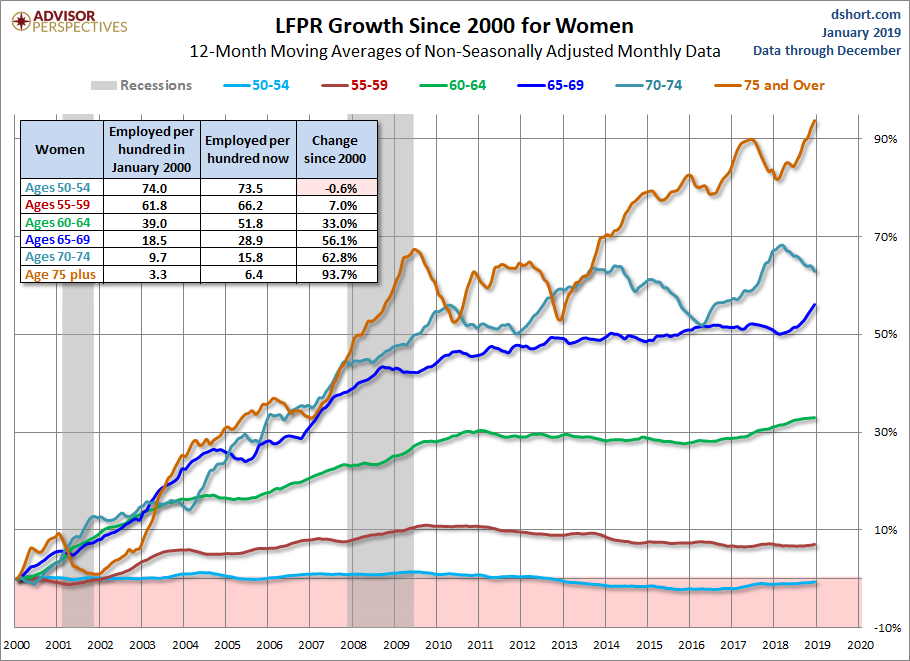
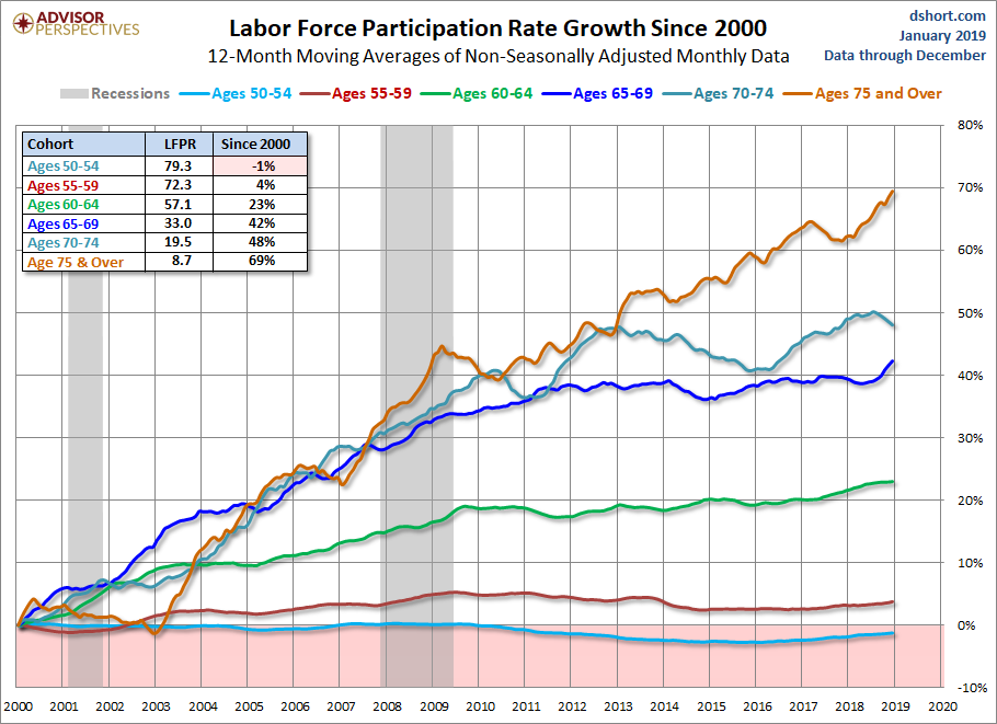
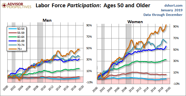
It might seem intuitive that the participation rate for the older workers would have declined the fastest. But exactly the opposite has been the case. The chart below illustrates the growth of the LFPR for six age 50-plus cohorts since the turn of the century. The chart below divides them into five-year cohorts from ages 50 through 74 and an open-ended age 75 and older. The pattern is clear: The older the cohort, the greater the growth. Interestingly, the 70-74 cohort LFPR was in decline from 2013 through the end of 2015 but saw a striking uptick in 2016 that has continued, though recently slowed. This movement is more prominent for women as seen in the chart at the end of this article.
Another Way to Envision the Data
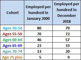
The table inset in the chart above shows the participation rate for the latest month and the percentage growth since January 2000. The adjacent table rounds the rates to integers for January 2000 and for the latest month. Essentially this table gives us two snapshots: The number of workers per hundred for each of the six cohorts at the turn of the century and the number of workers per hundred now. This is not the scenario that would have been envisioned a generation ago for the "Golden Years" of retirement.Consider: Today nearly one in three of the 65-69 cohort and one in five of the 70-74 cohort are in the labor force.
There is no question that the pace of Boomer retirement will accelerate in the years ahead. Just add about 65 years to the red dots in the chart below and you'll get some idea of the epic retirement wave that is just beginning (and note that the birth statistics below don't include immigration).

What's Ahead?
With the improvement in the market since the 2009 index lows, many households approaching the traditional retirement age are in better financial shape and with healthier nest eggs than was the case a few years ago. On the other hand, when we look at the age 65-69 cohort, the dark blue line in the second chart above, we see that it rose steadily between the last two recessions despite the market's improvement and showed signs of easing in 2014 with a trend upward through this year. Despite the current full-employment, the participation rates of the older cohorts have generally not been in decline. If the mass wave of retirement begins sooner rather than later, it would certainly improve the job opportunities for younger generations.
The Gender Difference
The comparative growth in the 50+ cohorts by gender is rather amazing. The LFPR for Women Age 75 and Over has risen about 94% since the turn of the century. The rate for Men Age 75 and Over is up less than half the Women's rate around 49%. To facilitate a visual comparison, the vertical axes on the two charts below are identically scaled.
Here are larger versions of the two charts.