Broad US Stock Market Update - Strong Evidence That It May Be Out Of Time.....
Broadly speaking it looks like the broad US stock market is at or very close to a final top with broadening formations visible on the Dow Jones Industrials charts on shorter-term charts and on a larger scale on long-term charts.
The broad stock market has put in an impressive performance since the Fed’s about face to save it at the end of May/start of June, and has even risen to new highs, but as we will see in this update it is not “out of the woods” yet – on the contrary, it may be at a double target and thus set to roll over soon and drop.
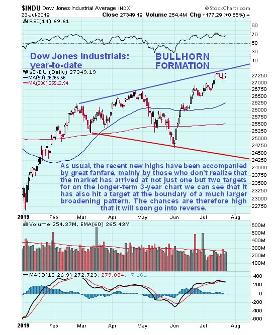
On the year-to-date chart we can see that although the rise from the late May low has taken the market up to a new high, it HAS NOT broken it above the upper boundary of the potentially bearish broadening pattern shown. It is overbought again after this run and is showing signs of rolling over.
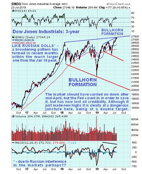
On the 3-year chart we can observe a curious and interesting technical coincidence, for not only has the market arrived at the upper boundary of the broadening pattern shown on the year-to-date chart, it has also arrived at the upper boundary of a much larger broadening pattern that has been forming since the early January 2018 blowoff top. What this means is that there is a good chance that we are looking at the final high here for the bullmarket that has been in force for over 10 years now. The smaller broadening pattern fits within the larger one “Russian Doll” style, although given the risk of Russian interference in the market, the use of this term might be deemed to be politically incorrect. So, to be on the safe side, we will henceforth refer to them as “North Asian Dolls”.
A word of caution is in order here regarding these broadening patterns. While they are a sign of distribution and often mark tops, what sometimes happens is that the price (index) breaks out above the top boundary into a final vertical blowoff move before collapsing back. What they do mean, even if this happens, is that the market is either at or close to a final high. This means that it is an effective tactic to short a market that is close to the upper boundary of one of these patterns, but with a stop above it in case, it breaks above it into a final spike, which can, of course, be very damaging if you are short.
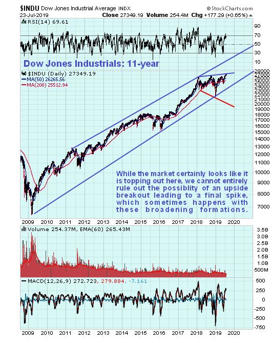
If the index does blow through the upper boundary of these 2 broadening (bullhorn) patterns then it will probably run at the upper boundary of the long-term channel shown on the 11-year chart on which we can see the bull market from its inception. It remains to be sign if the Fed can jawbone this possibility into existence, especially as it is almost out of credibility as made plain in this article The “Scared and Desperate” Fed Is Playing The Most Dangerous Game. This situation could suddenly flip so that no matter what the Fed says or does, the market no longer believes it or has confidence in it.
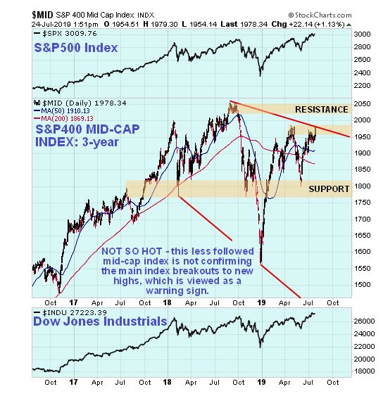
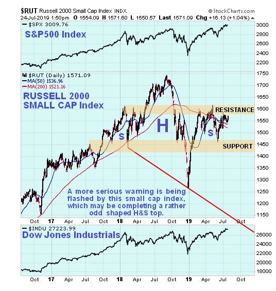
Because the vast majority of investors and market participants look only at the major market indices like the Dow and the S&P500 index, it follows that market manipulators which we can take to include the Fed and the government devote the most effort to window dressing them, by, for example, overweighting the FAANG stocks. So it often pays to see what is going on with the less popular indices and we do that now by looking at the S&P400 Mid-Cap index and the Russell 2000 Small-Cap index.
Starting with the S&P400 Mid-Cap index we see on its 3-year chart that it looks like it is topping out beneath resistance near to its highs, and it certainly doesn’t confirm the recent new highs by the Dow and the S&P500 index.
Considerably worse is the Russell 2000 Small-Cap index, which looks like it is completing the Right Shoulder of a skewed Head-and-Shoulders top. Failure of the nearby support shown on this chart and on the Mid-Cap chart could lead to a general market plunge.
At the end of bullmarkets, it is normal for the biggest stocks to outperform the mid and small-caps and that is exactly what we are seeing now, and it is viewed as a clear warning that we are either at or close to a top.
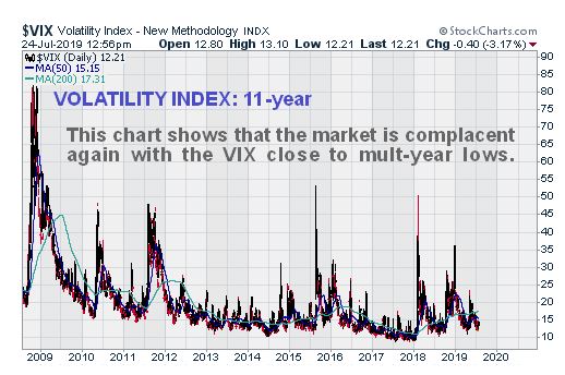
Finally, the latest VIX chart shows that complacency is again widespread with VIX being back near to multi-year lows…